
Scott English Milam is an Arizona native who has a great eye for capturing beautiful and authentic moments with couples.
With over 10 years of experience, he has learned to cultivate an environment that makes it easy for couples to express their love in front of the camera. Scott’s work is everywhere and we just had to sit down with him and ask a few questions about work ethic and practises.
…what a bonus that he is also a fan of Infinite Color!

Scott’s work with couples and weddings really serves as an inspiration for those in and out of the field. The viewer can truly see the love he captures in his subjects and we believe that to be one of the keys to Scott’s success.
We asked Scott what his primary sources of inspiration are and he told us how he always seeks to create authentic and meaningful images.
A lot of his inspiration comes from his own marriage and the marriages around him. Those relationships have helped him understand what kind of interactions mean the most to people who are in love. Scott works hard to set up those meaningful moments, in order to tell stories that have a bigger impact than just a pretty picture.
Over the years we have realised that many creatives don’t believe they have their own style even though others can clearly see it, so we were intrigued to see if Scott believes he has a particular style and how would he define it.
Scott told us:
“I would define my style as warm and peaceful. Because I live in Arizona, we have a lot of warm tones to start with, so it was always easy to harness that style. As I’ve progressed as a photographer I’ve continued to emphasize those tones to create more of a feeling with my images, instead of just an aesthetic style. And hopefully, that feeling is peacefulness because I am convinced that within the sweetest, most intimate moments with our significant others, we will find peace.”
Which leads us to the question what role color grading plays in the execution of Scott’s visions and whether he believes it to be a necessary part of the process.
Scott considers grading crucially important in conveying those feelings and maintaining his style. He has worked hard over the last few years to hone in on that style through editing and feels like he’s gotten to a really great place.

We were keen to find out if the direction Scott takes with color grading changes based on certain factors and how he knows where to go with it?
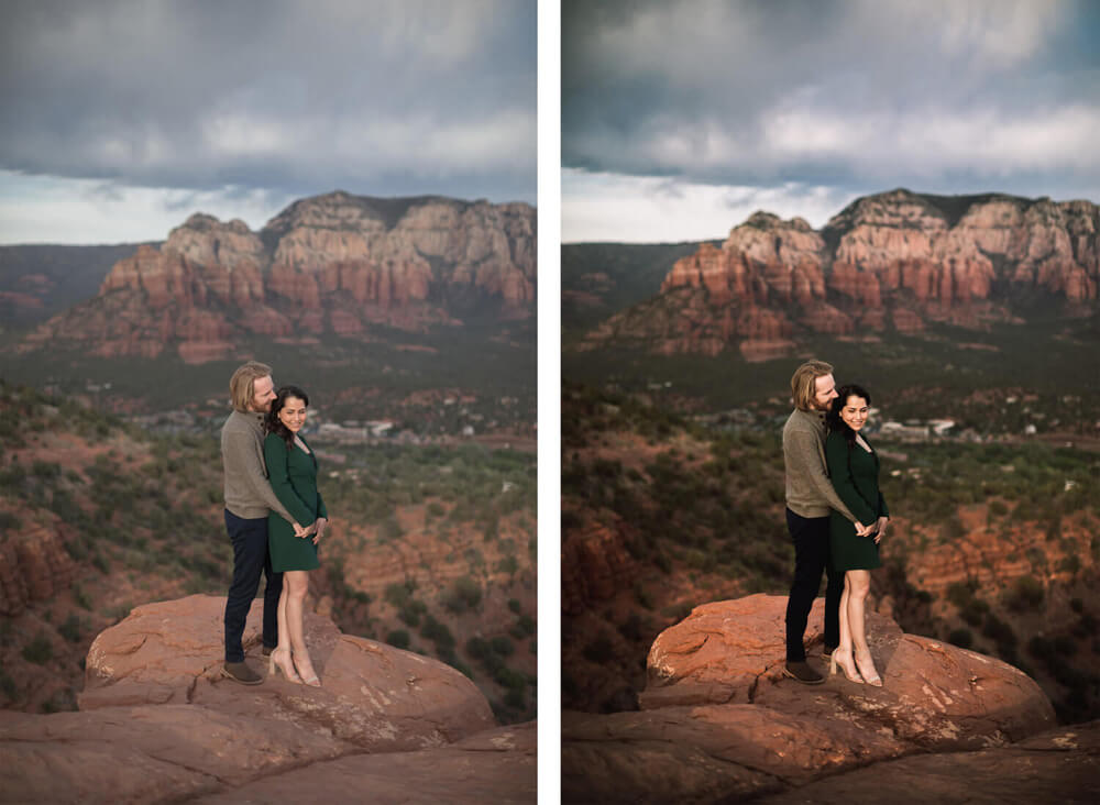
“It all has to do with the general color palette of the image, and the emotion that I am trying to convey. So if there are a lot of softer, muted tones already present in the image, I just focus on accenting those colors without overpowering anything. But, with images that are vibrant and contain bright colors, I focus on balancing those colors without desaturating anything too much because I think life should be full of color, so why rob photographs of the color they deserve! Ha!”
After seeing Scott work with Infinite Color and we’re delighted he’s chosen to use the panel to help with his color vision.
Scott tells us how the tool helps him accomplish his unique results in two ways.
Some of the time he starts out by dialling in most of his colors in Lightroom and then bringing over select images to Photoshop to tweak the tones with the Infinite Color panel. He likes the subtlety and easy tweaking the panel offers, which helps Scott not to stray too far away from his previous RAW adjustments.
However, as an alternative to the first method, Scott also likes starting from scratch with Infinite Color. He starts off by using Lightroom for image normalizing, then exports his images over to Infinite Color to see what options the panel comes up with. This is a great way to find new color toning styles and it helps Scott discover more about how to edit tones in Photoshop, which is a nice bonus!
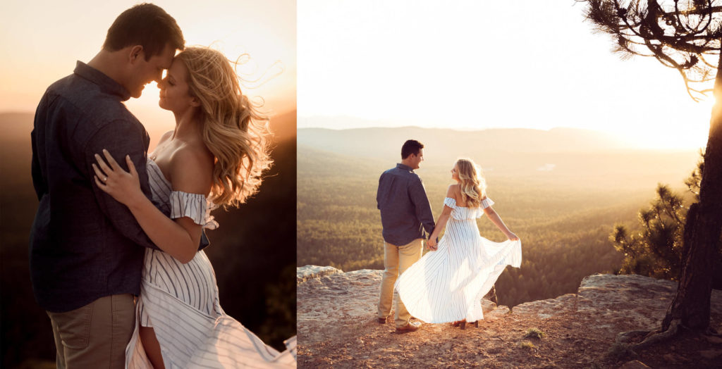
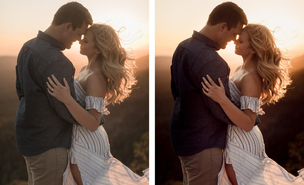 Infinite Color Panel in Action
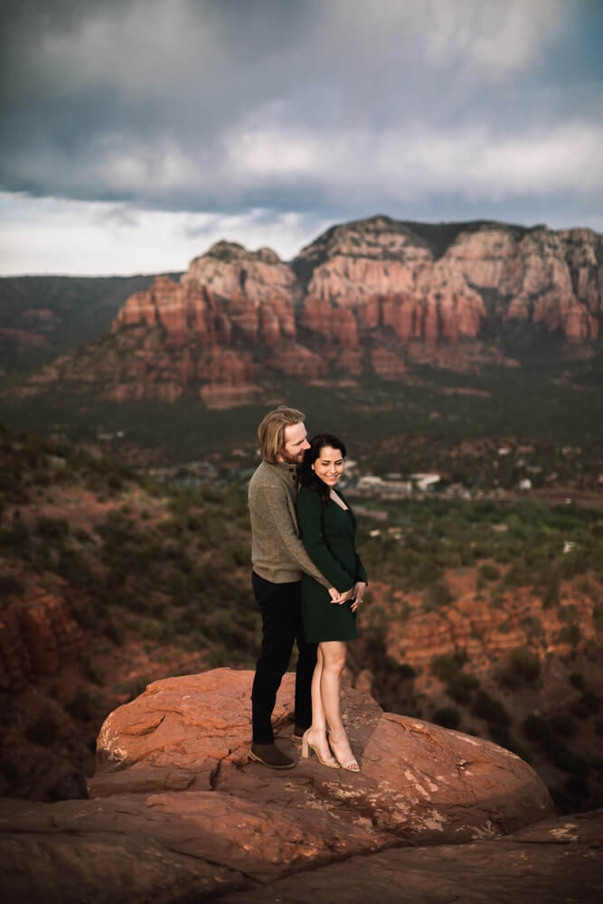
Lastly we asked Scott if Infinite Color would be something he’d recommend for other creatives, too, and what some of his favorite features were.
“Duh! It’s a no brainer! They really dialed it in, so that the toning is pleasant, yet still stylized, which most plugins seem to have a hard time finding that balance. It’s so easy to use, and the ability to adjust the layers after the fact, it’s so great for fine tuning!”
Thank you very much for giving us an insight into you world of photography and colour toning, Scott!
More of Scott’s work can be seen on his website and Instagram.
Have you tried the panel yet? We’d love to see your creations! Get in touch on Instagram @infinitecolorpanel or the Facebook Infinite Color Panel group and show us your work.