Category Archives: Inspiration

The Best Settings for Infinite Unify

Hey everyone, Pratik here!

I have to say retouching is my life, I am quite obsessed with it! Through the obsession, I’ve had the fortunate opportunity to have clients that count on me to make their images flawless. As a part of the process, I have to make sure that my skin tones are always looking good on images. It’s quite honestly the most annoying part about the retouching process! It’s why I wanted to see Infinite Unify come into existence.

Over the years I’ve been asked to show people just how I use it, what settings I prefer, and the best workflow to get amazing results without spending a ton of time! So I decided to make that video showing you what I recommend you do. There are many settings in the panel and this will show you what you need to do to make it as easy as possible.

In this video, I also cover the benefit of using 2 Unify layers, adjusting default opacities, and masking options, along with tips on changing saturation and hue with the hidden advanced editor within the panel! So be sure to watch it all, there’s lots of nuggets peppered in.

If you’d like to check out Infinite Unify, visit this link.

A special thank you to Bassam Sabbagh for supplying this image! He’s an incredible portrait photographer and a dear friend of mine.

Free Color Grade – Shades of Grace


Backstory:
I recently had the opportunity to collaborate with ballet artist Mackenzie Richter on a passion project. I wanted to incorporate floral elements into the shoot to complement her movement, so I asked my wife Bella Kotak to help style the shoot. I had a very precise vision for the colors, and I wanted them to match the sophisticated feeling of the shoot.

Color can be difficult for me to work with. I have a strong emotional attachment to color, but I often get bored of the manual experimentation required to get there. I would rather have a solid base that I can tweak. That’s why I rely on Infinite Color Panel to help me explore different color possibilities. With Infinite Color Panel, I can quickly see what’s possible with every image, and I can stop at the one that hits my vision. From there, each layer can be adjusted.

The shoot with Mackenzie Richter was a great success. The colors were exactly what I had envisioned, and the flowers complemented her movement beautifully. I’m so grateful to Mackenzie and Bella for their help in bringing this project to life. Now I want to share a little bit of that magic with you!

Download these color layers for Photoshop here: 
https://spaces.hightail.com/space/KbKQ1C9Qxy
1. Click on the link and download the Tiff file within.
2. Open the Tiff file in Photoshop, and there you’ll see the layers!
3. Feel free to drag it over to your work.

My Workflow:
As I mentioned, I use Infinite Color for my color grading process. If you haven’t seen it before, check out this video to see how it works.

As you can see from the screenshot, there are two Infinite Color groups created. The first group is set to 35% opacity, and the second is at 25% opacity. So the first group has more pull to the image than the second.

I like to set a foundation of the direction I want to go in in the first group. Then, the second group gives me variations of that as it builds on the foundation and also adds a little bit of complexity with the way all the layers interact.

This method I use is called Color Stacking and I have a video here that showcases the technique! It lets me create this intricate color grade easily.

Team Credits:
Photo by Pratik Naik (me)
Styling by Bella Kotak
Modeled by Mackenzie Richter


4th of July Sale!
If you’re interested in picking it up, we have a 30% off sale going on till the end of the 4th (Tuesday). Go to www.infinitecolorpanel.com and enter “30OFF” on checkout!

This applies to ALL of our tools in our store. To see our full collection check out www.infinite-tools.com.

Creatives Were Asked How Their Style Changed In 2022

As the year 2022 comes to a close, it’s a natural time to reflect on the year as creatives. One particularly interesting aspect to consider is how our styles have evolved and adapted over the past 12 months. To get a deeper understanding, we reached out to four photographers and asked them to share their thoughts on how their style changed in 2022. From exploring new techniques and subjects to embracing different approaches to post-processing and editing, these photographers offer a unique perspective on the ways in which their artistic vision has evolved in the past year. In this blog post, we’ll be sharing their insights and reflections on the journey of finding and honing their personal style as creative professionals.

1. Teri Hofford

My style has changed in that my work is more purpose driven and focused on imagery that will make people feel something – even if that something is uncomfortable.  While I used to photograph a lot of diverse bodies before, I wasn’t necessarily celebrating them as they ARE.  Instead, I would put them into poses and expressions that fit into the traditional beauty standards and this year I asked myself “What would it look like if I removed everything I’ve learned about bodies and how they “should” be?  What would my posing be like? What would my lighting be like? What would my editing be like?”  This has helped me redefine what beauty CAN be, instead of defaulting to what we’ve been told it should be.

__

2. Sanjay Jogia 

As much as technology and AI fascinates me (and I’m a huge fan) the abundance of this has forced me to look inward and truly understand myself more than ever. I’ve always said that style is informed by a deep understanding of one’s self, and with AI superficially appearing to have a ‘deep learning’ of the author, does the author ‘know thyself’ as much??

#AI
#AbundantIntelligence

__

3. Renee Robyn

My style didn’t really change, but it refined. I have been working on my art book and I realized that there was a huge lack of 40+ female models in fantasy art (mine included), so I’ve put a lot of work into casting women who want to be characters. It’s an ongoing quest and really opened up the type of visual stories I can create. I love it.

__

4. Fable Avalon

As a fantasy photographer, my work has always had a lot of bold colors. But this year I feel as though I have broken through a mental block and begun to refine both my color palette and my retouching unlike I ever have before. In addition, I have spent this year self-reflecting, which has helped me be more honest with myself as an artist and opened up my ability to connect with my subjects. I’m supremely proud of myself for this growth, and grateful towards the Infinite Tools plugins, team, and community for enabling visual creators like myself to reach greater heights each and every year.

Feature: Simon Diez’s Stunning Fashion Series

Simon Diez is a great creative in our community! He recently posted this beautiful set of images and it naturally caught everyone’s attention. I absolutely fell in love with it!

Everything from the concept down to the execution. I was absolutely enamored with how it turned out and had to reach out to feature this set.

Be sure to scroll down to see a short interview with Simon about the shoot and which Infinite Tools he used to create this series!

1. Can you tell us more about how this shoot happened? Was this your vision or one that came together with the team? 
It was a shoot with did for Caylen Johnson as a graduation present. She is part of my team, and I can’t be happier with how things happened that day. That is her prom dress, made by the one and only Walace Style. It is a very beautiful dress with a very interesting pattern on the fabric, I think is the pattern is inspired by the Sistine Chapel. The dress is huge, and a piece of art by itself so I immediately thought soft movement, you know? Like the one we see on angles flying on the chapel. I also wanted to show the size of it.

2. What were some of the challenges you faced during the shoot?
The draping! We had to do it like 20 times, all you see there was shot as is and nothing was enhanced or add in post

3. What tools did you end up using and where did they fit in the workflow?
First, I used Infinite Unify so the hands and face have the same color. Then I use Infinite Color a couple of times and played with the opacity of the layers until I got the color I wanted. Finally, I used Infinite Black & White to dial down and add some extra contrast to different areas in the picture.

Credits: 
Photography: Simon Diez
Model: Caylen Johnson
Designer: Wallace Style

Social Media: 
Come join our FB group! Also, checkout our IG page, where you can see more work! Simply tag our account for a chance to be featured as well!

Infinite Community Feature – August 2022

We recently asked to see some of your favorite images in our Facebook community. We wanted to feature some of our favorites from this month! We couldn’t possibly feature all of the beautiful work but you must see them all! Check out the post here in our group.

To see more of what our community is creating, please join our Facebook Group! You can also check out and tag our Instagram page as well! We’ll also be putting more call outs for future features on our social pages.

Under each photo you’ll find the name of each artist and the tools used to create each piece.


Photographer: Lara Giles 
Model: Vivien Sterk / Hair & Makeup Artist: Oksana Onischuk
Tool Used: Infinite Color


Photographer: Luca Storelli

“This is a recent picture I shot for a magazine editorial. In this example, I used Infinite Guide for retouching. For colour grading, I used Infinite Harmony applied with luminosity masks and then a level of Infinite Color Panel at low opacity for global color refinements. I love mixing different levels of color correction using luminosity masks. I love the new version of Infinite Color just because it’s enriched by Infinite Harmony which I find interesting for working with complementary colors.”


Photographer: Josh Beaton

“I used the Infinite Color Panel for this shot of Deepti from Love is Blind.”

Photographer: Wayne Denny
Model: Victória Valerian
“I took the background photo in downtown Orlando, and the model pic back in my apartment. Three different rounds of Infinite Color for the grade, and Infinite Unify on her skin to even out the tones. This was a part of 3 different shots I did with her from around the downtown area.”


Photographer: Simón Rafael Diez Tipa
“For this picture I was thinking on the 90’s type of magazine. I used Infinite Color, Unify and also Black and White.”

Photographer: Jordy Clarke
“Yeehaw 🤠 Shot for a feature on a western gothic clothing designer, Kassandra Love of Katakomb Clothing
Using Infinite Color for a little extra razzle dazzle ❤️”


Photographer: Menna Hossam
Tool used: Infinite Unify

Interview With Headshot Photographer Greg Thomason

We got to have a chat with someone that I highly respect in the photo community, Greg Thomason! He’s a headshot photographer based in Franklin, Tennessee and has some of the most engaging headshots I’ve seen. I absolutely love the emotion behind every photo and I’ve always been curious about how he is able to get the best out of his subjects! It’s a true mark of a professional, along with his impeccable choice in lighting and post production!

Recently we worked with Greg on our Infinite Skin launch to see if he was able to get the results he needed and save time in the process. We were thrilled with what he was able to do while still retaining his signature look at the end!

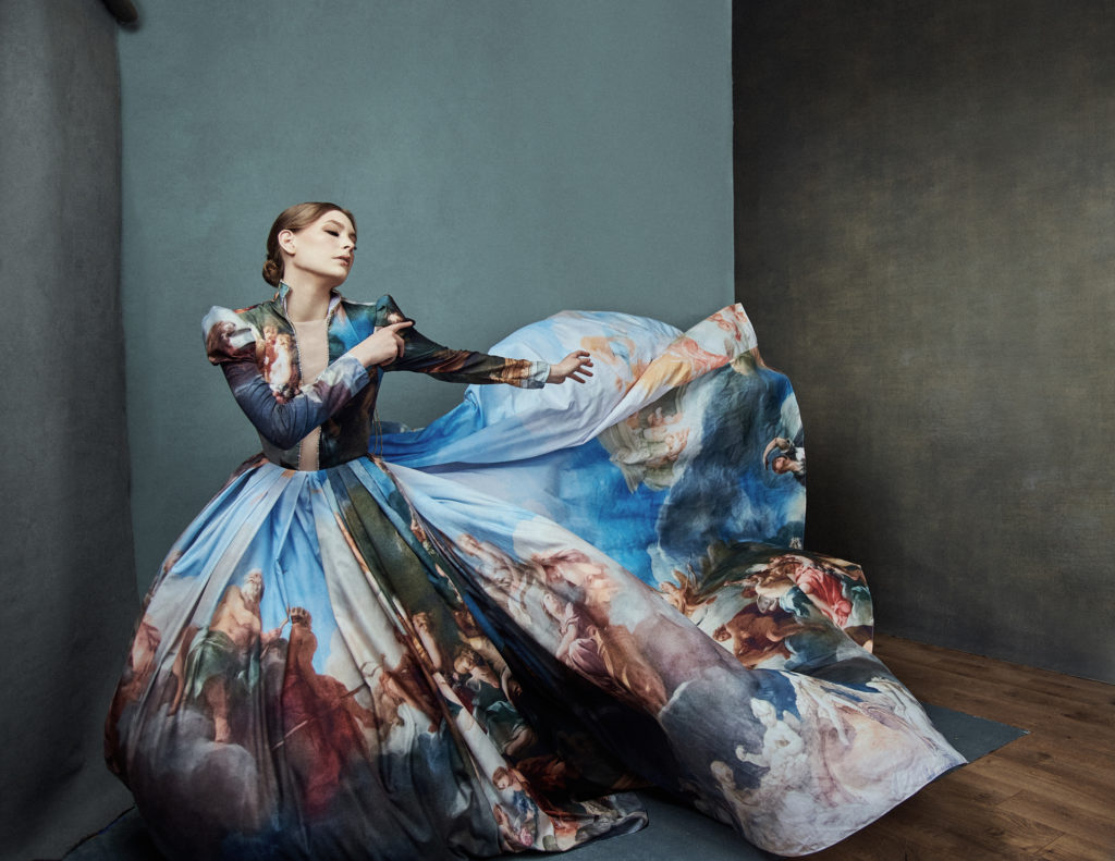
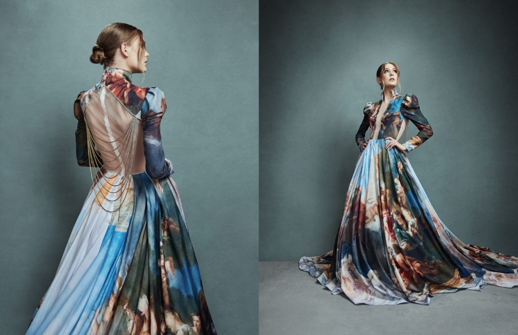
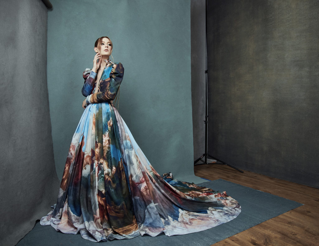
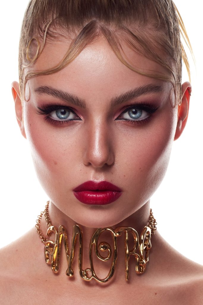
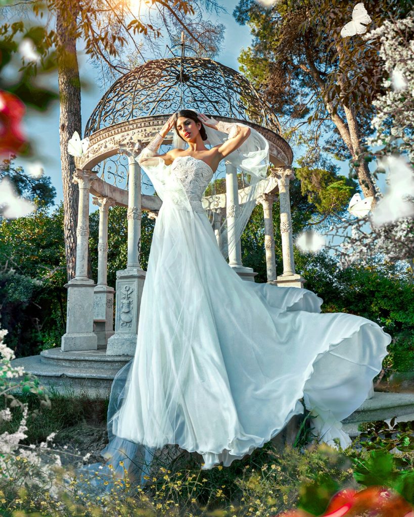
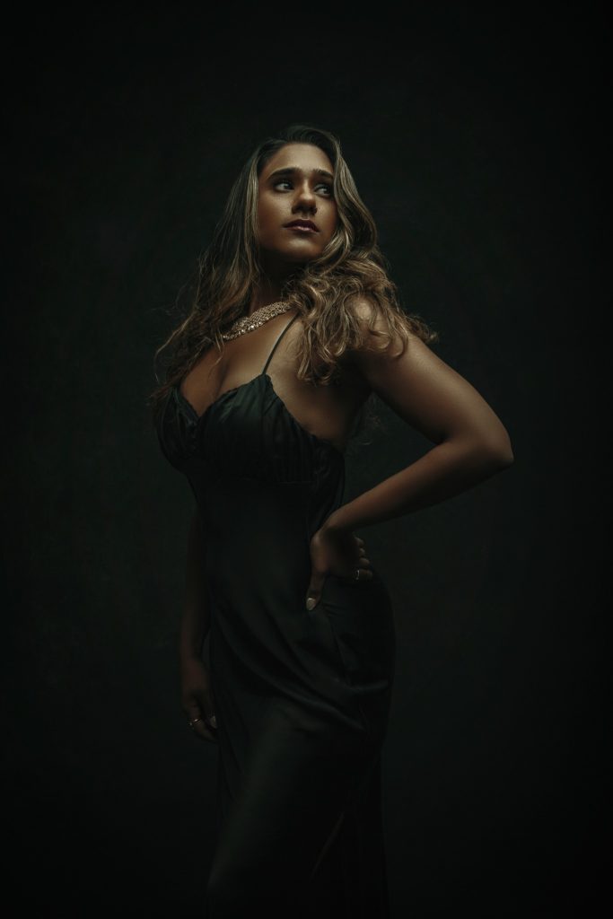
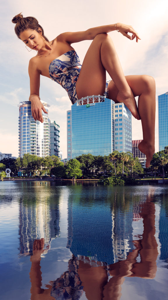
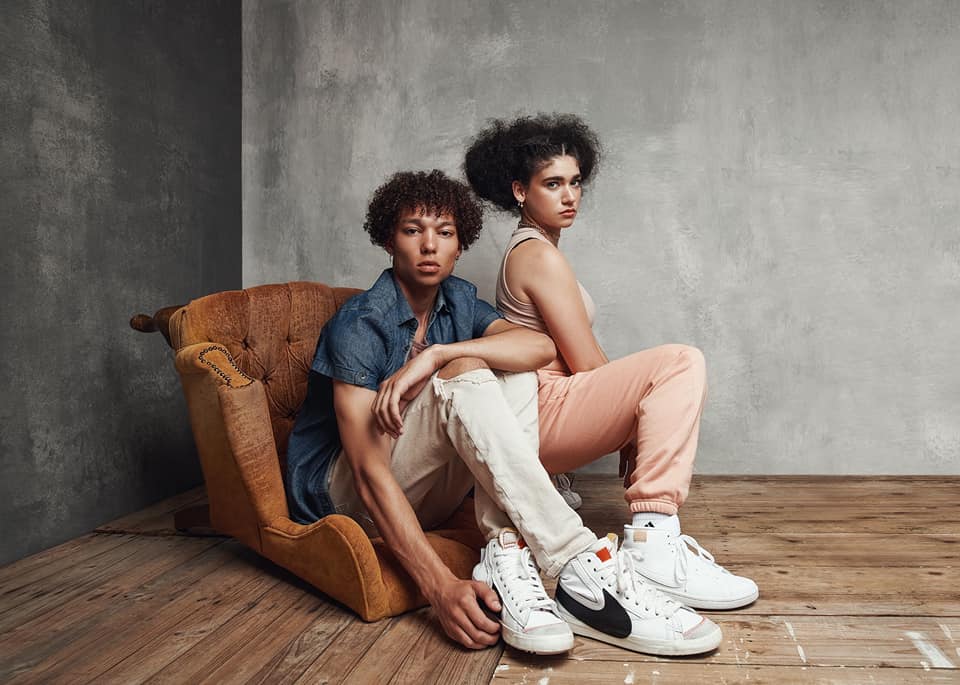
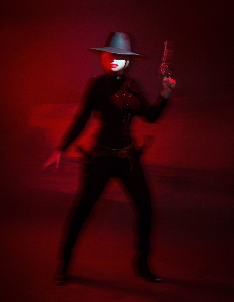
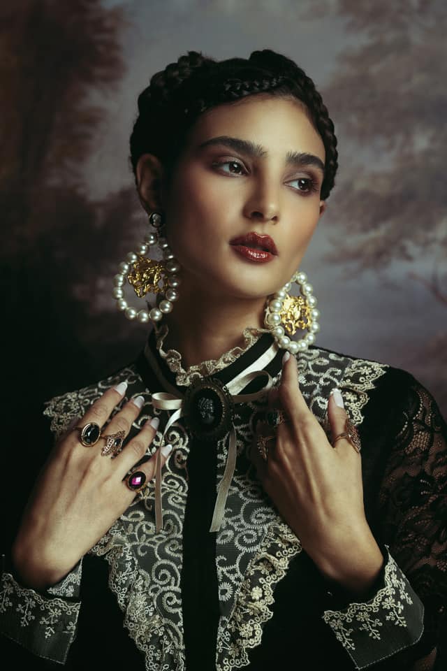
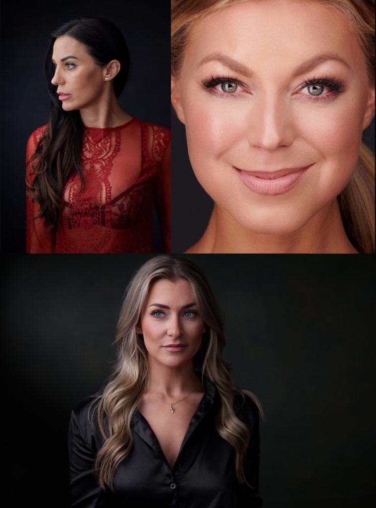
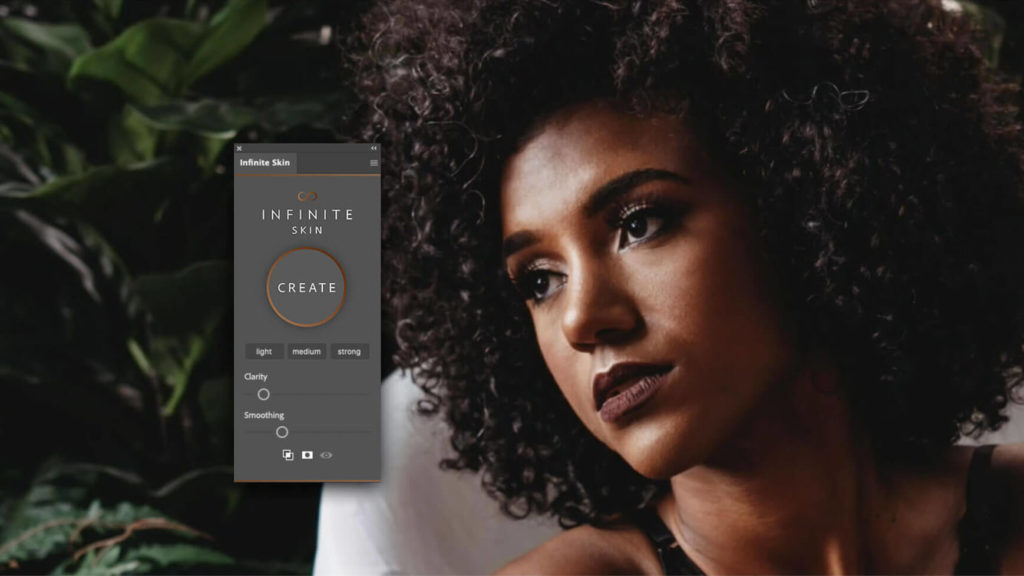
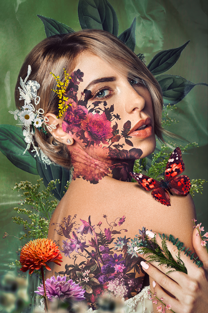
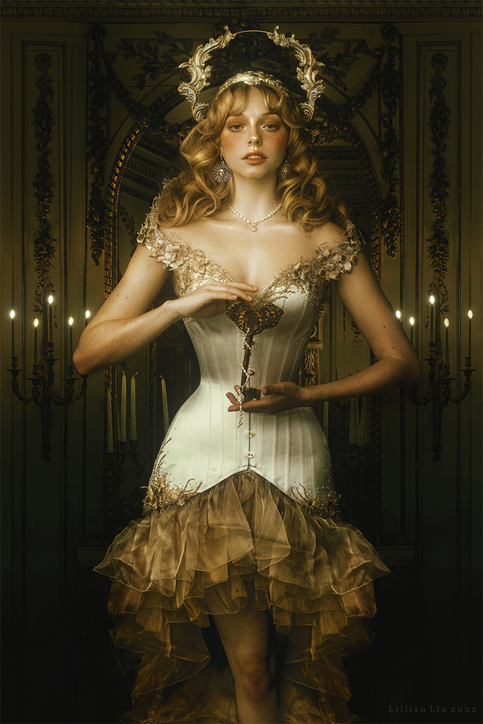
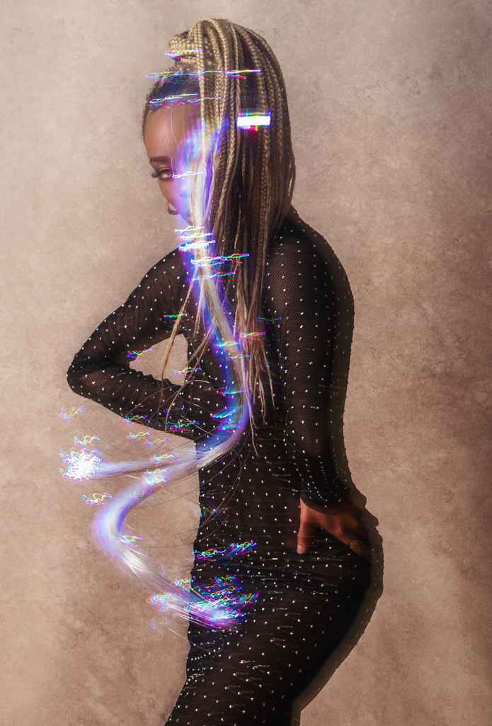
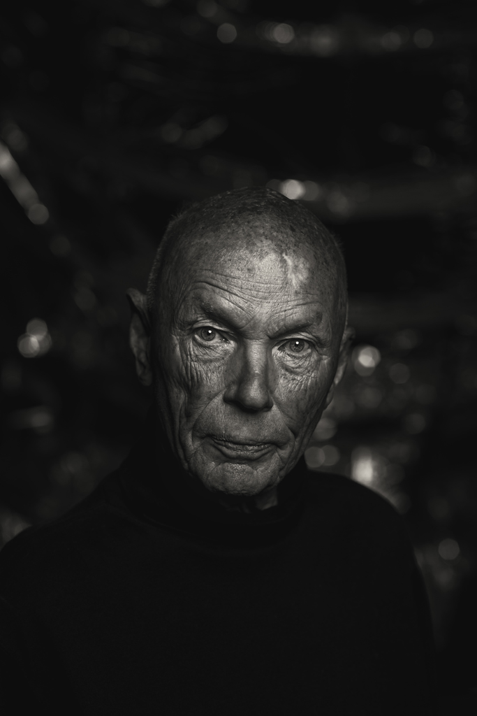
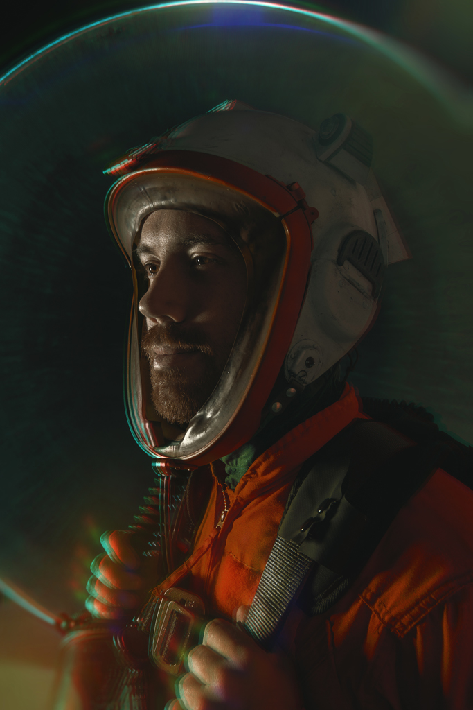
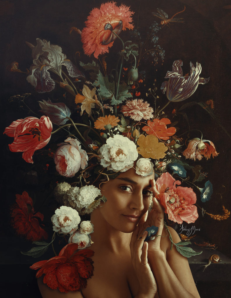
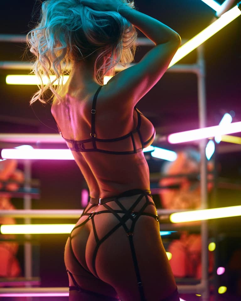
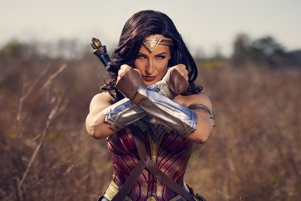
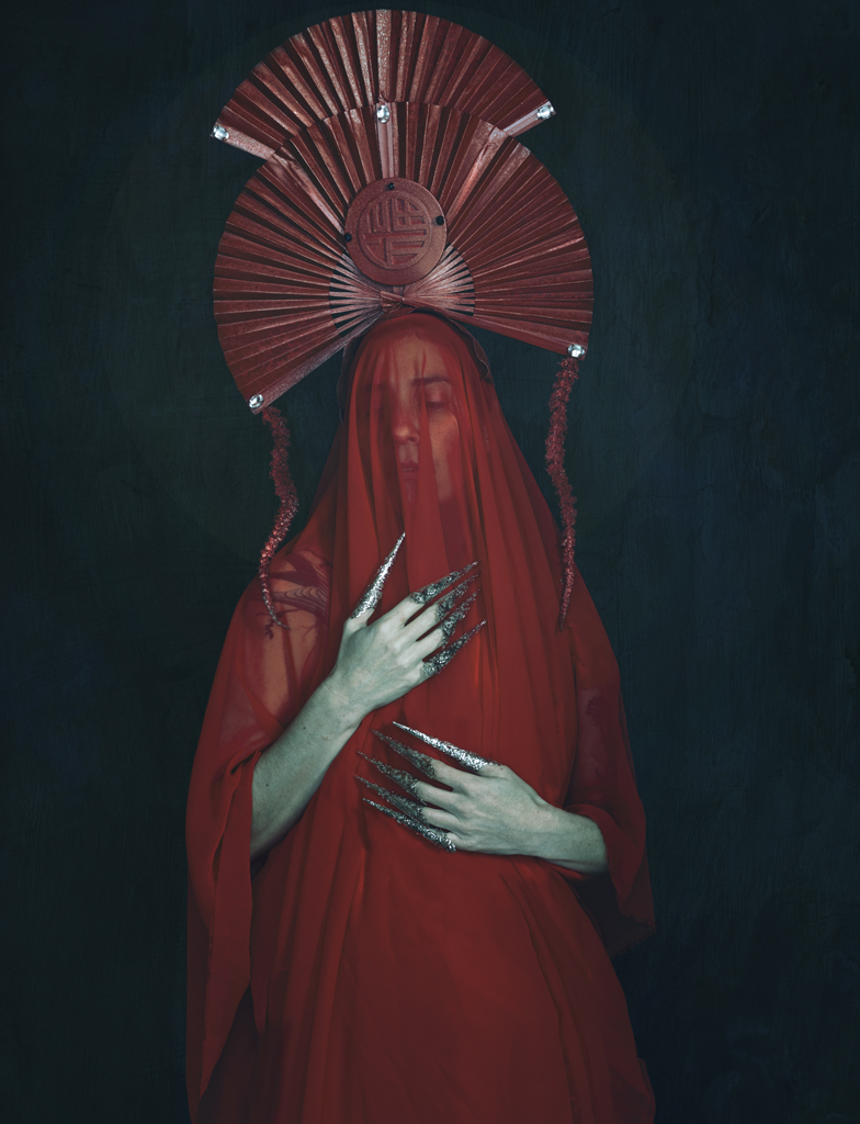
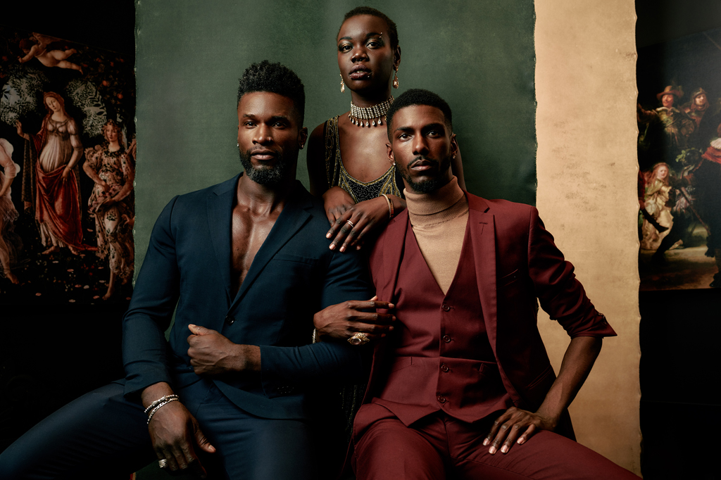
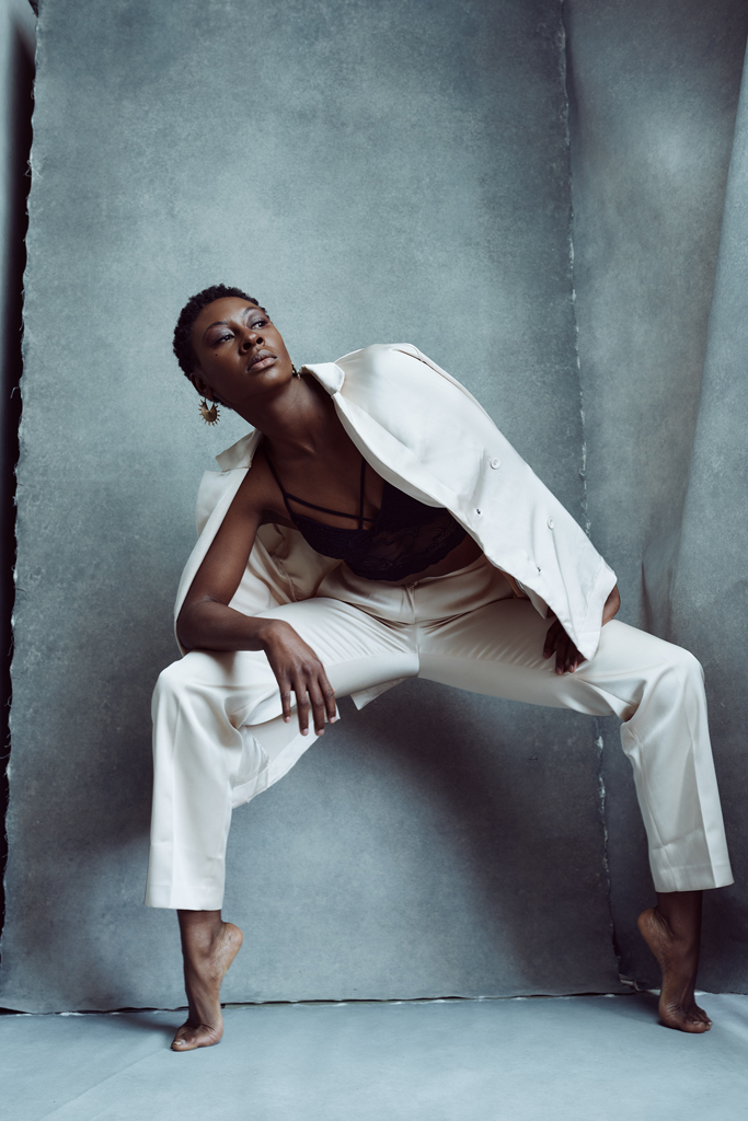
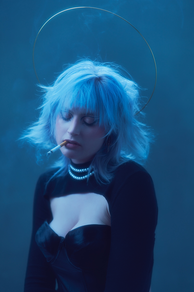
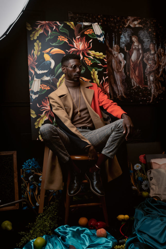
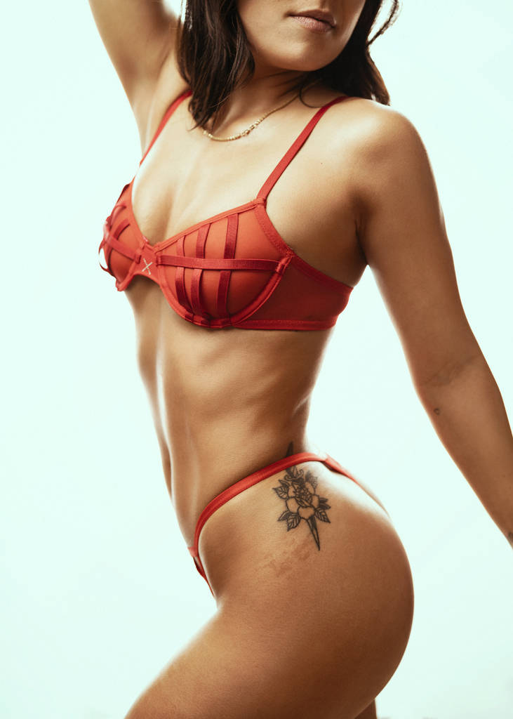
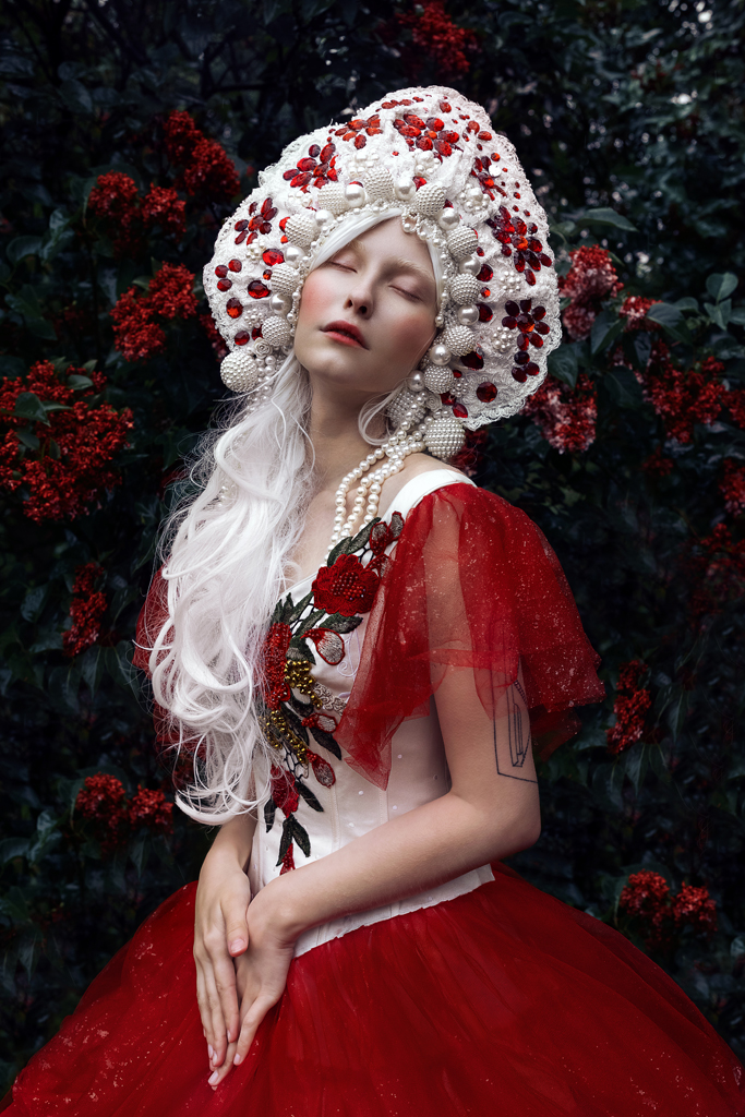
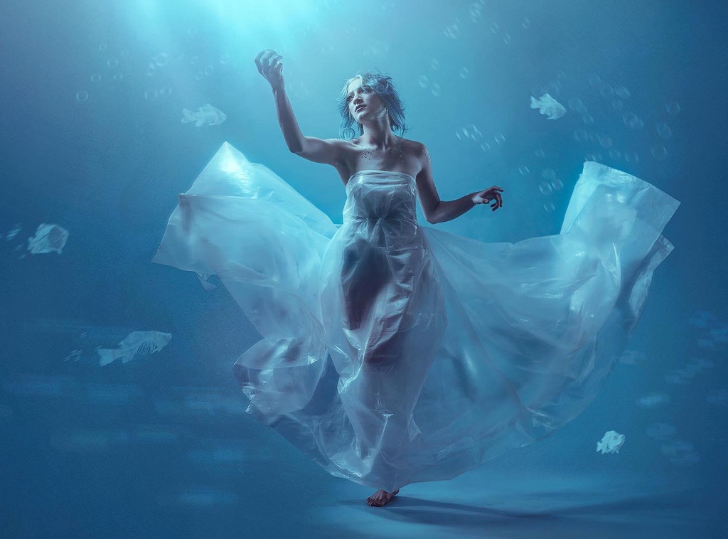
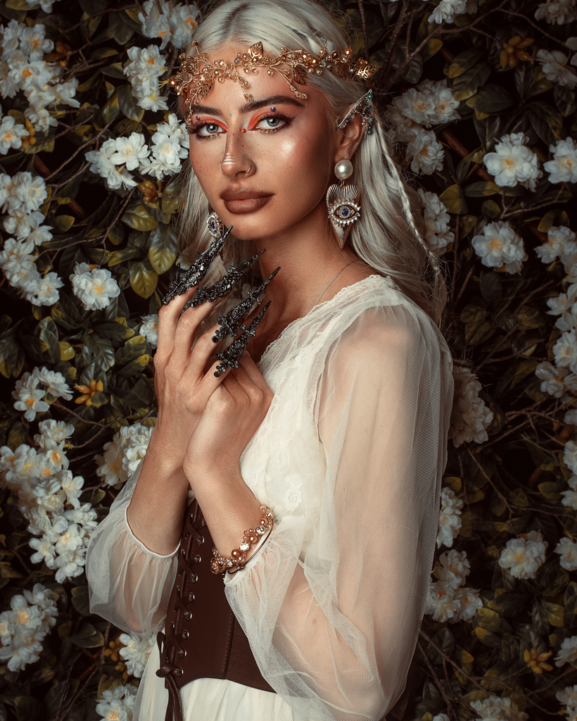
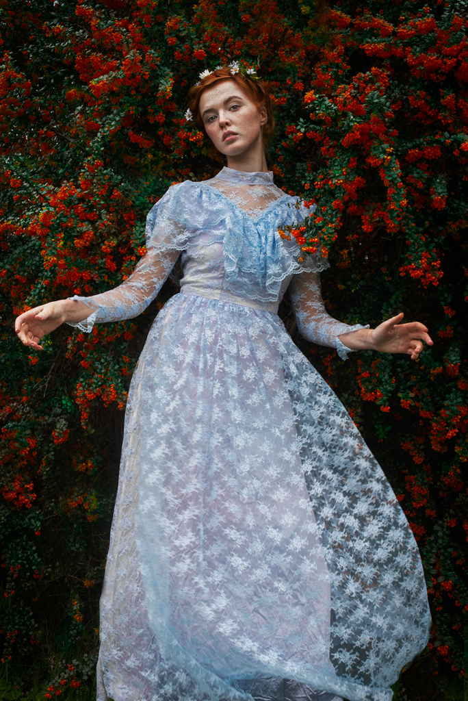
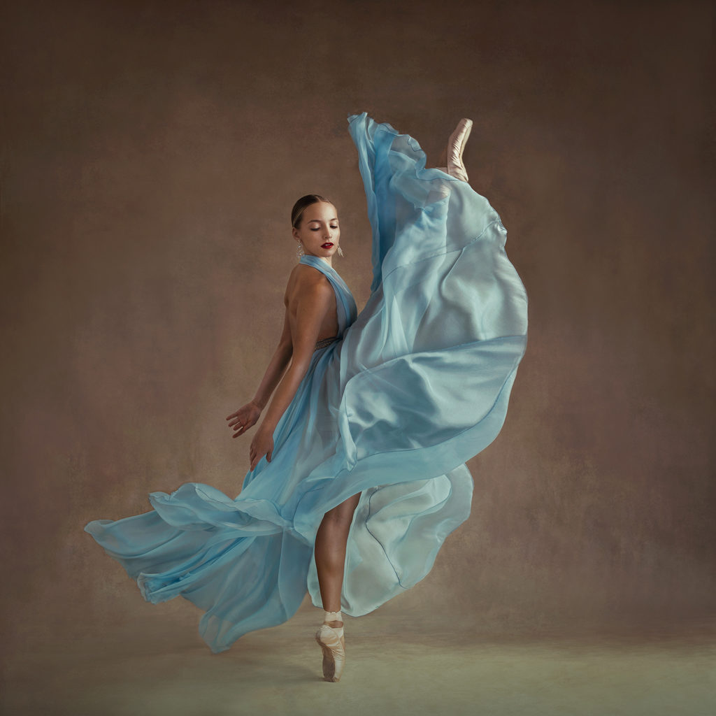
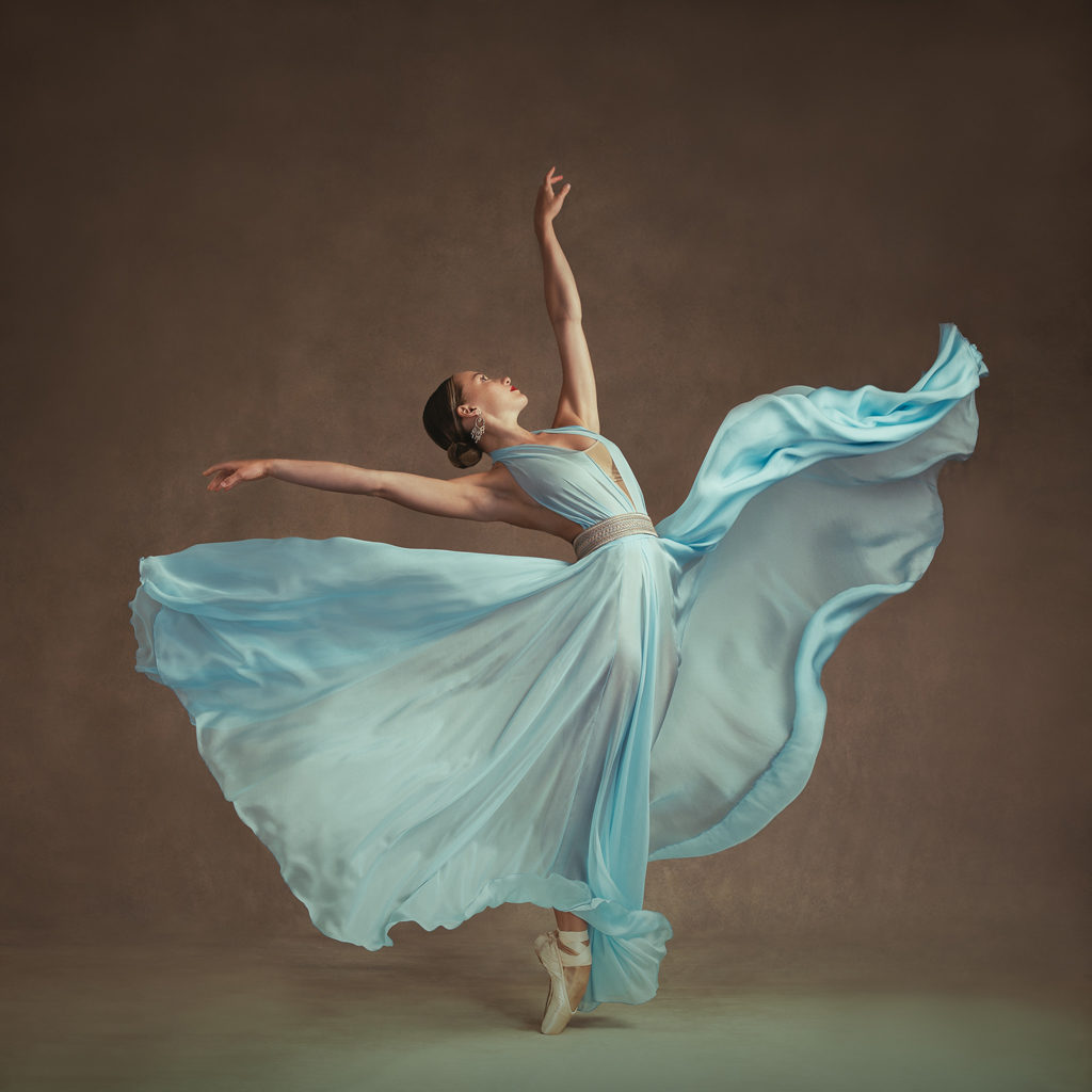
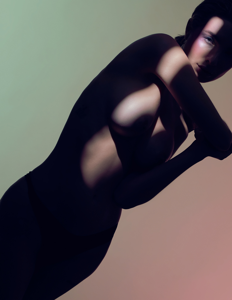
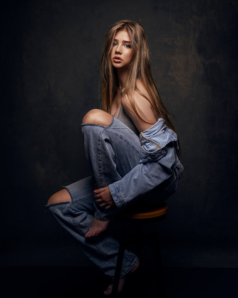
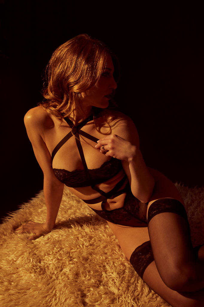
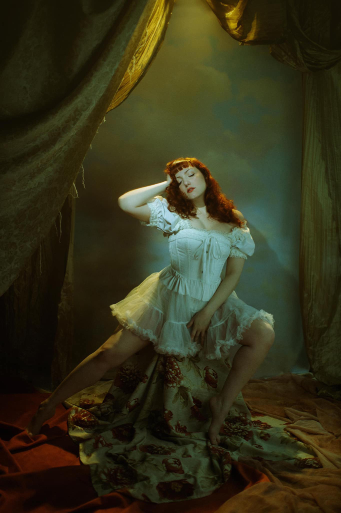
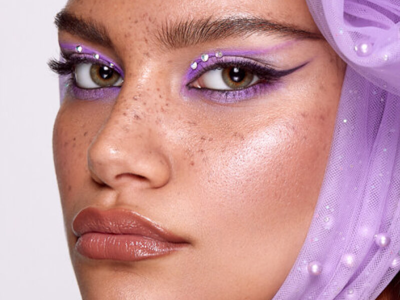
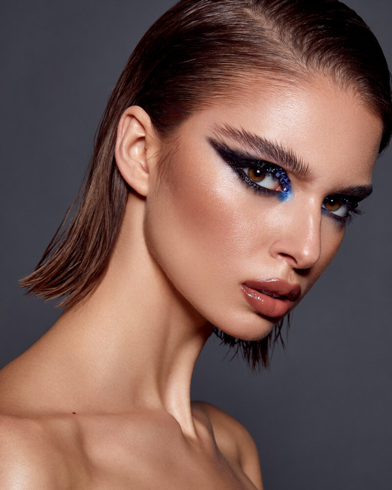
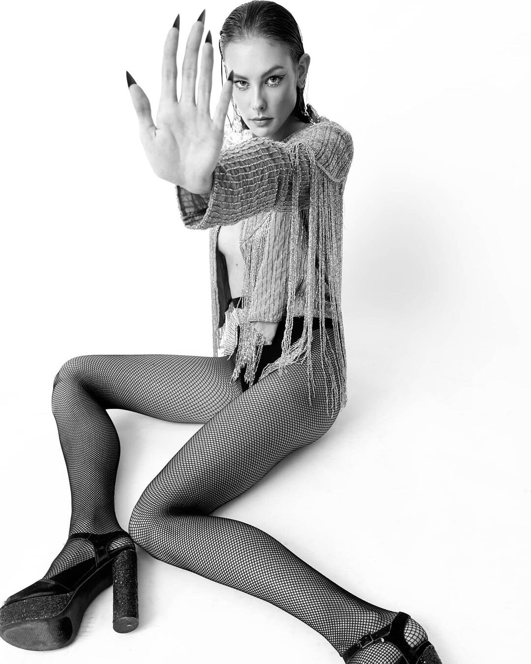
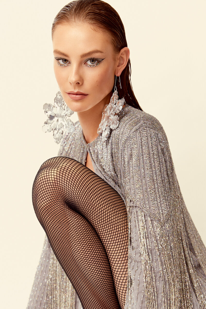
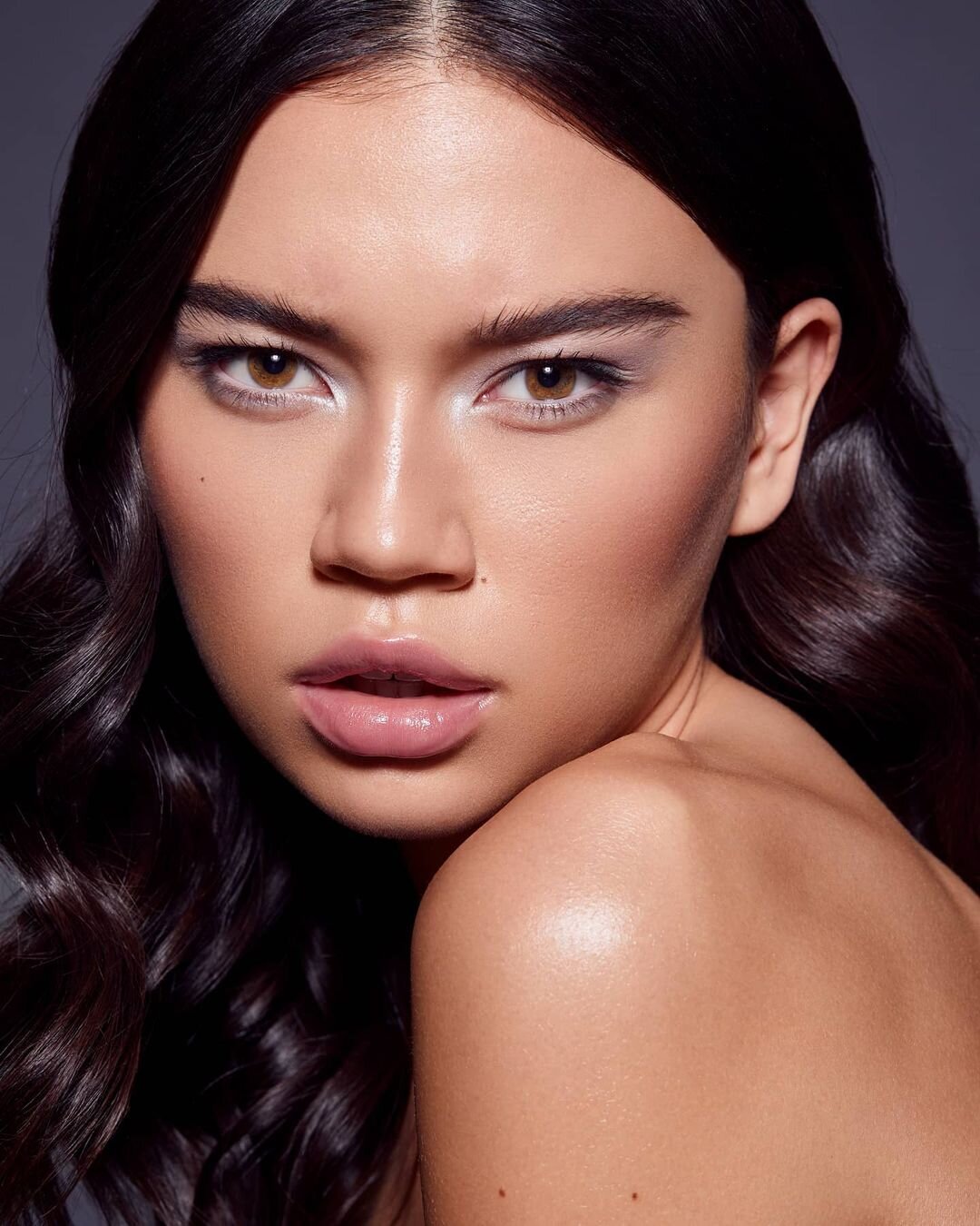
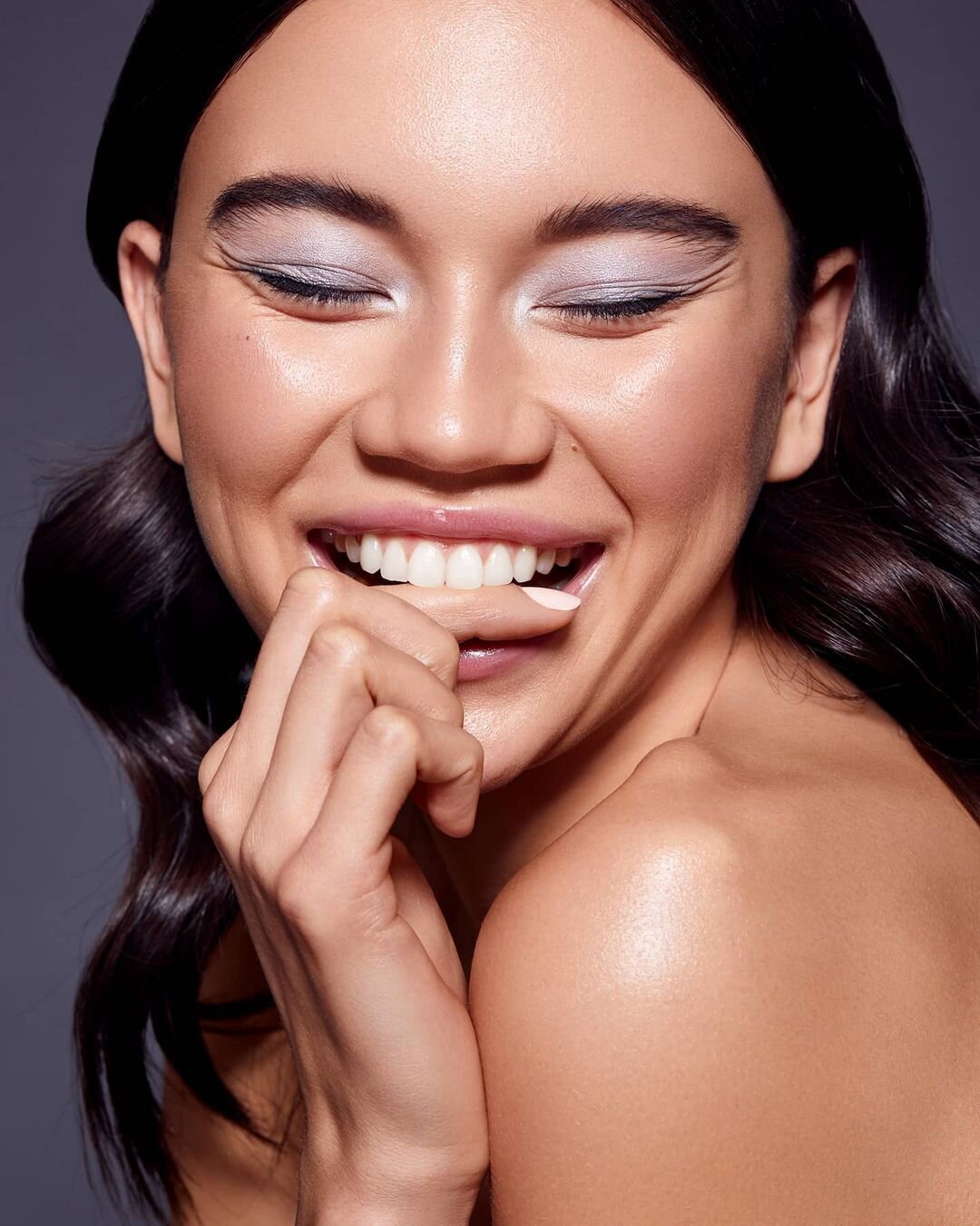
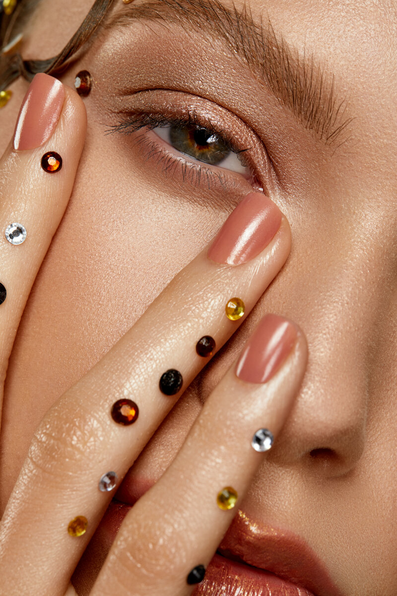
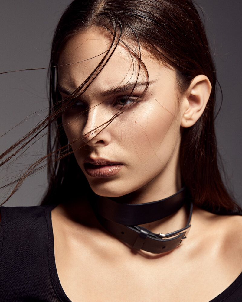
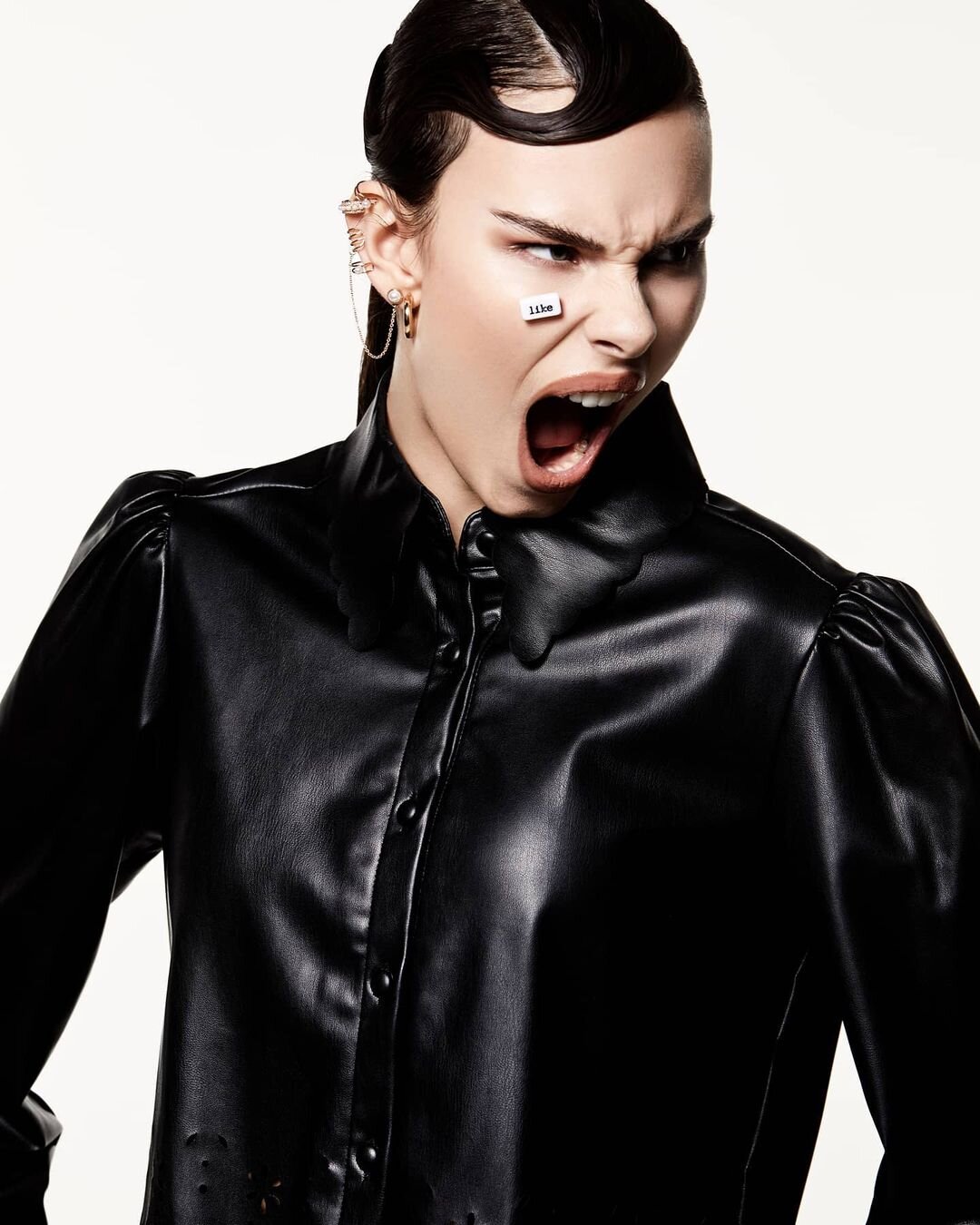
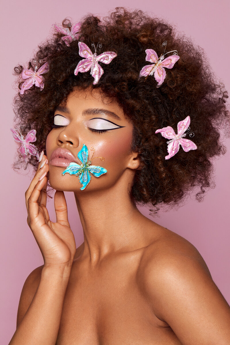
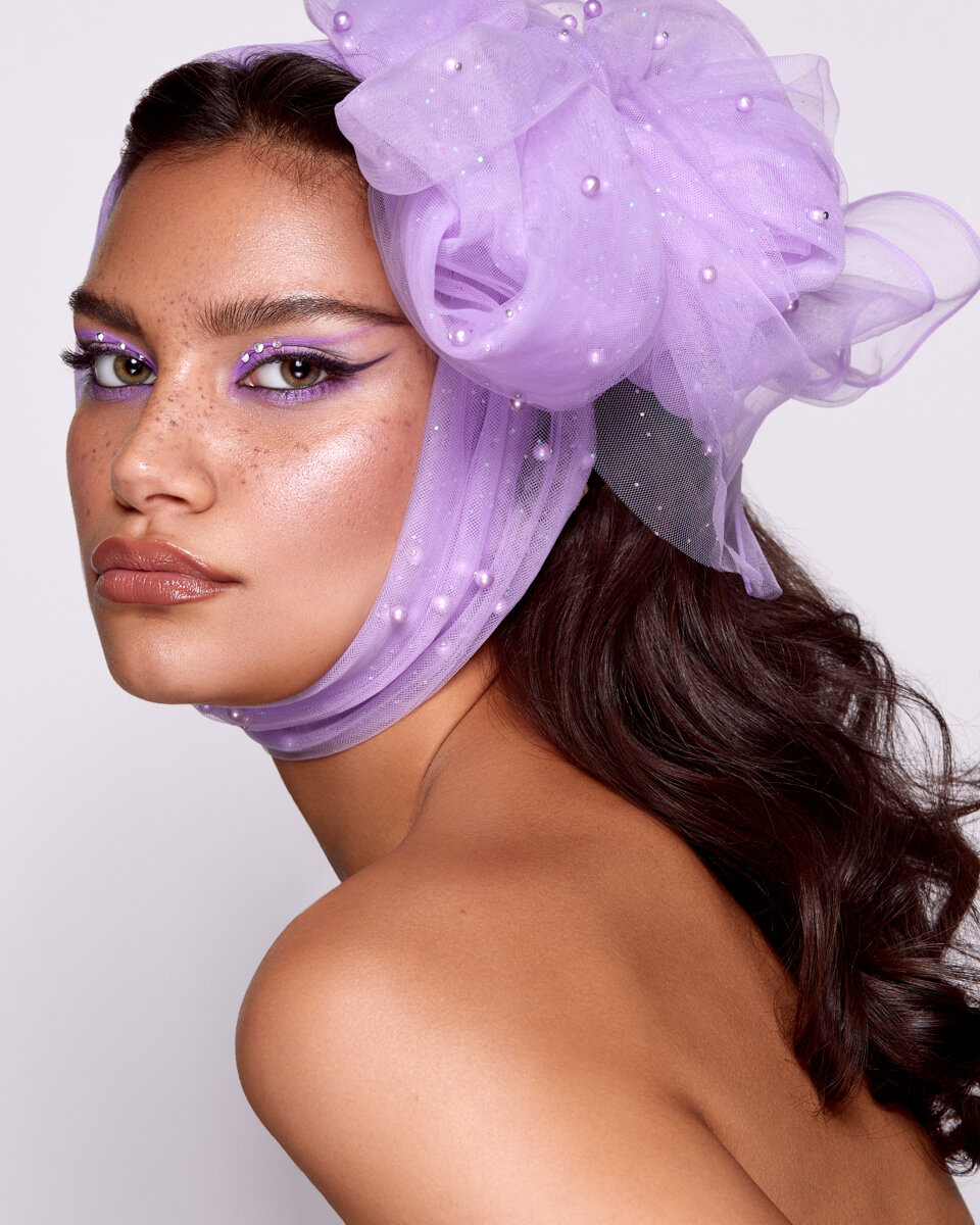
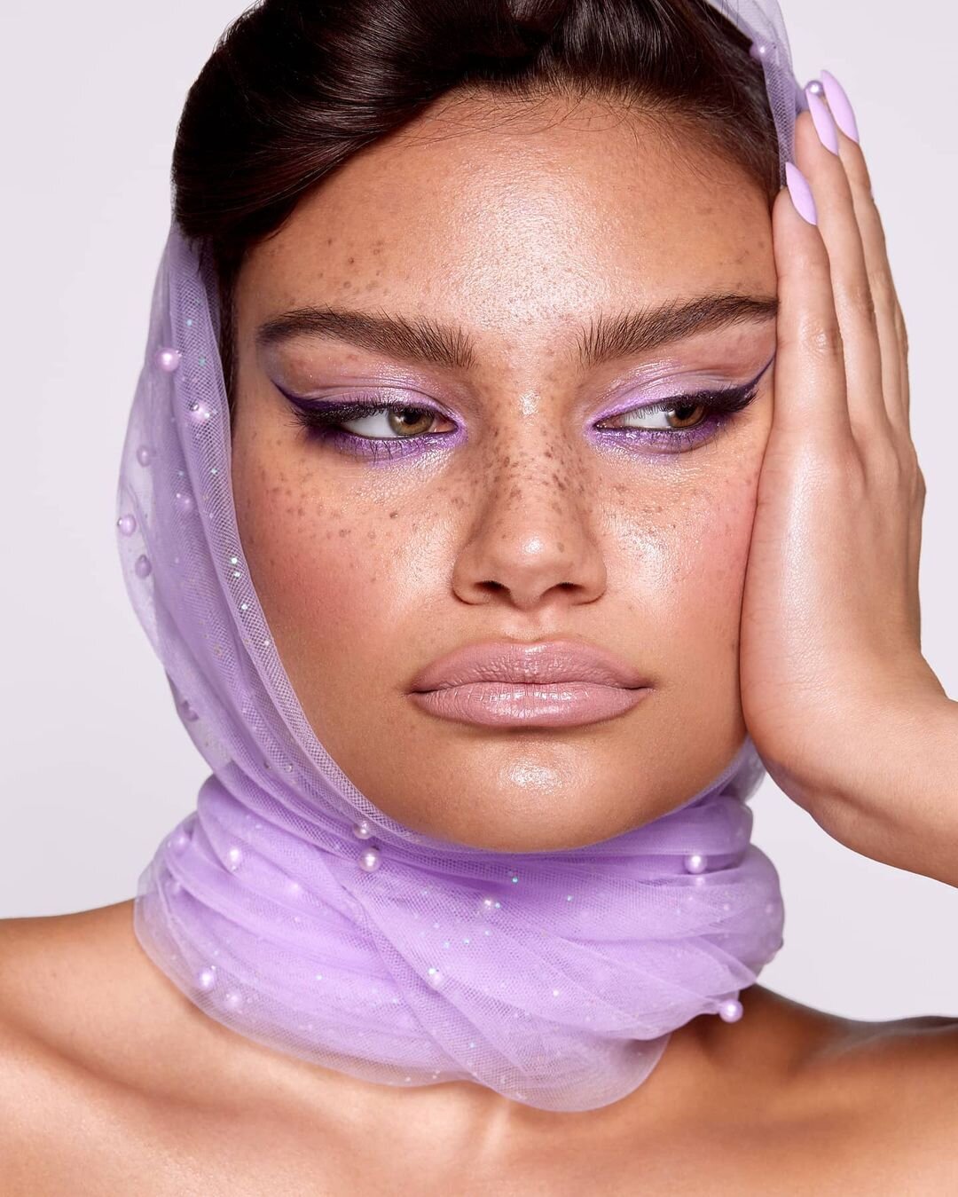
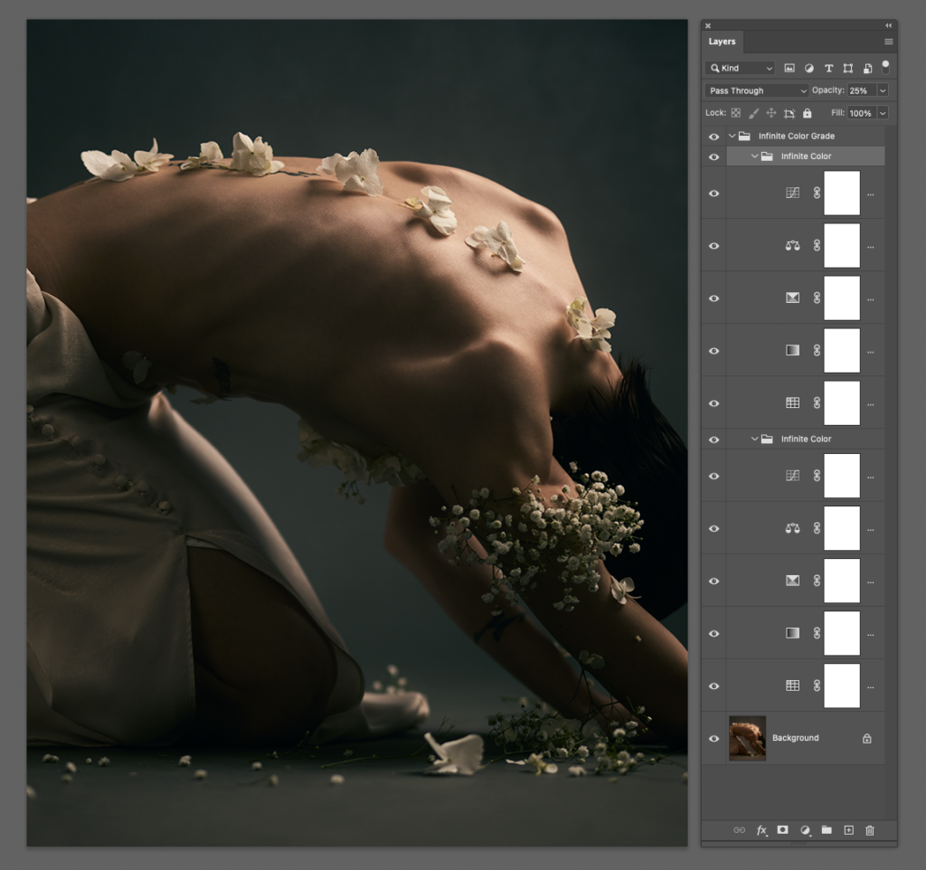
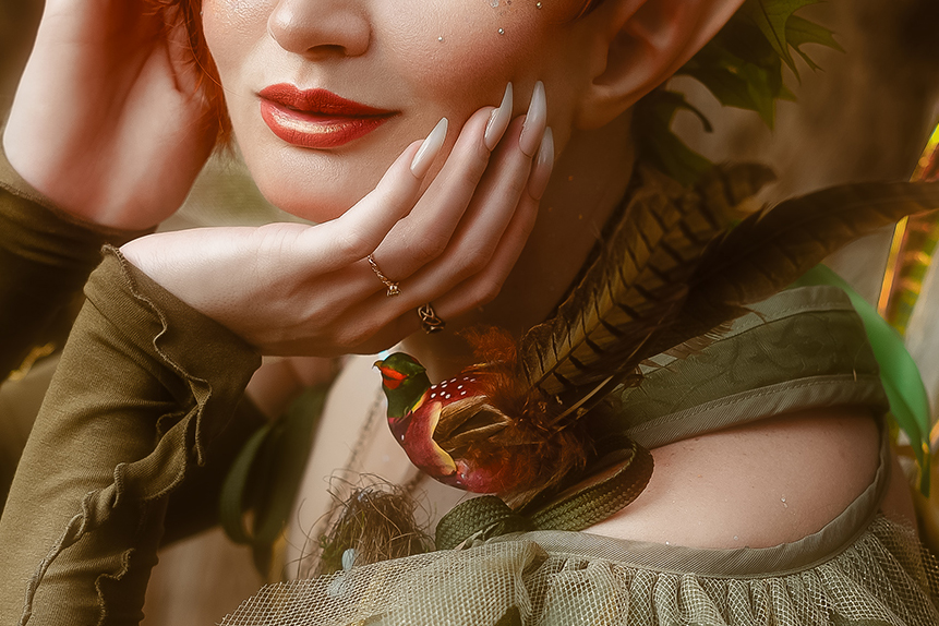
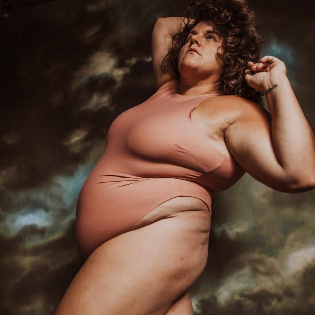
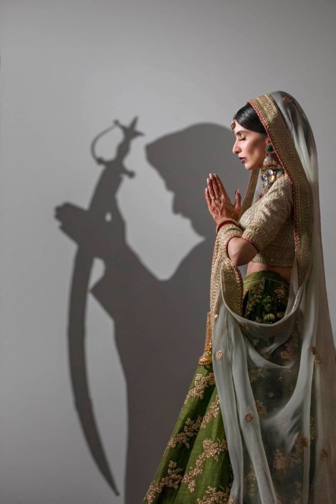
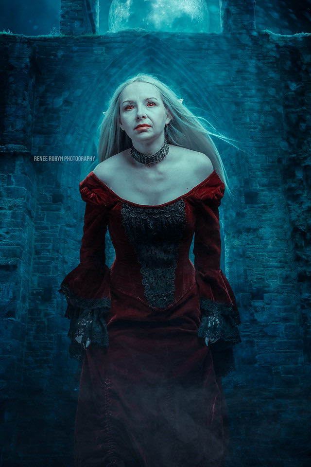
Here are a few images from Greg with either Infinite Unify and/or Infinite Skin used in the process.


Be sure to follow Greg by checking out his headshot and portrait site:  https://www.gregthomason.com
You can also follow his Instagram account: https://www.instagram.com/gregthomason
If you’d like to see more examples of his lighting, check out: https://lightninglink.io/gregthomason/

__

One of the main reasons I come back to your work time and time again is your ability to convey a true connection with your subject. Could you paint a picture of how you’re able to bring out emotion in your client and also know when to hit the shutter to capture that? 

Thanks Pratik! I feel the connection with my subject is the most important part of my photography. A well known portrait photog has famously said making a subject comfortable is not her job. For me, it is as much of my job as knowing where to put my lights. Although how much time I have to connect with them isn’t always in my control, bonding begins the second we are together. I like to get to know the person beyond name, work, etc… What makes the person happy, what are their hobbies, do they have kids, pets? If they want to know about me I share as well. I am asking the person to be vulnerable for me, I should do the same for them. As we talk, I’ll get the person where I want them and do any final light adjustments. Only then do I even start talking about the photography, and I emphasize that we have a delete button for photos we don’t like. This conversation continues throughout the photo session. I try to keep their mind off the camera. Often, I will get a reaction by suggesting a certain look. For example, “give me a look like you just got home from a long day at work (person frowns)… but as you walk through the door your dog runs to you and showers you with kisses.” I will start shooting when the person registers what I’ve said, and starts changing expressions. Somewhere in the three or more frames I make will be the keeper. This continues for the shoot’s duration.


Lighting is a common thread between various genres of photography. Do different subjects require different light setups, or do you find that you’re sticking to similar setups for each person? How do you determine what direction to go in? 

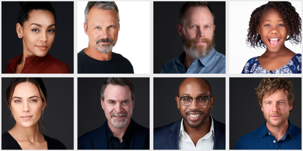
My main genre is portraiture, and within that are two sub categories I shoot. I principally shoot commercial headshots and creative portraits. With both I have a couple basic lighting sets I start with, but I am not afraid to change. For example, for headshots the lighting is used to support the subject. I start with a flat light to flatter the person. With many headshots that’s as far as I need to go, lighting-wise. However, some folks, especially actors, want some depth or mystery is their headshots, so I’ll add shadows and maybe a kicker. Still, the subject remains the star, and the connection makes the headshot. The subject’s needs really determine any direction changes I make.

When I’m making portraits, the lighting often becomes a co-star. I start with my background or fill, and build from there. Given the time, I like to start simple and get a keeper in the can. Once that is done I can start having fun by adding lights, flags, atmosphere, etc… The client’s availability determines how much I can play with the looks we create. Direction changes are influenced by wardrobe, mood, and the amount of flexibility in our portrait end goals.


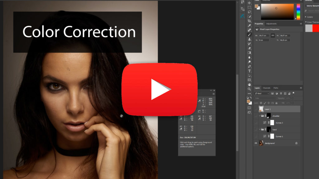
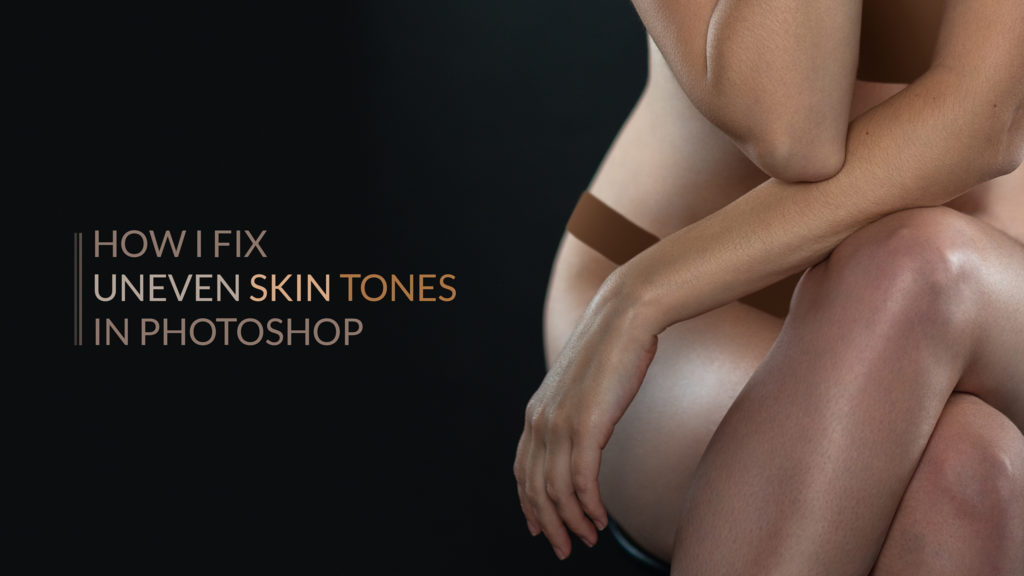
We love that Unify has been able to help you out in your workflow to correct skin tones and color casts. Where do you typically use it in your workflow and do you find most subjects have skin tone variations that are improved by evening them out? 

Unify has really helped me as a portrait photographer. I am an ok re-toucher at best, so having tools that help my workflow is critical. My work doesn’t require re-touching to a high-end standard, but it does require the photos accurately reflect the person I photographed. Small shifts in skin tones are one of the easiest corrections for a photographer to overlook, but something the client will notice right away. It doesn’t matter if they spent a day in the sun, or get flushed in front of the camera, they trust I will fix it. l use Unify to subtly even out spots on around 30-40% of the photos I deliver to clients. I usually use Unify after my basic skin clean up, but before any contrast correction.


Do you have any other tips for photographers who are looking to cut down on their skin retouching before a shoot begins?

My advice for photographers that get people in front of their cameras is to think like a film photographer. Get as much right before the shoot, and in camera as possible. Give yourself, or your re-toucher, the best file possible to start with. That sounds like a canned answer, so how do I do that? For starters, I’ll suggest the subject get plenty of rest the night before, and stay hydrated. Living in the Nashville area, my advice is often ignored. When I’m shooting someone from out of town, the draw of the honkey tonks on Broadway is often too strong, and I have to reassure them I can clear their red eyes! Everyone knows what Photoshop is. For the day of the shoot, the most important step a client can do for their skin is to hire a professional makeup artist (MUA). I have a couple I consistently work with that know what I like, which is usually a more natural look. When budget or time precludes a MUA, I’ll make suggestions on makeup. Things to be aware of include not using base that has sunscreen as it may reflect the lights in strange ways. Also, unless you are sure about a powder (another reason to have a go-to MUA), I stay away from using it to cut down shine. My headshots are really close up, and the powder becomes obvious. The solution is to use a mattifying cream or blotting paper before shooting. Some skin issues, like blemishes, may look worse if you try to deal with it. Knowing that’s an easy fix, even for me, I just assure the client I can make it disappear.

With the resolution of even entry level cameras, skin clean up in post is critical regardless of the level of re-touching your workflow calls for. For me, any tool that helps me achieve my desired final look faster and more consistently, is a godsend. Unify, and the other Infinite Tools, have made my life easier.


– —

Written by Pratik Naik

Using Infinite Skin To Retouch Moody Images With Various Skin Tones

See our video tutorial.

Describing an image as “moody” can mean a lot of things. Generally speaking, moody images tend to have darker tones, with heavy shadows and a lot of contrast. All of these elements can significantly affect your retouching, so in this video inspired by a question from community member Kait Nyutten we look at how the Infinite Skin handles images that embrace the darker side of things.

Infinite Skin is a plugin that aims to give you the ability to soften skin tone and detail independently in Photoshop while ensuring the settings respect the structure of the face. Working with these examples from Kait also gave us a chance to use the plugin on various skin tones!

In the video, we cover two approaches to using the panel; one with the healing work done before the panel was used, and another where the panel was applied first and the retouching done afterward.

Photo by Kait Nyutten
https://instagram.com/embraceboudoir 
Photo cropped in to be safe for YouTube.

Learn more about Infinite Skin here:
https://infinite-tools.com/infinite-skin-plugin-uxp/

Free Video Tutorial: Colors, Color Harmonies, and Photoshop

Through the course, we’ll take a look at understanding what happens when mixing colors in different color models. A big topic will be developing an understanding of what color harmonies are and how to find and apply them. We’ll take a deep dive into how the fundamental color tools in Photoshop work and make it so that you’re empowered to overcome any hurdle when it comes to color. These techniques and tools will aid in the process of both color correction and color toning. Finally, we’ll break down real-world images to show you how color is applied in various situations.

Part 1: Color Theory

RGB – Additive 

This chapter introduces the primary colors of red, green, and blue and the additive color mixing method. We will visually demonstrate what happens when you mix primary colors and examine the colors generated from the interaction using layers and channel adjustments. You’ll begin to understand how colors are connected and learn to mix primary colors to get to the exact color you are looking for.

RGB – Subtractive

Building off the “Additive” chapter, we’ll go the other way and talk about the Subtractive color model. For example, when presented with a situation where you can’t add more color, the subtractive mode allows you to understand what you can do to take away colors to get back to the primary or secondary colors.

Mixing Light 

We take a practical approach to the knowledge in the previous chapters by showcasing what happens when we take a two-light setup and gel them with various primary and secondary colors. Using a sphere as the subject, we can see what happens when the two light sources blend in different areas and the colors they create. This exercise will help you think about color and lighting when building your shoots.

Perception

A less commonly discussed aspect of working with color is the hues our mind completely makes up! In the presence of specific colors, we tend to imagine others that may not exist. This chapter will show you what that looks like and how to recognize them to help you in your color grading process. 

Color Harmony

What makes color palettes harmonious? This section goes over the main color harmony rules, what colors pair well with each other, and a simple tool to decide what works best on your images.

What Is Color? 

What sounds like a fundamental question gets broken down into explaining what a color is and the components that make it up! We analyze brightness, saturation, and hue and compare them to RGB values. This knowledge will further grow your ability to control any color for your images.

Color and Composition 

When looking at a color wheel, each color is equal in how much space it takes up on the wheel. However, these colors may come in different amounts across your image. There may be hints of blue in your subject’s dress, but orange dominates the background. This chapter outlines how to adjust the weight of each color to achieve visual balance. 

Part 2: Tools

Curves

Whether you’re a beginner or have been using Photoshop for a while, you’ll be surprised to find out how powerful the curves adjustment layer is. We take a look into exactly how it works on a fundamental level and what happens when you adjust the different points on the curve. Then we take a deeper look into how you can use curves to match two different colors to each other, an effective color correction technique whether the issue in your image is environmental or skin-related. 

Hue / Saturation

This robust adjustment layer in Photoshop has a lot of potential for manipulating color values. This section provides a clear explanation of what the sliders do, and what the numbers mean. You’ll get to learn how to use it in situations where trying to isolate a specific color is tricky.

Color Balance 

Modifying colors in Photoshop can be done in many ways, and the color adjustment layer is one of them. This chapter will help you understand where it works best and its effects. It will also demonstrate some of the accompanying settings that change the layer’s performance.

The Channel Mixer

Most users do not think of the Channel Mixer as a color correction tool. However, as this chapter outlines, using these sliders to adjust channels allows for really powerful color adjustments for specific purposes. You will learn how developing a stronger separation between colors can enable you to create precise masks that would otherwise be impossible with other adjustment layers.

Part 3: Working on images

Color Correction 

When you’re retouching an image, one of the fundamental steps is color correction. It is essential to understand how to look for areas that need correcting and what techniques will do it effectively. This section will apply the information in the previous chapter in a real-world example where many areas require correction using tools like curves, selective color adjustment layers, and blank layers. You’ll also see methods that do not work and learn why; helping you can avoid critical mistakes. 

Working with Color Schemes 

It’s one thing to pick a color scheme but being able to apply it to an image is essential. This chapter looks at a working example where we have a complementary color scheme in mind and apply it selectively across a fashion image. For added complexity, the example image presents a particular problem where the colors of the elaborate dress are similar to the skin. We’ll look at how we can apply previous techniques to isolate the dress from the skin and manipulate both separately to get closer to our final color scheme. You’ll also learn to use brushes in different blend modes to make the process easier.

Working with Color Schemes 2 

To build on what we learned in the previous chapter, we will work with a beautiful image that doesn’t require advanced selections. Demonstrating the process of fine-tuning with adjustment layers will explain how you can create pleasing results in very little time by understanding the fundamentals of color schemes.

Image Breakdown

In the final chapter, we go through a series of before and after images and examine the adjustments made to create the final image. You’ll get to see the shifts in each unique situation to get to an appealing color scheme. Seeing these examples should drive home all of the previous lessons and show you how you can use them to improve your images dramatically. 

Download the Practice files

Infinite Community Feature – April 2022

We recently asked to see some of your favorite images that you recently featured in our Facebook community. There were so many impressive images and we’re excited to share many of them with you!

To see more of what our community is creating, please join our Facebook Group! You can also check out and tag our Instagram page as well! We’ll also be putting more call outs for future features on our social pages.

Under each photo you’ll find the name of each artist and the tools used to create each piece.


Tools Used: Infinite Guide and Infinite Color
Credit: Luca Storelli

Tools Used: Infinite Skin 
Credit: Lillian Liu

Tools Used: Infinite Color and Infinite Looks
Credit: Ashley Marie Photo
Model: Bella Kotak 

Tools Used: Infinite Color Panel 
Credit: Brett Seeley 

Tools Used: Infinite Skin, Infinite Radiance, and Infinite Looks
Credit: Image – Robert Buchanan ; Model – Cassandra Cosplays 

Tools Used: Infinite Texture, Infinite Unify, and Infinite Color 
Credit: Sarah Rocca, Sarah J Photography

Tools Used: Infinite Luma and Infinite Color
Credit: Réjean Brandt

Tools Used: Infinite Color
Credit: Ore Adesina

Tools Used: Infinite Retouch, Infinite Unify, and Infinite Color
Credit: Michael Christopher

Tools Used: Infinite Unify and Infinite Luma 
Credit: Menna Hossam

Tools Used: Infinite Retouch, Infinite Texture, and Infinite Color
Credit: Rachel Langlois

Tools Used: Infinite Color
Credit: Piotr Bieniasz

Tools Used: Infinite Color 
Credit: Tanya Daniel

Tools Used: Infinite Unify and Infinite Color 
Credit: Szabi

Tools Used: Infinite Color
Credit: Kathryn Stabile

Tools Used: Infinite Skin
Credit: Olga Tenyanin

Creative conversations: Capturing expression with Jad Warde

“Every photographer has different experiences than the other. When you look at my images you will see what I went through before – happiness, sadness, anger.

When you look at Jad’s work, the first thing you notice is expression. Intense eye contact, powerful gazes, along with impeccable lighting and photographic technicalities. Jad Warde’s photography stands out from the crowd, and we just had to know more about his story.

First of all, we’d love to know how you got into this style of photography! Can you give us a run down of what your photographic journey looked like?

My journey in Photography started in 2015 during the war in my country Syria, where I started capturing children’s suffering and moments through the war there (happiness, sadness, and all kinds of emotions).

After that I moved to Lebanon and from there I immigrated to Canada. I couldn’t do the type of photography I love to do there, which is portraits, because of the lack of English and communication I had, so I decided to turn to landscape photography and shoot nature. I did that for 2 years and got published in National Geographic Arabia.

My sponsors in Canada realised that I had a good eye for photography so they took me to a photography school where I found my love for fashion and beauty photography. I studied there for 1 year and throughout that time people started to see that I had something special in my images. Lots of modelling agencies and companies started hiring me while I was still student.

I have been doing fashion and beauty now for almost 3 years and I absolutely love what I’m doing.

Your portraits all have one thing in common – emotion. Can you tell us about how you capture those expressions in your models?

I feel like that comes from an experience in your life and that’s why we are all different from each other. Every photographer has different experiences than the other. All that I went through and all that I photographed before starting fashion and beauty helped me today in capturing these emotions and moments. It even helped me to know when to click the shutter.

When you look at my images you will see what I went through before – happiness, sadness, anger.

We absolutely love your color palette. It’s super cohesive between each set. What is your preferred method for color toning, and how do you come up with your color options?

Most of the time for color grading I have my own workflow that I keep using, starting by adjusting the colors using Capture One at the RAW stage and ending in Photoshop, using adjustments layers mixed with the ICP.

Because I do both fashion and beauty it’s kind of hard to work on the same colors for both, as beauty is mostly all about keeping the skin colors looking natural and not fake, so I try to keep it in the red and orange zone. For fashion I experiment more with colors depending on the project and the mood in the shot!

In both cases I love starting with the ICP when I can’t decide in which direction to go. I run the ICP first to get an idea of the possibilities for the image I’m working on. However, my favorite method is mixing the ICP with luminosity masks, where I can add colors for the highlights, midtones and shadows separately.

Throughout your portfolio, the lighting set up appears to be changed up depending on the look and feel of the shoot. How do you choose which set up to go for, and do you have a favourite?

I am a big big fan of hard light! I just love the contrast and the depth that hard light adds to the images, especially in fashion photography. In beauty photography, hard light is amazing if you want to show more details in the skin and makeup, however, hard light can be tricky in many cases and not flattering to use for all kinds of people.

For me I choose the lighting setup depending on 3 things:

  • The purpose of the shoot (beauty, cosmetic, skin care, eyelash campaign, edgy fashion, lifestyle fashion, etc.)
  • The idea (the story of the shoot)
  • The model (the face and body shape, what the model can add to the mood)

Example: Skin care beauty can go in both directions – hard, edgy light, that still shows the products applied on the skin, or soft light for playful skin care images with a colorful background.

My favorite lighting setup that I use most of the time is using a large silver deep umbrella with diffuser straight in front of the model. This creates a middle ground between hard and soft light that can work in most cases and for most people.

When planning a shoot, the model choice is always a key element. What do you look for when selecting models?

For selecting models, again it is depending on the idea and the mood I’m going for. I do believe that not all models are able to do beauty and not all are able to do fashion, and only some of them can do both. For beauty, most of the time I search for big eyes, big lips, small nose and good skin, as it’s all about showing the makeup in this case.

For fashion I mostly look for edgy models who can pose and move nicely while still keeping a strong expression on their faces. But sometimes we don’t need all of that if the story doesn’t need it!

Check out Jad’s portfolio and give him a follow on IG to stay up to date with his amazing work:

jadwardephotography.com

instagram.com/jad.warde/