
Through the course, we’ll take a look at understanding what happens when mixing colors in different color models. A big topic will be developing an understanding of what color harmonies are and how to find and apply them. We’ll take a deep dive into how the fundamental color tools in Photoshop work and make it so that you’re empowered to overcome any hurdle when it comes to color. These techniques and tools will aid in the process of both color correction and color toning. Finally, we’ll break down real-world images to show you how color is applied in various situations.
Part 1: Color Theory
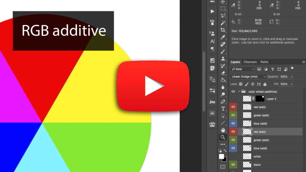
RGB – Additive
This chapter introduces the primary colors of red, green, and blue and the additive color mixing method. We will visually demonstrate what happens when you mix primary colors and examine the colors generated from the interaction using layers and channel adjustments. You’ll begin to understand how colors are connected and learn to mix primary colors to get to the exact color you are looking for.
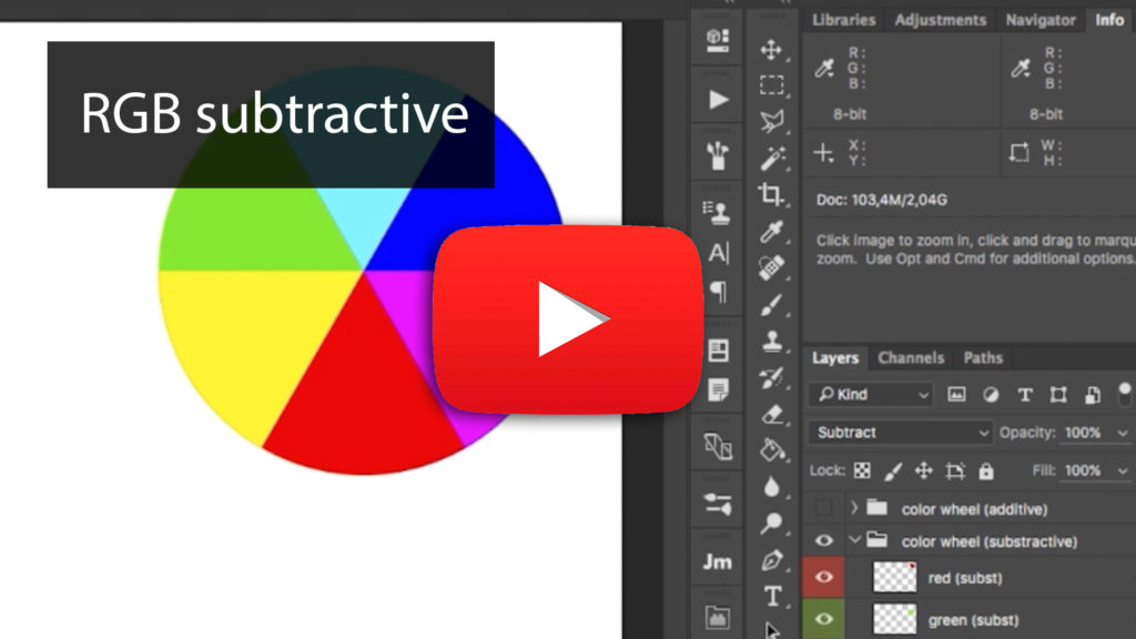
RGB – Subtractive
Building off the “Additive” chapter, we’ll go the other way and talk about the Subtractive color model. For example, when presented with a situation where you can’t add more color, the subtractive mode allows you to understand what you can do to take away colors to get back to the primary or secondary colors.
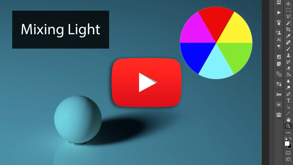
Mixing Light
We take a practical approach to the knowledge in the previous chapters by showcasing what happens when we take a two-light setup and gel them with various primary and secondary colors. Using a sphere as the subject, we can see what happens when the two light sources blend in different areas and the colors they create. This exercise will help you think about color and lighting when building your shoots.
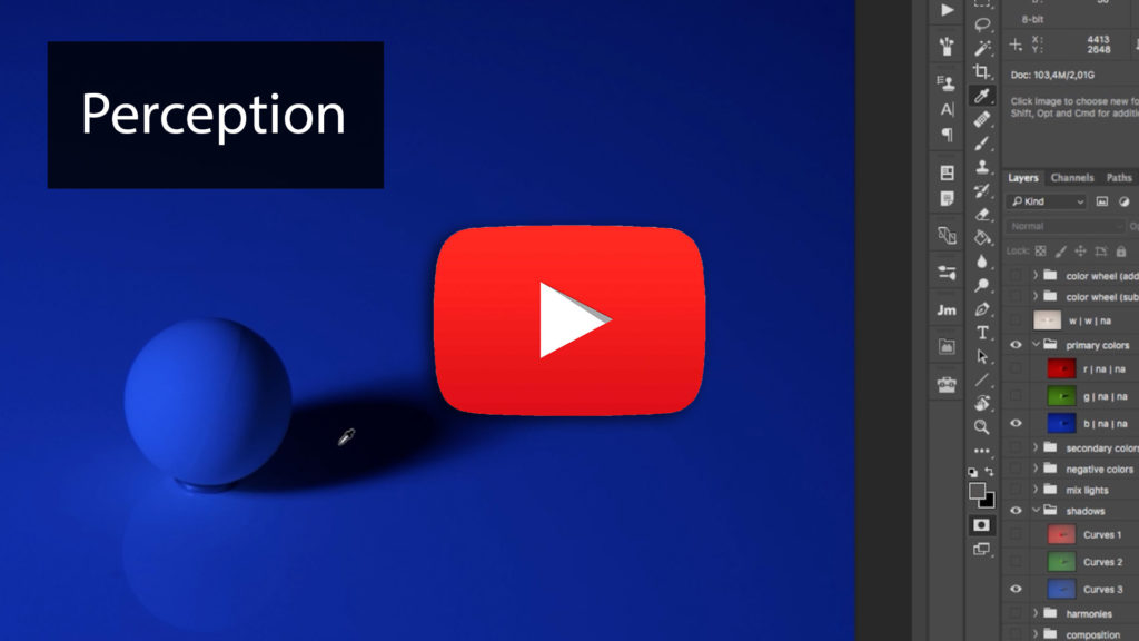
Perception
A less commonly discussed aspect of working with color is the hues our mind completely makes up! In the presence of specific colors, we tend to imagine others that may not exist. This chapter will show you what that looks like and how to recognize them to help you in your color grading process.
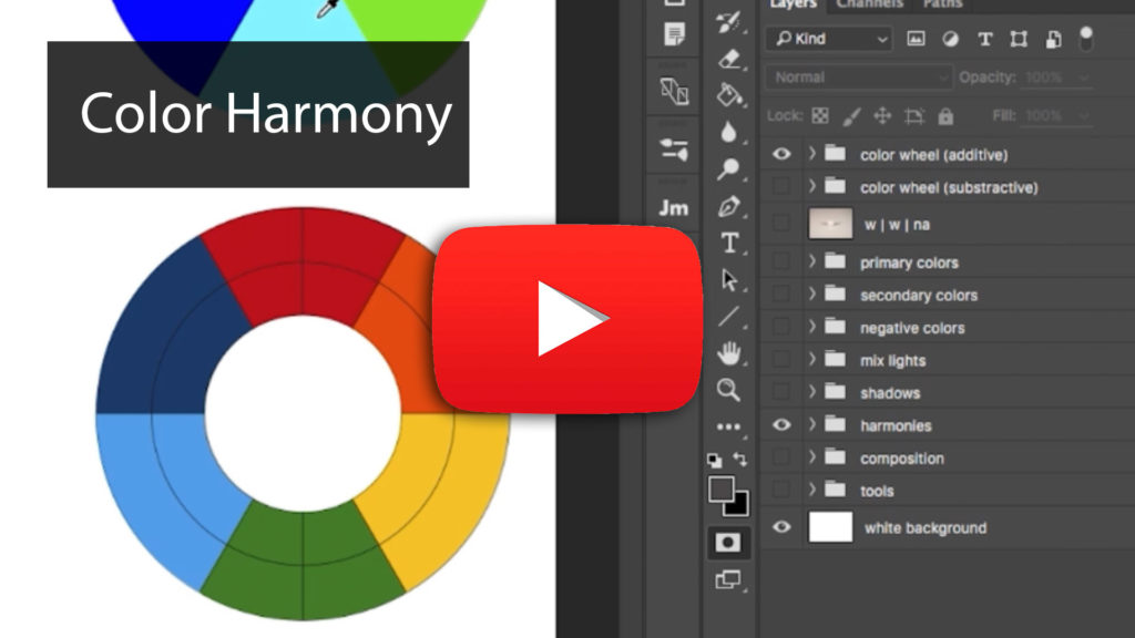
Color Harmony
What makes color palettes harmonious? This section goes over the main color harmony rules, what colors pair well with each other, and a simple tool to decide what works best on your images.
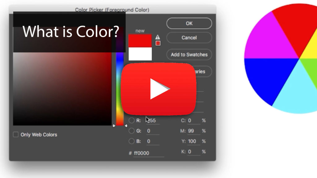
What Is Color?
What sounds like a fundamental question gets broken down into explaining what a color is and the components that make it up! We analyze brightness, saturation, and hue and compare them to RGB values. This knowledge will further grow your ability to control any color for your images.
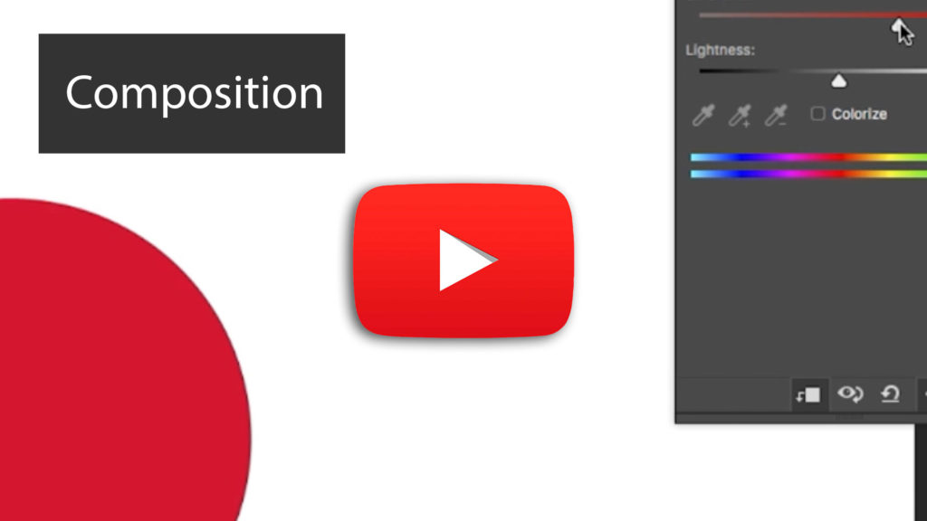
Color and Composition
When looking at a color wheel, each color is equal in how much space it takes up on the wheel. However, these colors may come in different amounts across your image. There may be hints of blue in your subject’s dress, but orange dominates the background. This chapter outlines how to adjust the weight of each color to achieve visual balance.
Part 2: Tools
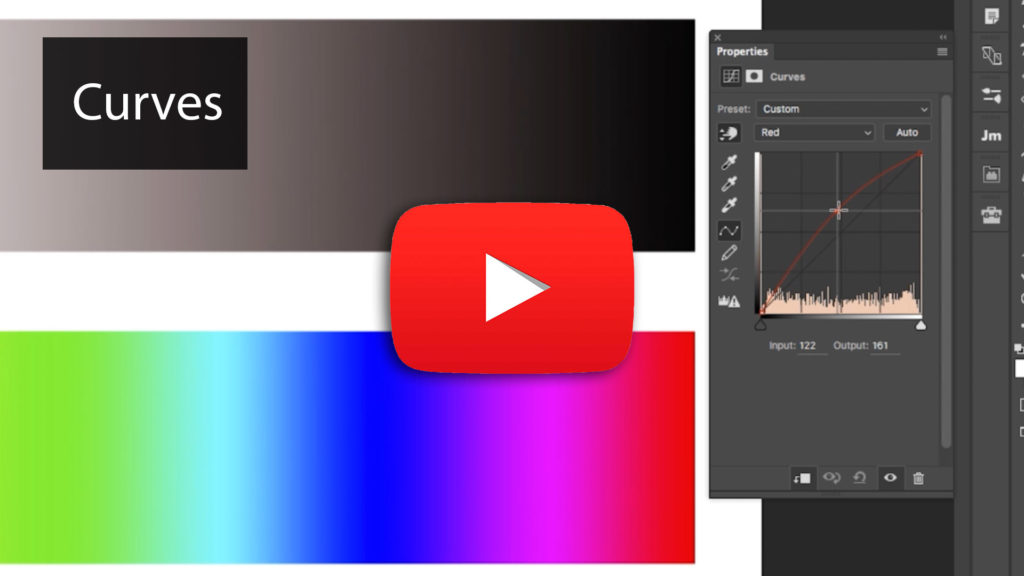
Curves
Whether you’re a beginner or have been using Photoshop for a while, you’ll be surprised to find out how powerful the curves adjustment layer is. We take a look into exactly how it works on a fundamental level and what happens when you adjust the different points on the curve. Then we take a deeper look into how you can use curves to match two different colors to each other, an effective color correction technique whether the issue in your image is environmental or skin-related.
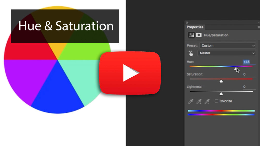
Hue / Saturation
This robust adjustment layer in Photoshop has a lot of potential for manipulating color values. This section provides a clear explanation of what the sliders do, and what the numbers mean. You’ll get to learn how to use it in situations where trying to isolate a specific color is tricky.
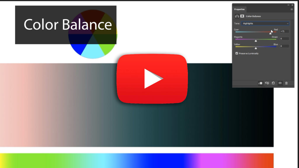
Color Balance
Modifying colors in Photoshop can be done in many ways, and the color adjustment layer is one of them. This chapter will help you understand where it works best and its effects. It will also demonstrate some of the accompanying settings that change the layer’s performance.

The Channel Mixer
Most users do not think of the Channel Mixer as a color correction tool. However, as this chapter outlines, using these sliders to adjust channels allows for really powerful color adjustments for specific purposes. You will learn how developing a stronger separation between colors can enable you to create precise masks that would otherwise be impossible with other adjustment layers.
Part 3: Working on images
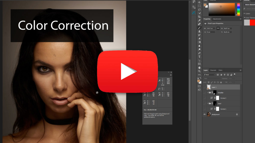
Color Correction
When you’re retouching an image, one of the fundamental steps is color correction. It is essential to understand how to look for areas that need correcting and what techniques will do it effectively. This section will apply the information in the previous chapter in a real-world example where many areas require correction using tools like curves, selective color adjustment layers, and blank layers. You’ll also see methods that do not work and learn why; helping you can avoid critical mistakes.
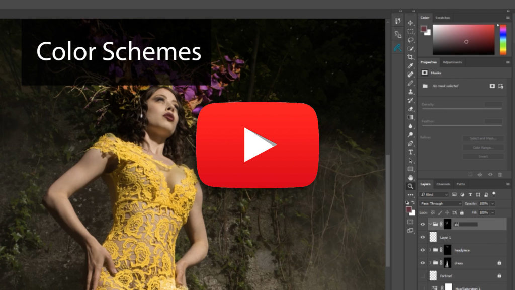
Working with Color Schemes
It’s one thing to pick a color scheme but being able to apply it to an image is essential. This chapter looks at a working example where we have a complementary color scheme in mind and apply it selectively across a fashion image. For added complexity, the example image presents a particular problem where the colors of the elaborate dress are similar to the skin. We’ll look at how we can apply previous techniques to isolate the dress from the skin and manipulate both separately to get closer to our final color scheme. You’ll also learn to use brushes in different blend modes to make the process easier.
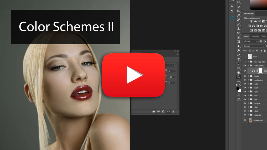
Working with Color Schemes 2
To build on what we learned in the previous chapter, we will work with a beautiful image that doesn’t require advanced selections. Demonstrating the process of fine-tuning with adjustment layers will explain how you can create pleasing results in very little time by understanding the fundamentals of color schemes.
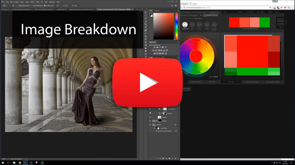
Image Breakdown
In the final chapter, we go through a series of before and after images and examine the adjustments made to create the final image. You’ll get to see the shifts in each unique situation to get to an appealing color scheme. Seeing these examples should drive home all of the previous lessons and show you how you can use them to improve your images dramatically.