

Written by Tina EisenAkwesi Baah is a commercial, food, beverage and product photographer based in Ghana.
His attention to detail and understanding of harmonising colors has recently caught our eye and we had the pleasure to (virtually) sit down for an interview with him this week!
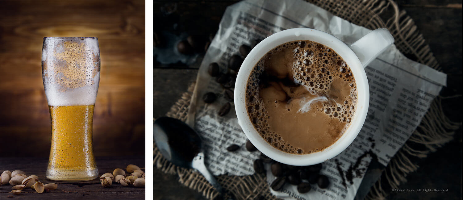
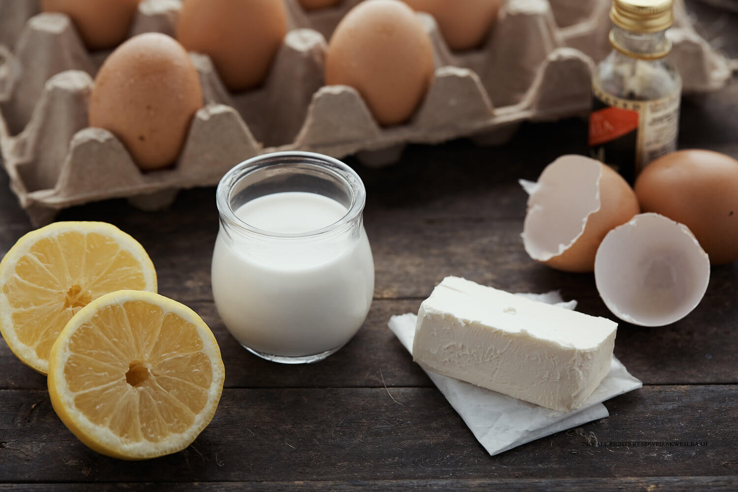
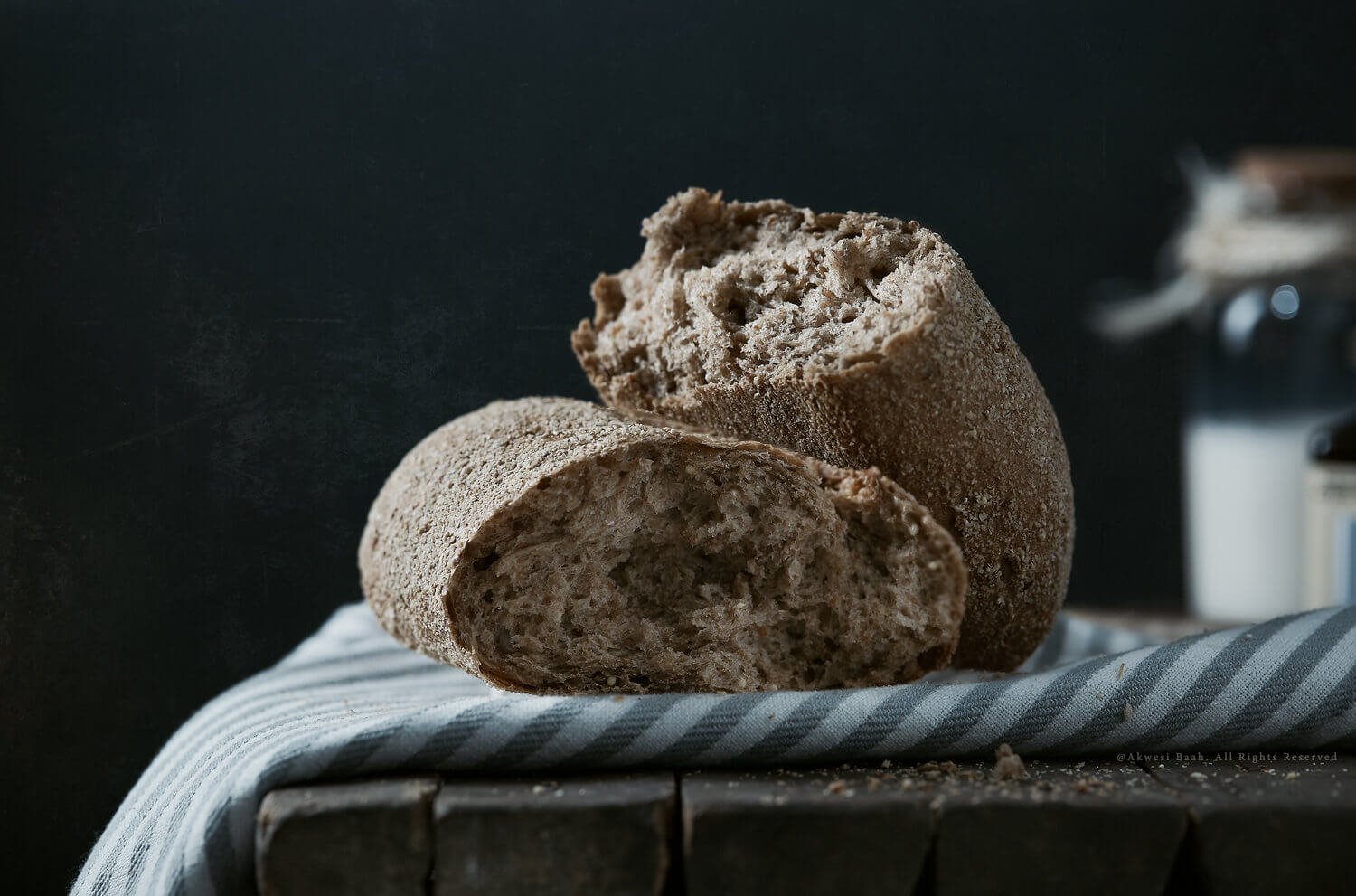
These images posted below were all treated with a little love from our Infinite Color panel!
1. Akwesi, what are your primary sources of inspiration?
I draw inspiration from a vast variety of sources like my environment, mentors, Instagram, Pinterest, the list is endless. I pay attention when I go out and see print ads and campaigns, I draw some inspiration from there as well, but mostly my background in film and advertising plays a very significant role in giving me inspiration for my work.
2. Many creatives don’t believe they have their own style even though others might see it, do you believe you have a particular style and how would you define it?
Lol… I think I belong to the crop of creatives who don’t believe they have a particular style, although, come to think of it, I seem to be drawn mostly to a lot of drama. I find myself trying to create drama within my work and in so doing, detaching myself from “catalog” imagery.
3. What role does color grading play in the execution of your vision? Do you think it’s a necessary part of the process?
Because I’m drawn to a lot of dramatic imagery, color obviously plays a very crucial role in creating that drama I may be seeking to achieve. I can create either a very happy, bright theme or a moody and dark theme simply by lighting right and grading to the specific theme I’m going for.
4. Does the direction you go with color grading change based on certain factors? How do you know where to go with it?
The direction I go with color grading may change or may not change based on what I may be working on, sometimes clients can influence the kind of color grade for the final look. Otherwise, based on my mood during a particular edit, I may choose a different color grading path.
5. I’ve seen your work with Infinite Color and we’re so happy you’ve decided to use us to help with your color vision! How would you say the tool helps you in what you’re looking to accomplish?
I used to fret about how fast and effective I can be during my color grading sessions. Grading alone sometimes takes hours or even days to finish just one image. Sometimes it demands taking a break, and stepping out simply just to refresh your view and clear from your mind the colors your eyes have become used to. There have been times I recorded and saved my colors to use them later but unfortunately, they seem to always change. I heard about Infinite Color Panel and started reading and watching the tutorials on YouTube. Then quite sincerely, after trying it hands on, I realised I could save a whole lot of time during the coloring process. The various color profiles come in handy, as alternating between or tweaking colors and even combining different color profiles makes the panel more intuitive, easy and convenient to use.

6. Would Infinite Color be something you’d recommend for other creatives as well? What are some of your favorite features and what will they find when using it too?
Most certainly! I recommend and endorse Infinite Color. I love the ergonomics and design of the whole panel and how easy it is to use, and most of all, how simply you can build or combine different color tones to create your desired look/mood. This is what I choose to call “Color Grading Made Easy!”
Tried! Tested! and Boom! Love it!
More of Benedcit’s work can be seen on his Instagram!
Have you tried the panel yet? We’d love to see your creations! Get in touch on Instagram @infinitecolorpanel or the Facebook Infinite Color Panel group and show us your work.
If you haven’t tried the panel yet, get started here: https://infinite-tools.com/infinite-color-plugin/