Lillian Liu is a Fine Art Photographer based in Vancouver, Canada. Although she first picked up a camera at the age of 16, Lillian didn’t properly find her passion until 4 years ago. And boy, does this passion shine through her work!
Lillian’s work reflects her insatiable curiosity and hunger for creativity.
This week I had the pleasure to sit down with Lillian and chat about the inspiration behind her work, her creative process and color management.
The stunning images Lillian kindly allowed us to showcase in this article are all toned using the Infinite Color Panel.
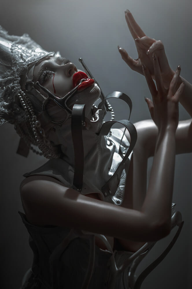
1. Your images are a work of art Lillian, each one rich in details, stories and imagination! What made you take up photography?
Being an art enthusiast, I was fascinated by the concept of creating a piece rather “instantaneously” with the click of a shutter button. I realized (very, very quickly) afterwards, how utterly wrong I was about the instantaneous part, and that the process runs extremely deep.
2. Many people struggle to define their own style in words. Often they aren’t even aware they have one. I’m going to put you on the spot, how would you define your “style”?
I think my style is a deliberate marriage between creative post processing and fine art photography! I try other styles when possible, of course, but my personal work most often meshes with fantasy themes and conceptual ideas. Nerds have been liberated in the last 10 years…no need to hide geekdom anymore!
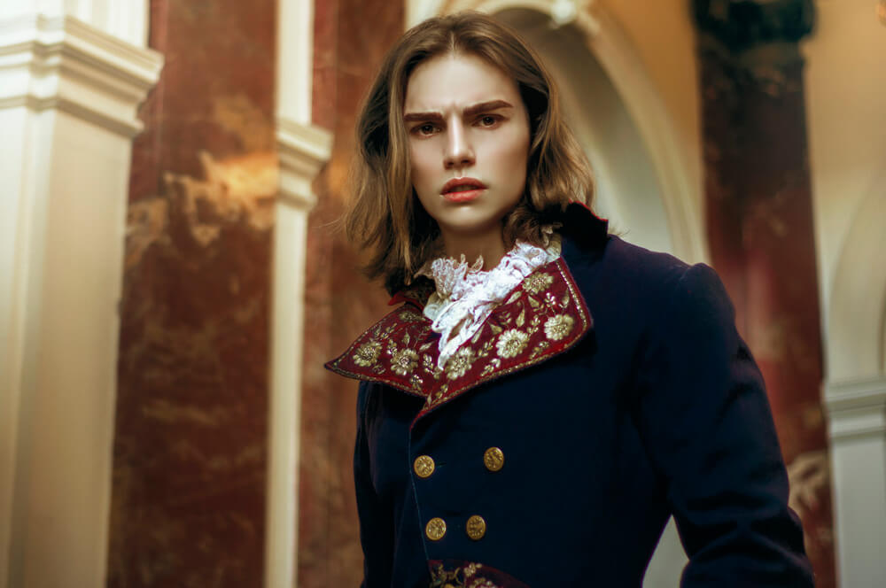
3. What inspires you in your photography, what are the “sources” for your inspiration? Could you give us a specific example for something that inspired you for one of your images?
My sources of inspiration are generally other things that excite me- history, fantastical literature, beautiful cinema, folklore, soundscapes, great painters, and stories. I enjoy things that poke at my imagination, and mostly draw my creative energy from these elements.
I enjoy having my subjects styled in a way that reveals a greater narrative- an example of that could be a recent I took featuring a silver Hogan Mclaughlin gown. The aesthetic…from the androgynous look, to the colour palette, to the helmet hair…it all rings as a tribute to Joan of Arc and her mythos.
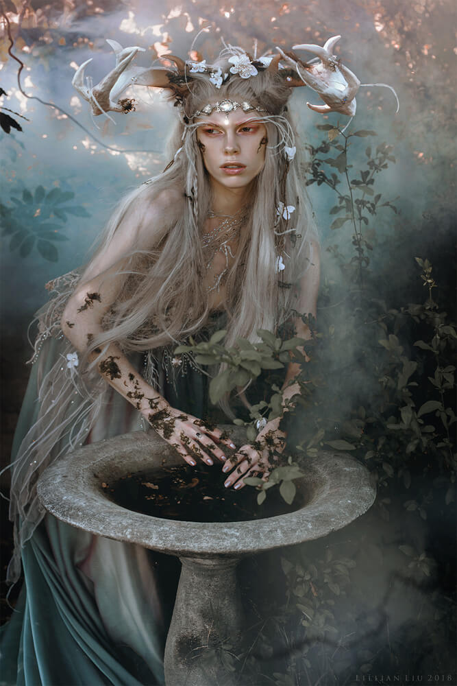
4. What role does colour play in your imagery and story telling? At what point in the creative process do you decide on a colour scheme?
Colour is especially important in my images, as it contributes heavily to atmosphere. I tend to decide on my colour palette during processing as opposed to during the shoot. This allows me to see how the images speak to me on an emotional level during the selection process, in which I then decide how to proceed with colour toning.
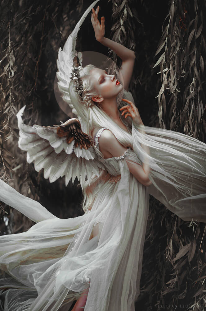
5. For the incredible set you’ve sent us, how did you come up with the concept? Can you tell us a little about the day? Who was involved?
Of course! This photo features one of my most beloved friends Maria Amanda, taken when we were on a hectic road trip that brought us down to designer extraordinaire Fairytas and her magical studio.
This angel outfit was actually the first look of many- and we were more or less given preselected garments to work with in our own style. Taking the garment, I would then try to convey how an angel would feel to me- how they would move, carry themself, etc.
Through directing the model with movement with some hilarious demonstrating on my part and verbal communication, I would then try to capture the image in hopes that my mind’s eye would be satisfied.
I felt like the set was overall a little somber as opposed to airy and purely angelic, so I decided to go with shadowy tones in post, removing most greens and focusing on earthy, dull colours.
I was thinking of an innocent, pure spirit in contrast to the corruption in a corrupt world. Hopefully, some of that comes across!
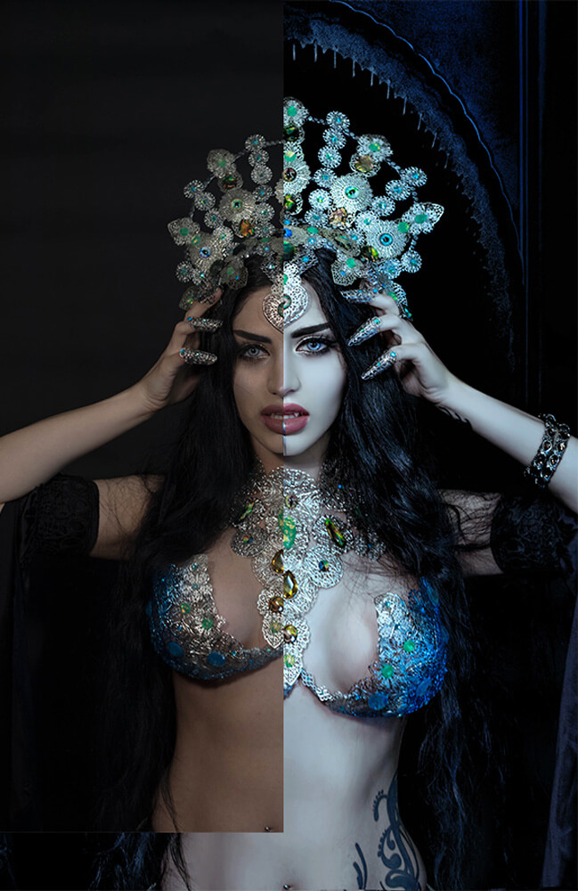
6. Has the Infinite Color Panel changed the way you approach colours or your decisions? How has it helped your process?
Definitely! It has given me the freedom to brainstorm with ease, and also yields quick results with the deliberation process.
The most time consuming part of editing is definitely the experimentation to see what looks and feels right for the final product. ICP gives me the tools to click and rotate through multiple potential directions without having to sacrifice hmm-ing and humm-ing and lots of trashed psd files!
It also can inspire new ideas and perspectives!
More of Lillian’s work can be seen on her Instagram, Website and Facebook Page.
Have you tried the panel yet? We’d love to see your creations! Get in touch on Instagram @infinitecolorpanel or the Facebook Infinite Color Panel group and show us your work.
If you haven’t tried the panel yet, get started here: https://infinite-tools.com/infinite-color-plugin/

