In this color conversation, we had an opportunity to chat with scientist turned artist, Jennifer Tallerico. Her underwater photography is dreamy and spellbinding! Truly unique and absolutely lovely. We adore how Jennifer creates alternate realities through a brilliant intermingling of photography and post-processing. Fine-Art at, well, it’s finest. If you’re not familiar with Jennifer’s work, do yourself a favor and go check it out!
Firstly, your work is sublime! So surreal and dreamy. How did you find your way, as an artist, to underwater photography?
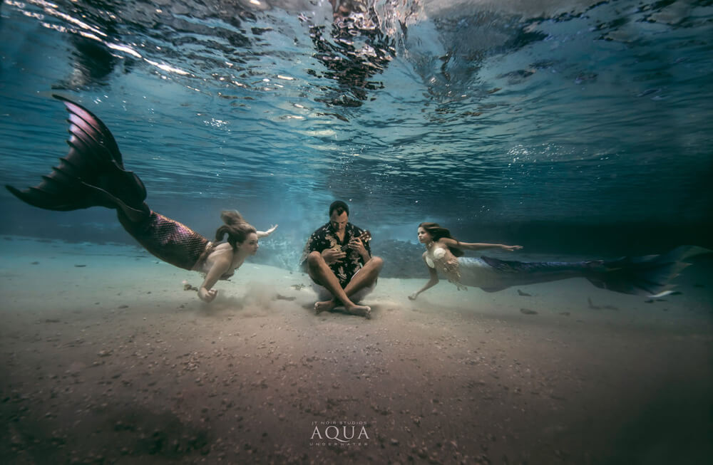
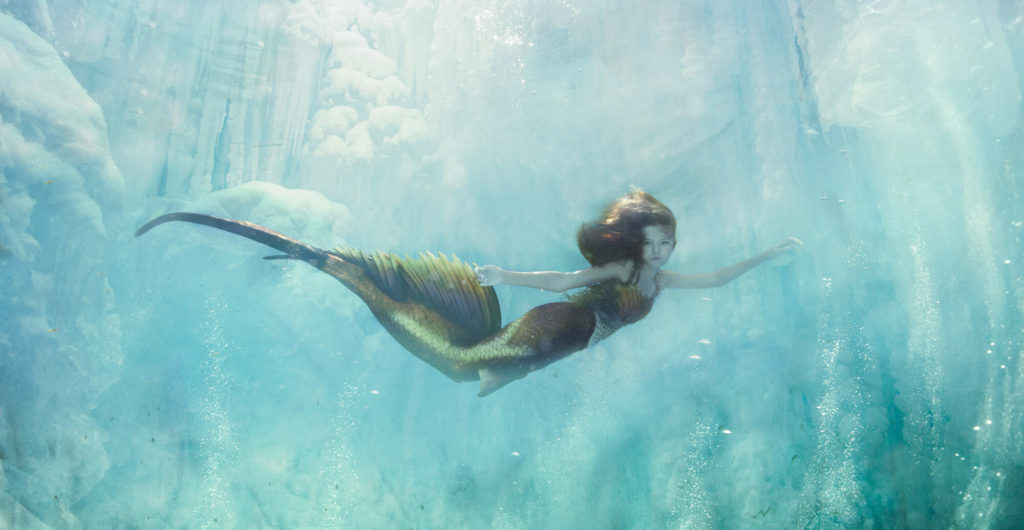
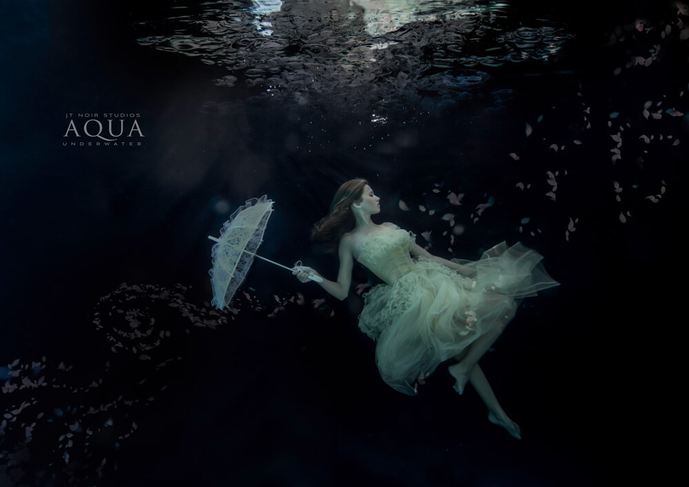
I was a scientist working with water quality on the environmental level for many years prior to my life in photography. Once I began my career in photography, water had to play a role in some form or another. One day while photographing my daughter playing underwater (seen in many of my images) – the way her hair moved, the light danced around her, and the flow of that water surrounding her, I just knew I had to incorporate this kind of work into my photography. Since then it has become a blessing and a curse on how much I want to shoot below the surface.

Have you ever found yourself in any type of trouble or predicament(s) when photographing underwater? I imagine there are singular safety and legal considerations?
I always have a trained lifegaurd with all certifications on location for my clients safety. He can tell signs of distress above and below the water when I may miss it while capturing the image. If we are in the springs there are also concerns for wildlife where he is my look out as well. If the client brings long flowy dresses he is there with the rescue equipment to help her for periods of rest in between shots.
I’m really curious, as are many I’m certain, what unique challenges do you encounter, when photographing subject underwater?
Each session comes with its own challenges. Some clients do amazing naturally underwater while others need to be coached a bit more on how to stay under and have control over buoyancy. Other issues that come into play are with the water quality itself. While I try to always use the competition pool or the springs, many times I am hired to shoot in a private pool which comes with color balance issues, clarity issues, and size of the location. The smaller the pool the quicker it will fog up with the activity underwater so I need to be able to work in a way that allows the water to have time to settle in between.
More specifically, in terms of color, how is underwater photography dissonant from creating on land?
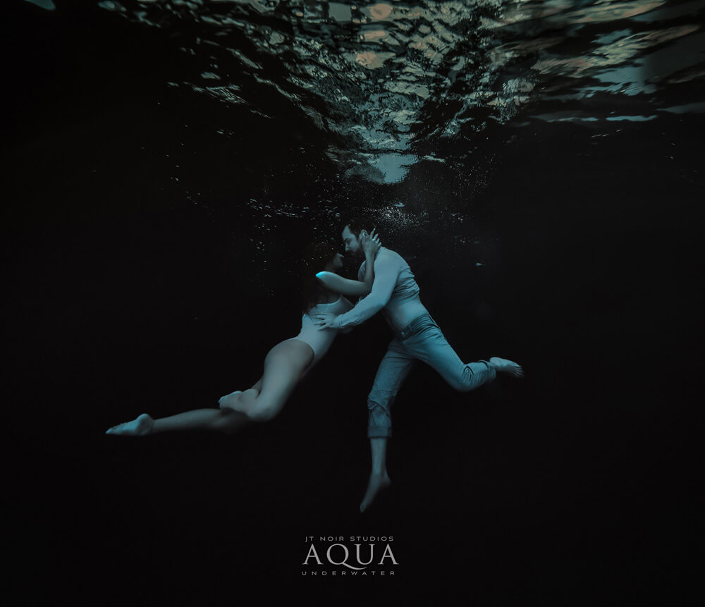
Red wavelengths are lost quickly under the surface so understanding how to bring that back into you image is important. Use of colorful wardrobe can be helpful. I shoot in kelvin as well to help bring it a bit warmer, use of strobes under and above the surface will also help to bring back color. The major time I am working with color is of course in post and layers play a big role there.
In a similar vein, what role does color play in your creative process, both during a project and in the post-processing phase?
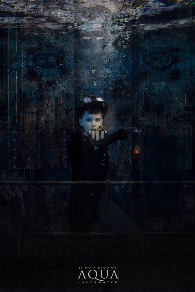
I know ahead of time how I want to combat the color loss issue in the water so I can spend less time on color and more time doing fun composite work in post. I love working with adding in other images to give that surreal and fantasy look to my images. My clients adore having another world hanging on their walls.
Has the Infinite Color Panel impacted or bolstered your artistry or artistic approach? If so, please elaborate.
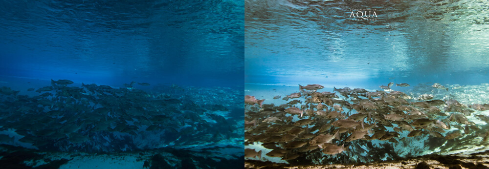
The ICP has helped in so many ways. It was difficult at first when I was playing with the panel as most images coming in from the camera are on the bluish hue only. Once I got a workflow going and knew when to apply the ICP it was amazing from there. It not only helps a image that is just a client on a plain backdrop and adds that boost, but it also helps to blend a composite.
Are there certain scenarios where you find the Panel to be most relevant and useful, in terms of your respective workflow?
Yes! I use it in two scenarios. If the image is from open waters, I can apply it directly as the color balance in the freshwater springs is more natural than in the pools. If the image is in a pool setting, I will apply it to the end to give it a boost in color. My favorite setting is the harmony as it truly blends the image overall.
Thank you to Jennifer for taking the time to give us an insight into her life! Be sure to see more work on her Website, Instagram, and Facebook!
Have you tried the panel yet? We’d love to see your creations! Get in touch on Instagram @infinitecolorpanel or the Facebook Infinite Color Panel group and show us your work.
If you haven’t tried the panel yet, get started here: https://infinite-tools.com/infinite-color-plugin/