
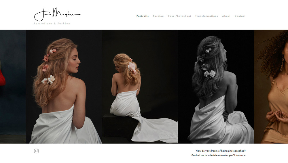
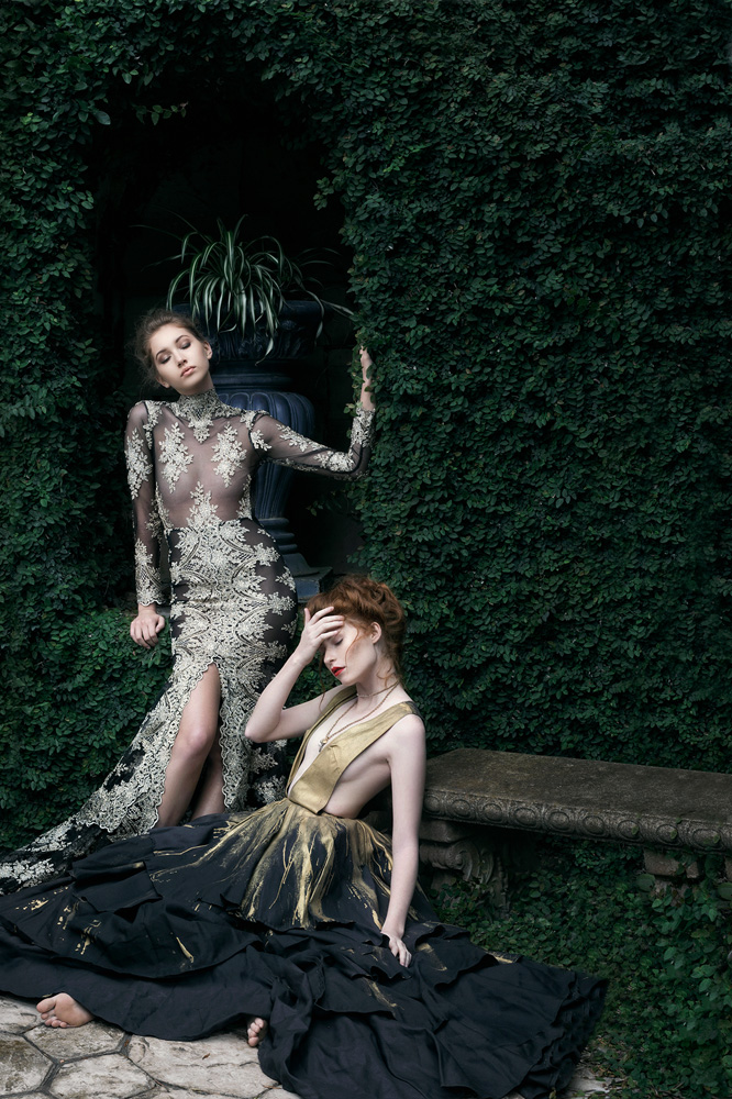
Fine Art photographer and artist extraordinaire, Jai Mayhew specializes in the realms of portraiture and and fashion. Her work walks the fine line between modern and classic, inspired by the greats of the Old World, infused by the likes of Vogue and Vanity Fair. The connection Jai creates and fosters with those who step in front of her lens is immediately evident. in the authentic emotion and vulnerability she is able to capture and convey. In this Color Conversation, we had the opportunity to chat with Jai and learn a bit more about her art, approach, and creative philosophy.
Be sure to check out her work on her Website, Facebook, Instagram, and Pinterest.
Your photography has a classic, timeless aesthetic that is unique and recognizable. Please, tell us a bit about your influences and journey as an artist, and how you arrived at your signature style
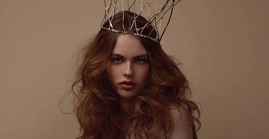
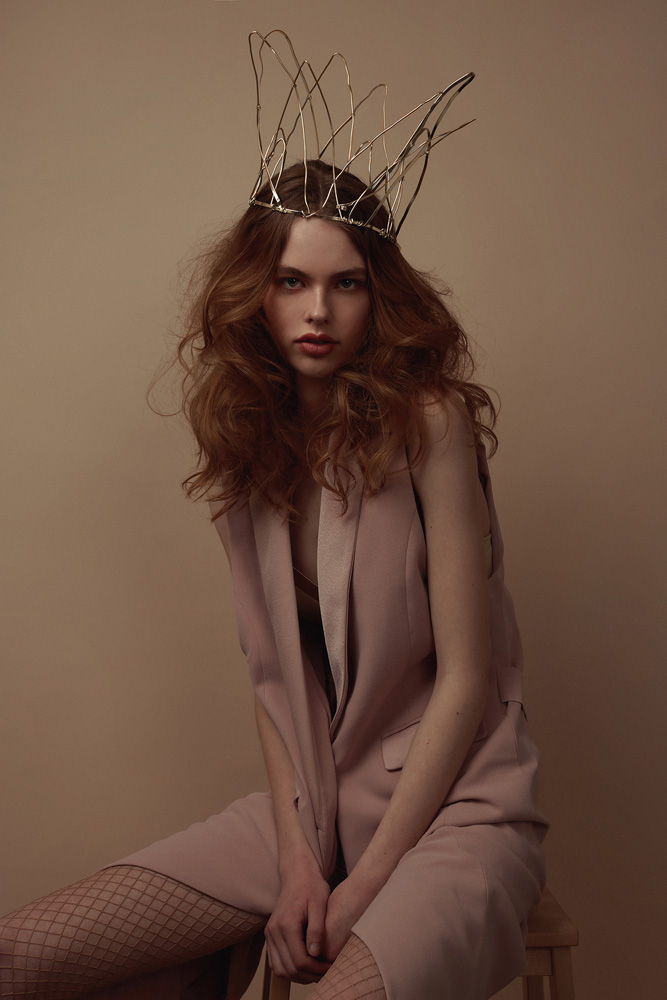
Thank you! My aesthetic was carved entirely out of old Hollywood movies, from film noir mysteries to bright and colorful musicals. I grew up in Germany on a military base with one TV station and shaky reception. This led to renting lots of movies from our small base library. I grew up on Fred and Ginger musicals, Hello Dolly, Gentlemen Prefer Blondes and Singing in the Rain (the “Beautiful Girl” fashion montage being my absolute favorite part). When I got a little older, I discovered classics like Casablanca, Laura, and Rebecca. Those movies were all about style and dramatic lighting and this classic, feminine elegance and all that made a lasting impression. I have tried to be edgier, to shoot a harder style, but my aesthetic has a softness to it and once I was willing to embrace that my work really changed. I am always learning and trying to grow, but I’ve come to appreciate what makes my eye unique and stopped fighting my instincts.
It’s clear to us that you have a commendable ethos, in regards to the connection you strive to create with those you photograph. If you don’t mind, please elaborate on what it means to you to have someone in front of your lens.
Photography is, for me, an empowering responsibility. Whether it’s a fashion editorial or a client session, for me it’s all a degree of portraiture- the art of showcasing a beautiful woman in a beautiful way. I love what I do and that women trust me enough to step in front of my camera. But I also know that a portrait is more than photo, it’s a validation of the best or worst things you think about yourself. I take that responsibility seriously and it is with a passion that I strive to show women the most beautiful and authentic sides of themselves. It’s an honor every time I get to be a part of that.
Moving on to the realm of hue and tone, what role does color play in the scope of your work and how important is color to your creative process?
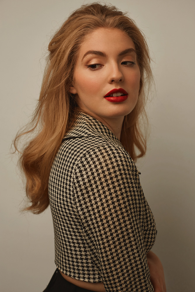
I give Bella and Pratik full credit for introducing me to color grading. A few years ago I was struggling to get to that ‘next level’ (a continual pursuit), when I began experimenting with Fine Art Actions, I was amazed at how much impact could be added in post to enhance a theme or emotion. Color grading has become more and more an integral part of my work whether it’s still life or portraits. Kate Woodman’s beautiful approach to color changed how I viewed the color wheel (am I now reading books about color theory? Yes, I am.) and I love Bella’s PSD files that break down her editing layers. Color is a language and I love learning to speak with it.
Are there a certain set or combination of colors that you are drawn to, when editing, or is your approach singular and unique to each subject or project?
I’m usually drawn to warmer tones and palettes, though there are always exceptions. I once had the pleasure of hearing Lindsay Adler speak and she gave an insightful suggestion to photographers struggling to find their style. She said to go through your portfolio, find the 5 pictures you love the most and then figure out what they have in common. At the time I heard this I was really struggling to find consistency. I felt like every shoot was different, but not in a fun way, in a frustrating way. I went home, studied my portrait portfolio and found the 5 images I was most drawn to. They were sensual, classic, feminine and warm. That’s when I realized I’d found my style.
We’re curious, how has the Infinite Color Panel impacted the way(s) you interact with, and apply, color in your work?
Oh it is like a color cheat sheet, it’s fantastic. There are an infinite combination of curves, levels and adjustments you can make in photoshop. That variety is both incredible and overwhelming. The ICP offers you unlimited and instantaneous glimpses of the directions in which you can take your image. Sometimes I know what I want and click through until I find a great jump off point, sometimes I have no idea and start clicking until I find something I love, and other times I think I’m done with an image only to find adding a few ICP layers (at different opacities) really polishes the final product. ICP takes hours of guesswork out of color grading and shows me combinations I may have never through to try. It’s remarkable.
What is your favorite aspect of the panel, and how do you feel creatives could potentially benefit from integrating the panel into their respective workflow?
It’s so adaptable. You can choose which components you want it to adjust. You can choose a light to heavy effect. You can individually adjust each layer of the action, then layer more and more ICP actions until you’re satisfied and copy the whole work flow onto each image in that set. No matter your experience level, it’s so easy to use, but adds so much to your work.
Have you tried the panel yet? We’d love to see your creations! Get in touch on Instagram @infinitecolorpanel or the Facebook Infinite Color Panel group and show us your work.
If you haven’t tried the panel yet, get started here: https://infinite-tools.com/infinite-color-plugin/