
Written by Casey Cosley
Being a self-taught photographer is a tough row to hoe, and Rutvik Katuri being of that ilk has brought the same perseverance to the table and mixed it his special brand of craft. Each of his images has a thoughtfulness of design playing throughout from conception, to color, and tone.
Rutvik’s ability to balance those elements and create depth is a skill we strive to achieve.
Join me for an internet round of applause (is that just a bunch of clap emojis? 👏👏👏) as he shared that with us what drives him and how he considers his artistic process.
Your work has such a strong presence of story while maintaining a sense of self that maintains a style unique to yourself. How would you describe that style to someone who has yet to see your imagery?
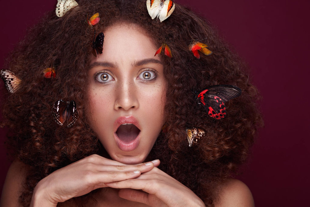
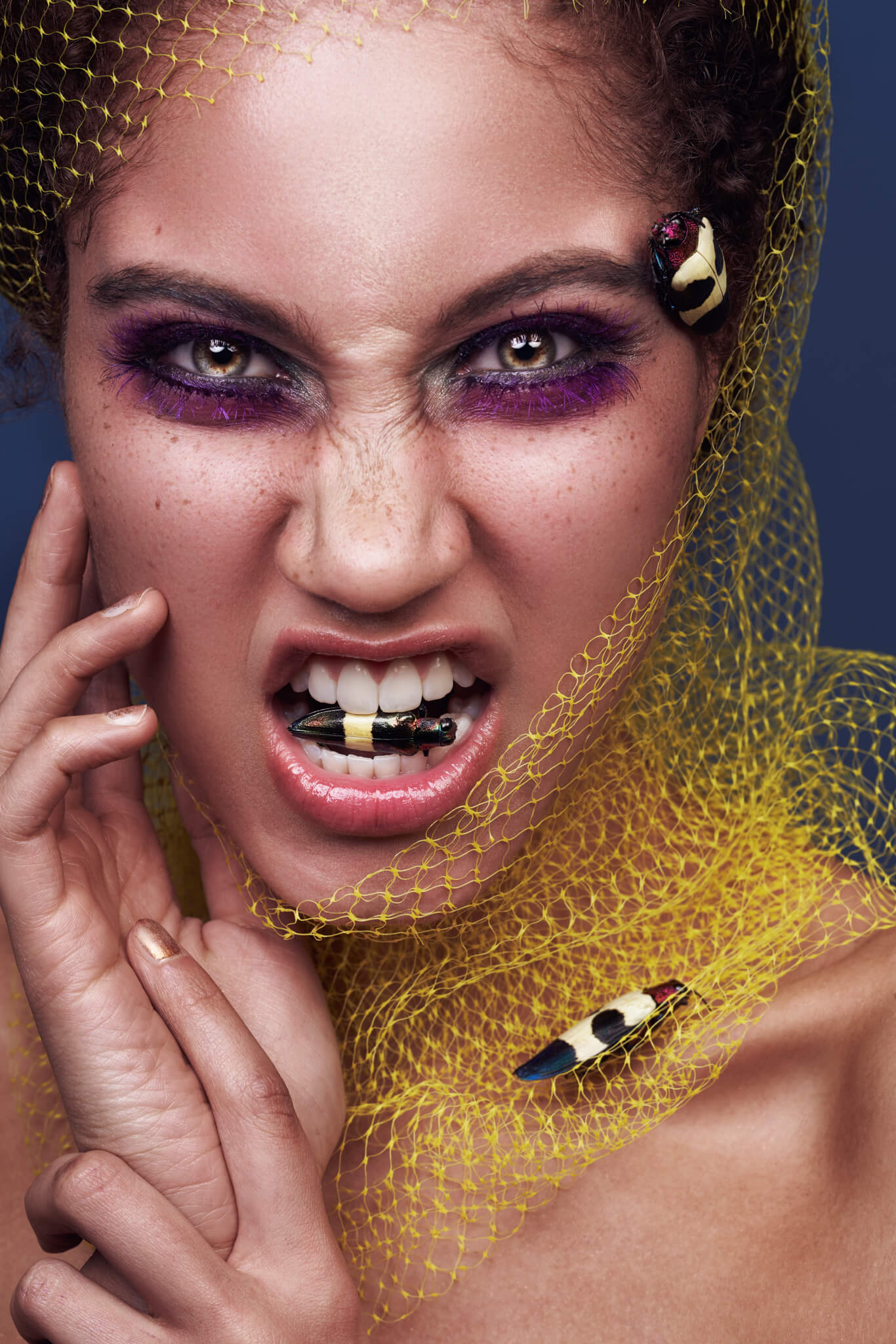
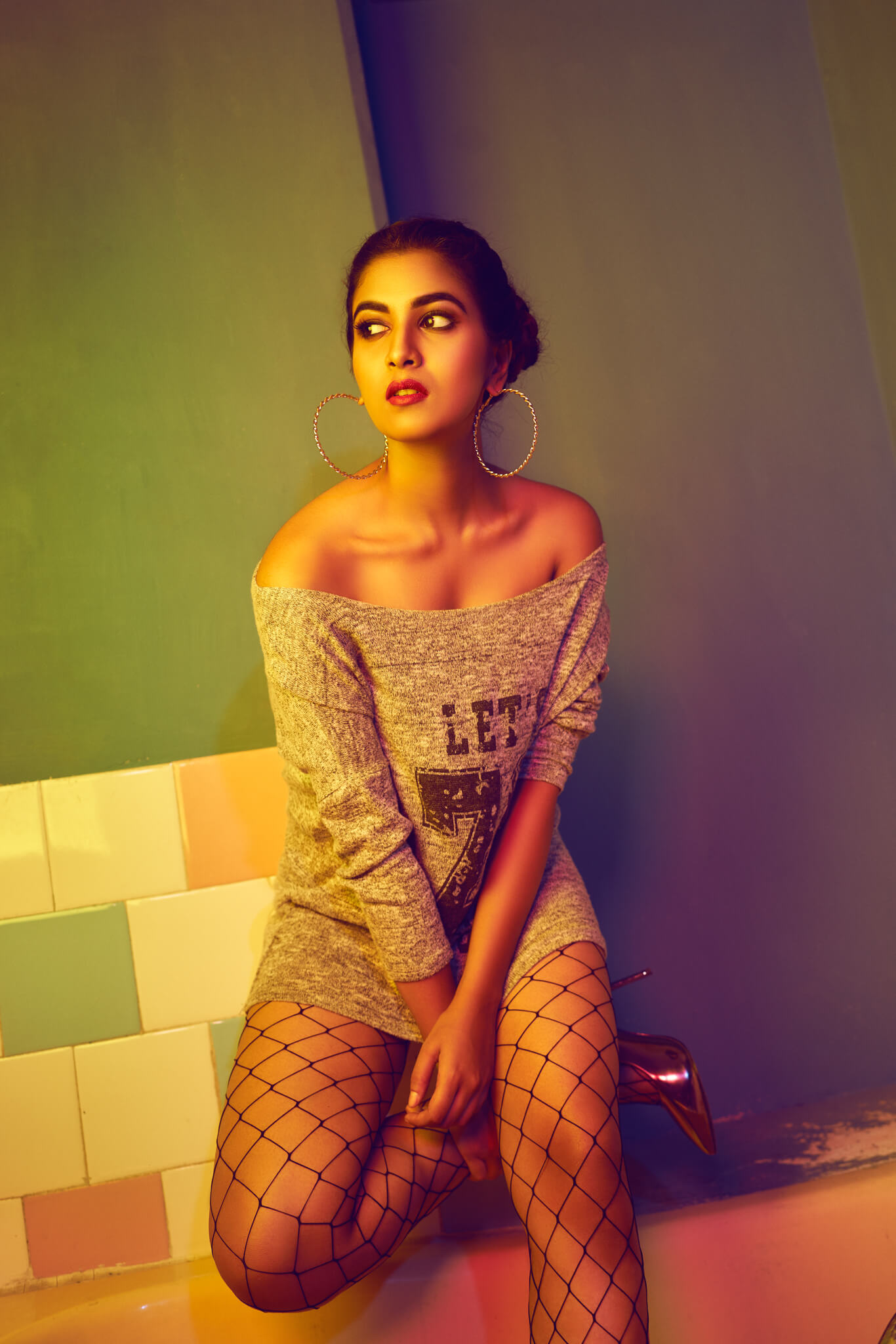
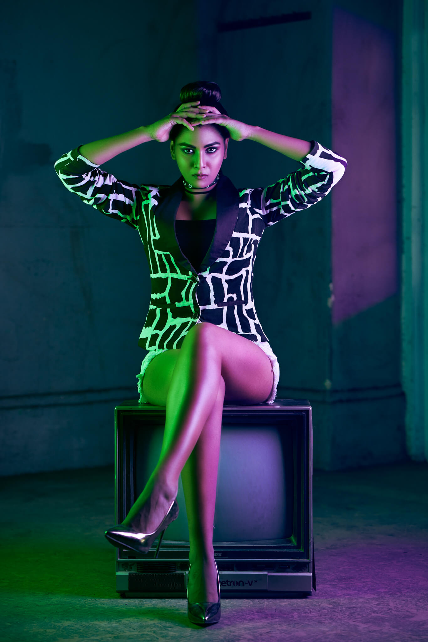
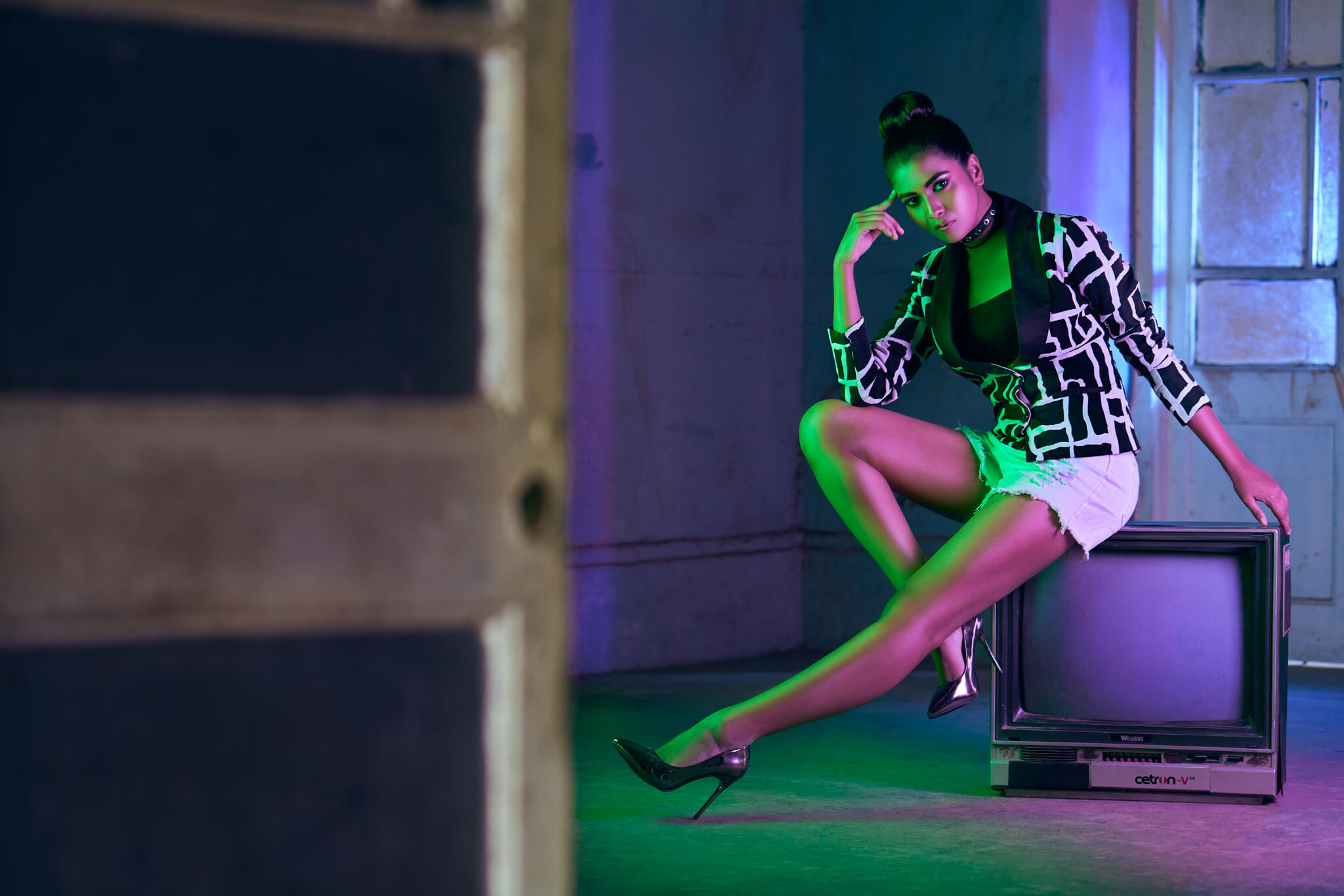
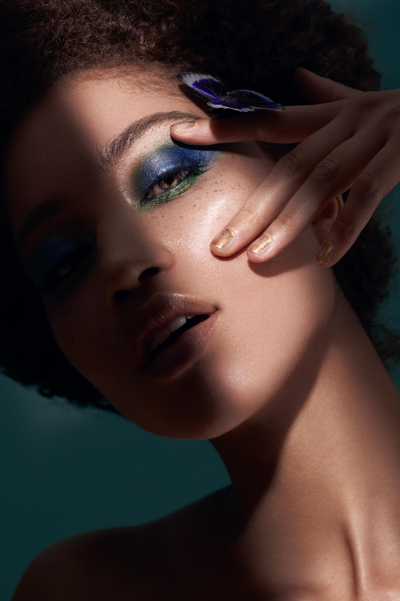
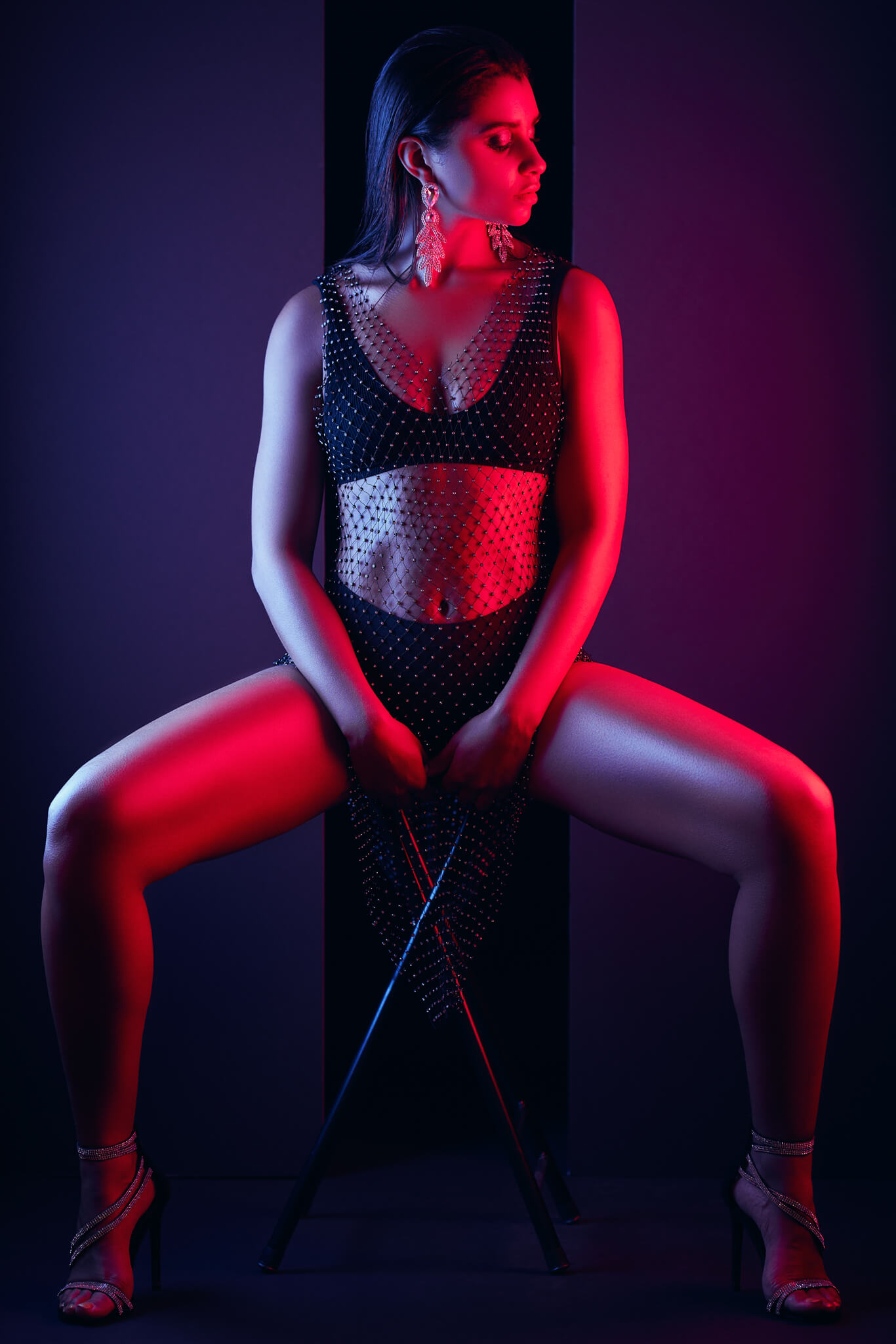
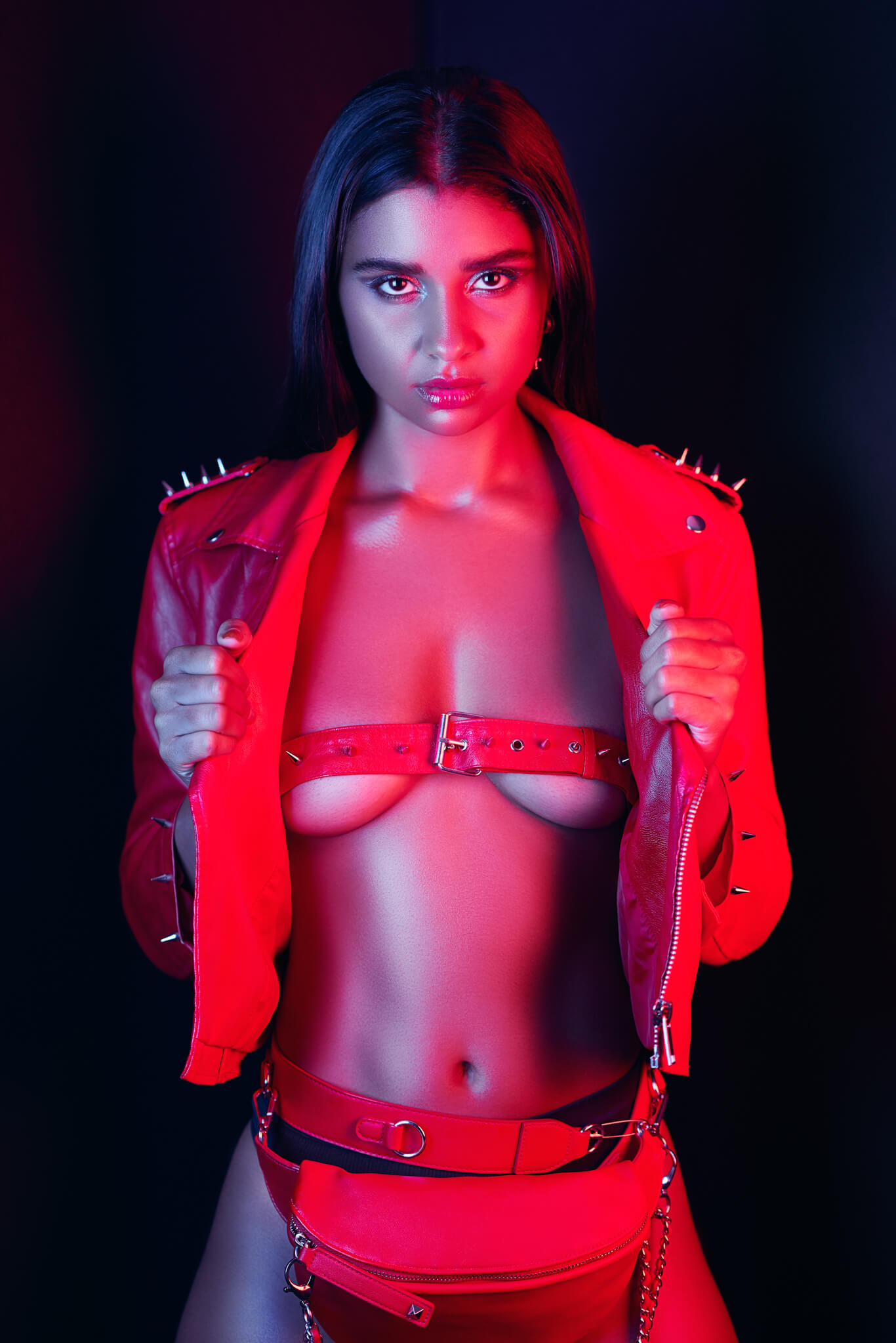
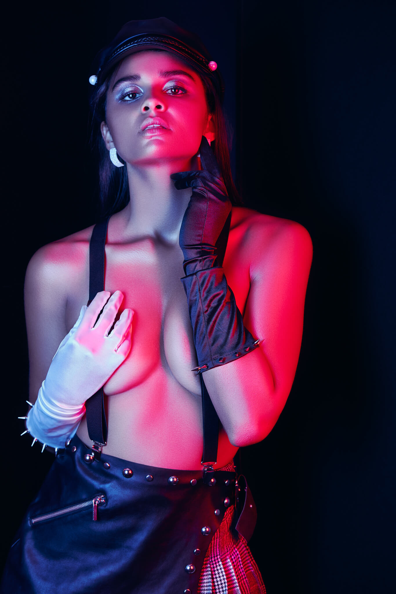
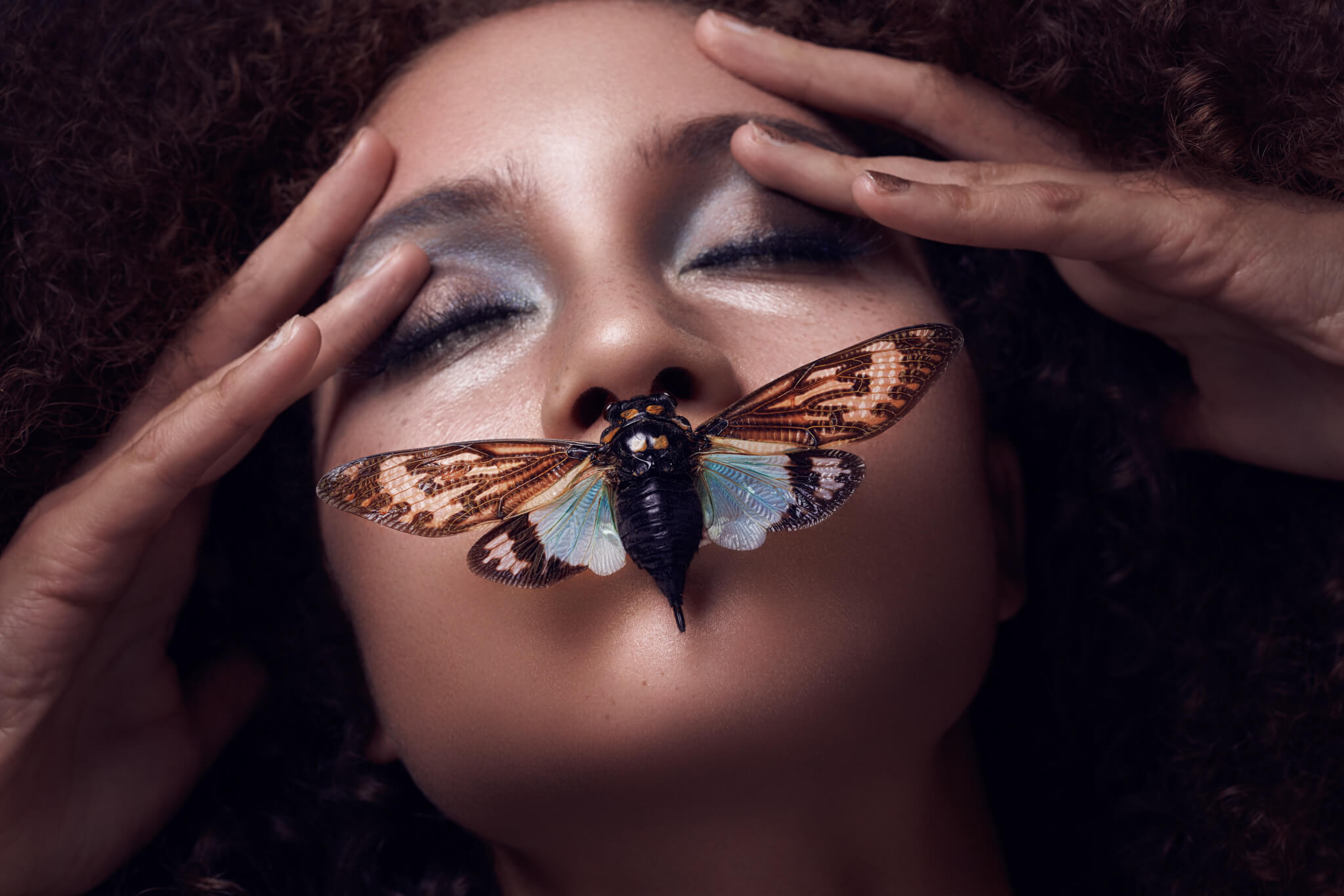
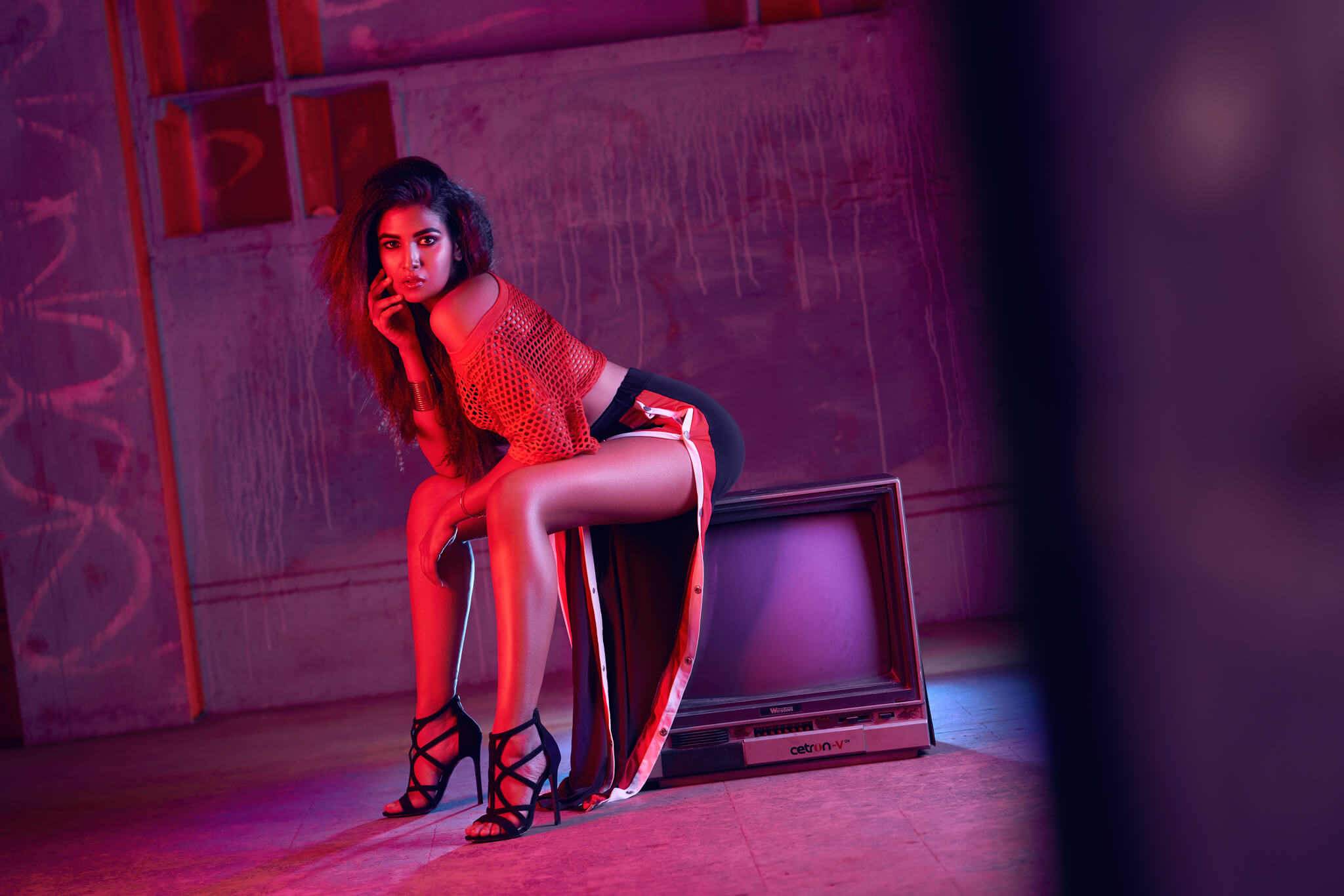
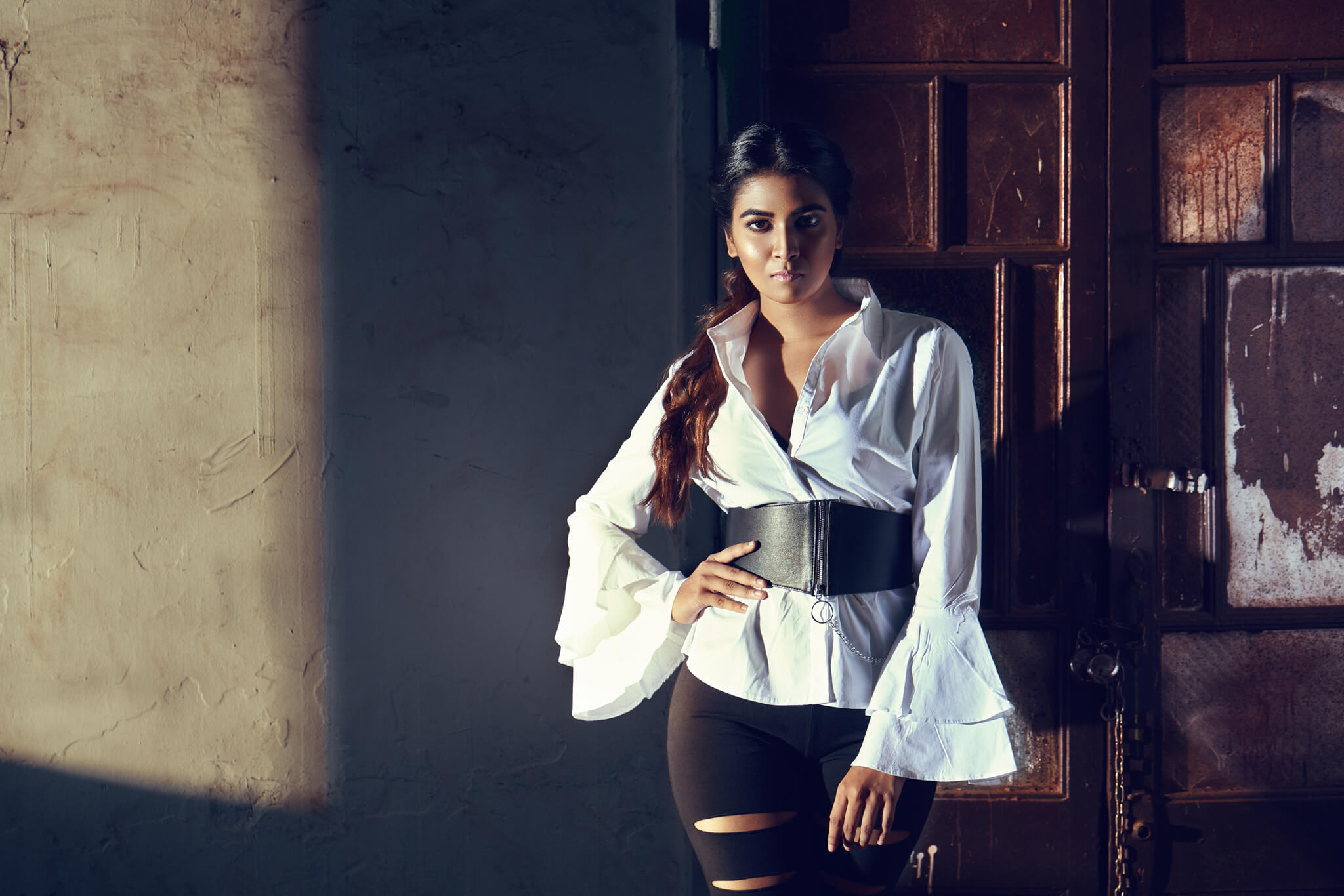
Fashion and beauty are essentially the two genres I am pursuing and am fascinated with. My sense of aesthetic is currently evolving in beauty but I like experimenting with the play of colors, while adding a dramatic element to it. Drama with a great deal of vibrance and edgy, And bold is my current fashion aesthetic. I consciously aim to have a consistent aesthetic in both these areas of my craft.
What part of your process feels the most personal to you?
The art of crafting and shaping light is something I love. This process excites me about this field and it conveys my perspectives and the essence of my work and is most personal to me.
Tell me a little about your concepting process.
I draw my inspiration from some of the top fashion & beauty photographers like Lindsey Adler, Tina Eisen. Movies and music videos also influence my thought process and ideas. As an example when I’m inspired by a certain light or possibly an element from these shoots or music videos it results in an idea for which I discuss a collaboration with my stylist and MUA, and all the elements become clear to me and then I take it forward. From there everything fits like a jigsaw puzzle and it also evolves into narrowing down on the model, the kind of expressions and posture which ultimately is my concepting process.
Is there a facet of your work you’re proud of?
Before I pursued photography, I was fascinated with photoshop, also proved my love for graphic designing in my early years. And when I took up photography my love for graphic designing transformed into my love for retouching. I am a self-learner, so I spent time watching tutorials on YouTube and kept exploring the idea, I was having to do lot of trial and error. That is when I finally got a hang of retouching skin & hair. But for me the most important thing about retouching that defines my work is the color grading process and tweaking the light in post to get it to where I want. That way the viewer perceives the image exactly how I want them to view it while my idea behind it is transferred to them. By tweaking the light and color I can control how the viewer views the images. It definitely took a lot of effort and time to understand but it also keeps me going.
What part of your post processing workflow has taken you the longest to master?
I believe that one never stops learning. The process of Retouching hair and skin is not for the faint-hearted. It’s something that requires patience and a lot of love. They are both daunting to me till date but keep me on my toes while making sure I’m still evolving.
Do you have a routine that helps you get into the editing groove?
Having the attention span of a chimpanzee which is about 20 seconds in other aspects of my routine, my love for my work has me glued to my computer for more than 8 hours a day retouching images. Also, I am very particular about the perfect temperature in my room. The comfort of my seat has to be just comfortable enough to work but not too comfortable that I doze right off. And most importantly, my playlist. Each beat in a track adds to my editing groove.
In what way does using ICP help with the creation of your work, and that workflow?
Before starting the post-production for any image, I generally have a color palette in mind and I complete the image on my own, no problem! There are many situations where I don’t know what I want or complete my initial color grading process and realize it’s not working. This is where ICP steps in; it really helps me get an idea of what I want or at least get me close to it so that I can tweak and turn it into absolute perfection. I absolutely love the shuffle tool, it is my go-to when I feel like trying something entirely new and different or get to a good starting point.
What would you say to people who are curious about ICP and want to know if it’s for them?
Well for most artists today the clarity about their end product or how to get there can get unclear or hazy, which can lead to them not satisfied with the result. This tool is definitely for them, and like I mentioned the shuffle tool is simple yet the perfect tool for color grading.
How hard was it to get to the final result for your colors on this set?
Retouching or color grading for me isn’t about finding it hard or easy. I look at how much time it consumes and how much of tweaking is necessary. And for this particular set because I already had a color palette in mind, once I got my base/first image, it took me no more than a minute to apply that color group into the rest of the images to match. For an image or two had to tweak it a bit more to get it to where I wanted. And the base/first image took around 2 minutes to get to where I want with ICP.
Do you have a vision of the colors you want to use for future work?
Since I make the conscious effort to keep my aesthetic evolving, there is a lot to explore for me, but if you see any of my work, you will see a majority of black and cool tones. On very rare occasions there is a mix of cool and warm tones. My current work is now starting to branch into broader color palettes that are current in the commercial market.
Check out and stay up to date with Rutvik Katuri’s work by following his instagram, facebook, or purising his website!
–
Have you tried the panel yet? We’d love to see your creations! Get in touch on Instagram @infinitecolorpanel or the Facebook Infinite Color Panel group and show us your work.
If you haven’t tried the panel yet, get started here: https://infinite-tools.com/infinite-color-plugin/