
Article written by Pratik Naik & Jonny Edward
To us, David’s brilliant photographic art is reminiscent of the great masters of painting. Elegant, classic, and altogether cohesive. There is a strong sense of maturity, both in what he creates and how he approaches the creative process. We’re delighted to bring you this Creative Conversation, wherein we explore the man and artist behind the ever-growing collection of unique, modern-day masterpieces.
Do take a moment to follow David on Instagram. To see more of David’s spectacular photography, or learn about his workshops, head over to his website.
There is so much humanity in your images, how do you achieve such a relaxed state of emotion with your subjects? I know you personally, and you have an extremely warm and welcoming vibe. Do you think someone’s character plays a significant role in the emotions they’re able to evoke from their subjects?
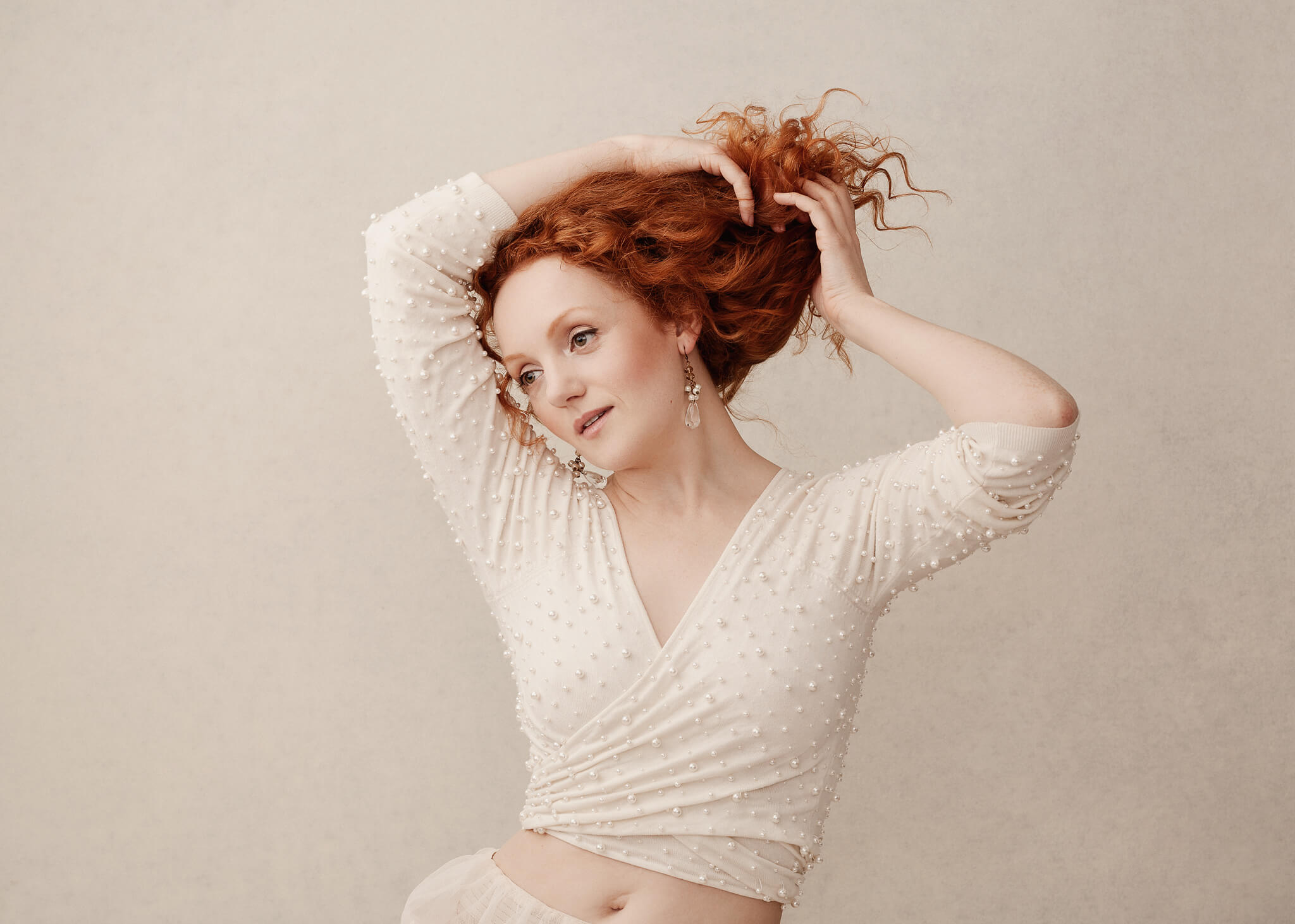
Yes, I think that’s true. It doesn’t matter whether you’re shooting a seasoned model, performer or someone who’s never been in front of the camera: everyone feels vulnerable, to a degree, in the shoot. I think it’s pretty common for people to feel self-conscious initially, and part of my job is to help people feel at ease. I think a big part of that is just being natural, confident and taking control of the shoot. Once people can see that the shoot has direction, a plan and is moving efficiently, they become more at ease, and things generally work well. I always shoot tethered in the studio, which allows me to show the client how things are progressing through the session. Communication is key: even people who shoot often like to have feedback and reassurance that things are going okay, so I talk to people!
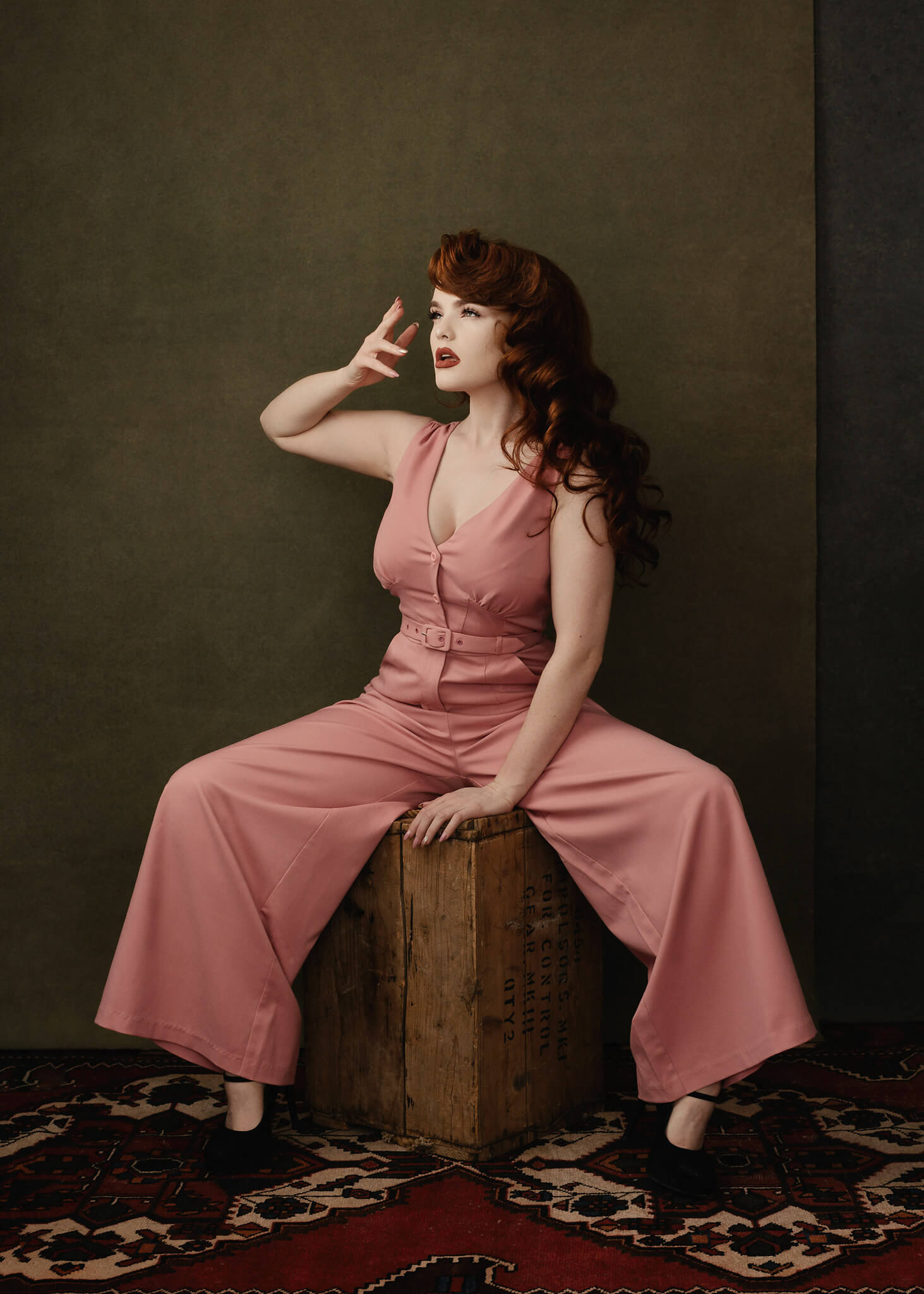
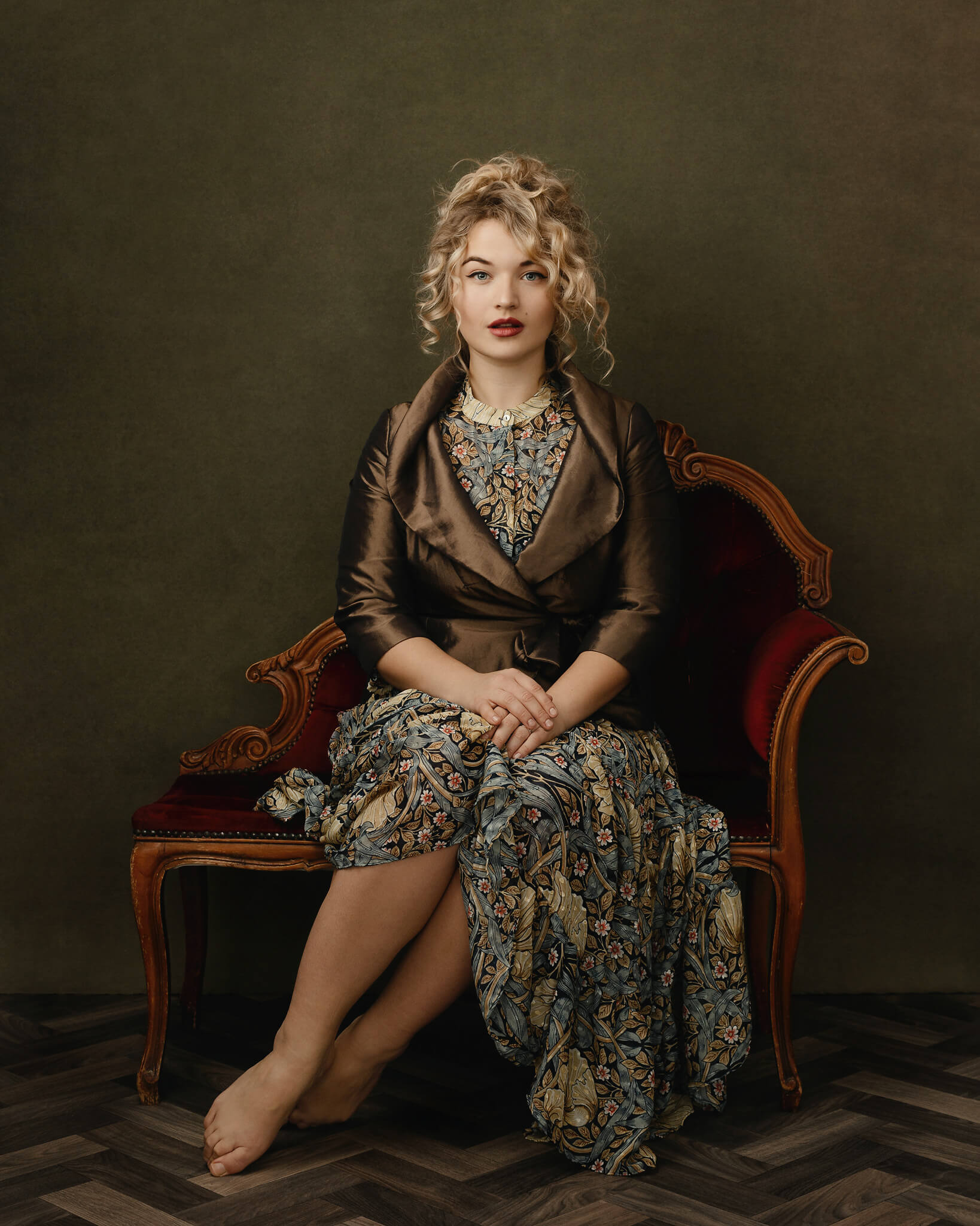
I love the elegant simplicity in your work; although it’s mainly just you and the model, the final product looks so regal. Are there certain choices you consider before making your background, styling, and floor/chair choices for each shoot?
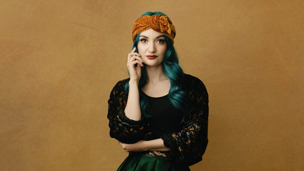
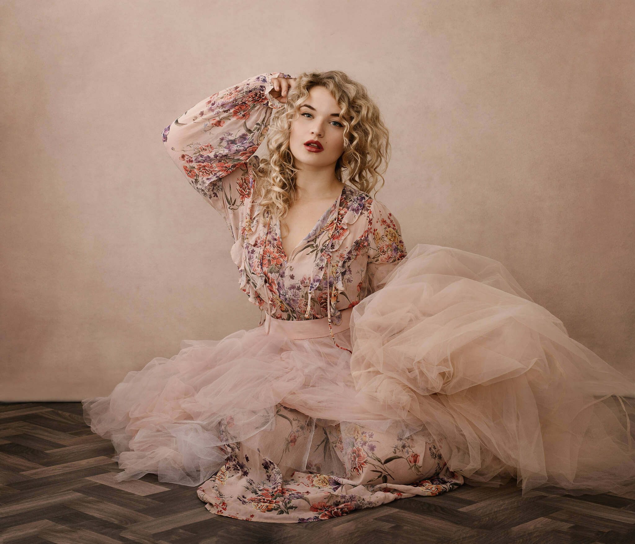
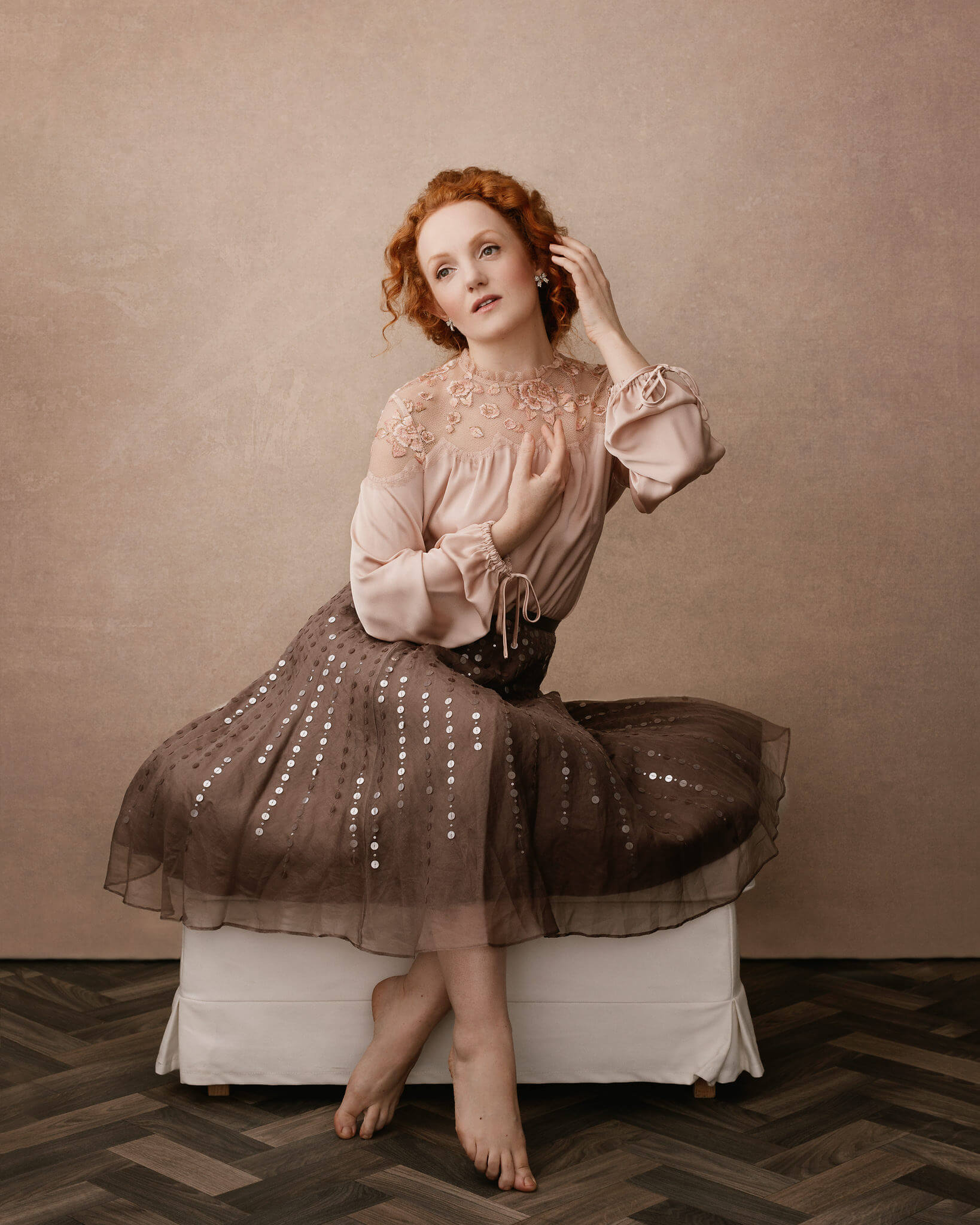
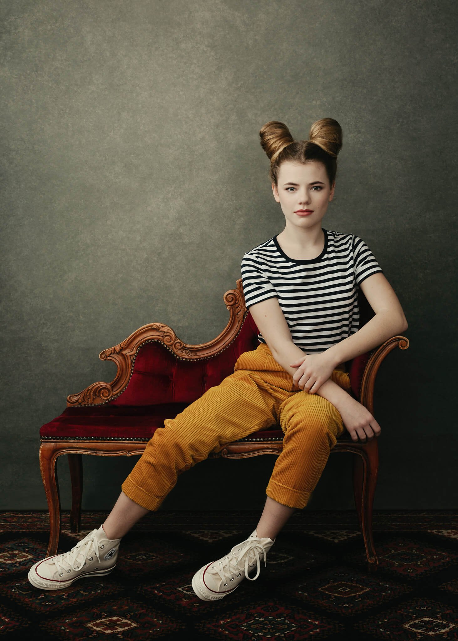
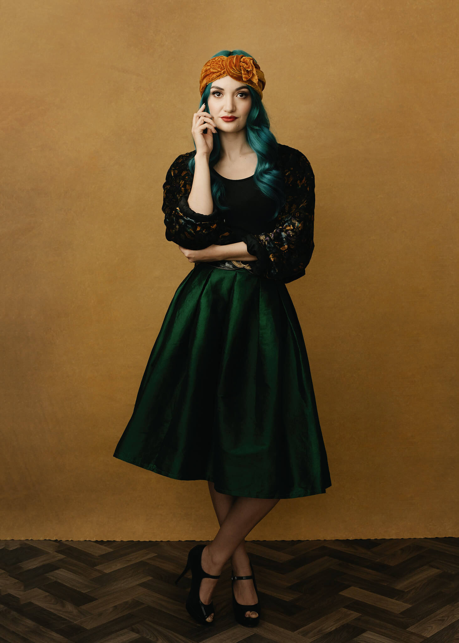
The inspiration for much of my work is old painted portraiture, whether it’s in the posing, furniture or colour schemes. My feeling is that the old masters’ pictures have survived and been revered for very good reasons, and I’m able to tap into that and be creative! We stand on the shoulders of giants in the history of art and design, and I’m happy to learn from the masters. I have a pretty decent selection of furniture, almost all of it thrifted, and I just try and match that up as best I can with wardrobe, styling, etc. Although I like to approach shoots with a good general plan, I can’t do it all myself, so I’m lucky to work with four hair & makeup artists, all of whom have a good eye for wardrobe, styling, colour choices etc. Over the years I’ve amassed a pretty good stock of backdrops, floors etc, so there’s a degree of flexibility and potential for plenty of variety.
When it comes to posing, many people find it difficult to position, and direction, people’s hands. It’s usually an indication of how comfortable someone is, and heavily influences how at-ease they seem. Do you provide much guidance when it comes to posing people’s hands or do you let them do what they want?
This is a, really important point, and people definitely communicate any kind of discomfort or self-consciousness through their hands! I photograph mostly professional performers (singers, actors, models etc.) so they’re generally used to thinking about hands, and know their angles. For clients who aren’t used to being photographed much, they do need help with how to place hands. I keep any posing direction simple, and with hands, I try to limit it to positions that people would do naturally (outside of a shoot situation), and make sure that they don’t have any ‘defensive’ hand posing.
Your color choices seem very deliberate on set, is it the same in post-processing; do you always know where you want to go? How do you decide?
Yes, the colour schemes for my shoots are almost the first thing I think about. I try to have as much input into wardrobe choices as I can (not always possible with clients, but it’s generally not an issue). Clients will often have a range of choices which I can help them narrow down, or in some cases, they’ll be purchasing wardrobe especially for the shoot, in which case there is even more freedom. My colour schemes are based around old, time-honoured methods: mostly via a cardboard colour wheel (like the ones they give you at school). I most use triadic colour schemes, a single dominant colour, or complementary colour pairs. I also like to consider fabric textures. If you’re shooting a set which is mostly a single dominant tone, breaking up the textures is an important way of avoiding a ‘mushy’ and indistinct look.
As a part of our community, what are some of the reasons you use the Infinite Color Panel? Has it done anything for you that you wouldn’t have expected, prior to integrating the Panel into your workflow?
I’m pretty much obsessed with colour and feel that it has the potential to inspire an almost limitless range of emotional responses! With the colour grade in all my images I like to begin with a broad tonal palette and decide if I’m going for warm or cool tones – I’m naturally drawn to a cooler palette, but that’s just personal preference. With Infinite Color, I’m able to really refine the grade and produce a unique look for each shoot. I love the fact that I’m able to save ICP layers stacks within the Photoshop Library: it means I can bring the ‘vibe’ of one shoot to something else later on. An area that I always have to be careful with is colour saturation: if I’m not careful I have a tendency to over-saturate at times. The ‘Harmonize’ feature of ICP is a very good way of pulling me back from my worst saturation crimes!
What is your favorite feature of Infinite Color?
The thing I find amazing about it is its ability to randomise parameters in Photoshop, and actually return usable results. I like to use it as a final polish to my work. I find that, if I’m not careful, I can slip into making ‘habitual’ decisions about colour work. Infinite Color helps me to avoid that by providing me with a wide selection of other choices.
Do you a favorite adjustment layer that you like using a lot? If so, why?
For colour work I tend to make most use of the Selective Color and Color Balance layers. Selective Color is very powerful for working with skin, so I add and remove tones from the reds and yellows to get the desired skin tone.
_
Have you tried the panel yet? We’d love to see your creations! Get in touch on Instagram @infinitecolorpanel or the Facebook Infinite Color Panel group and show us your work.
If you haven’t tried the panel yet, get started here: https://infinite-tools.com/infinite-color-plugin/