
Insights curated by Pratik Naik & Brandi Nicole
We’re happy to introduce a brilliant artist, and recent addition to the Infinite Color digital community, Erika Barker. Her fearless use of color and coloring, and story from combat photojournalism to fashion photography is so inspiring to us! We think that you’ll enjoy Erika’s work as much as we do!
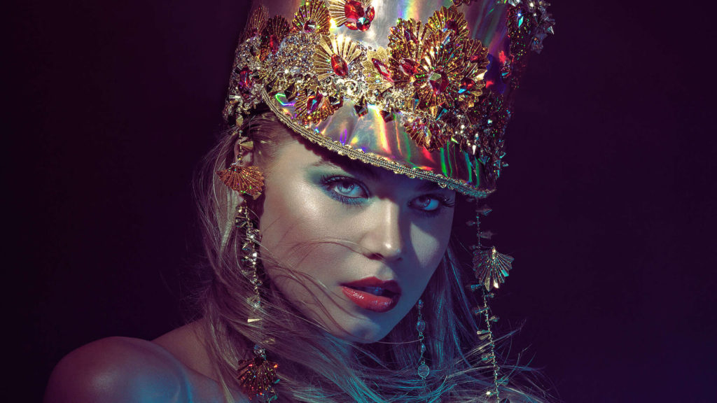
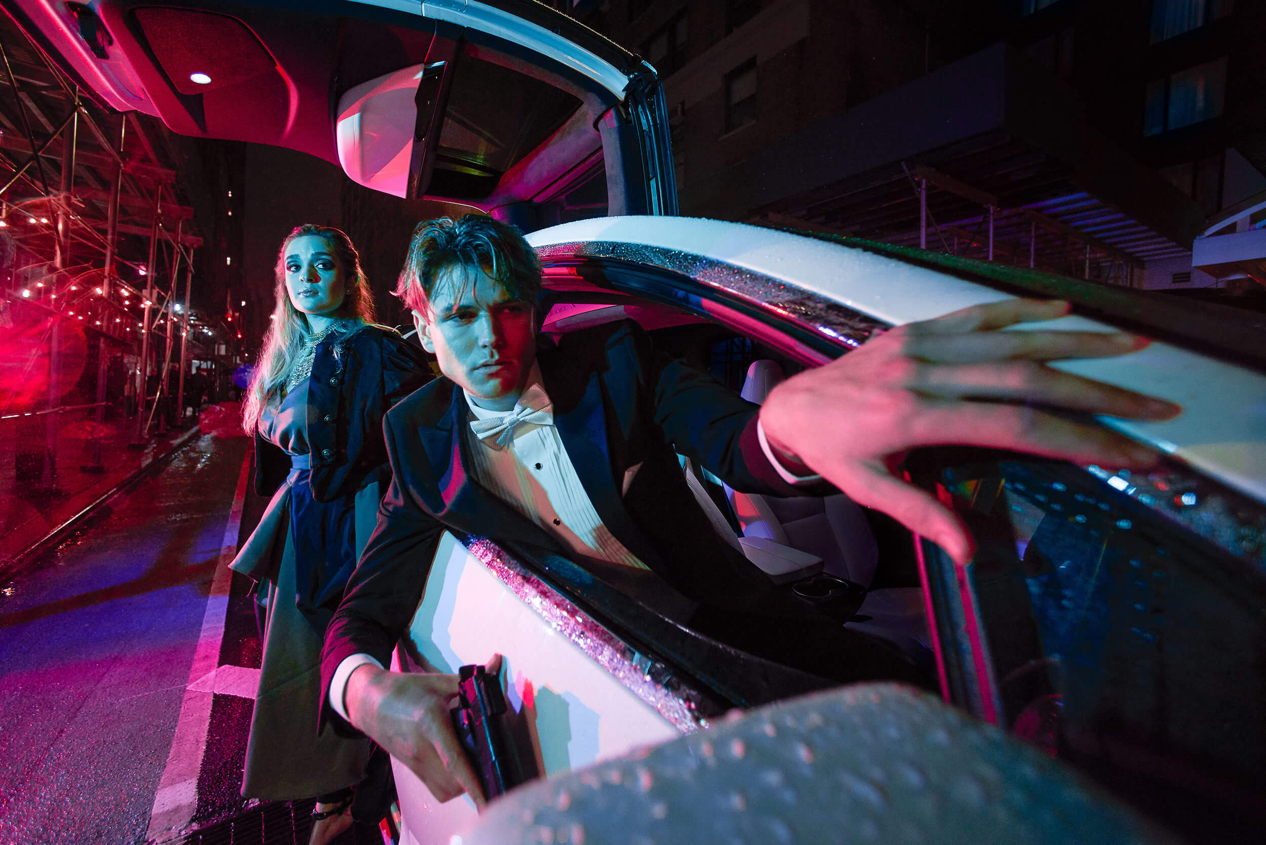
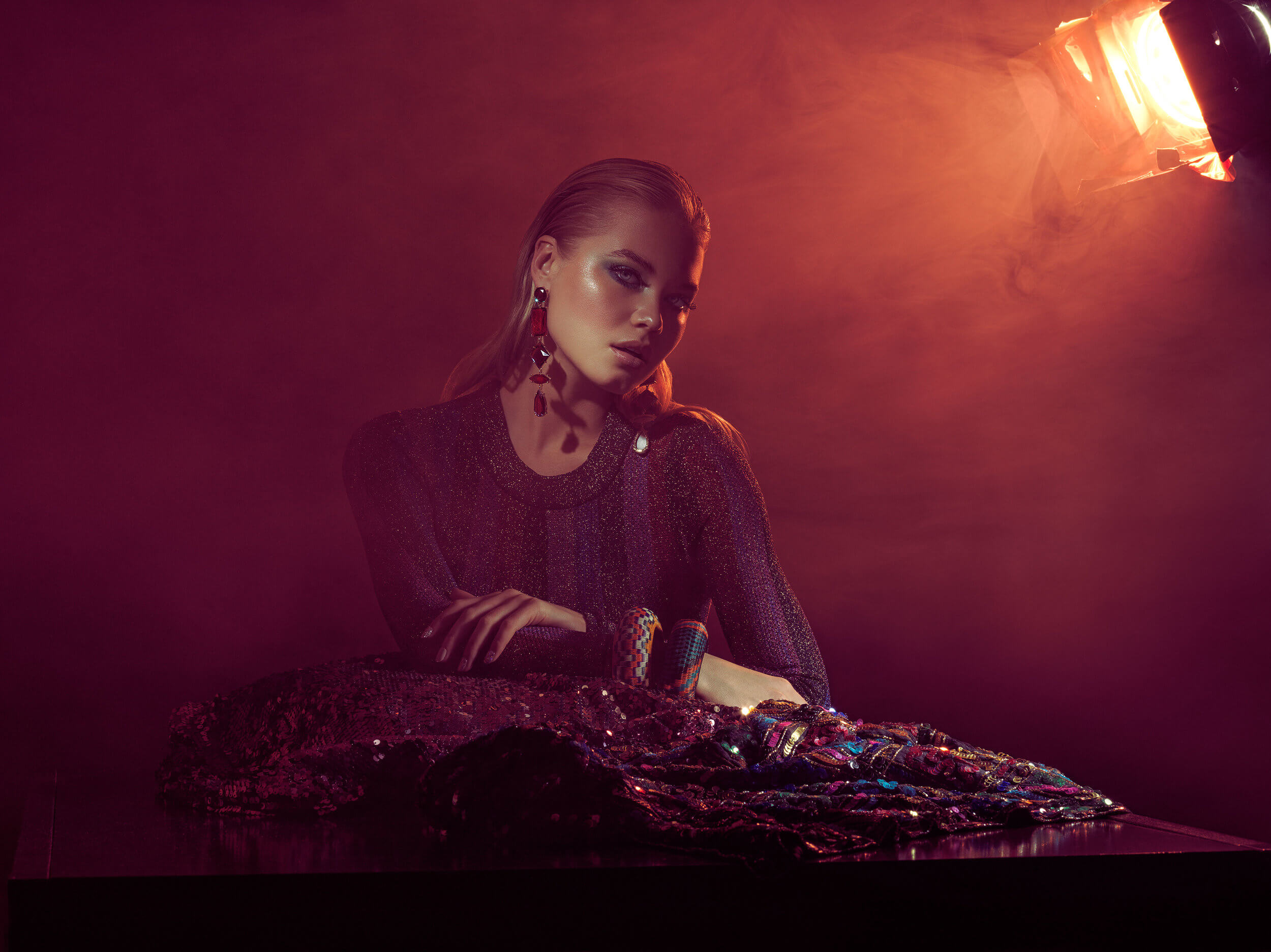
Before
With Color Grading
I started photographing as a hobby when I was in my Video Production class in 1996. Honestly, my passion at that time was behind a video camera. I, however, had a generic Kodak point and shoot camera, and had to practically beg my parents to pay and have the film developed at our local K-Mart or Eckerd’s drug store (Now known as CVS). By 1998, my young ADHD mind shifted focus toward the internet, and I started designing websites on the side. At this point, I just kept photography solely as a hobby. It was not until I joined the military in 2004, where I would learn photography as a profession, and have a wonderful mentor who would show me how one powerful photo could change the world.
I would describe my style as shamelessly nostalgic, consisting of a tribute to my childhood in the 80s and 90s, painted with an array of vivid colors and composed of moments that tell a compelling story. In other words, I really like colorful photos, and I find great inspiration from great photographers such as Mert Atlas / Marcus Piggot, Ben Hassett, Steven Klein, and Mario Sorrenti.
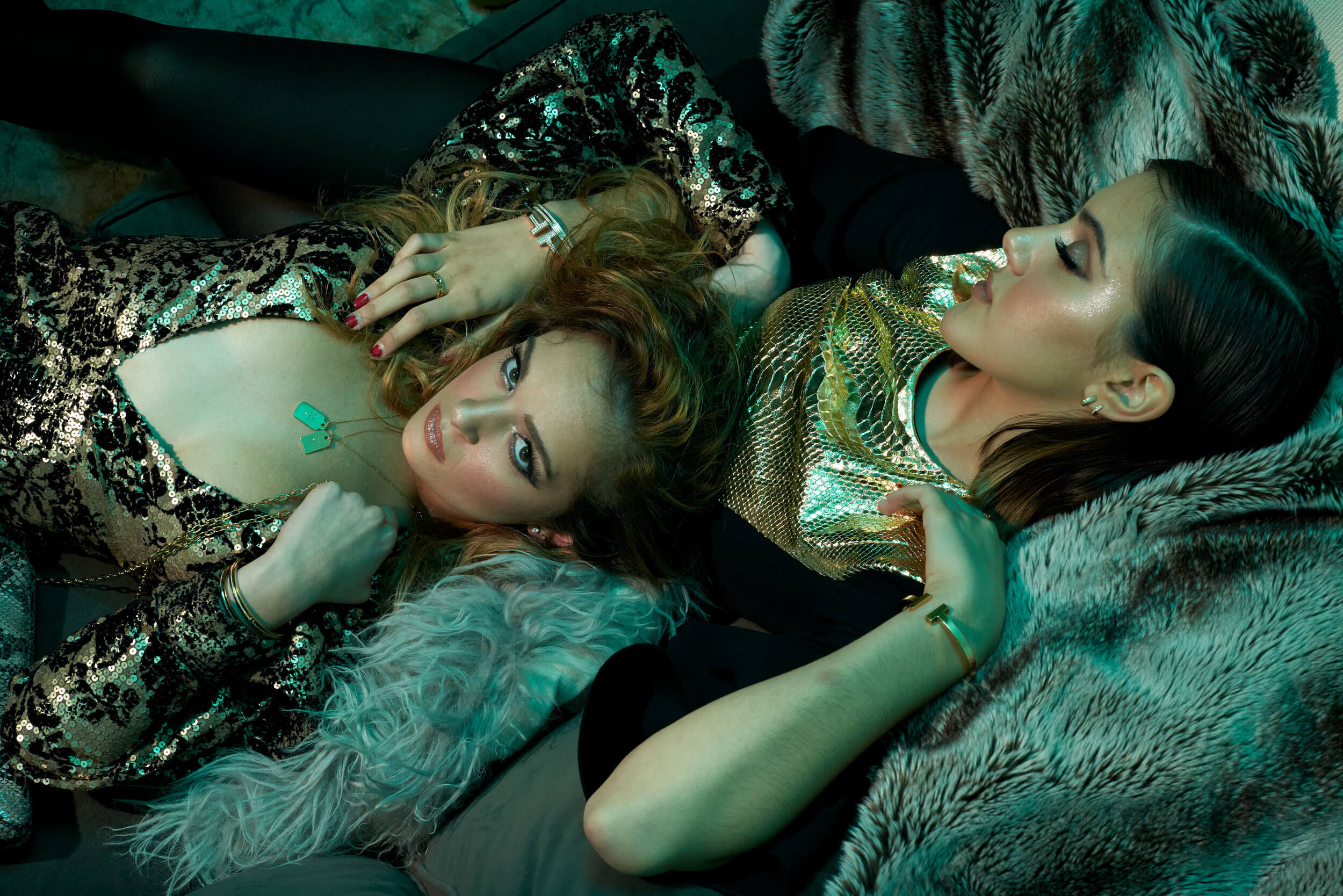
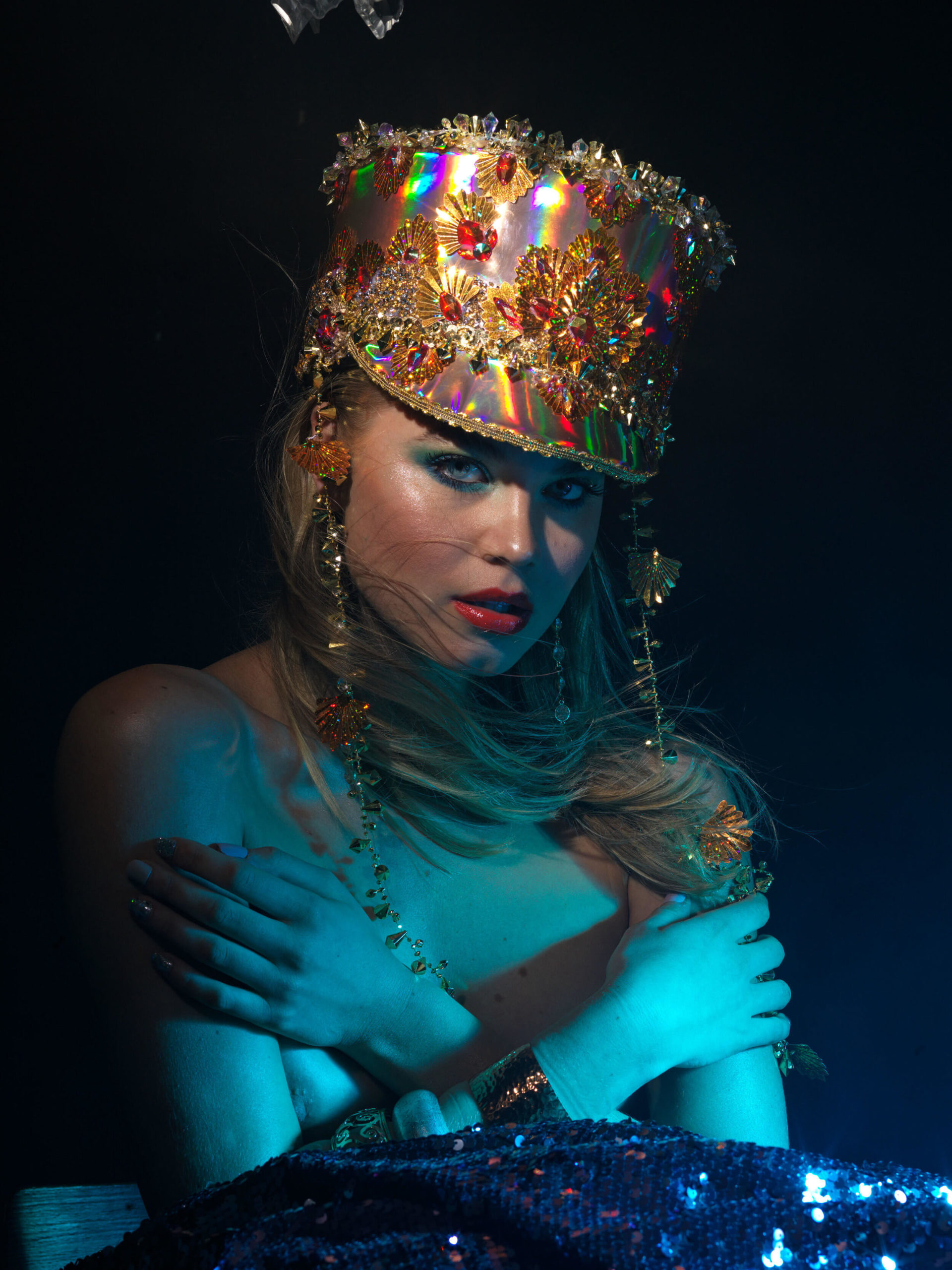
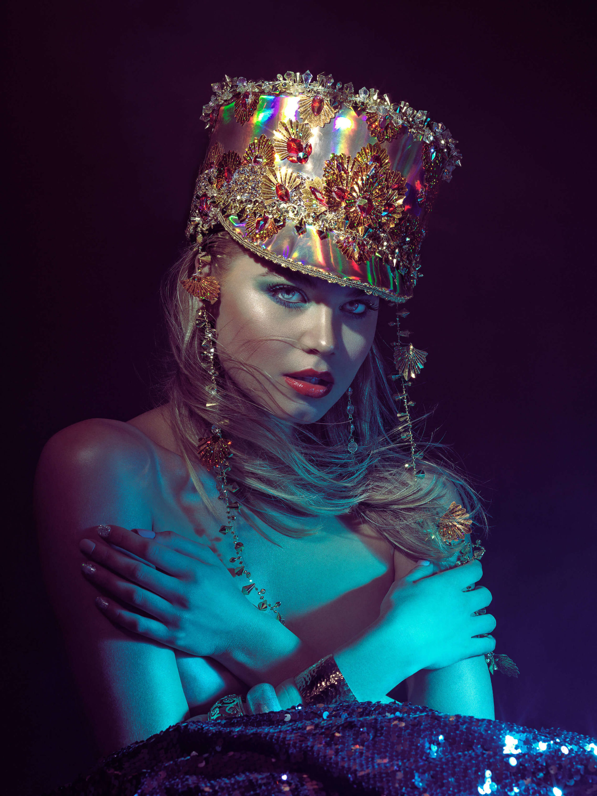
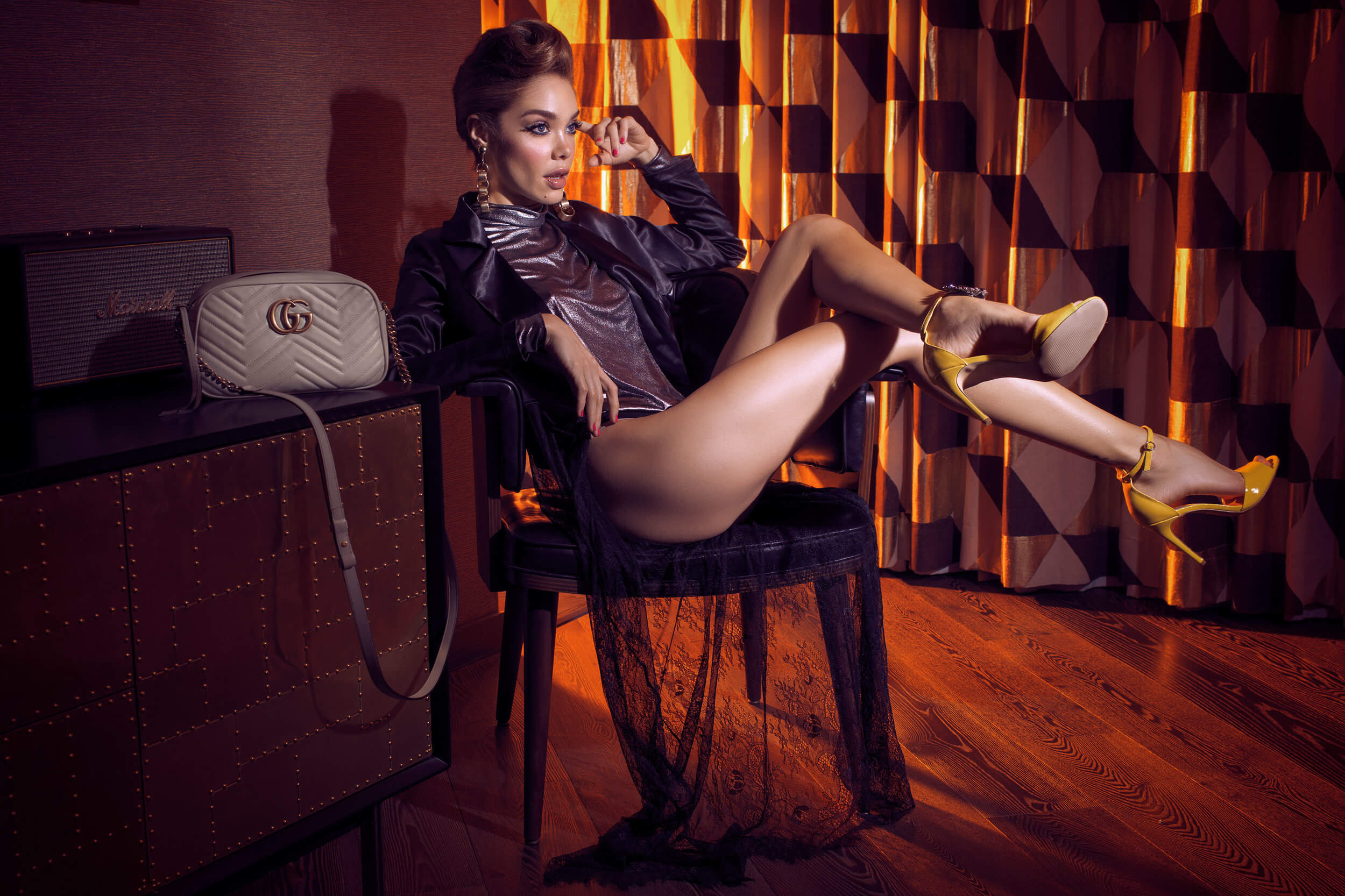
Before
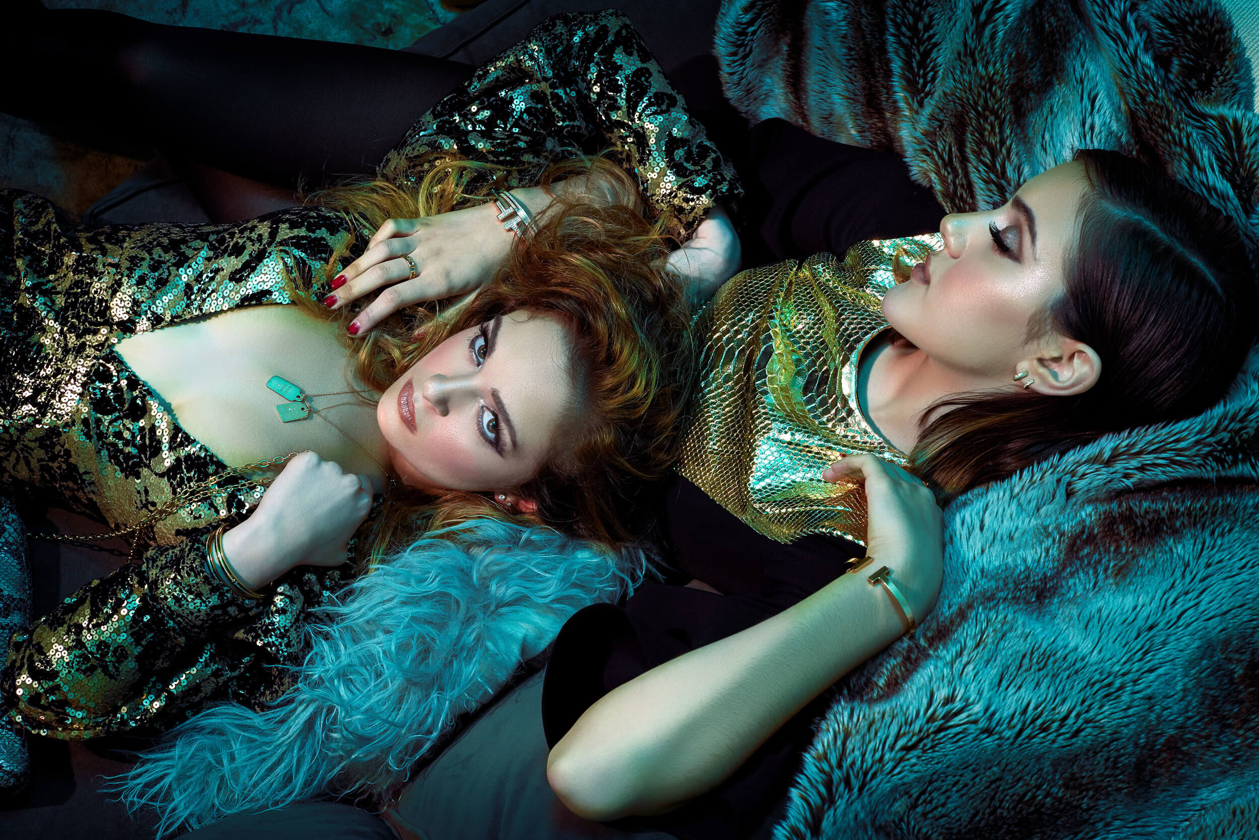
With Color Grading
When I first came to Combat Camera, I had a bit of an ego because I was a bit of a Photoshop prodigy compared to these old salty sailors who were photographing on film and bickering about the movement to digital. In my young egotistical mind, I thought photography was a piece of cake, yet, I had no idea how to shoot outside of Program. I honestly just thought it was taking photos with sleek angles, and photoshopping the crap out of it. My mentor, Bobby McRill, who was also my boss, slapped me (metaphorically) behind the head and called me a shit-stick. He spent months mentoring me and made me cry at one point when I finally learned what the art of photojournalism really was. He introduced me to legendary photographers like Eddie Adams, Robert Capa, and Joe Rosenthal. To go through their photographs, read the captions, and learn about the outcome of millions of people around the world seeing these photos is breathtaking… It’s incredibly powerful, and it’s storytelling at its finest.
We, unfortunately, lost Bobby July 6, 2007 to an IED in Iraq. He died doing what he loved most. From the moment I carried his casket to the church service, I decided to tribute my career to him. He is the reason I pick up the camera, and he is always kicking my butt and pushing me to be better. If it was not for Bobby, I would more than likely be a UX designer today (No offense to UX Designers).
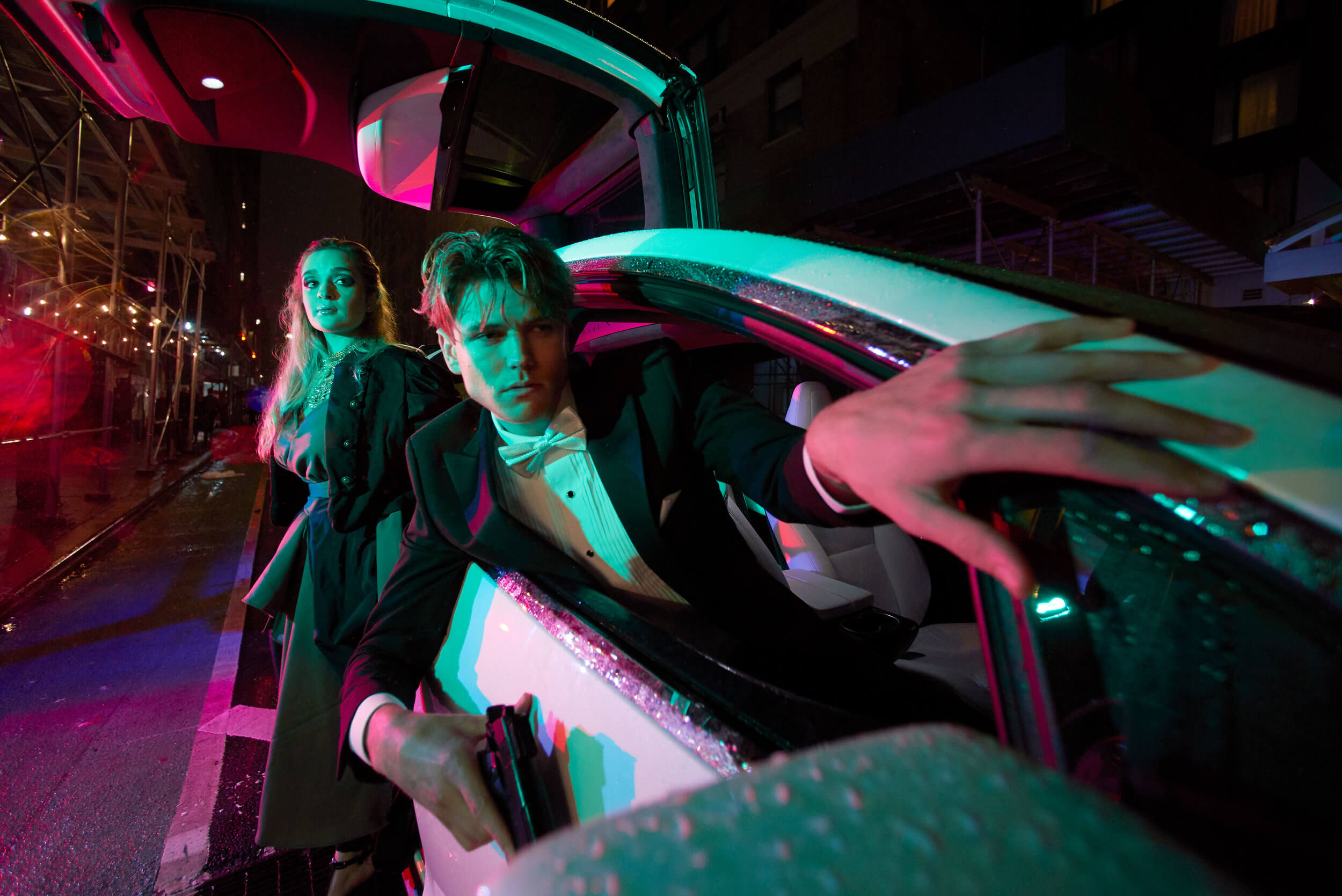
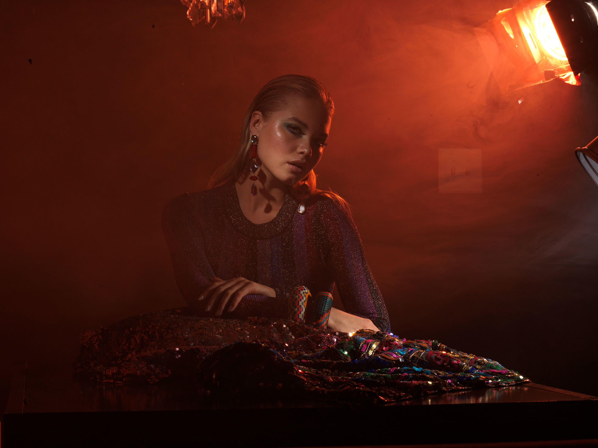
Before
With Color Grading
I transitioned from photojournalism to commercial when I left the military because I have always been fascinated with blending photojournalism with my love of art and design. I wanted to see if I could bring something new to the table with lessons from my past. Why choose one path when you can walk several at the same time?
I do a lot of personal projects with my good friends Charlie Riddle, and Henry De Lapaz. Charlie and Henry have worked on everything from Vogue Editorials to Tom Ford and Gucci ads I believe. The three of us make up a team we call Team Fabulous (It’s a silly nickname I came up with while drinking martinis). We work together and create editorials for fun, just to push the envelope a little. I can honestly say without them, my portfolio would be nothing. We all bring something unique to the table. I want to tell you more about what we have coming up, but you know the old saying “Loose Lips Sink Ships.”
Before
With Color Grading
I first learned about Color Grading while watching the DVD extras for the Cohen brother’s film, Oh Brother Where Art Thou. The production filmed it during Spring and Summer, but the Cohen Brothers wanted the film to have an old-time gritty-depression look. They shifted all the bright greens to yellows, browns, and reds, and gave the film its signature look. The film would definitely not be the same story, without the incredible artists who color graded it. It leaves you to conclude that the right color combination is really powerful stuff. It’s like Dynamite, but you got to know how to handle it. It’s honestly not something you can wing, and an intuitive understanding of color harmony is a must.
These days I try to keep my hands off of retouching and focus on being a photographer and videographer. I’m someone who has a hard time sitting in an airplane seat for two hours, let alone sit behind a computer for hours at a time. I’m not sure how brilliant photographers like Julia Kuzmenko photograph and retouch. Not me, I’m too antsy. It tests the limits of my sanity. Perhaps I should slow down on the caffeine a bit.
I, however, do need to be involved with the final touches of the photo. Before the Infinite Color Panel, I would sometimes spend 2-3 hours just playing around color grading a picture, going back and forth, and the indecisiveness was just not healthy. That’s time I could spend with my family, in a gym, or blissing out watching Netflix on my fantastic couch. Time is such a valuable thing and it does not really hit you on how precious it is until you are in your mid-thirties. Anything I can do to optimize my workflow, and deliver stunning visuals is a must. Infinite Color Panel helped me do just that.
My new workflow with Infinite Color Panel consists of the following:
1.) Receive TIFF or PSD back from the retoucher
2.) If using gels, I will more than likely create a Vibrance adjustment layer and pop the colors everywhere except on the skin, eyeballs, and teeth. Adjust Vibrance at your own risk.
3.) Use the Harmonize feature on Infinite Color Panel
4.) Tweak the opacity of the Midtone, and/or Shadow Harmony Layer.
5.) If suitable, I will play around with Light Color Grading options from the Panel, but this is very rare for my photos where I use gels. This is more for shots with natural light or lighting with no gels.
6.) From here, I will merge all visible layers into a new layer and converting it into a smart object. (Note: that I am not flattening my image.)
7.) While selecting the new smart object layer, I go into the Camera Raw Filter, slightly increase Clarity to about +8, and adjust and make some very minor exposure adjustments. Since it’s a smart object, I can always go back in and change my settings.
8.) Finally, I sharpen the image if needed, and off it goes.
Boom! this process takes about 15 minutes or less.

Before
With Color Grading
Follow Erika on Instagram or browse more of her work on her website.
Have you tried the panel yet? We’d love to see your creations! Get in touch on Instagram @infinitecolorpanel or the Facebook Infinite Color Panel group and show us your work.
If you haven’t tried the panel yet, get started here: https://infinite-tools.com/infinite-color-plugin/