Category Archives: Inspiration

Creative conversations: Raw emotion with D’artagnan Winford

“I would create if I didn’t have a camera. I’d create if I only had a stick and mud.”

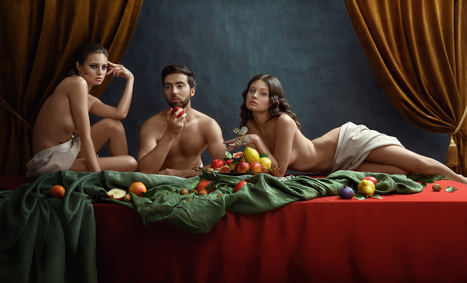
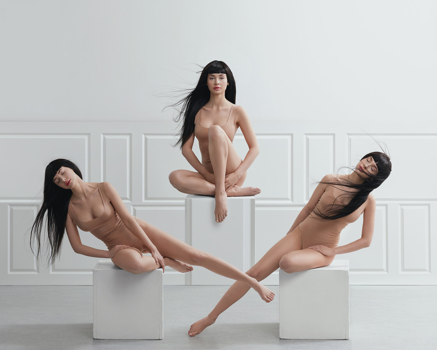
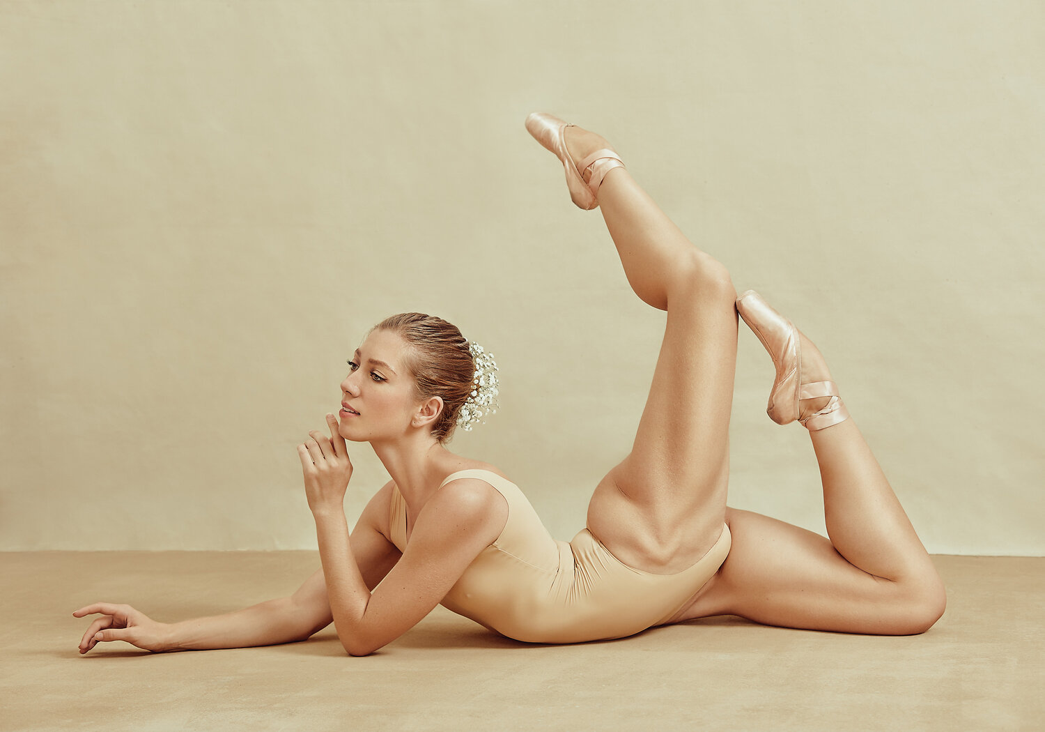
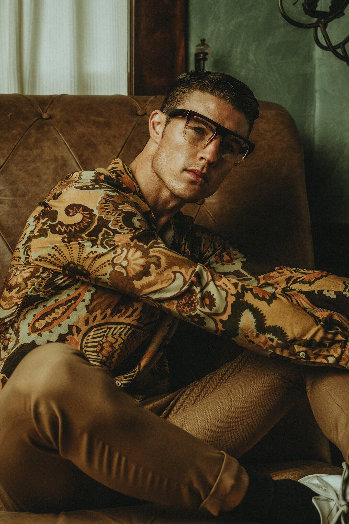
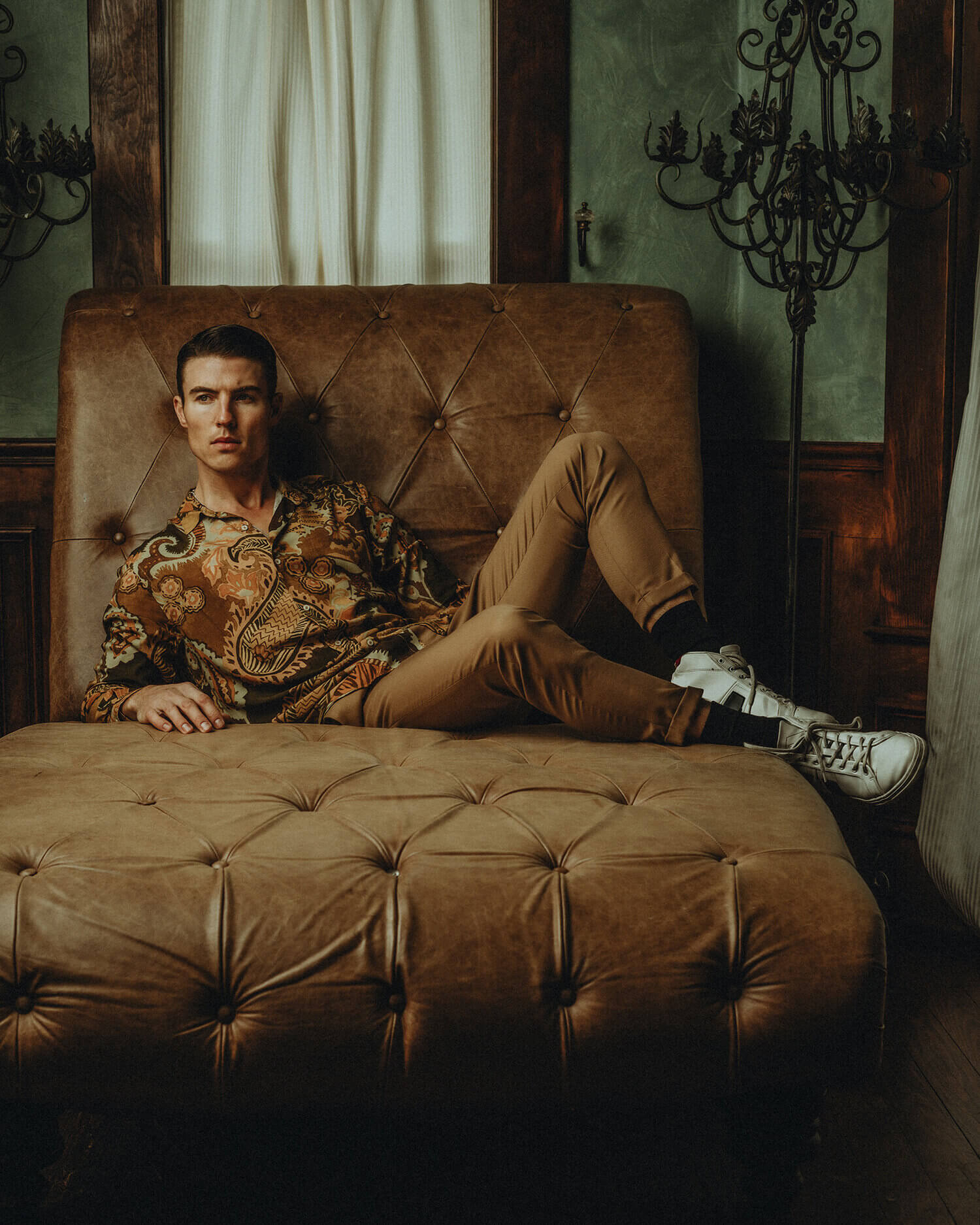
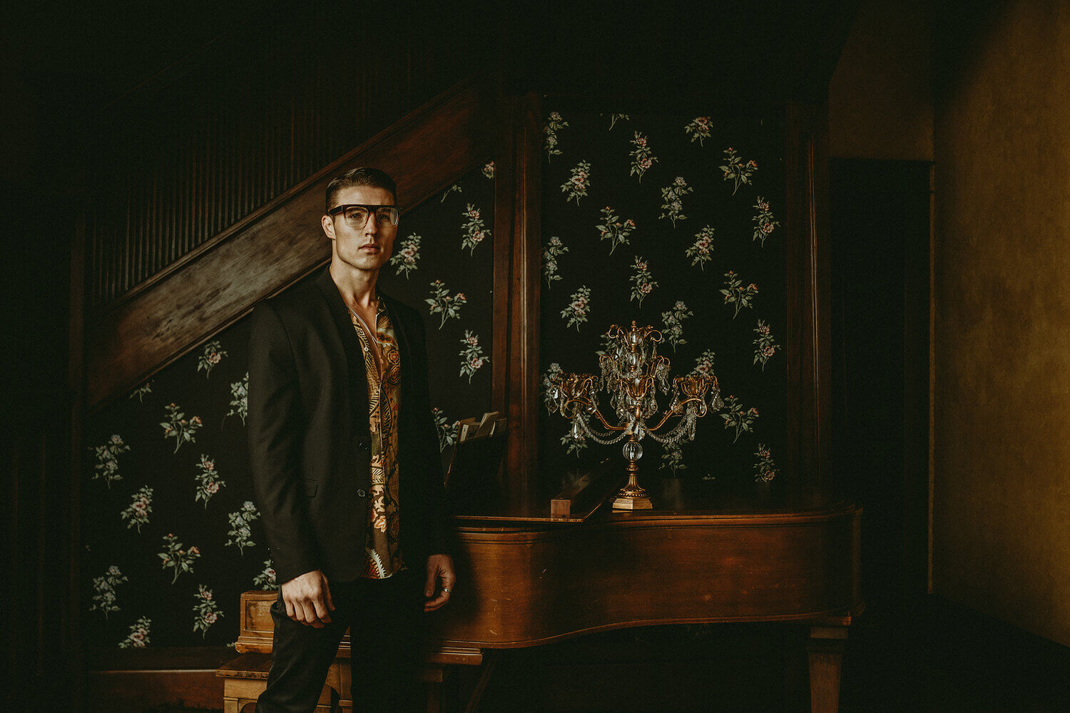
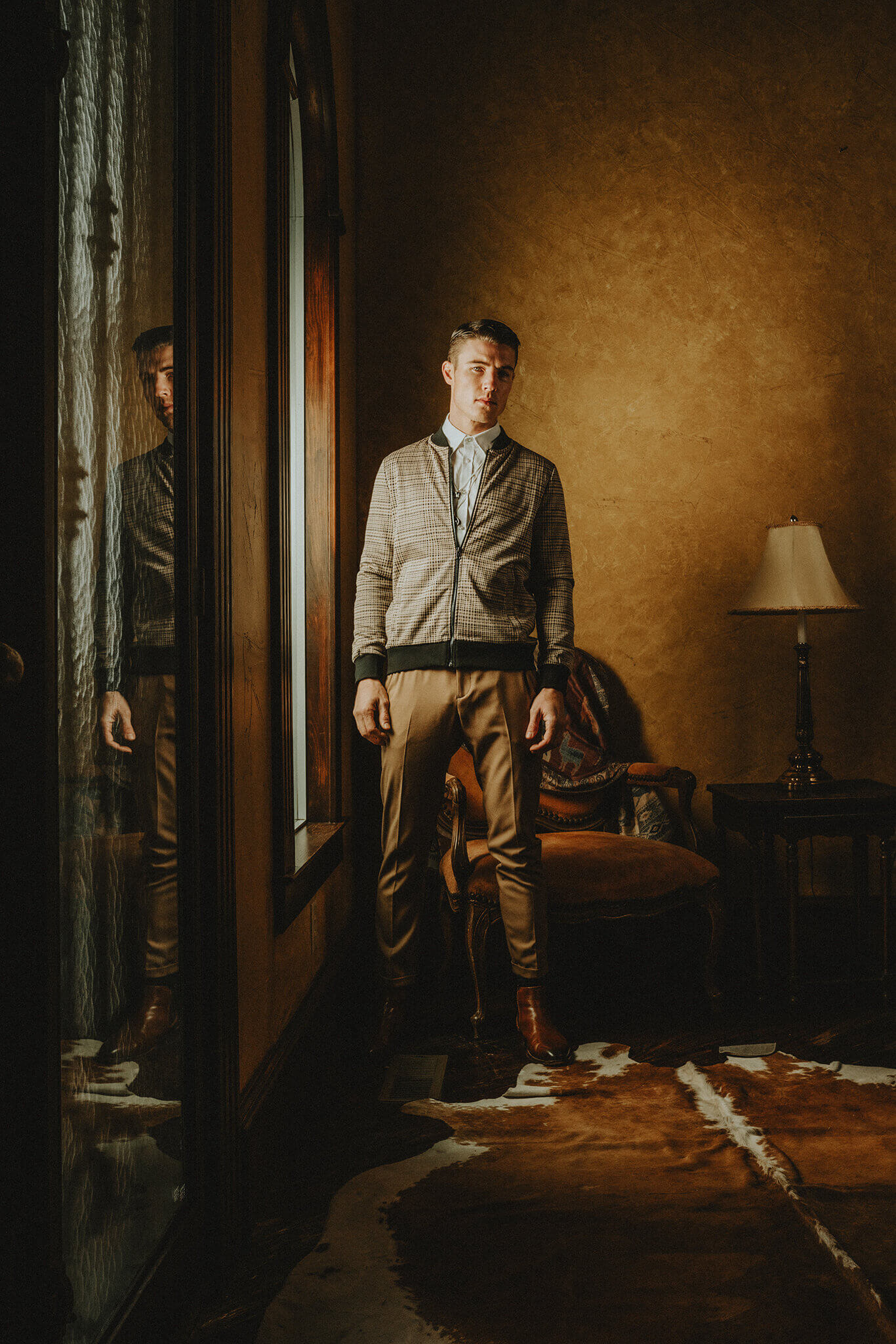
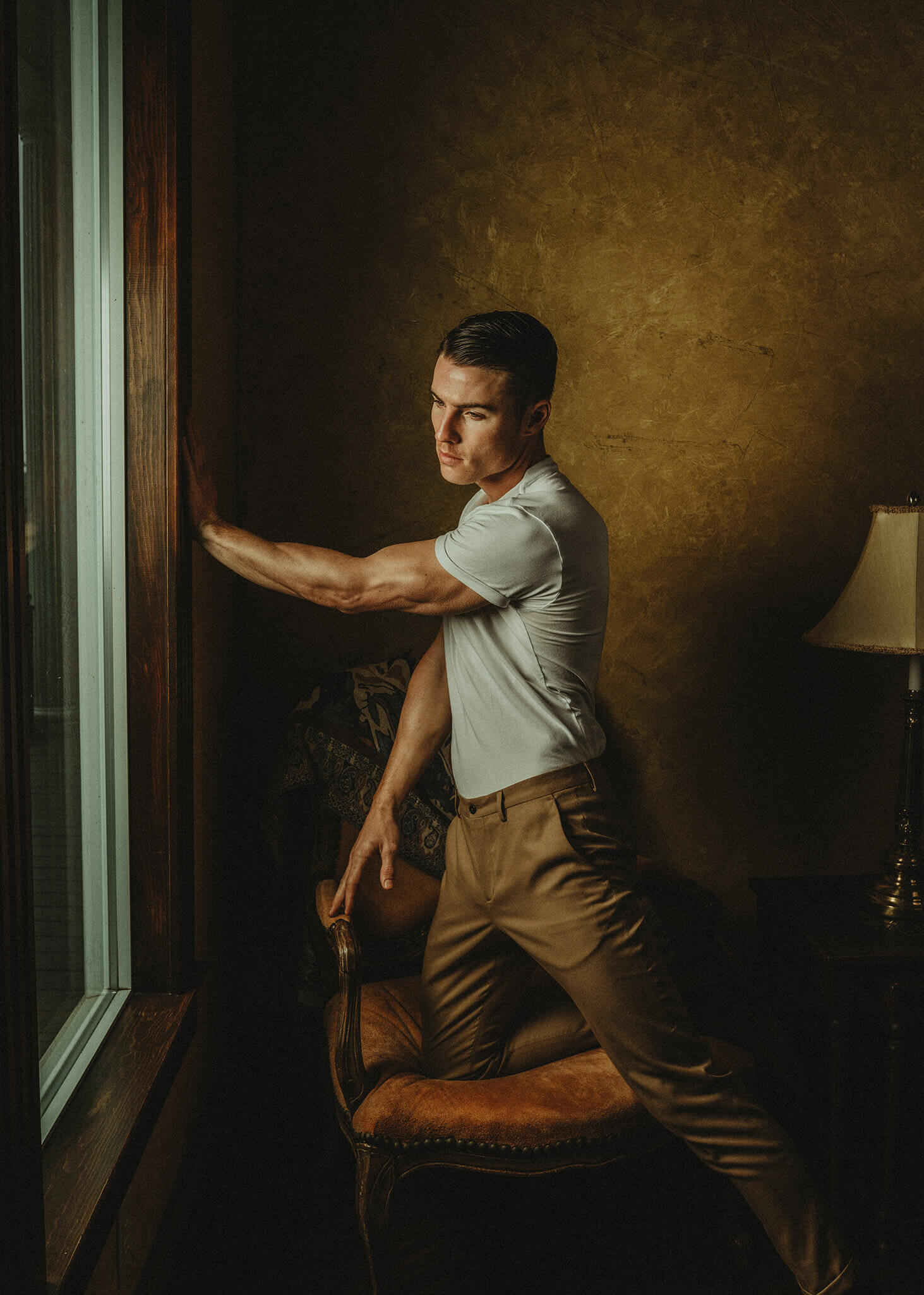
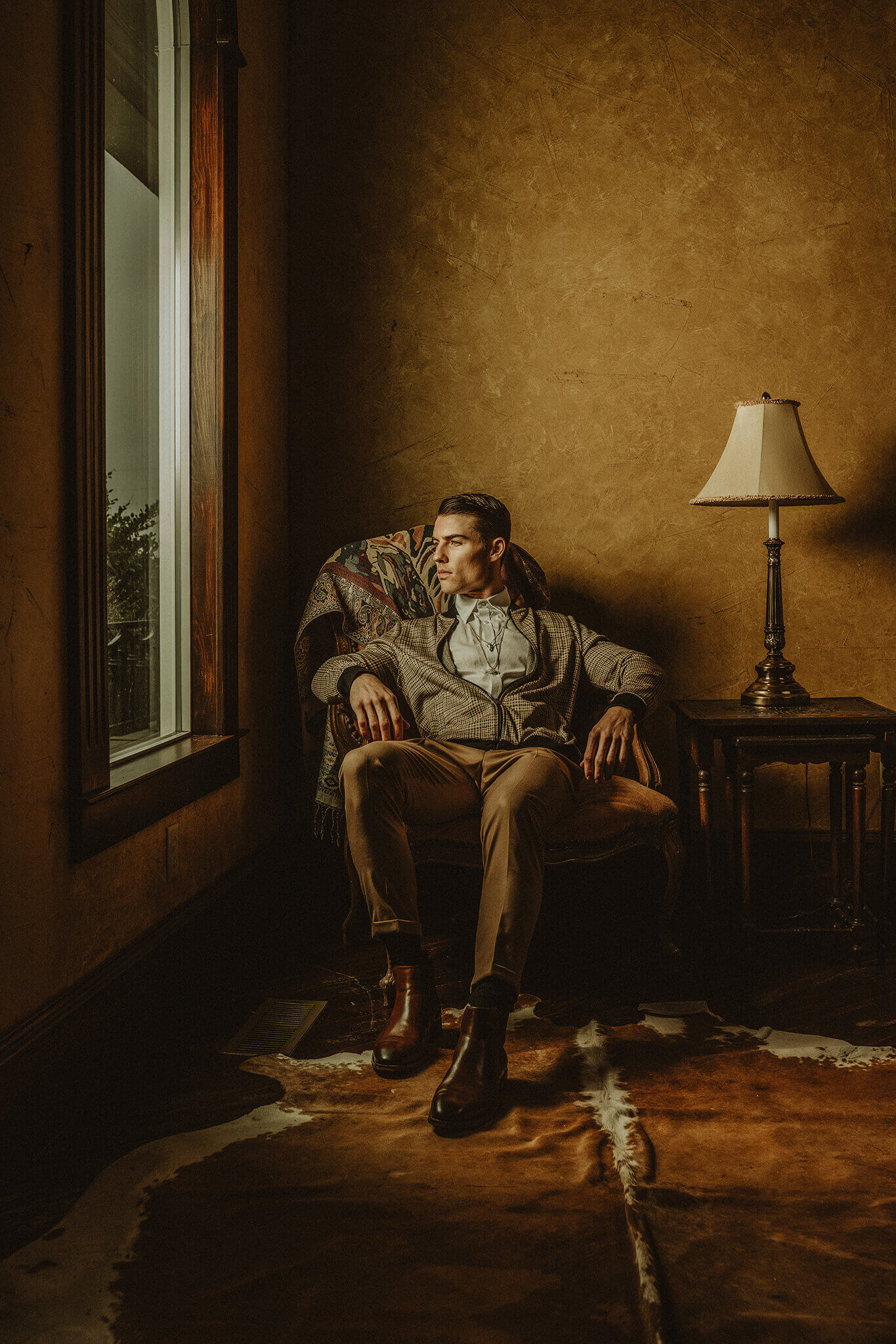
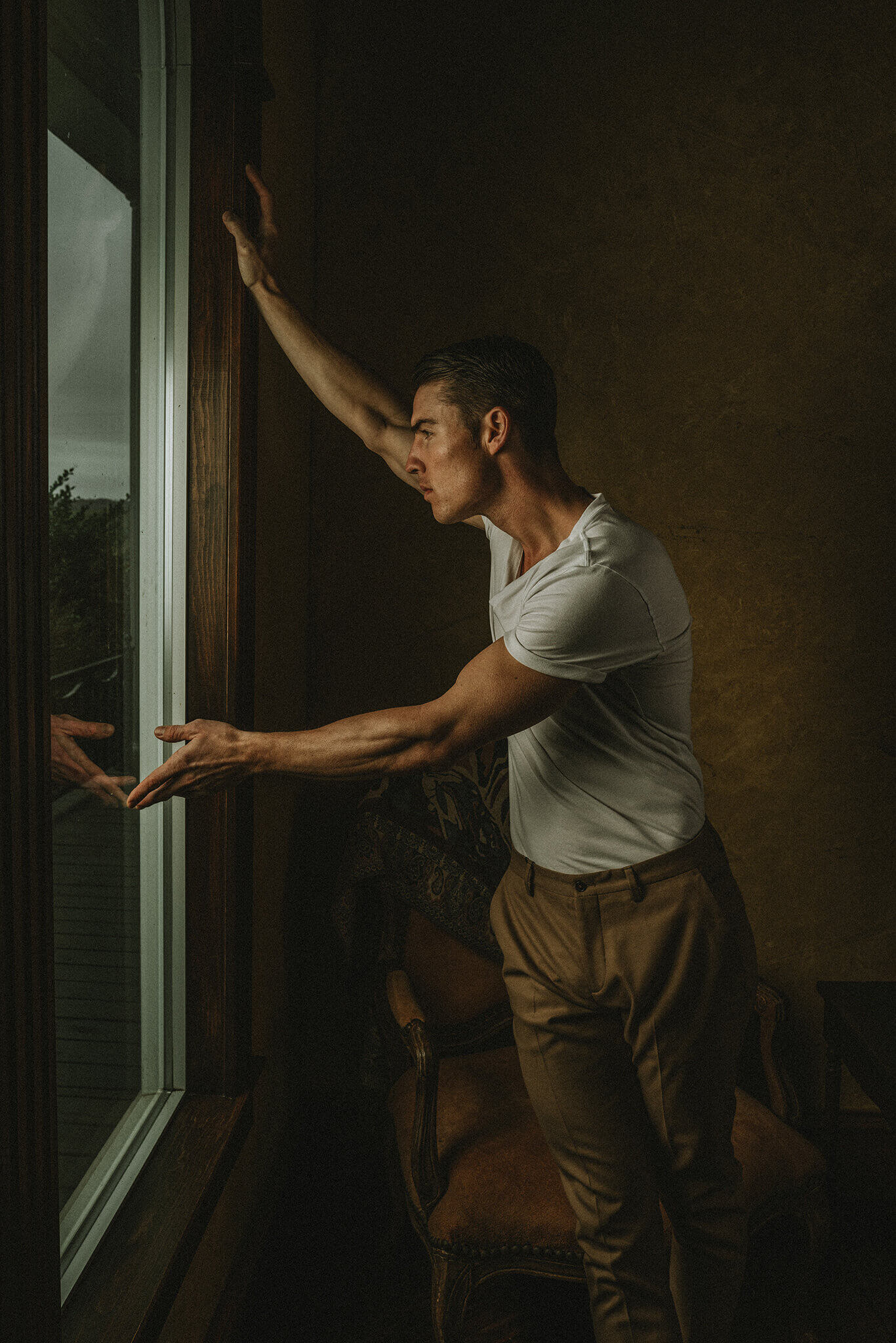
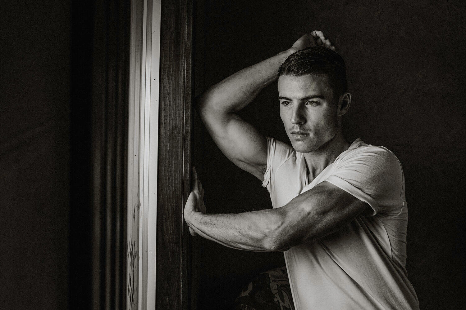
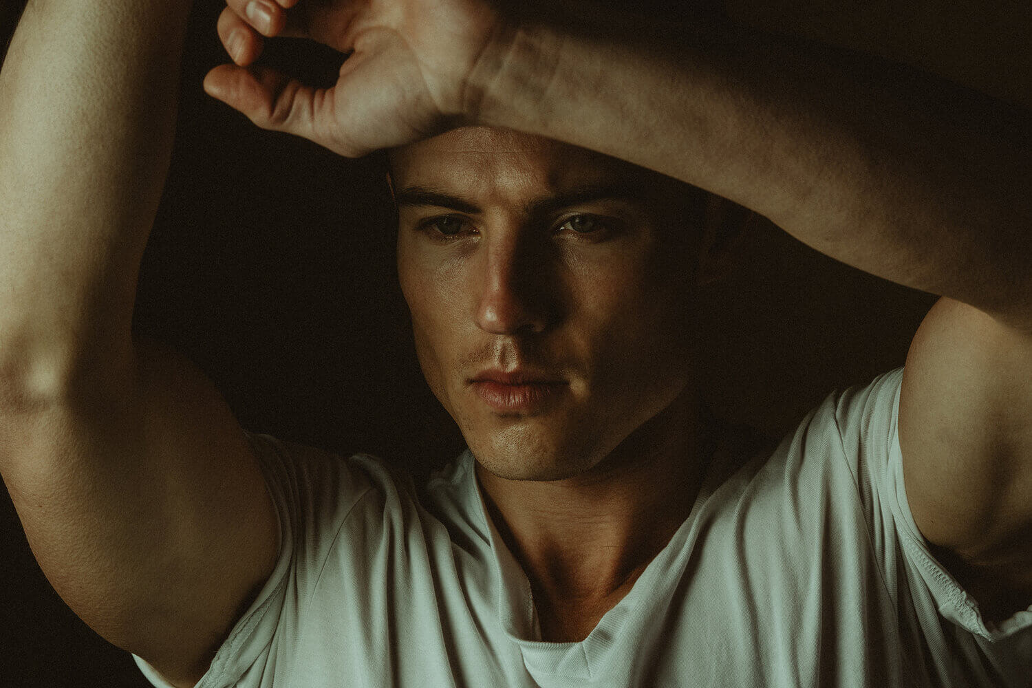
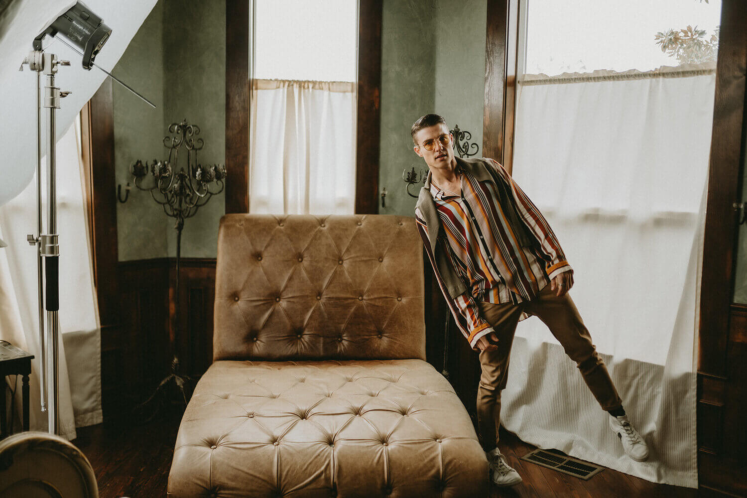
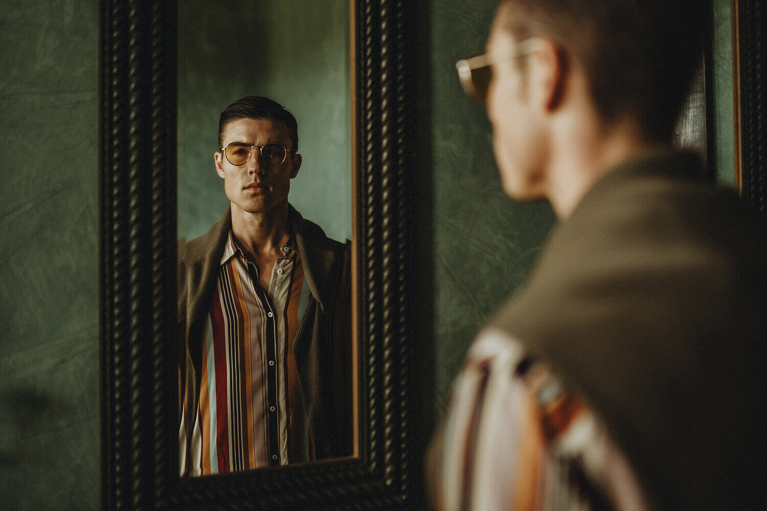
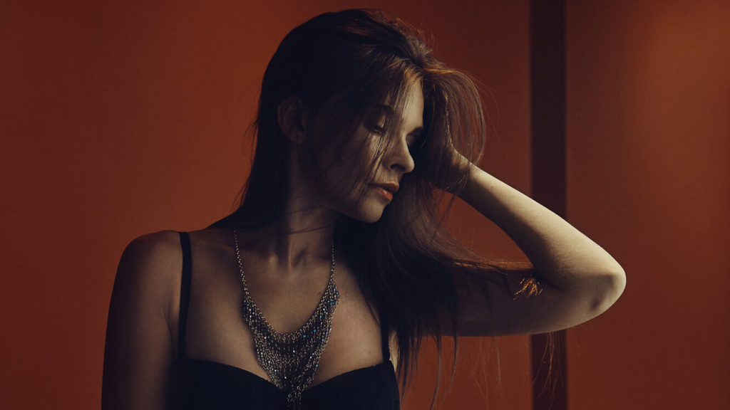
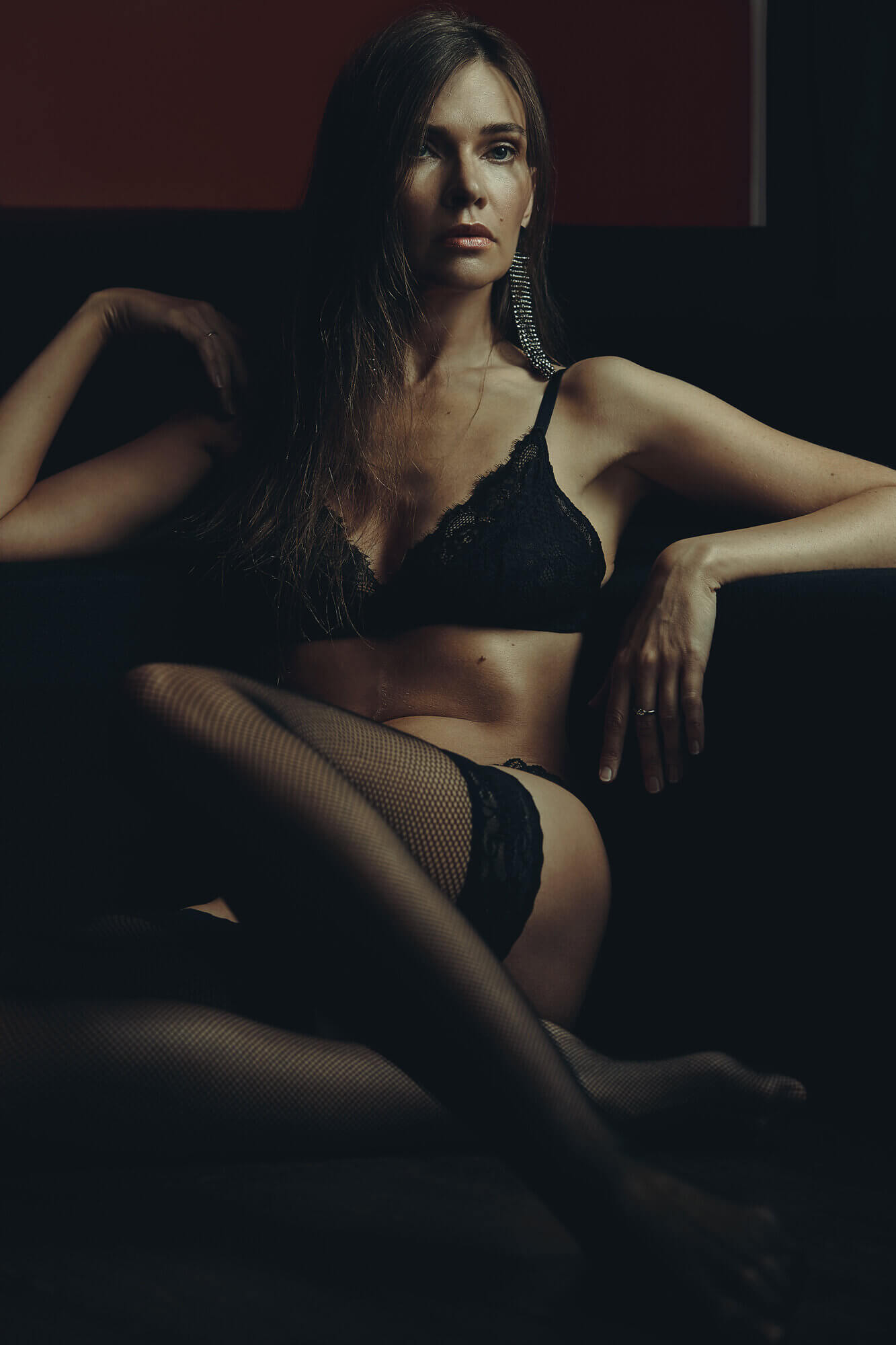
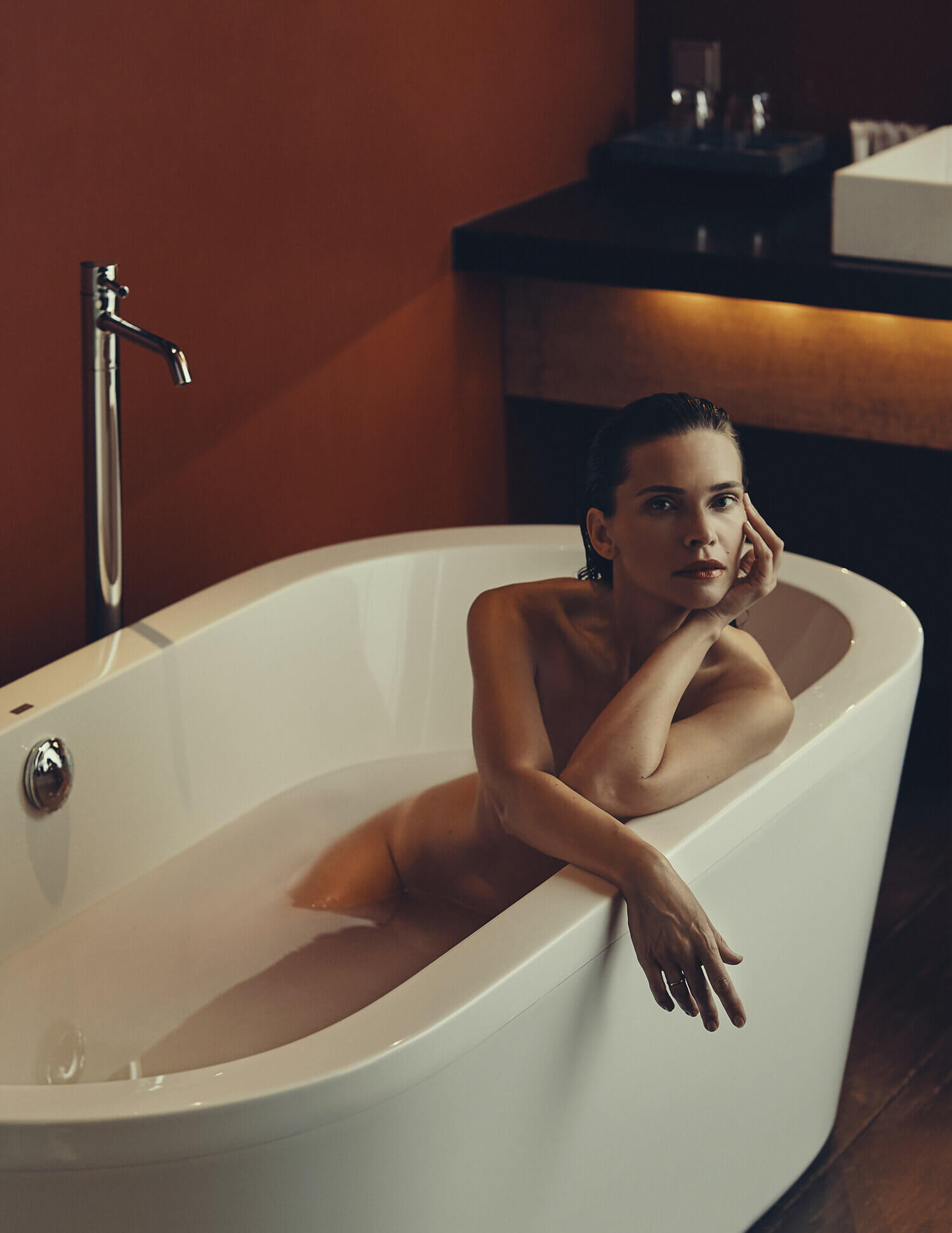
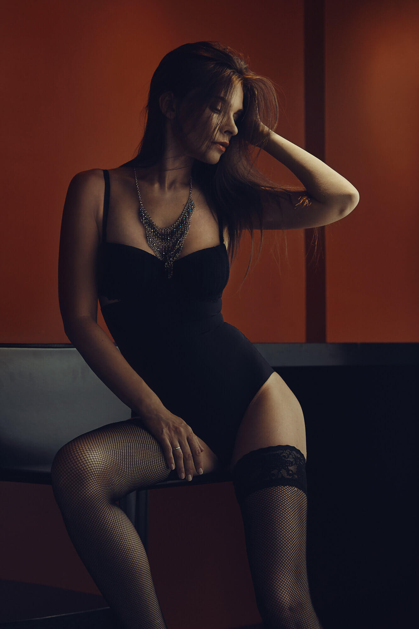
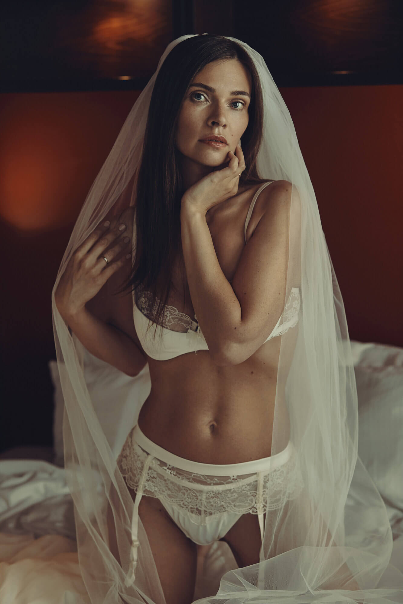
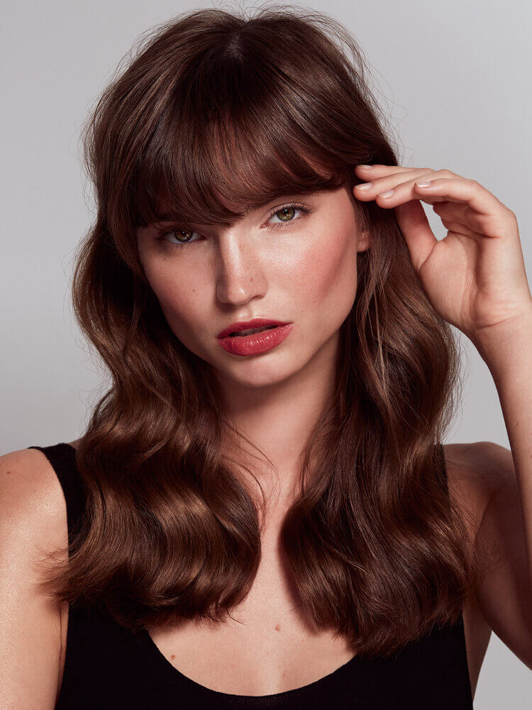
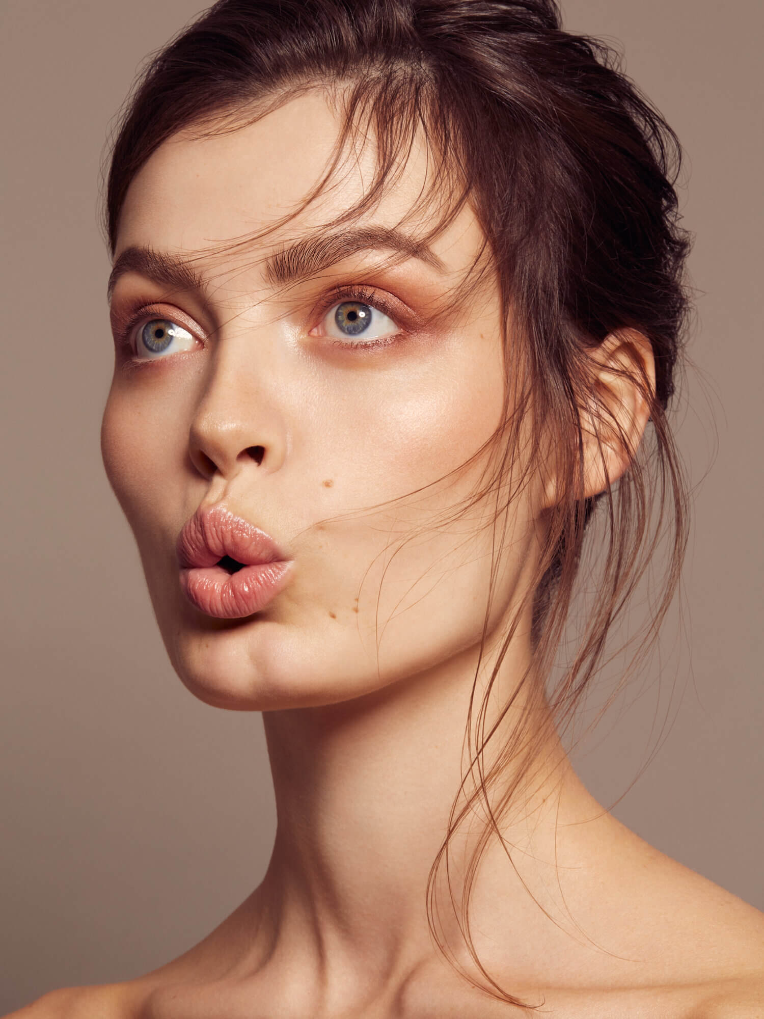
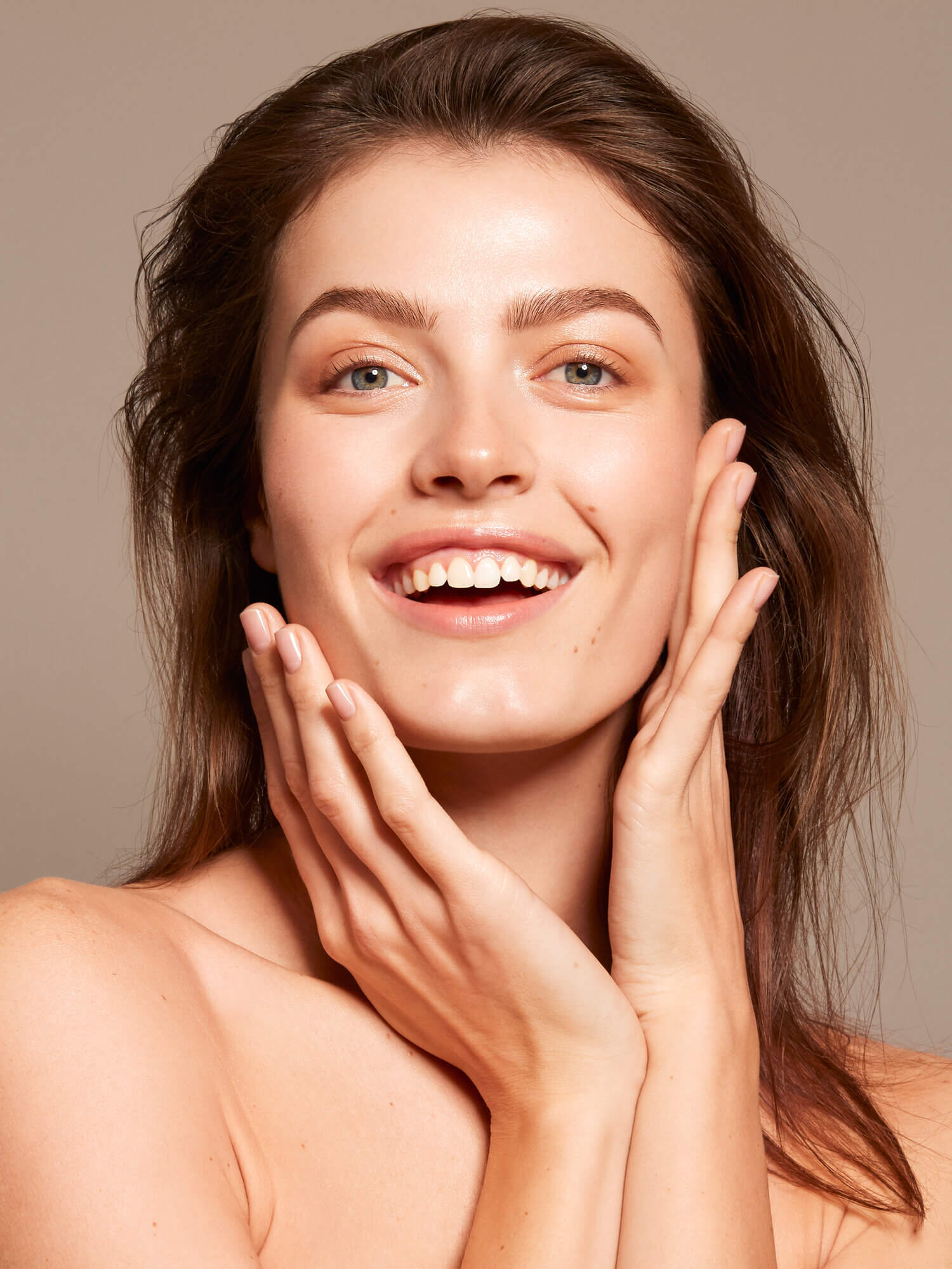
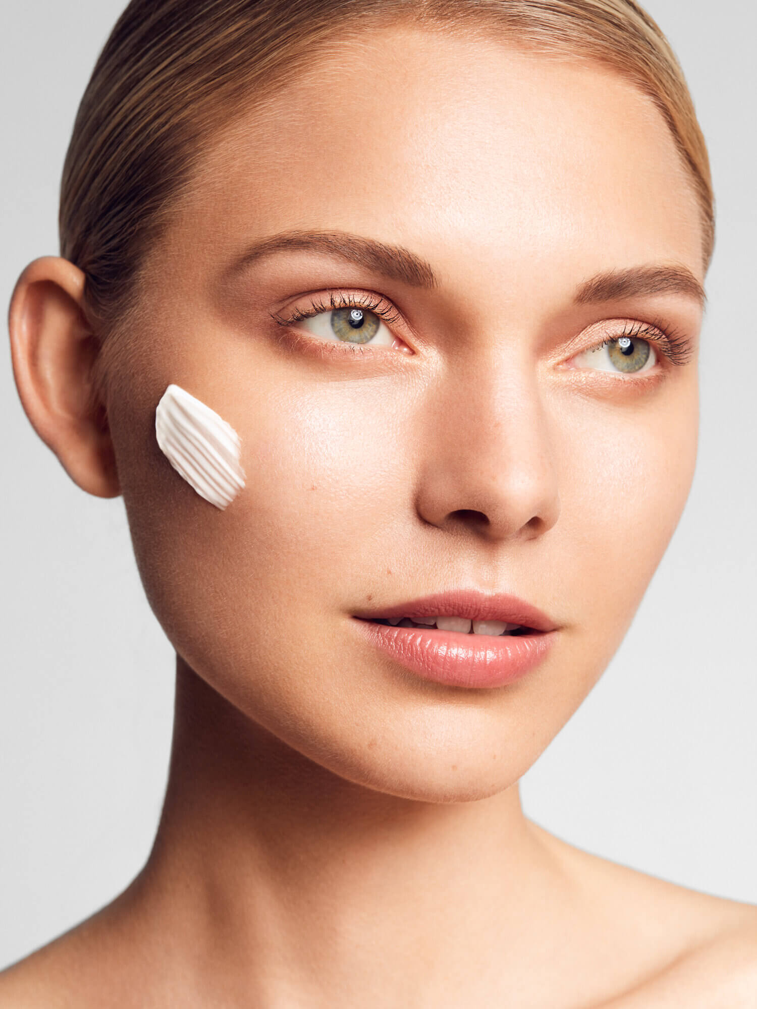
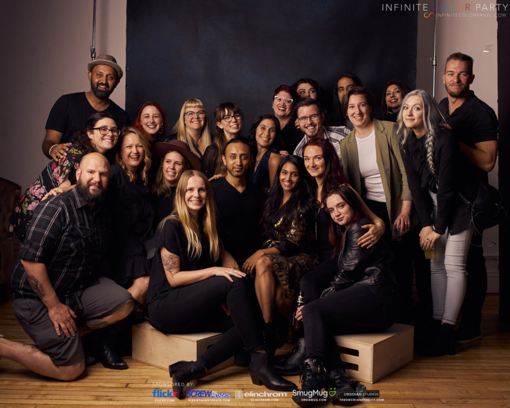
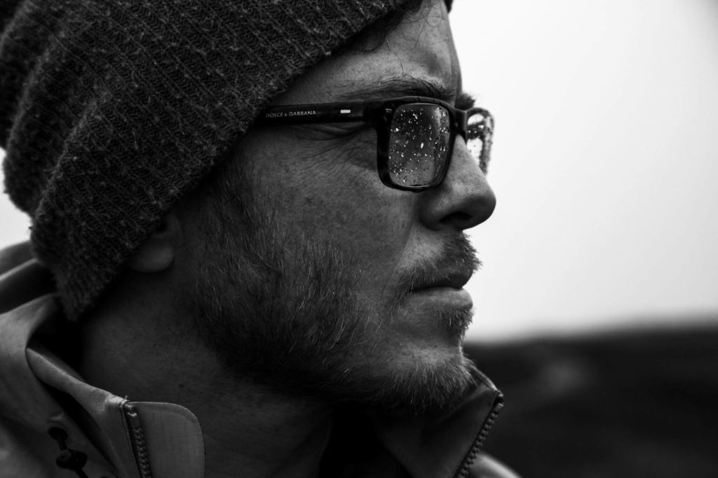
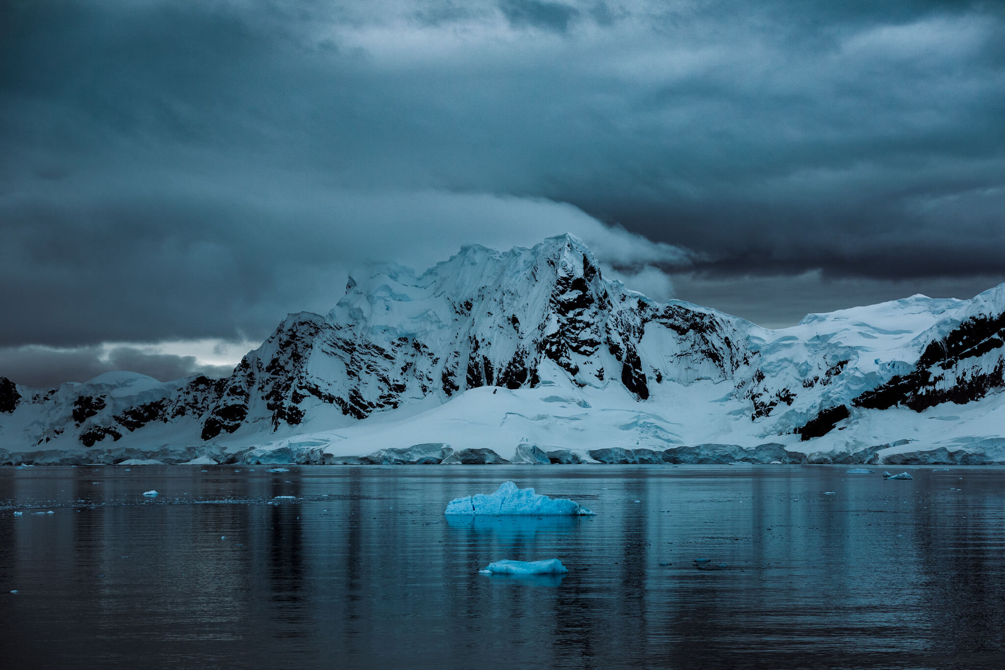
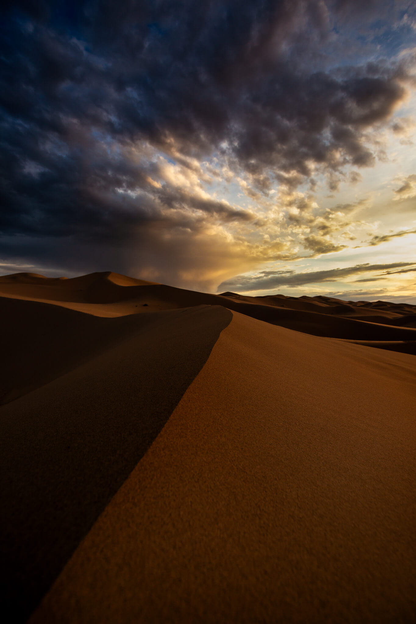
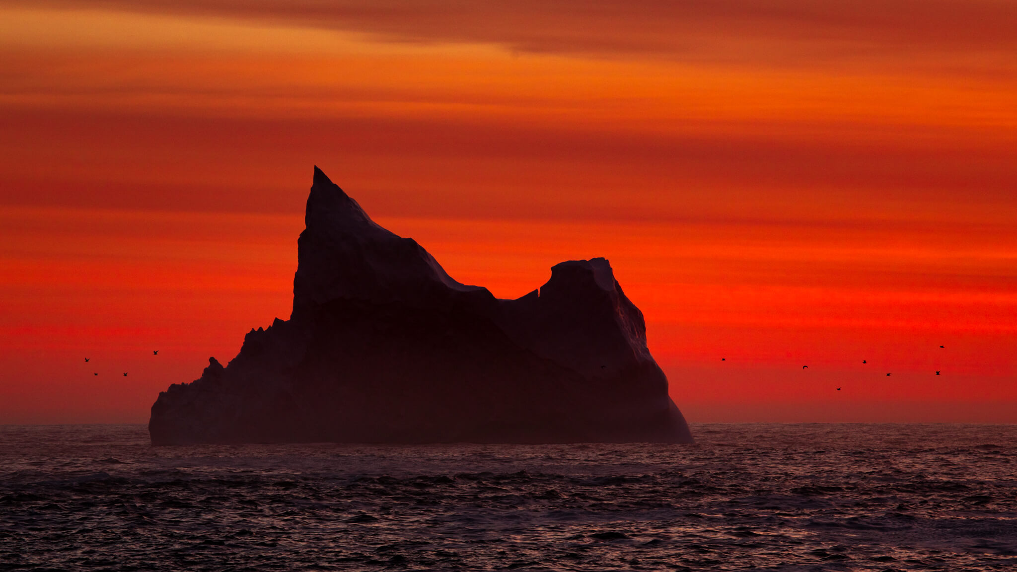
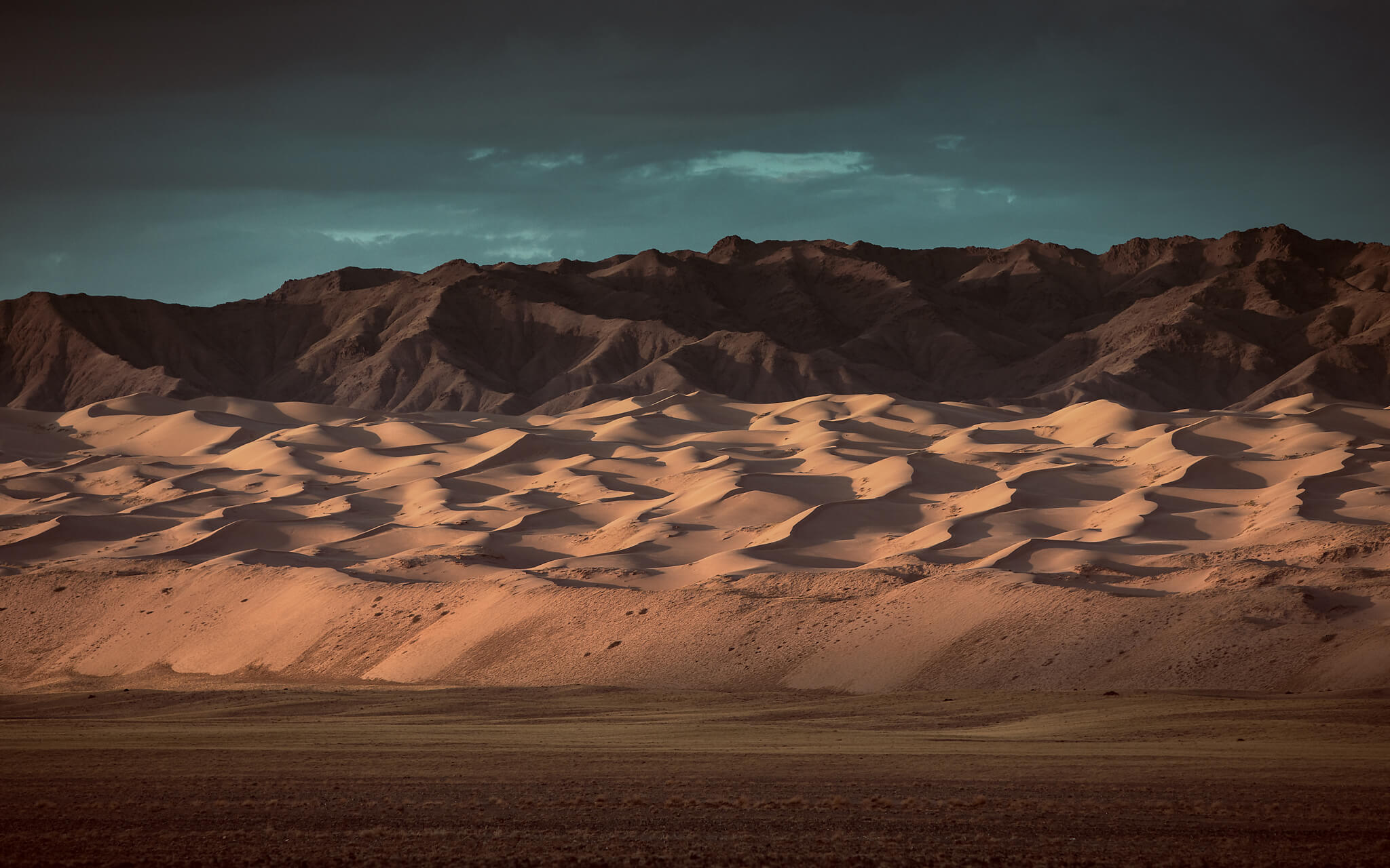
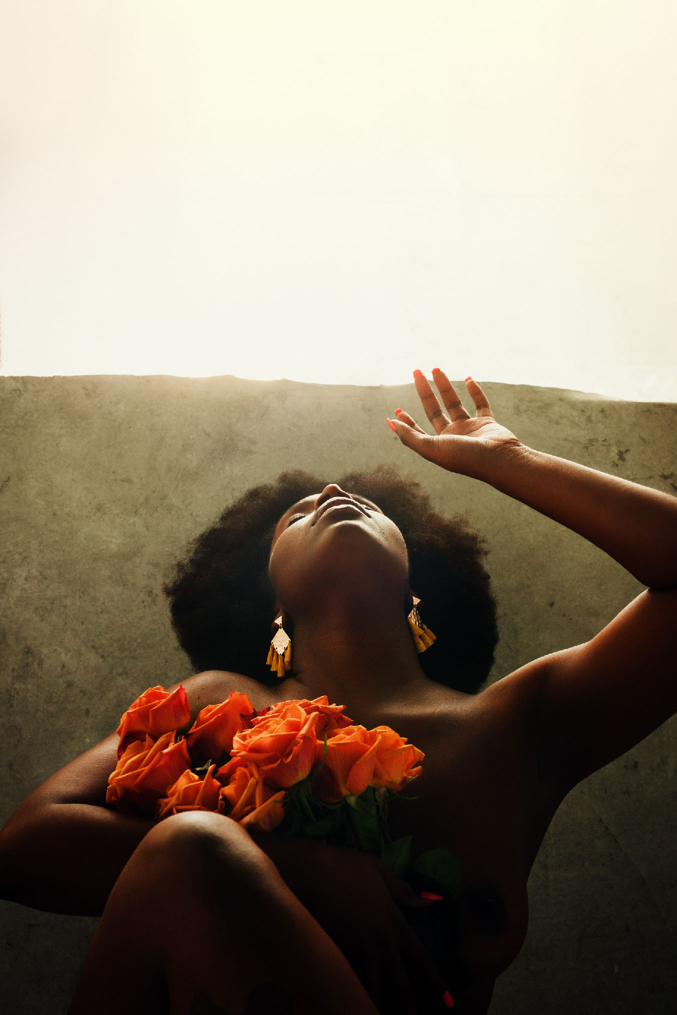
It’s not often you come across work like D’artagnan Winford’s. Everything from his cinematic, earthy color palette to the emotive subjects is executed in an exquisite and profound way. We are so proud to have D’artagnan be part of our color community, and wanted to dive deeper into his work and process.


Your work is so raw and authentic, can you tell us how you found your style?

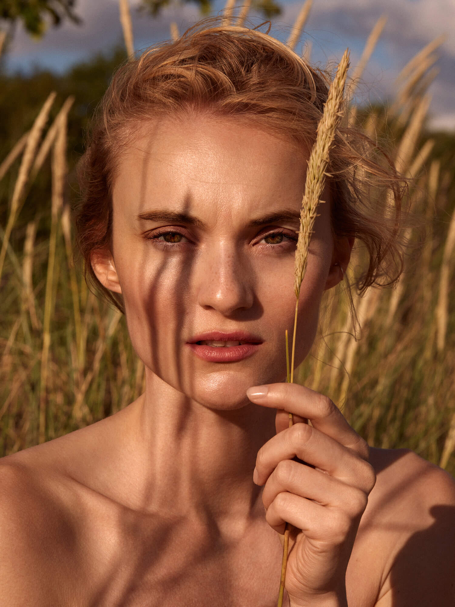
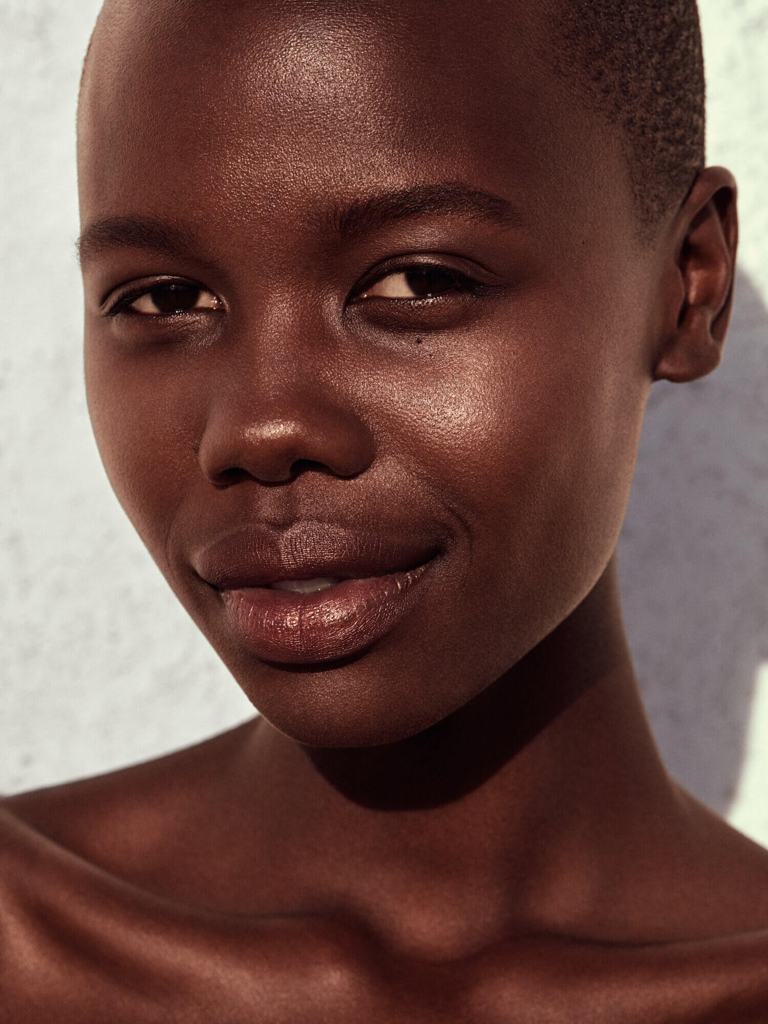
A: I’ve always loved that raw film look so I’ve always wanted to include it in my finished work. I would say my style is a result of constant working at letting the image dictate the final look.

What is your motto when going into a shoot or project?

A: My motto, if I had one would be “I’m gonna learn something new today.”

Does your post-production workflow differ from shoot to shoot? If so, how?
A: It’s pretty much the same however some images call for a different look.


What drew you to creating images at the beginning?

A: I’ve always been an artist. Photography is my current medium. I would create if I didn’t have a camera. I’d create if I only had a stick and mud.

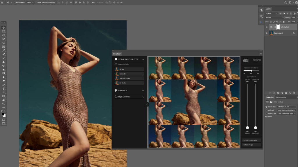
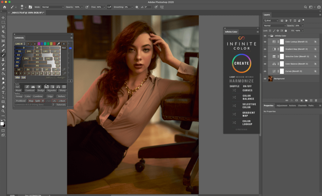
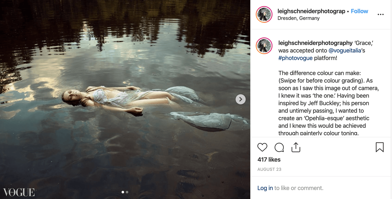
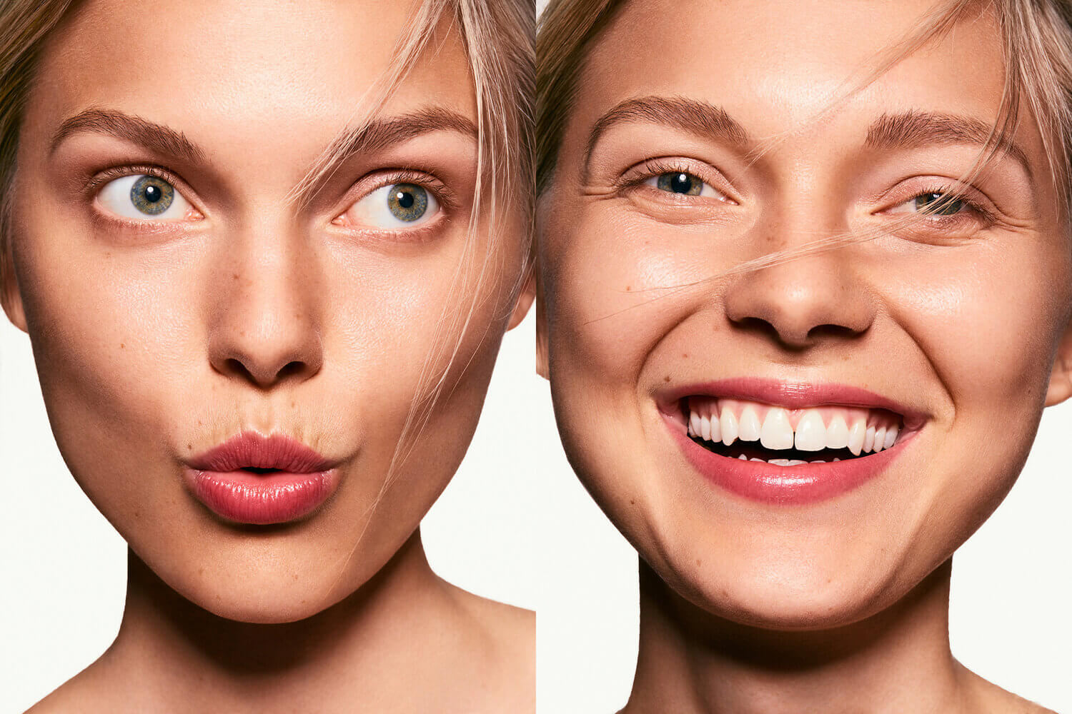
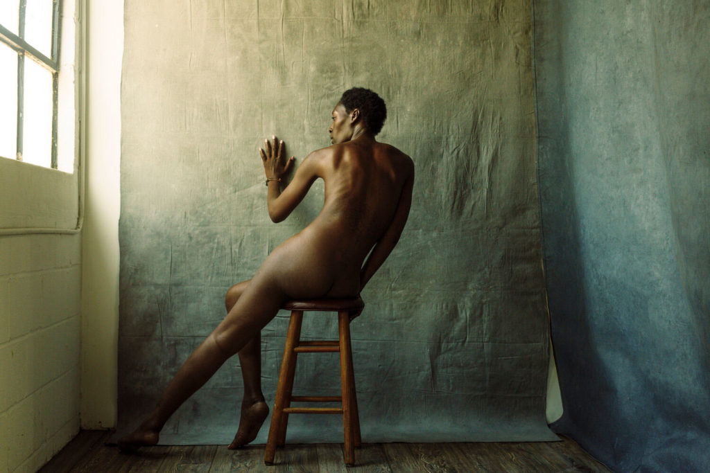
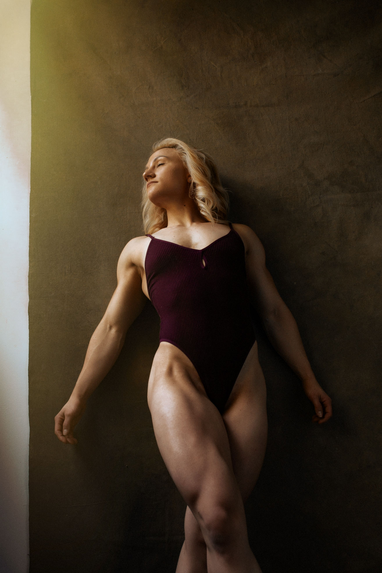
Your color palette is so rich and filmic, can you tell us about how you achieve these gorgeous tones?
A: They usually start off with one of the many presets that I’ve built in Lightroom. From there I go into photoshop and make changes and adjustments. Then I use Infinite Color Panel to set my mood.

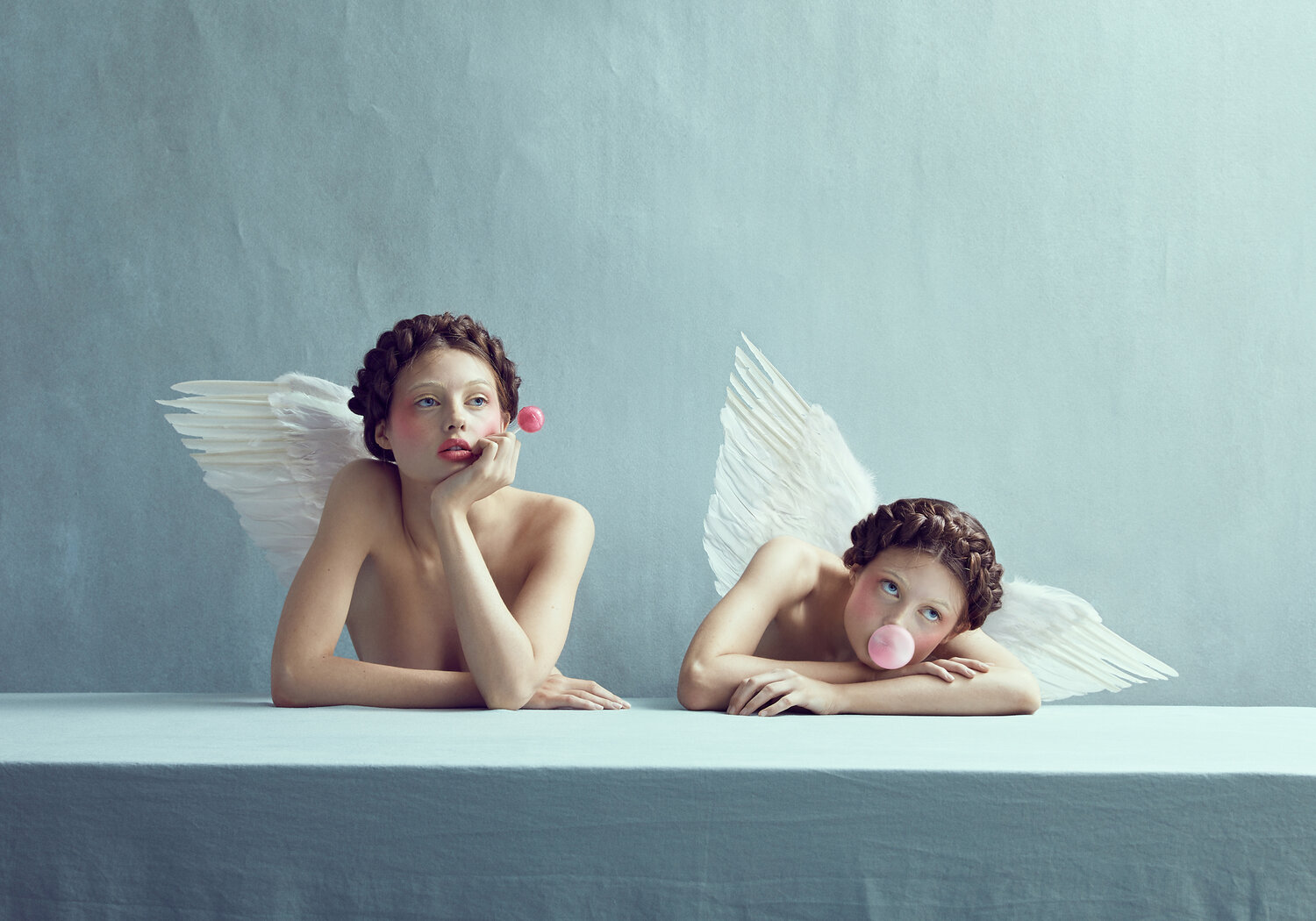
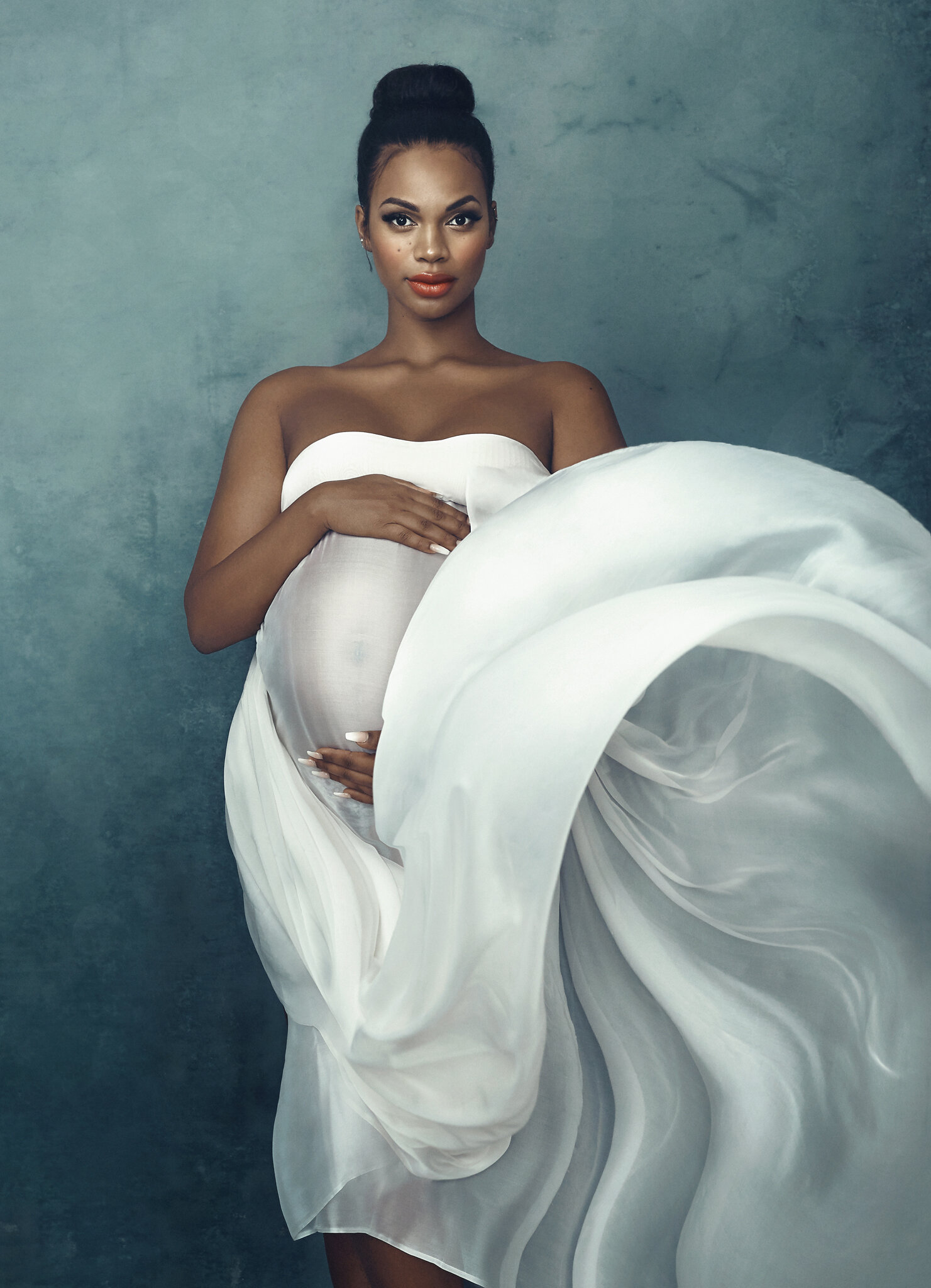
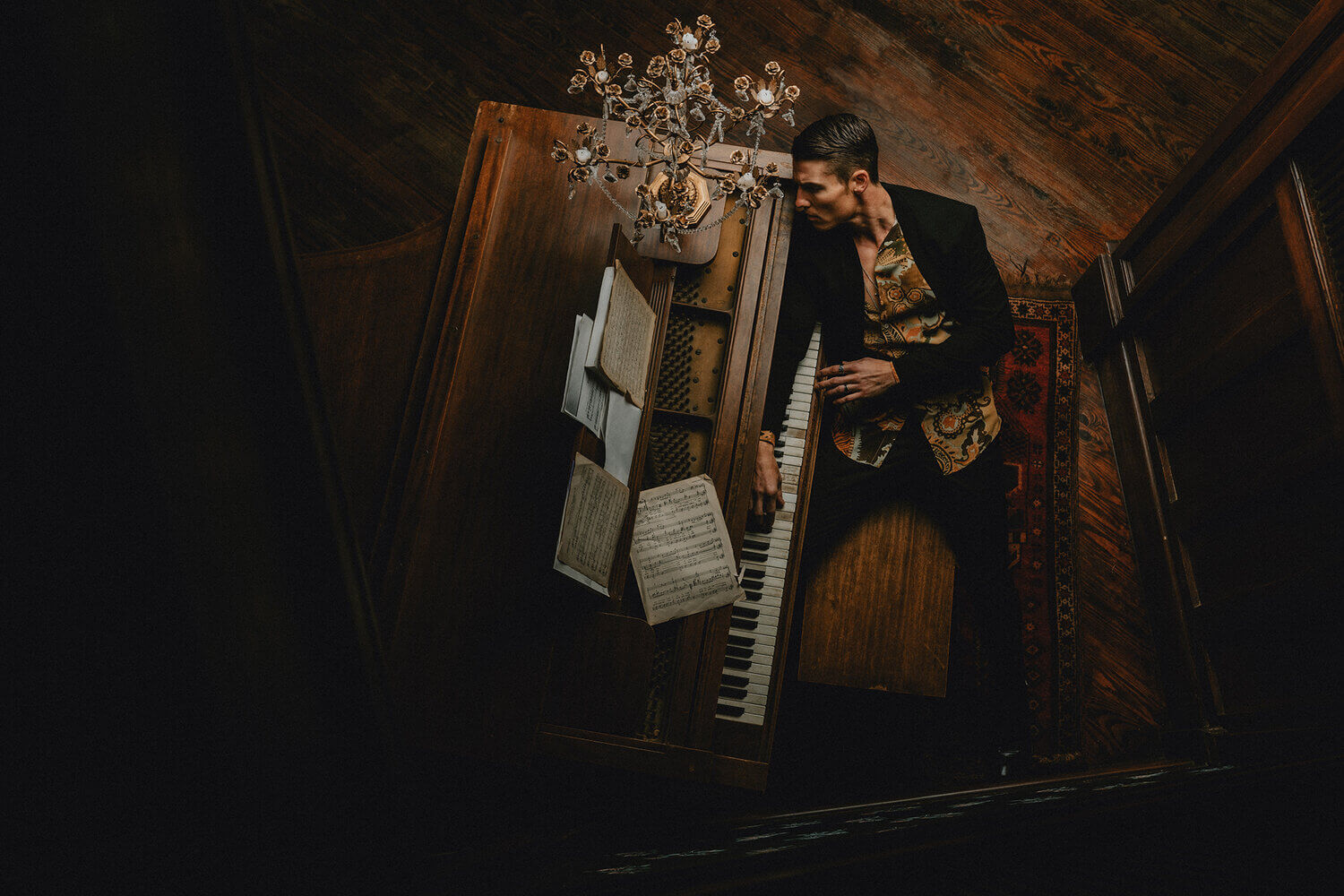
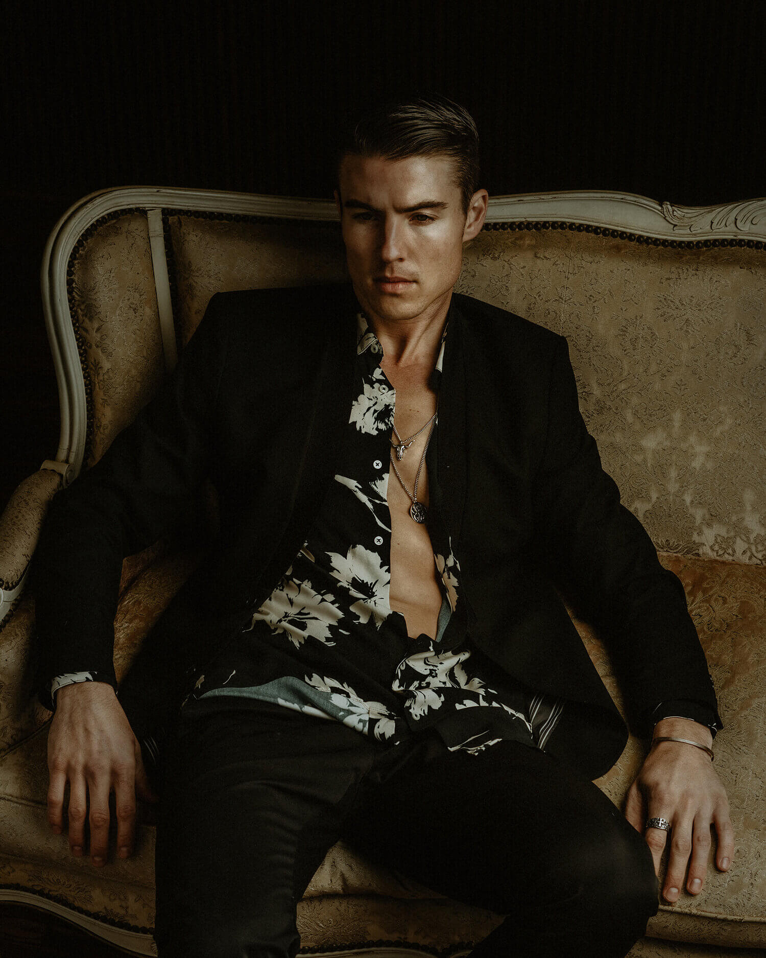
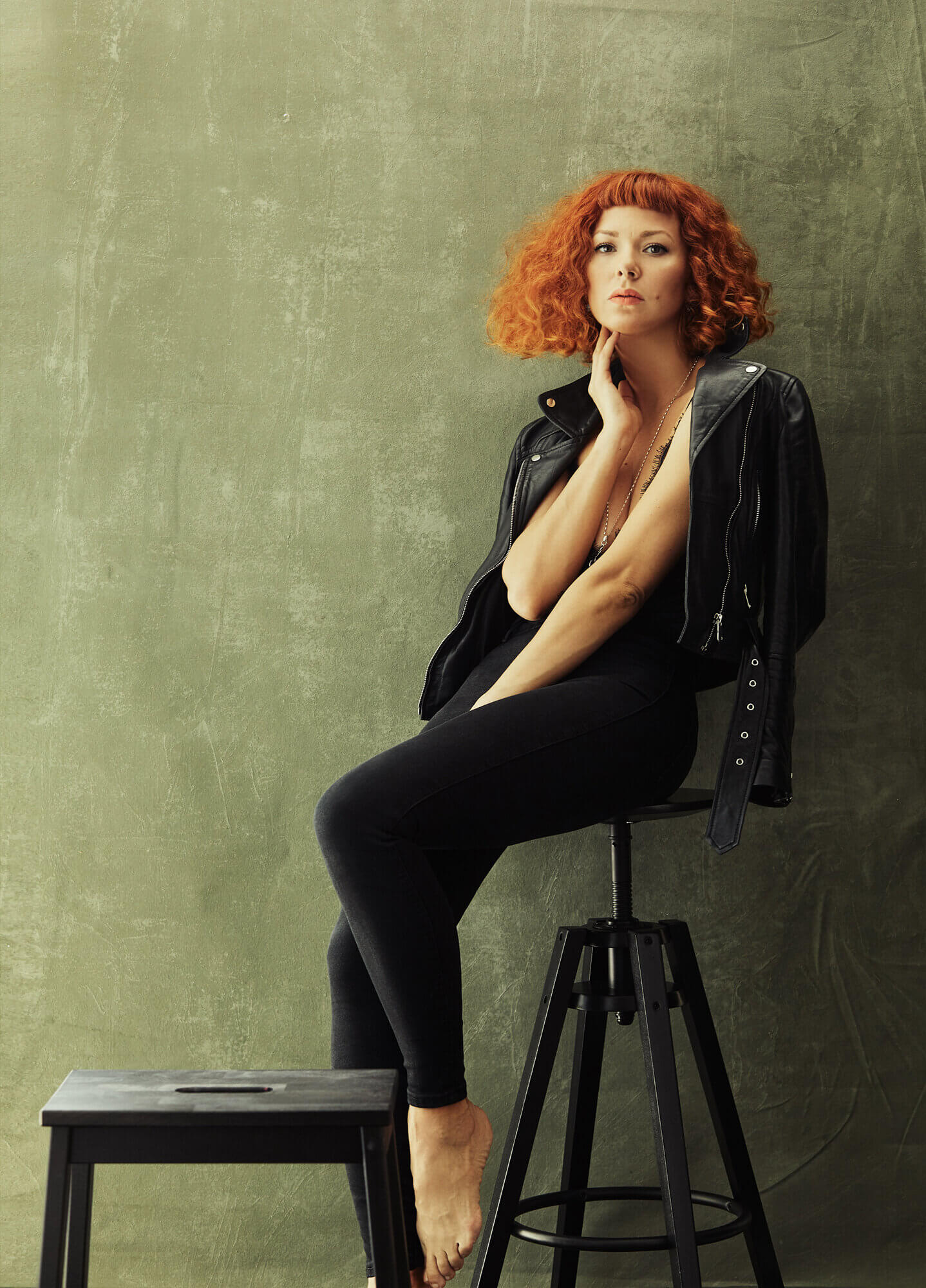
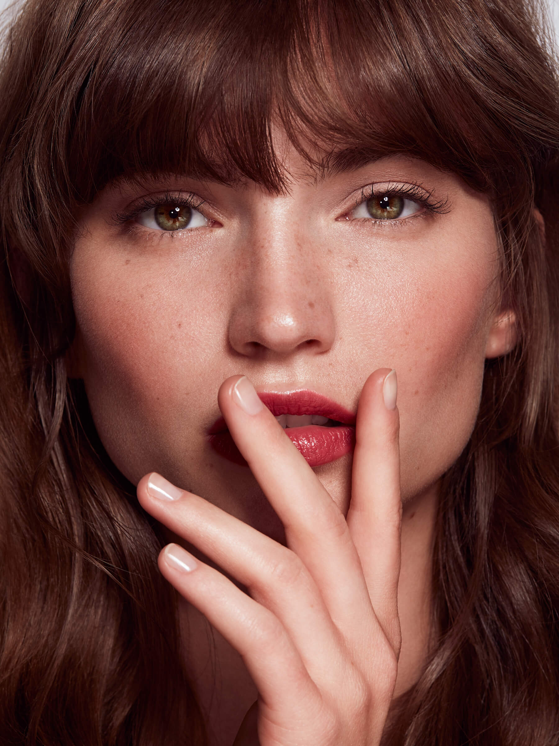
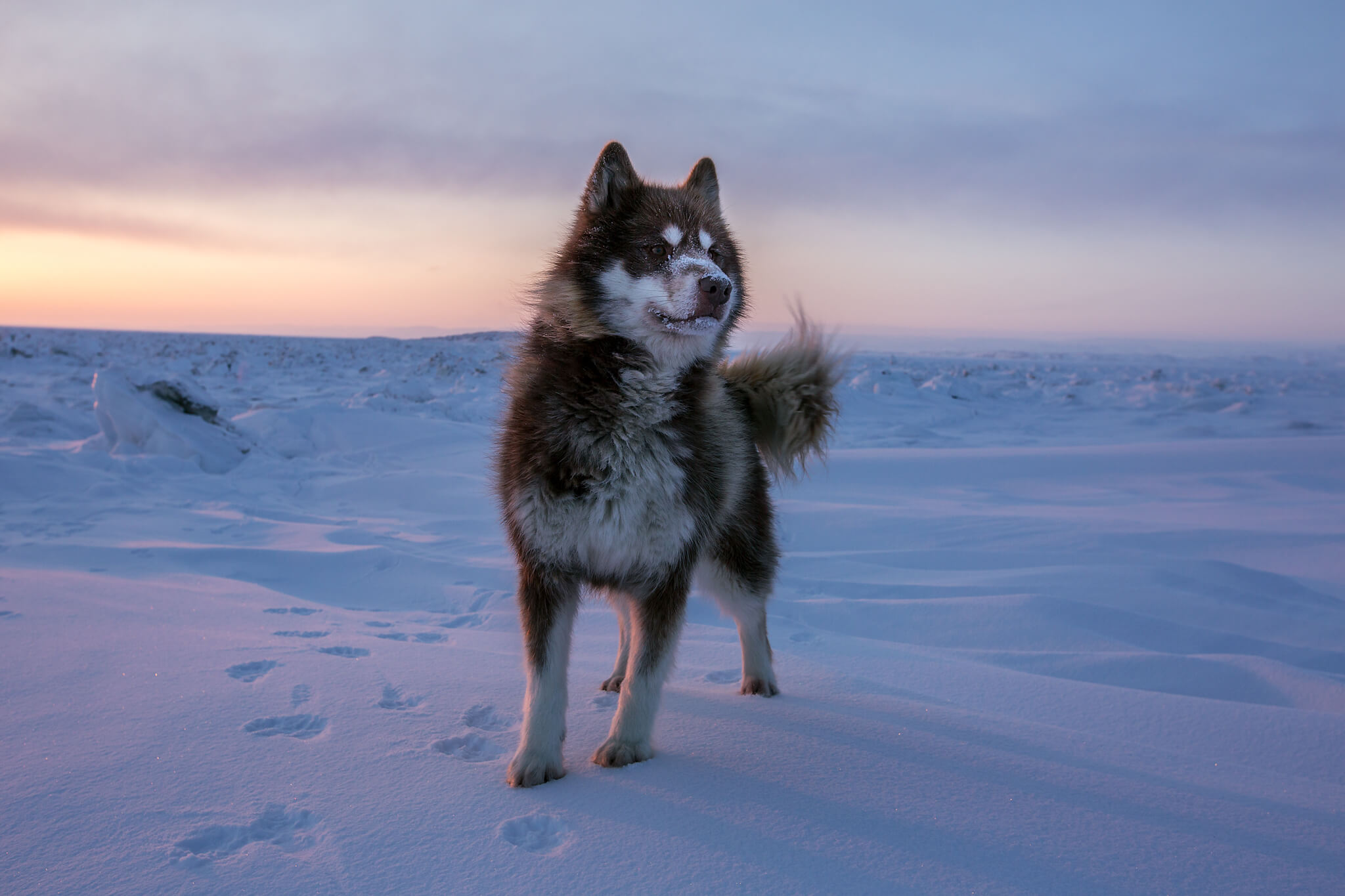
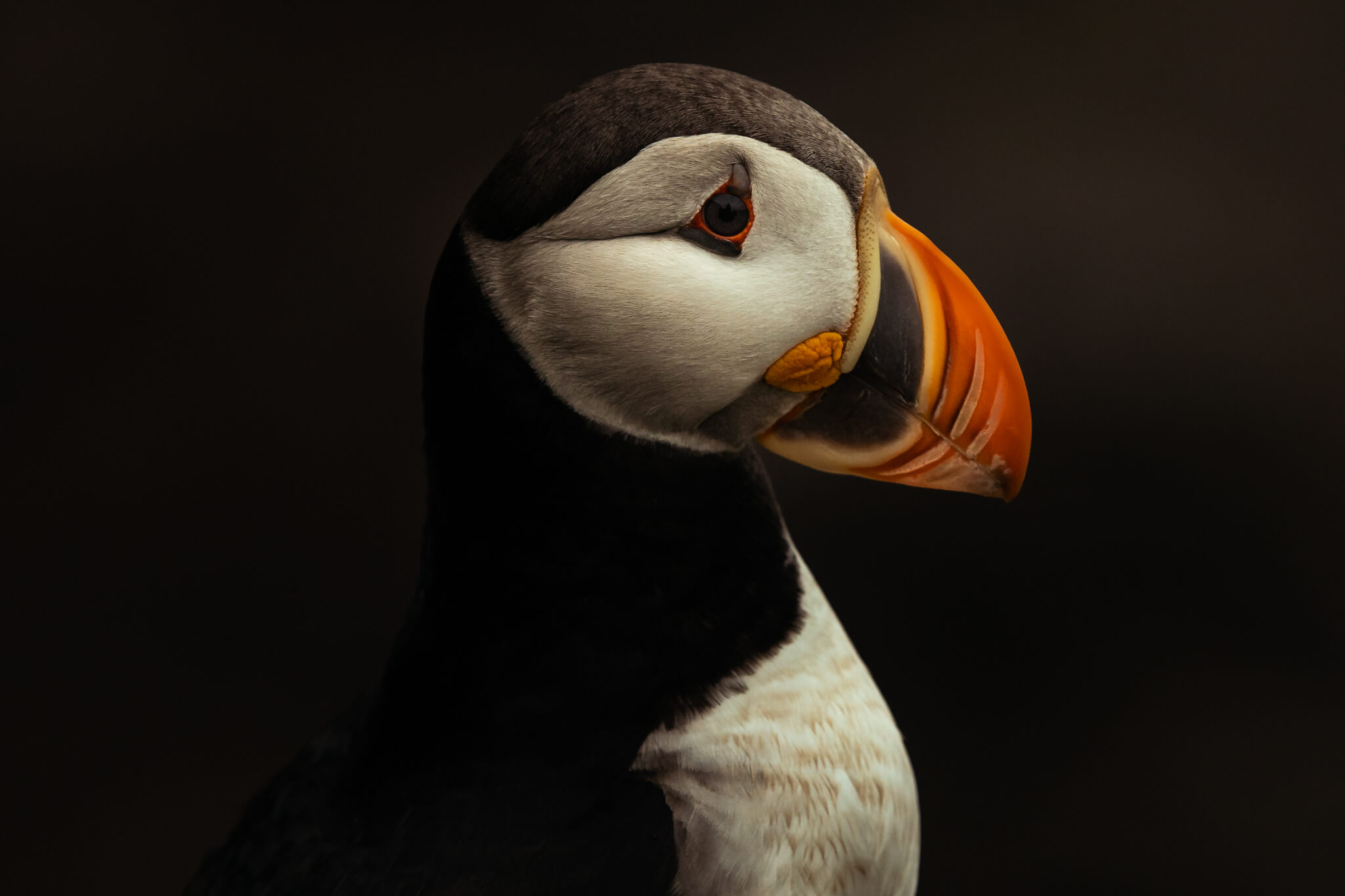
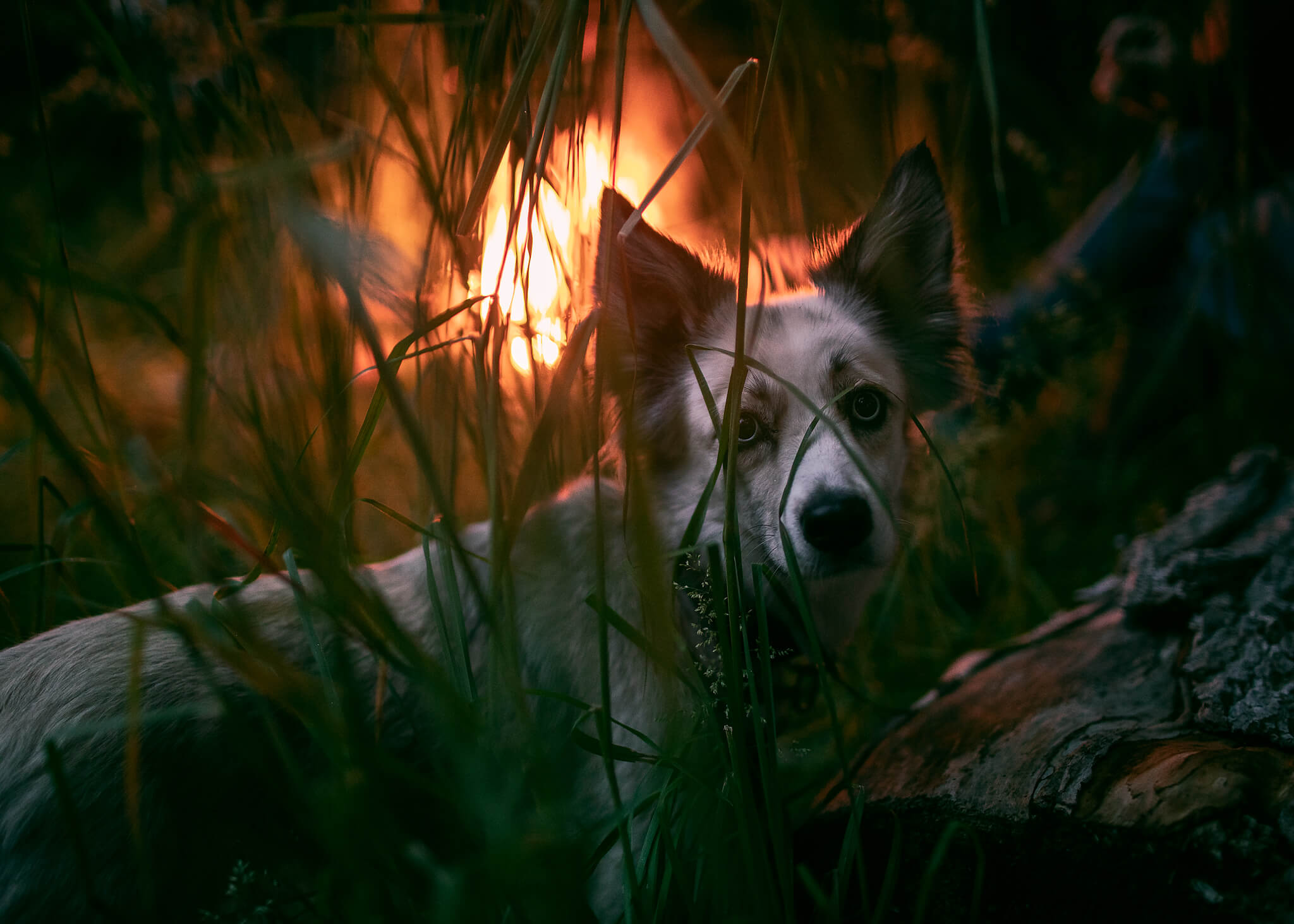
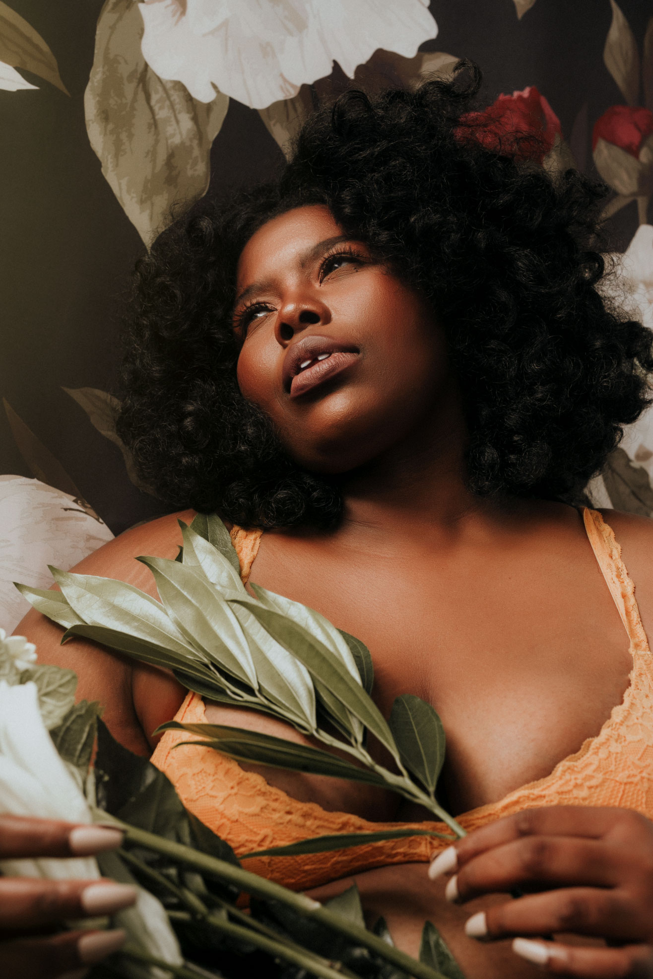
Can you show us your favourite photo you’ve ever taken?

A: See below.

What is your favourite part about creating?

A: Creating lets me express myself and my thoughts. It’s therapeutic for me. I get to get away from all of life’s problems and just be free.

Do you have any exciting projects coming up in the future that you can share with us?

A: I’m working on a series called “Masked” it’s a boudoir series that’s a play off of the masks we had to wear during the pandemic.

To see more of D’artagnan’s incredible portfolio, head to his Instagram and don’t forget to give him a follow!

Creative conversations: Photography by Irina Jomir

Light is a silenced music that you can only hear in your heart. It’s a synonym for mood.”

Irina Jomir is a fine art, fashion and portrait photographer based in Oslo, Norway. If you haven’t seen her work yet, be prepared to be stunned! Irina’s compositions are so captivating and awe-inspiring, and left us wanting to know more about her work flow. We are so excited to share a new creative conversation with Irina about her artistic process!

Trinity by Irina Jomir

With the styling and poses, your work is very reminiscent of classic paintings. Can you tell us about where that influence comes from?

I don’t think I have a particular source of influence, or maybe I’m just not aware of it. However, I’m inspired by many artists in different areas of art. My source is very global, and the choices are somewhat intuitive.

What does your creative process look like, from initial idea conception, to final realised image or series?

I focus mainly on an emotion every time I create an image and build everything around it. I don’t think emotion in an image has to be explicit in a subject you photograph, but can be expressed in other ways, like a choice of color palette, posing, lighting, editing, and tiny details you place in the frame that gives a slight hint of which emotion they depict. It’s like I have an inner library with multiple sections, and each of them contains a visual and acoustic representation of different emotions. So often, I start with deciding on that, first and foremost, finding the right sentiment. Then I search for suitable music – it’s the base of my building process; it gives me a significant drive and paints colorful ideas on a blank canvas. It also helps to keep my focus in one direction during the whole process. Once I find the visual elements, I decide on the color palette and lighting. I try to make everything simple and as minimalistic as possible.

Mai Soli by Irina Jomir

What are your favourite tools to create a new piece of work?

Lighting. Light is a silenced music that you can only hear in your heart. It’s a synonym for mood.

How do you decide which route to take your color toning?

It’s pretty simple. It has to follow the spirit of your idea because it enhances the message (if there is one); it has to be in unison with it. Very often, I know right from the beginning which direction to take, and at times I want to be more experimental and see if there is an option that is perhaps more interesting or I just haven’t considered. Then I turn to some help tools like Infinite Color Panel, Infinite Looks, and color toning actions from The Color Lab, for example. These are great tools to have in your retouching set that can help you to quickly find the right start point.

Is there a specific method you use to achieve your fine art aesthetic?

I think that would be my editing approach. I’m obsessed with transitions of highlights and shadows and in-between color tones. I make sure those transitions are very soft. But I also guess softness in just about everything else – movements, whether it’s a movement of hair or fabric, softness in posing and gaze.

What is one tool (physical or digital) that you could not create without?

Camera, definitely.

Angels by Irina Jomir

The work you’ve been releasing recently is much more conceptual than your previous maternity and portrait photography, which direction do you see your photography going in?

I started in one genre and went into another, and then another again because I don’t think I can ever stop exploring new ways of self-expression in the photography field. Conceptual storytelling has always been extremely attractive to me, but I haven’t felt strong enough and ready for it. In the future, I want to focus more on these types of projects because it’s more challenging to create and gives a bigger platform for expressing myself creatively. I feel like I have a lot to say, and I don’t know a better way than to do it through photography. Somehow it’s a release and compensation for what I’m not able to express verbally. What I’ve done so far is more of a careful walk around the subject I intend to hit in the future. I don’t think I’ll ever want to stop shooting portraits and maternity, but I feel like I’m ready for more.

Marie by Irina Jomir

What advice would you give to someone looking to get into photography or post-production?

Don’t let yourself get lost in the ocean of other artist’s work. Look for inspiration, but don’t let it consume you and affect your own vision. It’s only advisable to learn from those who inspire you, but remember it only has to give you a great start to your own path, not shape you. We often compare ourselves to others, and it’s very destructive. We go to Pinterest, Instagram, and such to look for ideas, and it is supposed to be helpful, but it often kills your uniqueness instead. Look for elements – lighting, posing, or styling perhaps – take away only one thing. If you follow this rule, it will help you build up your own style instead of copying someone else’s. Don’t do something because it’s trendy, but because it resonates with your aesthetics. Look for inspiration within yourself. You are like no one else, and neither are your own stories and experiences. Give yourself time. You’re gonna get there sooner or later.

Irina is releasing new inspiring imagery all the time! Don’t forget to keep updated with her work on Instagram, and her amazing website.


Be sure to follow our Instagram page to see all of our amazing photographers and creatives using Infinite Color! We love featuring our community on Instagram, FB, and blog posts! Tag us and showcase your work for a chance to be featured and get involved with our Facebook community.

Also check out our full line of other tools at Infinite Tools!

Introducing The Infinite Looks Panel! A New Way To Color Grade

The Brand New Infinite Looks Panel Is Finally Live!

My colleague Stefan Kohler and the entire team has worked so hard on this for many months!

You can grab Infinite Tools by clicking on this button:

Get Infinite Looks here

There’s currently a 25% OFF sale during our launch, simply enter VIP on checkout!


What Is Infinite Looks Panel?

The Infinite Looks Panel is another great way to navigate through a wide range of color palettes! You can explore over 1,000,000 intricate color options (LUT files) for every single image! It’s all organized in really fun and intuitive way I know you’ll enjoy.

This video will explain it perfectly!

Find or Refine Your Palette:

Whether you’re trying to shop around to see what color palette works best for your image, or you know what you’re hunting for, our two simple sliders for color and contrast will help you find and then refine what you’re looking for!

Protect Skin Tones:

An advanced algorithm also helps protect skin tones to saves hours on masking! All this magic happens non destructively in one panel!

How Is It Different Than Infinite Color Panel?

Infinite Color creates one look at a time for those who may not know what direction they want to go in. Also, Infinite Color provides you every layer for each color grade it generates. So you can adjustment the nuances of each color grade in case you would like to modify certain layers that make it up! It also has a truly infinite number of options, exceeding in the millions.

Infinite Looks on the other hand provides a different flow to exploring color, but it provides you with a single layer so you are unable to tweak individual layers. However you can browse through more looks at a time and use the sliders to get variations of each look as well! You have a million options to play with including a skin tone slider!

Each of the panels have their own strength and they are best used together! We wanted to fill the gaps that Infinite Color has so they work harmoniously together.

Here’s a video showing just how they are used together showcasing each of their strengths!

We’re so excited to expand the “Infinite” family and hope you are a part of this community!

Taking Color Grading To The Next Level With Advanced Selections

I’ve been using Infinite Color in my own work for a couple of years now and it still fascinates me seeing what I get with every single image. I love stacking the colors to really make things intricate. I really enjoy what it creates! What if we could take that to another level?

What if we had the ability to take the color grading and actually apply it to a specific region, say the shadows, highlights, midtones, or something in between? So you could have warm intricate midtones and highlights, and a complex cool tone for the shadows. The idea really opened my mind to what could be possible and how it could elevate any image.

If you aren’t familiar, masking specific regions of the image is called luminosity masking, and Lumenzia is a tool I’ve been using for years because of all the control it has. After realizing that I could actually combine Lumenzia and Infinite Color, I had to see what was possible! So I reached out to Greg Benz (founder and mastermind behind it) and asked him to see what he could do with ICP with Lumenzia. He’s a brilliant landscape photographer and I knew the way he would use ICP would be different to me as well!

Here’s a video where I walk through how to use both of them in a workflow to show off the capabilities of each.

In this video, we cover color grading shadows and highlights separately using two ICP groups, and Lumenzia to make that happen. We also look at blend-if modes in place of masks. It makes a great free educational video aside from the tools themselves!


Check out Luminezia

Special Discount

I asked Greg if he could offer a discount to our community for Lumenzia You can use the code ICP25 on checkout for 25% off Lumenzia (as well as Greg’s Master Courses on Exposure Blending or Dodging & Burning, which are designed to help you make the most of Lumenzia).


Check Greg's Video

Greg Benz made a video showcasing how he uses it in his landscape workflow. It’s fascinating since he has a very unique thought process and approach! I would encourage everyone take a look just for the sheer sake of curiosity and seeing a master of color and selections at work!


In This Video

We start by using ICP to show the general color grading across the image. Then we begin introducing selections using Lumenzia and give you an idea of just how and where each mask works. After selecting the specific zone we’re looking for with the panel, we attach it to the ICP group to really narrow down where the colors are being applied in the image.

We continue by using Lumenzia to pick another tonal region and combine that with another ICP group in order to show you how to color grade shadows and highlights separately. It goes to show just how detailed you could get with it!

Better yet, the slider Lumenzia has on the right can really help narrow down the selection so you get as precise or as wide of a selection as you like!

So far, we’ve been using masks as a way to control each region, but Lumenzia can also make a selection using Blend-If modes instead! We take a look at how that can be applied to the layers ICP generates. If you’re completely new to the concept, this video gives you an idea of what Blend-If modes actually are, and why that can be really powerful in a workflow with color grading instead of just masking! So even if you may not even be interested in the extension itself, it’s a really great educational video to give you a few ideas.


How This Idea Came About

I always love collaborating with creatives and showing off their work to others, especially when I believe in them and what they can produce! Greg Benz is someone I’ve known for years and someone I admire. His tool has been one in my arsenal for years and something I wanted to really show to everyone. So we decided it would be really fascinating to come together to see what we could both create and show both of our audiences!

With full disclosure, Greg gave me his panel years ago, before our collaboration, and in return I gave him mine recently when approaching him in return. I did sign up for his affiliate network when promoting his product and always believe in full transparency! The reason is simple, it’s a damn good product and once you see the video, you’ll see for yourself.

I can’t see what everyone creates and I hope this inspired you!

Featured Project – Southern Hospitality by Wesley Jones


Meet Wesley Jones!

Website | Instagram

This shoot was planned at the last minute with my buddy Brandon Thornton(model featured in shots). I secured the location from some friends that own Tara Winery in Athens, TX on which the home is located. The home has a really classic Texas vibe. We had both been thinking a lot about the feel and mood we wanted to get, and Brandon fully styled the wardrobe himself.

As soon as he walked out in one of these awesome outfits, I knew exactly what needed to happen as far as my lighting, camera setup, and colors I wanted to achieve in post. We went through 3 or 4 outfits, and knocked the entire shoot out in a couple of hours.

I shot the set on a Sony a7riii/Sony 50mm 1.8/Sigma 35mm 14 ART, and did all lighting with an Orlit 601 strobe, which was modified with a Westcott large diffused umbrella.

My usual style is shooting wide open at a long focal length with multiple strobes, but i wanted to challenge myself and shoot opposite of my norm. I can always kind of see the colors I want to achieve in my head when it comes time to process. For the last year or so the Infinite Color Panel has let me have options I may not have originally went with. I get the images toned with my usual methods, then bring in the panel to start clicking away until my eyes say “YES!!!” and find what they love. Its a fun way to edit :).

 After editing this set I had the sudden urge to watch Fight Club and Fear and Loathing back to back!

I’m located in Athens TX and shoot mostly dramatic portraiture. I’ve been shooting for 3 years.


Featured Project – Adapting Lighting for Unique Situations with Irina Jomir

Portrait of Irina Jomir

Irina Jomir is an amazing photographer in our community. We’ve been following her work closely and she recently had a challenge where she had to adapt in order to create the imagery that she was proud of. She integrated Infinite Color beautifully into the shots! We had to know more about the shoot itself and Irina shares her story below.

Be sure to follow her Website and Instagram account!

I´m a photographer that shoots majority of work at studio. I love the comfort it gives, the control over light. I rarely want to shoot anywhere else.

The project I and my MUAH came up with was a challenge – new, unknown space, unpredictable lighting scenario and new genre. We´ve decided to shoot boudoir in a hotel room. The team was small, just me and MUAH as model which perhaps was a challenge too for both of us. We booked a room, prepared a mood board and were ready to experiment for as long as possible.

I remember coming into hotel room where the shoot was going to be taken place at, being completely terrified – narrow room, no white walls or white ceiling to bounce my strobes from, last hour of day light to use as fill light and mix with strobe… nothing I’m used to at all. Harsh light is not my thing and strobes are soon the only source of light in pitch black space with red walls. Basically that moment was a moment of regret and if could get the refund I would absolutely leave.

I kinda felt like an amateur in that situation and the only solution was to experiment. As we started to warm up and I let my creative part take over. My fear of failure faded and all of a sudden I learned knowledge of light that naturally mixed in. By the time there was no more day light the only option was to soften the strobe as much as possible and the further we were moving into the room to change the set up, the darker and narrower it was. I decided to use the Photek Softlighter with one strobe and double diffusion plus an extra large diffuser from the largest reflector I had which I placed in between the model and the strobe. The distance between model, diffuser and strobe varies from picture to picture.

Our shoot started at 6pm and we finished 6am, 12 hours straight with one break only. It´s so far the longest I had and perhaps most fun as well. We tend to forget how much we learn when we experiment. If I may draw a conclusion and give my recommendation, that would be to experiment more and challenge yourself more.


To see more from this set, be sure to visit her Instagram!

__

Have you tried the panel yet? We’d love to see your creations! Get in touch on Instagram @infinitecolorpanel or the Facebook Infinite Color Panel group and show us your work. If you haven’t tried the panel yet, get started here: https://infinite-tools.com/infinite-color-plugin/


Infinite Color Challenge Winners: Our First Big Contest Comes To An End

We had an amazing array of entries for our first Infinite Color Contest! If you somehow missed it, you can see all the details and entries here.

I wasn’t sure what to expect because this was our first biggest contest with an amazing number of prizes and options people could pick from!

I just want to thank everyone that took part because without you, this wouldn’t have been possible. It really showed me that you all really did enjoy this and I can tell how much fun everyone had being creative! Often that is really difficult to find the time to do work we actually have fun with!

We had a group of people who helped me decide on the winner(s). I spent some time really going through each one to ensure that everyone got a fair shot and it was really tough. I didn’t want to mess up and truly give the right person an opportunity. I would want the same if I entered a contest like this. But then I realized everyone was deserving, truly!

And the winner is…

Now with that said, I would like to announce our winner as photographer Leigh Schneider from Germany!

Her entry can be found here: LINK

She decided to take advantage of being a part of our future Retouching Retreats, where she will spend up to a week with a group of creatives. Her flight and room are all compensated including a spot at the event (collectively priced higher than our prize giveaway of $4,000). And she will receive the personalized training that comes with it!

Leigh had a really great before/after image but also a great entry and is a wonderful part of our community. I know she’s been creating for years and really is a great person who is a creative at heart. I am proud that she won this and hope she is excited to use this time to take her work to another level!

Second and Third Place Winners

Our second and third place winners are JoAnna Claire and Tiffany Tran!

They will receive:
A full reimbursement of the Infinite Color Panel
A personal critique session of your portfolio
Retouching credit from Pratik Naik for 4 images
A one on one online tutorial session on anything regarding post production with Pratik Naik.
$200 credit to a future Retouching Retreat

See all of the entries to the contest by going to the challenge page.


Thank you to everyone who took part! I really can’t tell you how fun this was. I can’t wait to do more and host more fun opportunities for the community! There’s nothing more fun than getting creatives together to do fun things like this!


Infinite Insights with Marius Wilkens-Zimmermann: Blending Photography, CGI, and 3D Rendering

In art, many concepts and methods can be applied across disciplines. The work of this following artist shows just that by how he blends his knowledge of photography with CGI and 3D rendering.

My name is Marius and I am a 26 year old freelance digital artist based in Hamburg, Germany. I specialize in the combination of 3D-rendering/CGI (computer generated imagery) and post production. The majority of my clients are advertising agencies working for food, product, and cosmetics/beauty brands.

When I was 15 years old we used to have those flip phones with a camera – guess what I used the phone for the most – exactly. My first time using an actual camera was when I was 18 – still using that 5D Mark III today.

School never really suited me; I was every teacher’s worst nightmare and when I turned 18 I was finally able to drop out. That was probably the most important decision of my life.

It all began when I had my first client at age 16. I had the chance to edit video for instruction manuals and product presentations. This led to working with CAD files and experimenting with 3D software. I was addicted to learning about the industry and experimenting with the endless possibilities my newly discovered virtual world was opening up. At 18, a small 3D animation studio in Cologne hired me for an internship early 2013.

Later that year I moved back in with my parents and I spent a year learning how to retouch, use 3D software, and eventually built a portfolio. Throughout the following two years, I moved to Hamburg and worked for another 3D animation and motion graphics studio, a major industrial design studio (Sieger Design), and a real estate company producing 3D renderings in their specific fields.

I always loved my work but I slowly realized I was losing motivation working 9 to 5 plus endless hours of overtime for someone else.

This month 4 years ago I quit and began my freelance career, probably the second most important decision of my life.

Around that time I got into shooting model portraits and I scratched the surface of the fashion industry as a photographer. My passion grew for clean and natural beauty photography and of course the post processing of my images.


I worked with some of the best stylists and hair/makeup artists in the industry and photographed highly experienced international models through leading modeling agencies.

Photography was always sort of a time consuming and expensive side project for me and I had to remind myself that my full-time job was promoting my brand new business I just started. You can probably imagine being that young and knowing nothing about business and marketing. Building relationships with my first potential clients was a struggle and took a very long time.

My CGI work really benefits from my photographic experience especially from working in the studio with strobes and modifiers.

I explain CGI and 3D rendering as a new or different way of photography – virtual photography based on physics and mathematics in a virtual three dimensional environment.

I recently decided to quit photography in order to focus entirely on post production and CGI. It is no secret that you have to focus on one thing you are really good at to successfully work among the very best in the industry.

I have always felt that I lack a certain level of creativity, but where I lack creativity I make up with absolute technical accuracy and quality. That is where the Infinite Color Panel makes a huge impact on my work.

Coming up with color grading for a project was one of the most difficult parts of the post production workflow. Even before getting into the actual retouching stage you can non-destructively overlay random grades with just one click and try within seconds what direction you want to go with the project.

I use ICP on a daily basis to present a variety of different looks to my clients to choose from. Then I go into the layers and fine tune the adjustments based on the clients’ feedback. I even use multiple sets of grades for different parts of the images. Clients want their products to look as accurate as possible – to avoid color shifts I simply mask out the specific grade wherever I don’t want it to affect the image and I still get the amazing overall color look ICP provides out of the box.

When working with skin I really want to enhance the natural beauty of each model. With ICP I know within seconds what direction I can go and what might not work with a makeup look or lighting setup.

I rarely use any presets for my work. It devalues the art and I believe high end clients don’t take you seriously for using settings another artist created for the work they hired you for – ICP is not a preset, it is a tool just like Photoshop itself. It is still up to you what you create – it pushes your creativity to the next level.

Interested in seeing more of Marius’ work? Check out his Website!!

Have you tried the panel yet? We’d love to see your creations! Get in touch on Instagram @infinitecolorpanel or the Facebook Infinite Color Panel group and show us your work.

If you haven’t tried the panel yet, get started here:  https://infinite-tools.com/infinite-color-plugin/


PHOTOS: Our First Ever Infinite Color Party

Emily Teague and I hosted our first ever Infinite Color Party in NYC during Photo Plus on October 24th!

When we first thought of the idea, I knew we had to do it. Especially since there wasn’t an event on the first evening. After all NY has done for us over the years, we wanted to give back to the community and come together to have a fun event!

We were so impressed with the turnout and we had such an amazing time! Of course, we had to make sure we captured the night too! We had Tyler Rayburn on photo duty that evening and Bella Kotak and I taking the BTS!

Before jumping into those photos, we want to take a second to thank everyone who played a part in making this happen! It really meant a lot to us to see all of our friends come and let loose that evening.


Thank You!

We’d like to also give special thanks to everyone who came to help in any way they could. There are SO many people to thank but without them, we couldn’t have done this. I love you all!

Also a special thanks to our sponsors! As word took wind, our friends from these groups reached out to us to take part as they shared a similar philosophy on community!

Elinchrom brought all the lights for the venue, from the photo bay to the LED lights you saw around the space. They have a similar and vested interested in being at the pulse of the community to see just what we’re looking for. I’ve been so impressed with them.

SmugMug and Flickr provided direct support and SmugMug is where we are hosting the photos from the event (below). They have incredible and customization photo galleries for clients and an easy to use interface. I’ve used them since I started doing photography.

Screw the Metadata helped us coordinate the distribution of drinks, setup, and the bartenders at the event. They have a philosophy of talking about things beyond the technical and really breaking down what creatives should be thinking of in order to maintain a successful business. I love their approach!

Obsidian Studios for the support in providing and making a custom backdrop for the event! If you need a custom backdrop, I highly recommend them for the most personalized approach. With their art history and business background, they are my favorite company.

A special thank you to the full Infinite Color Panel team that came through with all the help in filling in the gaps to execute this party and last minute unexpected stressful hurdles that came up!

Now, it’s time to check out the photos!


Please Share! Before You Do…

Feel free to use the images as you wish and be sure to use #infinitecolorparty if you post any on social media!

If you can, please tag our sponsors @smugmug, @screwthemetadata, @flickr, @theobsidianstudios, @elinchrom_ltd.

You are allowed to retouch the photos as you wish.

Please do not crop the photos, it’s the sponsors that made this possible and we want to show them love, especially if you want to see another one in the future!

Because of which, we highly encourage you to share the photos! It really helps to make the next one a success and better than ever!


See the Studio Images here

Gallery hosted by SmugMug


See the behind the Scenes Images here

Gallery hosted by SmugMug


See the Polaroids here

Special thanks to Ken Yu for the Polaroids he took during the party! You can see his work here:
https://www.instagram.com/aperture7photo


Creative Conversations with Landscape Photographer Curtis Jones

Curtis Jones

To say Curtis Jones is a landscape photographer, would be like saying Gordon Ramsay likes to cook. Curtis is someone who (unlike Ramsey) is extremely humble and unassuming in nature. However, when you speak with him you’ll realize that he has a lot of great thoughts about his craft.

This statement drew me to Curtis’ work in the first place!

 “I often struggle with my place in the outdoor photography world. Too abstract and you lose the message, too literal and it starts to feel less personal. I guess it’s a balancing act for all of us. Walking that line between expected brand or content vs. constant evolution. Landscape photography, in particular, is a paradox. Landscapes (mountains, oceans, arctic tundras) in of themselves do not ‘feel,’ they require the human experience. So, for me there is always a discussion I have with myself; How does a place ‘literally’ look and then how does it look to me, with all my experiences, hopes, fears, and intentions. In a sense, we are projecting our thoughts, emotions, fears, hopes, etc. on the physical world around us.”

You can find more of Curtis’ work on his Instagram and Website!

Finding that balance you mentioned above is so critical. Your shots carry a lot of emotion in them! What is it that you want each photograph to convey after you’re done working on them? How much of that comes from the post-processing and how much comes from framing the scene?

I guess I’m always trying to distill my experience into a single image or set of images. I have so much appreciation for how vast our natural world is. The words epic, or awesome, can easily become cliche – quick nods to the power and beauty of the world around us. I want my images to have resonance. Ideally, I would like my work to convey humility and respect for a place or an environment. An appreciation for what makes me feel most alive and human. To feel insignificant but connected to something bigger than myself, this is truly freeing for me. Much of this energy that I am trying to convey comes from spending extended time in these places. I feel my best work comes from letting a place settle. I always have a bias or vision when exploring new scenes. I try to let that voice have its moment then let go of it. In the field, composition is a slow and deliberate process. Like songwriting, I’ll often find my “hook” first. That thing that draws me back over and over. Once I have identified what I find compelling I’ll get to work refining the frame, working toward minimalism, cutting away everything that’s not necessary.

More and more this process is just the beginning. With time my mindset has shifted from capturing the literal toward conveying resonance and mood. I’ve always been a sketcher and half-ass painter. I love enhancing a scene in post. Not because I feel my raw image is not good enough but because it feels necessary to replicate my experience. My experience is never a literal one, how could it be? Post-processing work helps get my photograph closer to how I perceived the scene, how it felt. And this, as well, is a sliding scale. Sometimes needing a very light touch and other times hours of craft.


What is something about your work that most people don’t realize just by looking at it? I assume most of our readers shoot portraits. I wonder if there are any commonalities between landscapes and portrait photography. If so, what are they?

I think there are commonalities. At the very least a point could be made about capturing the essence of place vs person.

In a sense, both subjects can be fleeting. A candid portrait can capture perfectly a moment or the true nature of a person. Similarly, a passing moment in nature, morning light reflected in an ocean break, for example, may say more about a place than an entire week spent waiting for the stars to align.

As creators, something of ourselves goes into every photograph. The moment we decide to shoot a person or a landscape, any subject really, we change it.

To be honest, mostly, I have no idea what people realize about my work. I guess something that I don’t promote or include with the images is a detailed backstory. Almost all my work has an element of self-deprecation, insignificance and humor. I like that creating these photographs allows me to live life in the places and with the people that I care most about.

You always seem to be very present in the moment based on how you try to really capture the essence of where you are. When do you decide to pick up the camera and take a photo vs putting it down and appreciating the moment?

It’s a sliding scale for me. Sometimes I hit an area with an agenda and I rock it hard for as long as I am there. That’s less common if I am shooting primarily for myself though. In an ideal scenario, I would arrive at a location a day or more before I really needed to produce and take my time letting the place sink in. Hiking around with only my phone, snapping quick compositions and making note of sun or star placement or an interesting hook when the light is better. I’m sketching ideas, loosely keep track of things to revisit but mostly just getting a feel for a place. There is a certain amount of anxiety and pressure that accompanies shooting beautiful light in epic locations. Capturing the moments that make the world scream with envy as they scroll social media feeds. It’s always a battle to give that anxiety it’s moment, acknowledge it and then move on. Sometimes this is as simple as shooting like a crazy person for 10 minutes then putting the camera back in the bag. Other times I will intentionally leave the gear and walk until I’m not afraid of missing out anymore and instead I’m just super excited to shoot. It’s a fine line, but an important one.

A dead giveaway for me in knowing when to put the camera down is if I’m constantly battling the conditions for progressively poor results. I decided a long time ago that if the sole purpose of the trip was to make a stunning image, I’d likely not enjoy that trip.

How do you decide on what location you want to go to next? Or is that something decided by the “client?” Speaking of which, is most of your work produced for the sake of a client or do you go on your accord?

It’s always been a mix of both what I want to explore or seek out and where someone might ask me to go. I spent so much time in the arctic, building that sort of remote wilderness portfolio that it’s often what clients will hire me to do now. I love going back to the same places and rediscovering things more deeply, or differently. For example, when I teach a workshop in Greenland or Mongolia and return the following year I will often try to tag on some personal adventure time. This allows me to keep expanding my view of a place and potentially have more to offer prospective clients looking for that kind of work in the future. I do keep a list of interesting places I’d like to visit as well. If I can pitch an idea to a client or corral some funding for a story, I’ll take the financial help. If I am really motivated or the project is deeply personal or not quite at a marketable stage I often just go it alone.

Renée Robyn and I have started a photography workshop company, called Newfound Shores, in my home province of Newfoundland and Labrador, Canada. I have spent most of my life exploring those shorelines and coastal towns. We aim to deliver authentic Newfoundland experiences in inspiring photographic locations. Newfound Shores is a great example of me deciding on locations I want to document and the client, in this case, participants, deciding if that’s a place they would like to get creative in too.

Being a lover of all things outdoors, you also stay connected online to share that work with the audience. Do you find it hard to balance the online world with the desire to be outdoors as much as you love it?

The balance is something I struggle with weekly. It’s a funny thing to be able to share so easily and at the same time resent that ease. Getting outside is not difficult. Some trips are large endeavors, yes, but I also live ten minutes from some of the most beautiful ocean on the planet. The battle for me is in the compulsion, the absentminded need to check-in online and the self-deluded competition to always be bigger, more noticeable. I don’t think I am an overly active person online but it can get the better of me sometimes. When the relation to work becomes toxic, ego-driven or wrapped up in my sense of self-worth – I know it’s time to dial it back. I have learned that if the content I share comes from a positive place for me or helps build real connections to other folks in those spaces, I can enjoy it much more. Like anything, honesty with myself and my audience and real intention makes the balance easier to maintain.

Processing and color is such an important part of conveying that emotion. I was so elated when you told me how much you enjoyed Infinite Color for your work. What about it helps you achieve your vision in a way that nothing has done for you in the past?

For years, I’ve looked at color theory as a bit of fantasy in the world of post-production. It baffles me. I don’t trust my choices so I tend to stick to the bare minimum. I mean, I know the basics. I understand the color wheel, I think. And I get primary colors – Ketchup, mustard, and what’s a blue condiment? Honestly, I have always sort of played it by ear, relying on my gut while trying to stay close to “reality” in my editing style. I play with the vibrancy and saturation or warm things up by sliding Mr. Yellow a little to the right. But there has always been a part of me that feels color grading is kind of a taboo subject for landscape and outdoor photographers. On the outside looking in, it felt like there was more latitude for creative color processing in other genres.

The truth is, whether it’s theory, grading or spinning the wheel. Color processing done well demands purpose and sometimes it’s hard to figure out where to begin. I have found that a good place to start exploring is other people’s work, art books and film, but the big shift in my workflow came after I was introduced to Infinite Color. IC is intuitive and addictive to use. My experience so far has been great. I can quickly generate a well-balanced, sometimes unexpected shot. I discovered, however, the real magic is in the ability to open the randomized layer steps and get in there to muck about. I could see the impact changing these things had on different areas of my photo. At its simplest, the panel generates creative new options I may not have considered before. An engaging jumping-off point. When you decide to get your hands dirty and pop the hood it becomes a powerful tool for understanding and using color.

Not all my work requires an extreme creative color grade. Most look beautiful with minimal enhancement that compliments what was already there. Nature has a way of looking great all on its own. Every image is different. Just as each of us has a different take on how we compose and light a scene, we have a great aptitude for unique and ever-evolving processing choices. Whether we wield that sword with a heavy hand or a subtle touch, aspiring to master the basics make us more skillful color ninjas.

Some of my work with Infinite Color might be considered a “nontraditional” edit, at least for me. The finals might not work for marketing or documentary purposes, sometimes these shots are not exactly as seen in person. But something about the edit brings back more of the feeling of what the place was like when I was there shooting. I feel these more naturally convey my experience – the way I remember it. Infinite Color has helped opened that door for me.

__

Have you tried the panel yet? We’d love to see your creations! Get in touch on Instagram @infinitecolorpanel or the Facebook Infinite Color Panel group and show us your work.

If you haven’t tried the panel yet, get started here:  https://infinite-tools.com/infinite-color-plugin/