Category Archives: Inspiration

Creative Conversations with The Ever Charming Oscar May

Questions written by David Parish

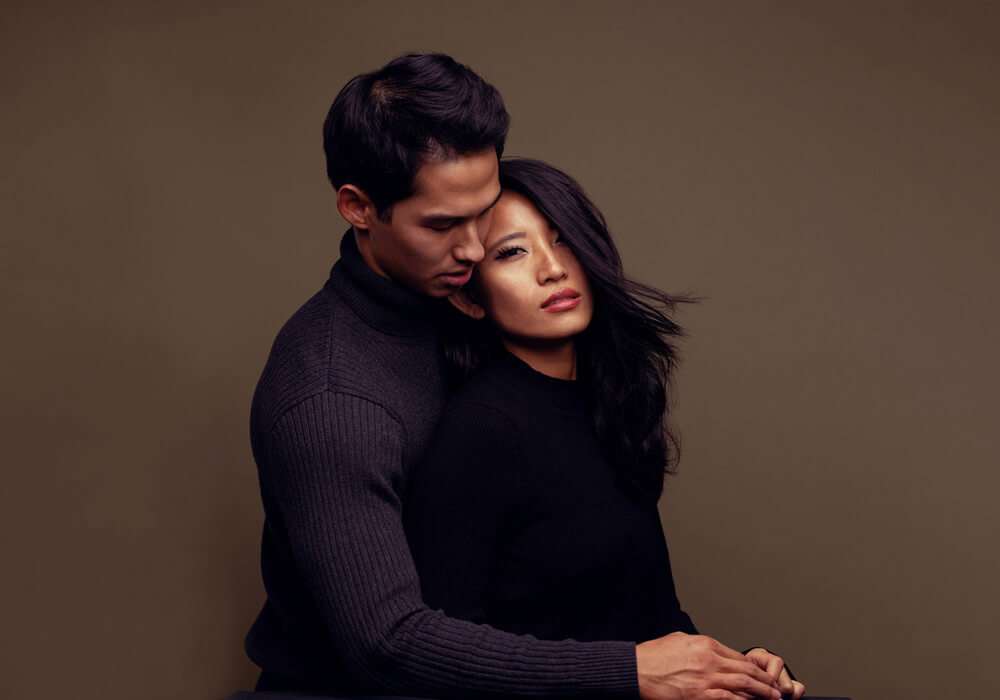
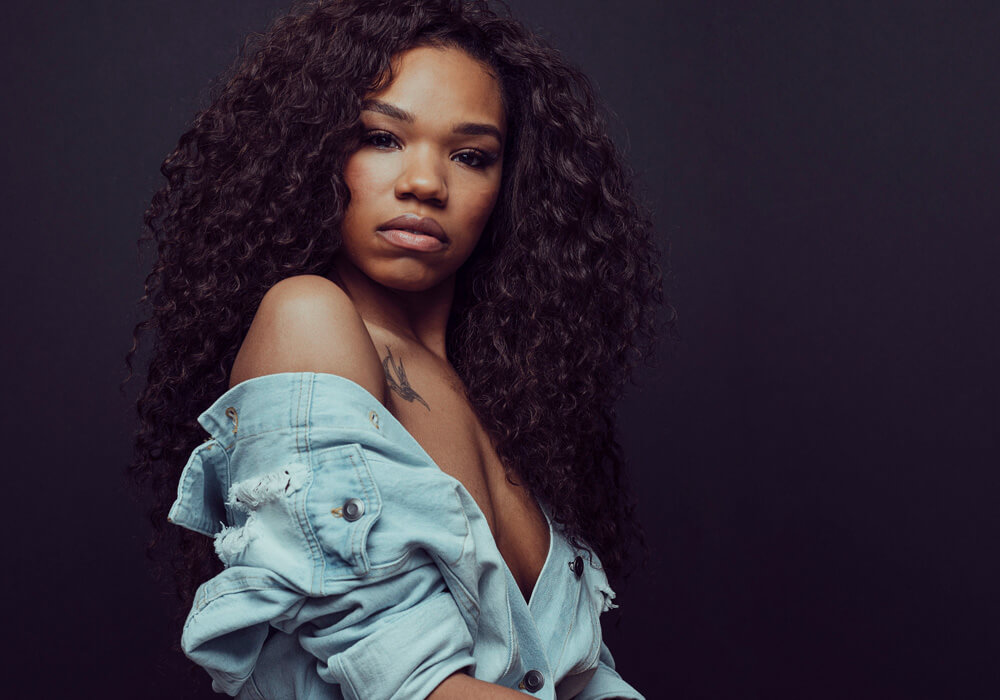
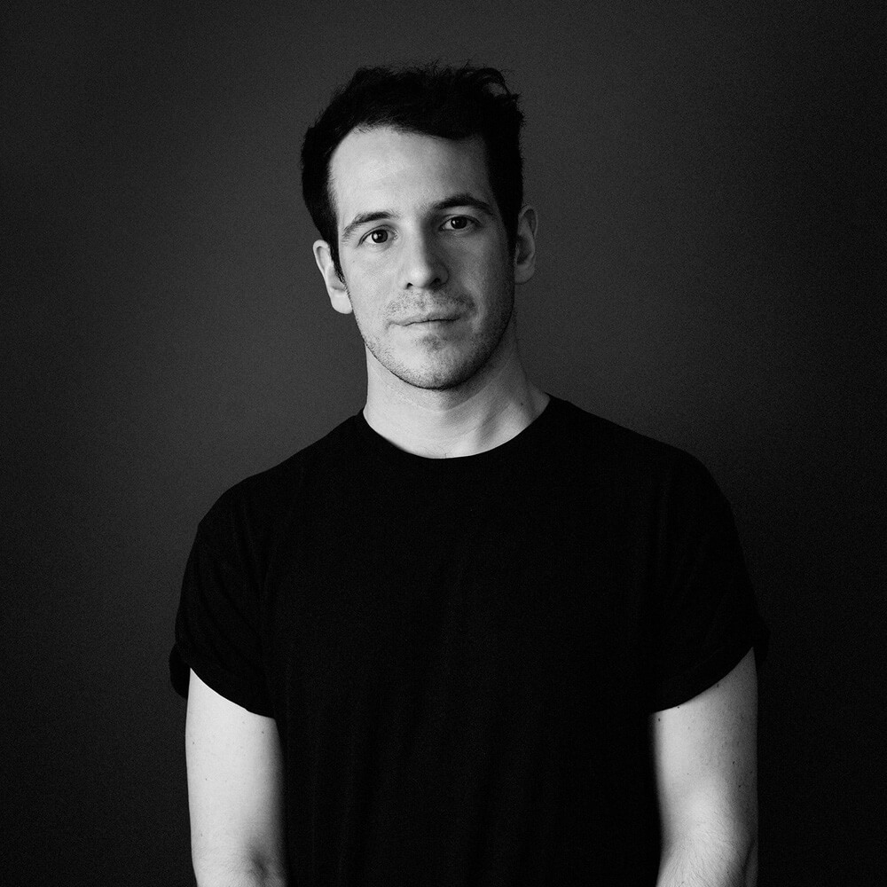
Oscar is just one of those people that you’re better for knowing. He has a really great grounded demeanor about him while still being charming. I’ve known Oscar for a few years now and I always admired his portrait work. There’s a sense of drama and mystery about it. I can definitely say I use it for my own personal inspiration as well. With his experience shooting personalities and celebrities in both studio and on location, we decided to talk to him about a few topics like photography education, his approach on working with clients, and his color grading process among others.

Be sure to get to Oscar through his Website and Instagram!


You graduated with a BA in Fashion Photography from London College of Fashion in 2009. How do you think that has benefited your photography career to-date and do you recommend that others follow the formal education path?

For me, doing the BA in Fashion Photography was a formative time. Back in 2006, when I applied, it was the only degree that specialised in Fashion Photography, and the only other option I could see to learn was assisting.

It did influence the direction I took with my work, I’m not sure where I would have ended up otherwise. However, if I were to be at that stage of my life again, in 2019, I have a feeling I would do things differently.

Now there are so many options to learn, good photography education available to purchase online, and a lot of photographers running workshops too (all for a fraction of the price of going through university, I might add).

When I began, magazines, (and if you were lucky) a YouTube tutorial were available to learn specific techniques.

Having seen some of the courses out there, I would probably recommend going  that route now. At university, we did cover the technical side of things, but generally it was quite entry-level, and not scaled much for those who already knew the basics. With online education you can dip in and out at your own convenience, and repeat sections anytime.

The good thing about university was learning the cultural and historical side of photography and fashion, and we had some very interesting lectures on that. I don’t doubt it could all be found online somewhere, but it doesn’t seem to be as readily available, and consumable as the more technical tutorials. Of course meeting the lecturers, mentors and other students with the same interests and direction was also great.


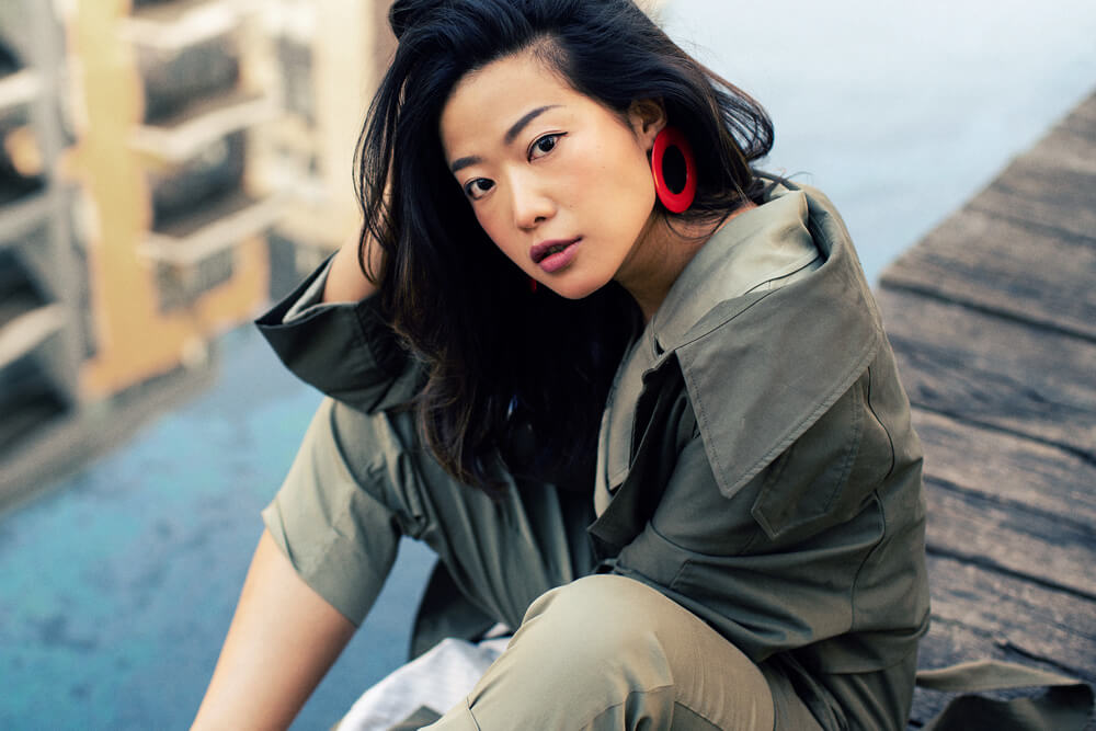
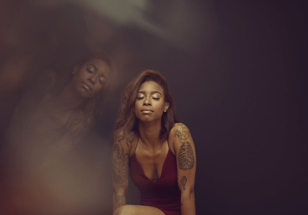
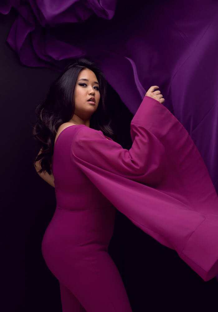
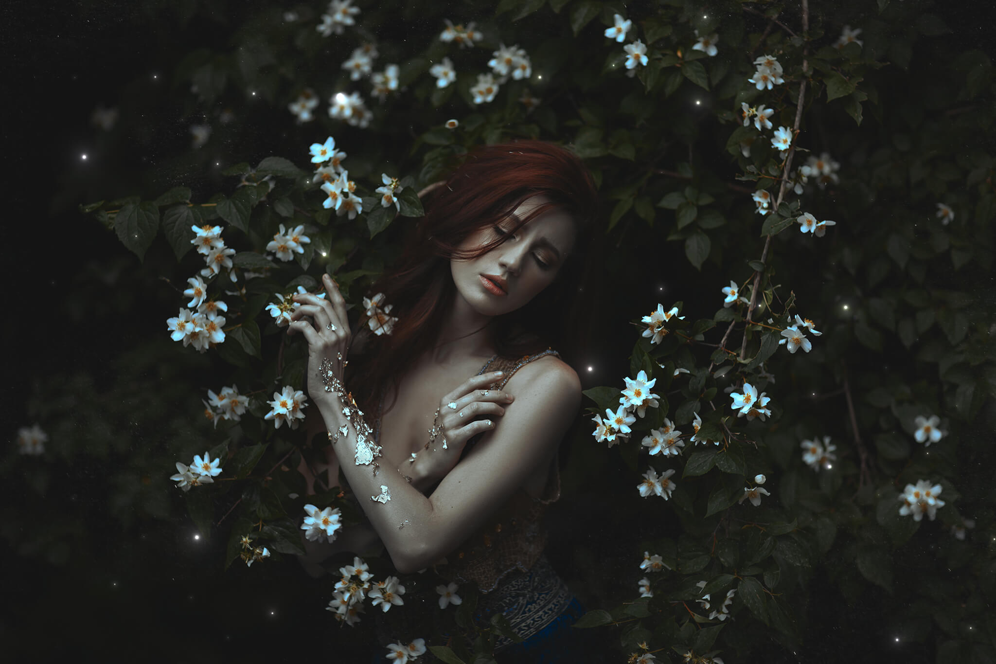
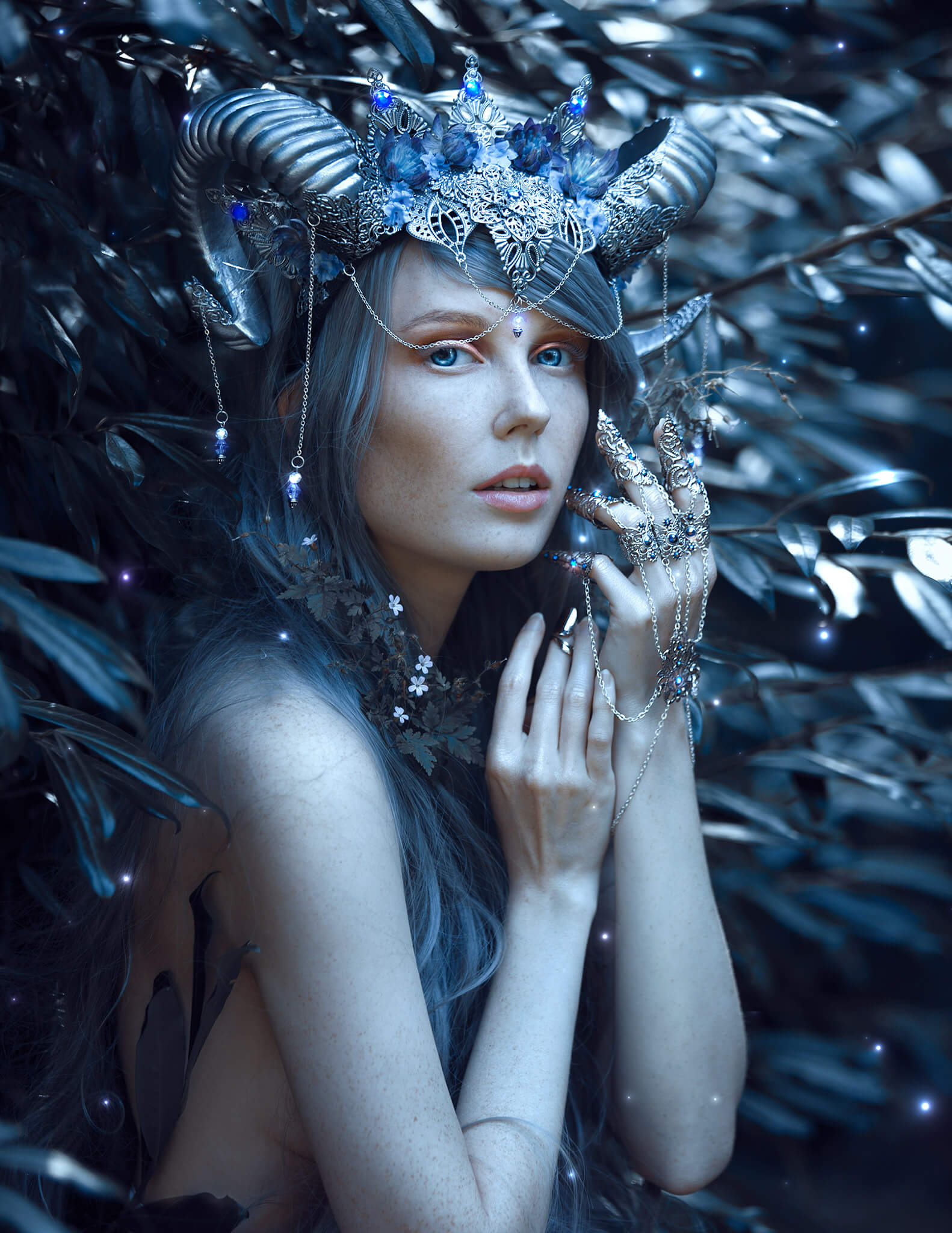
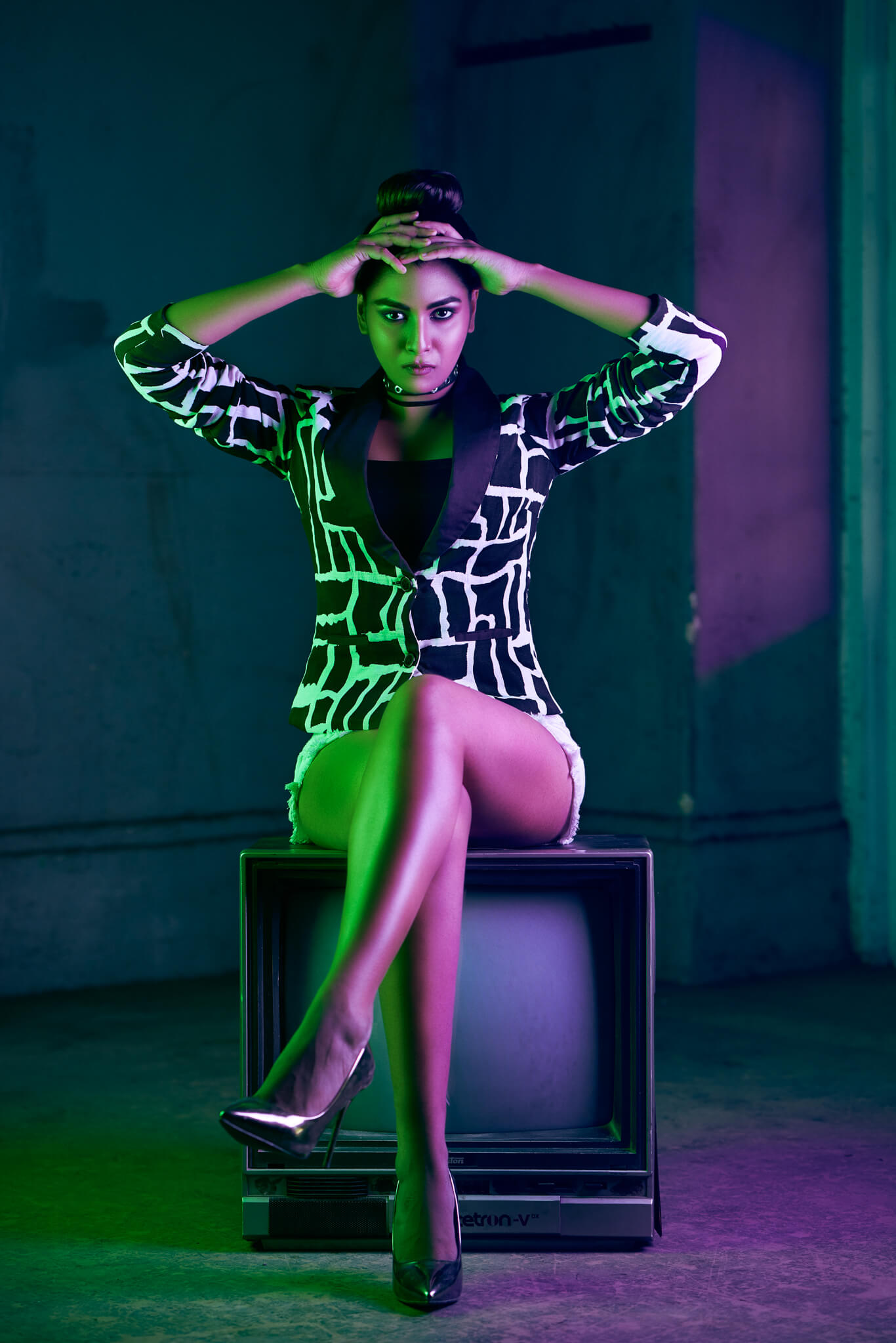
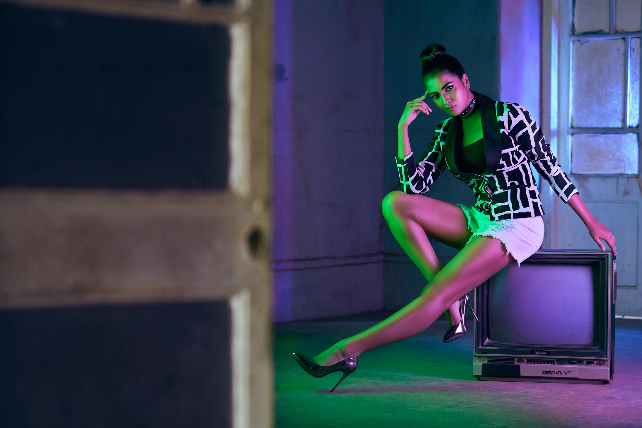
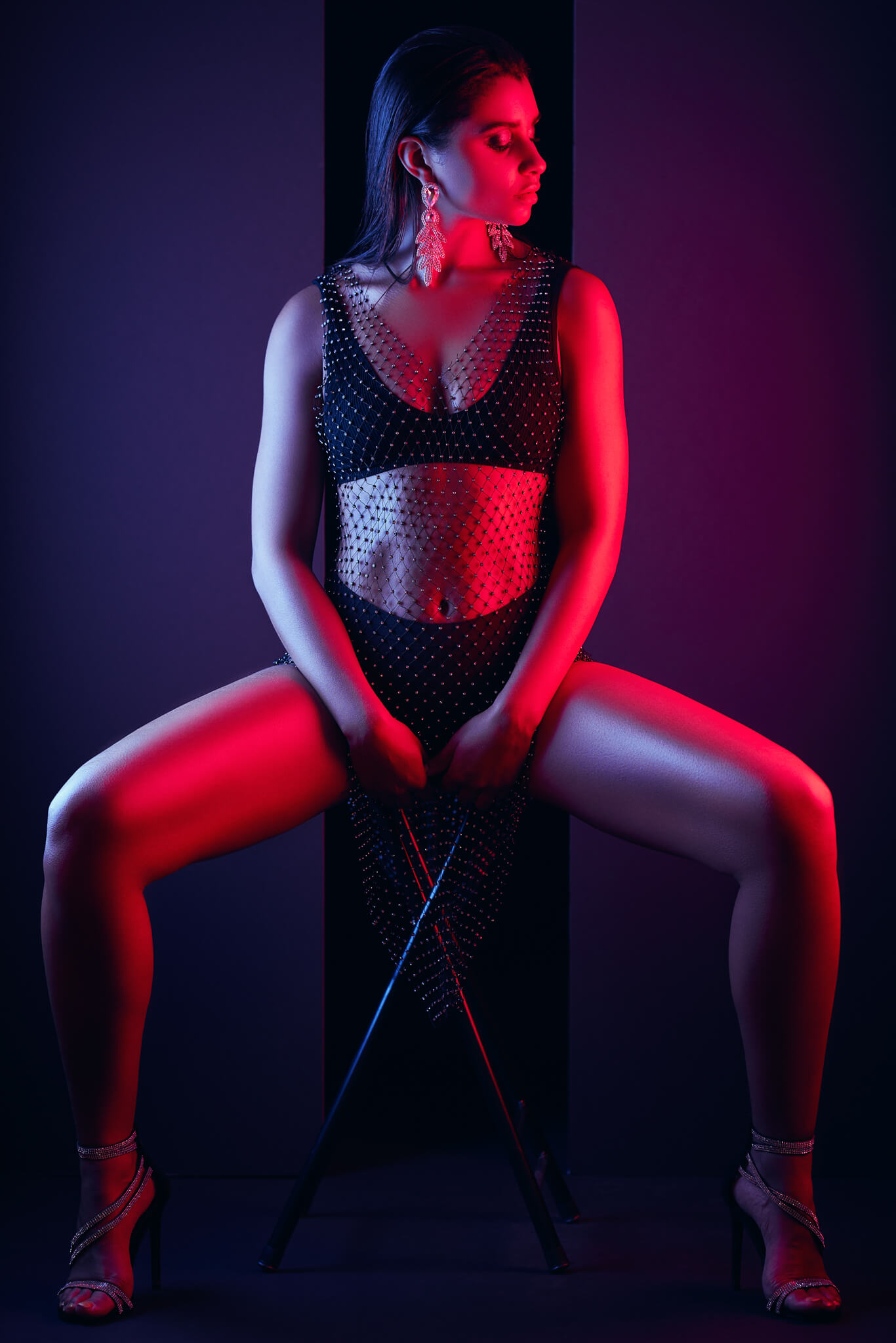
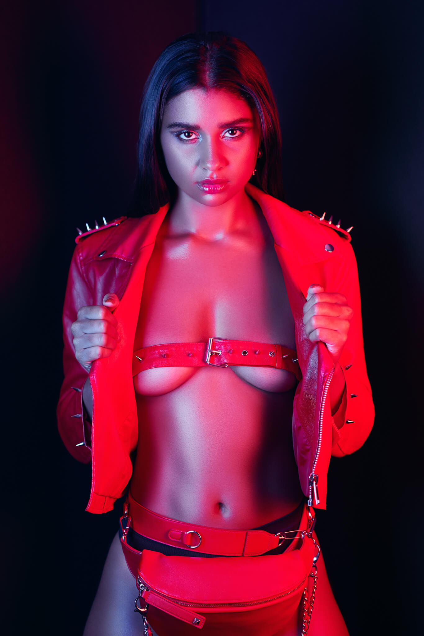
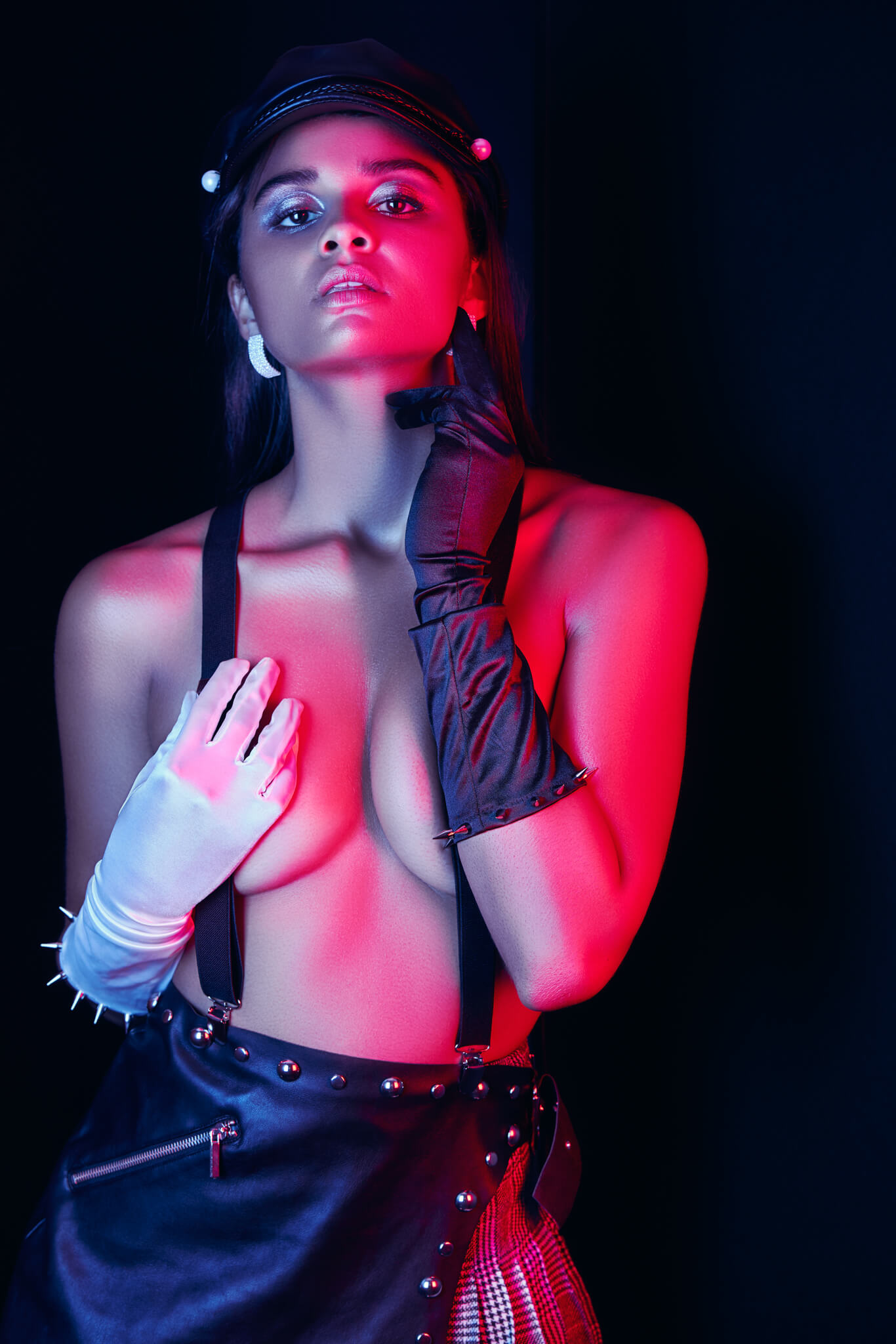
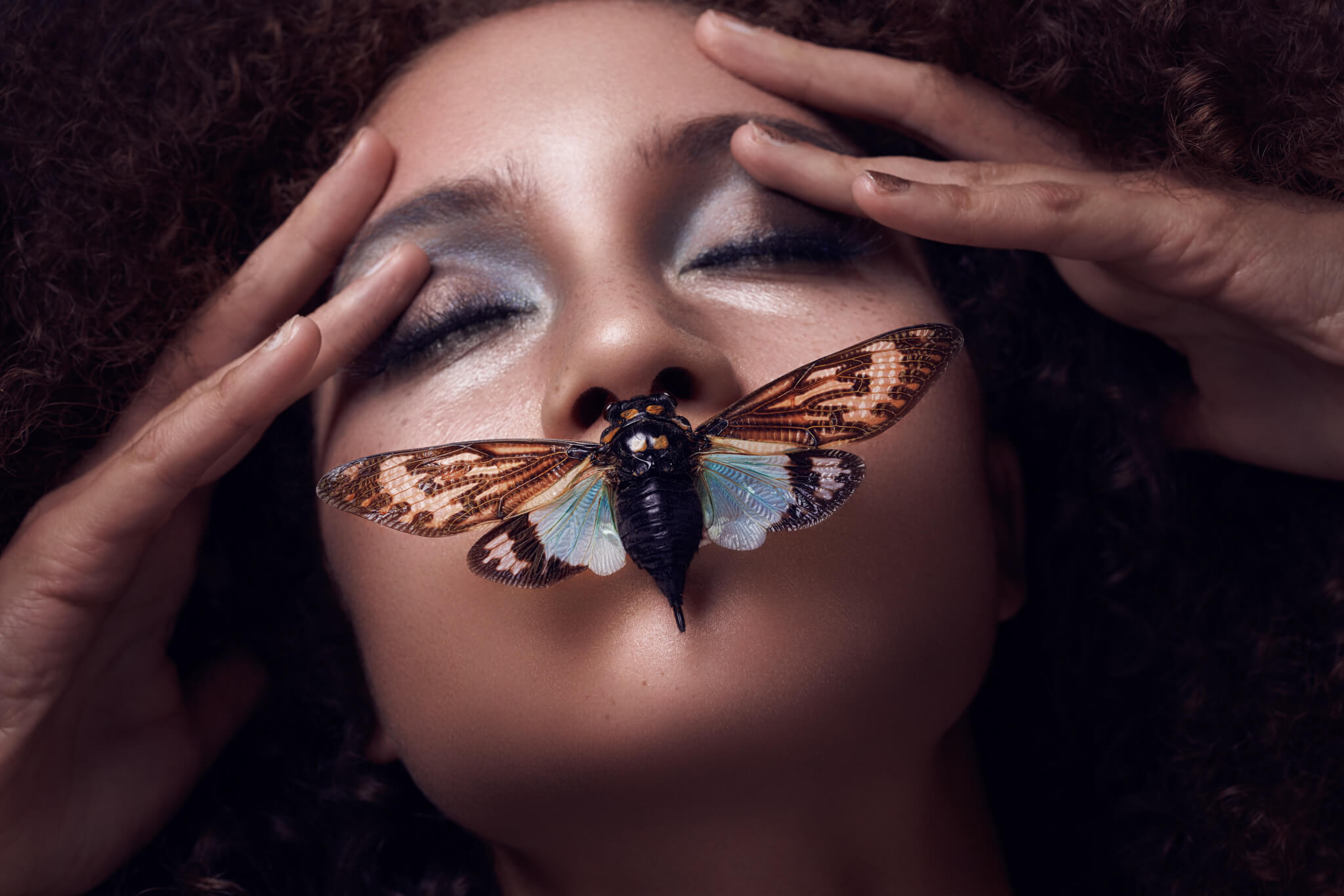
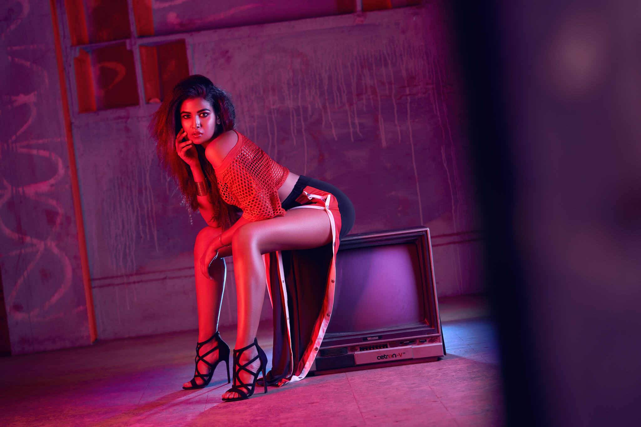
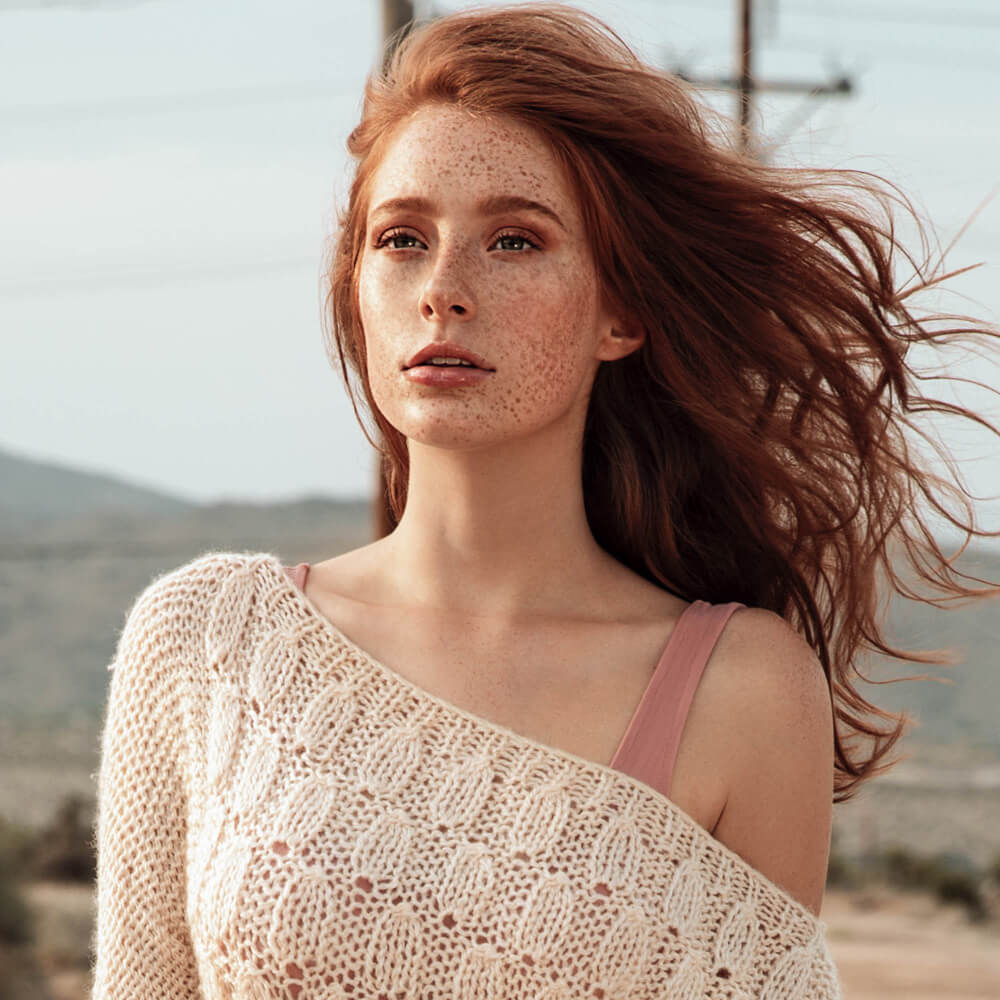
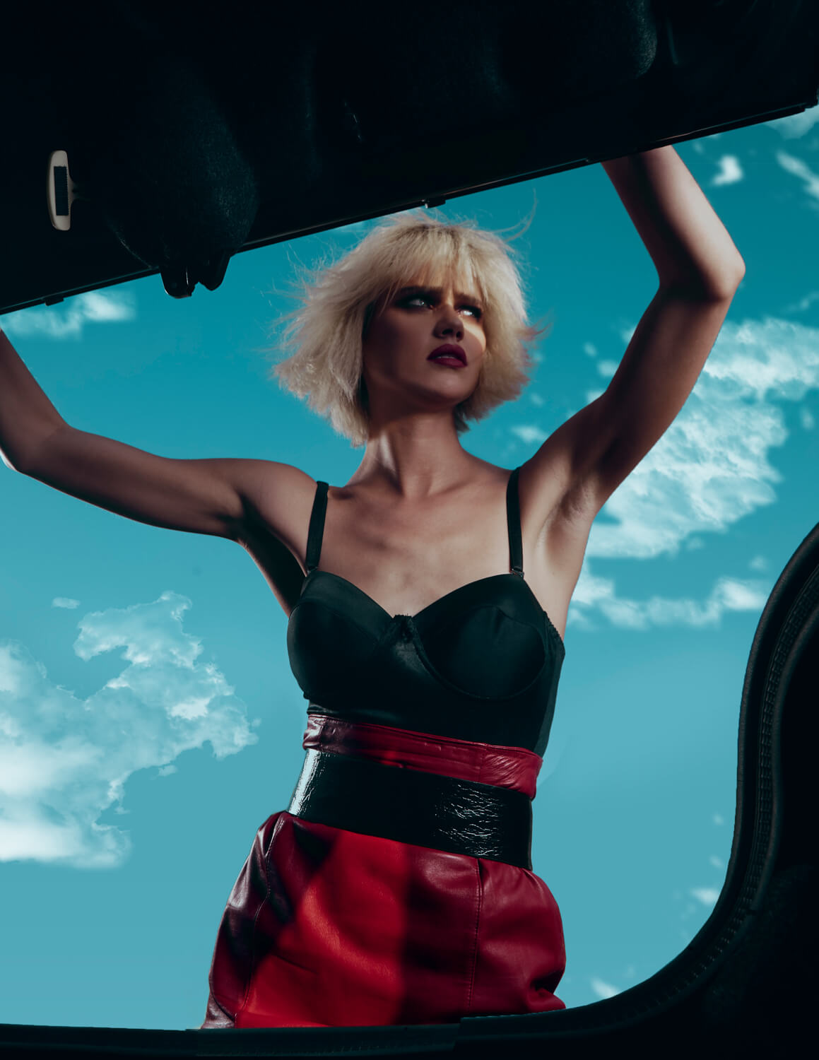
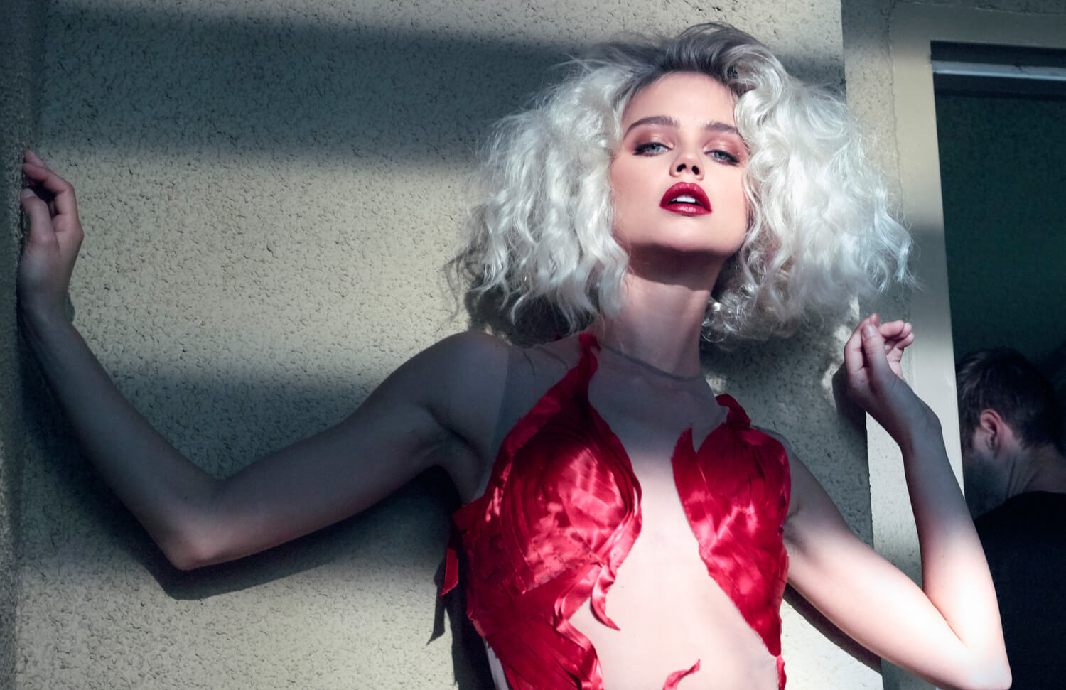
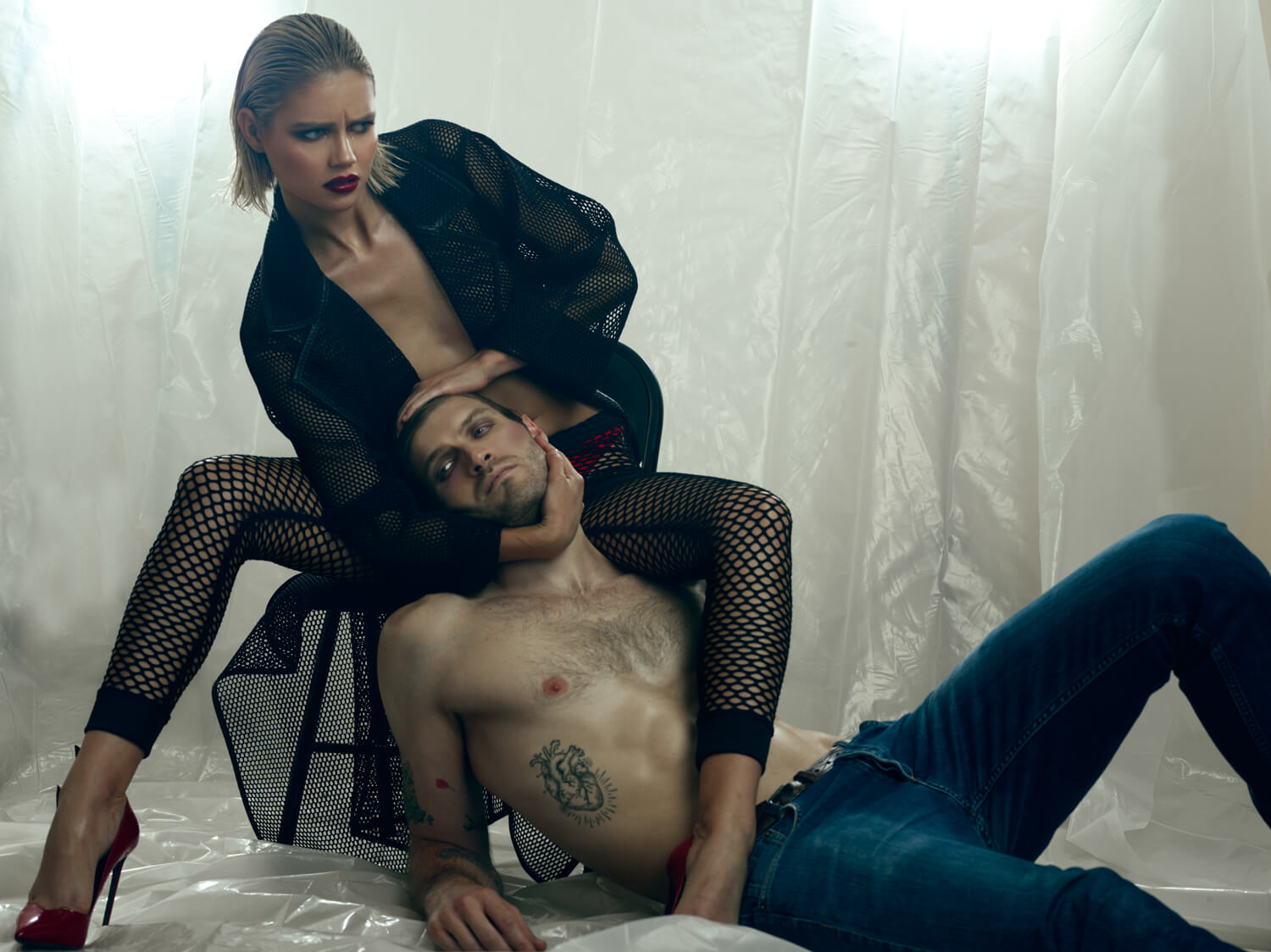
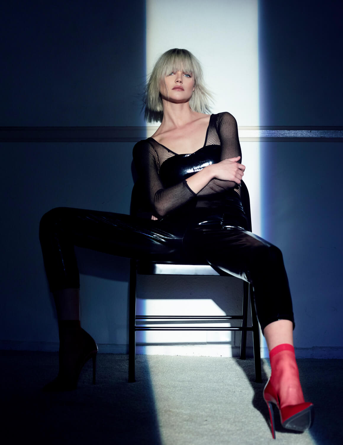
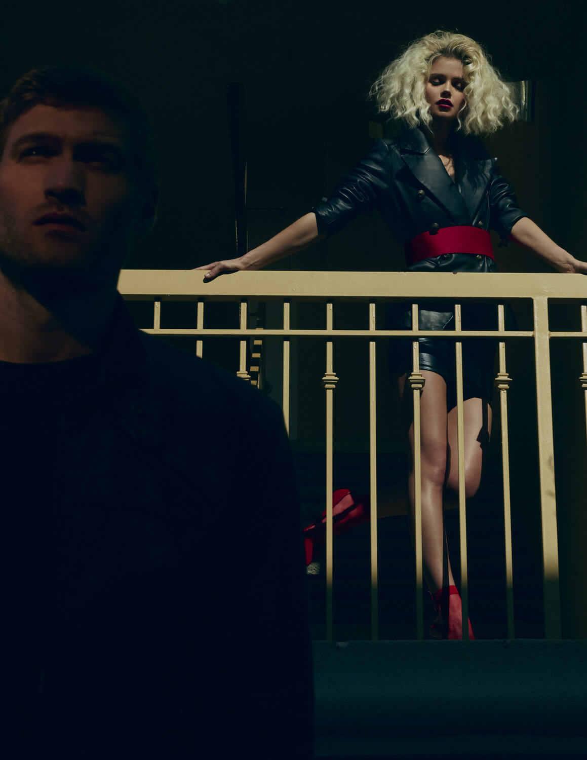
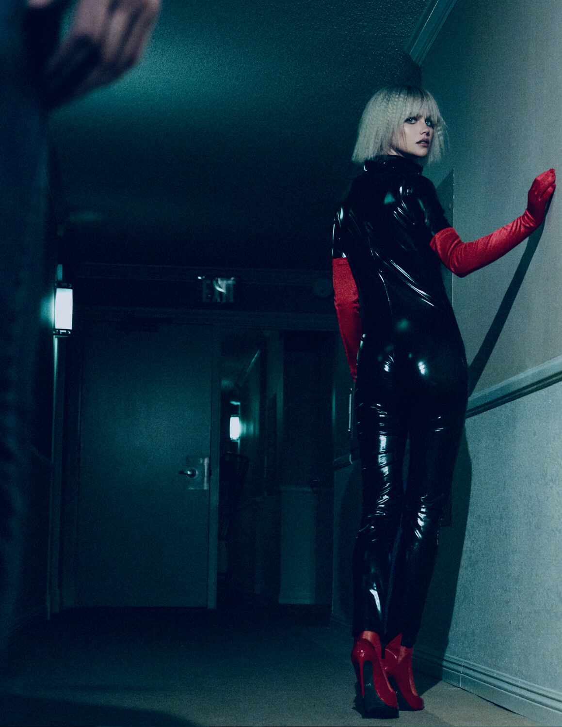
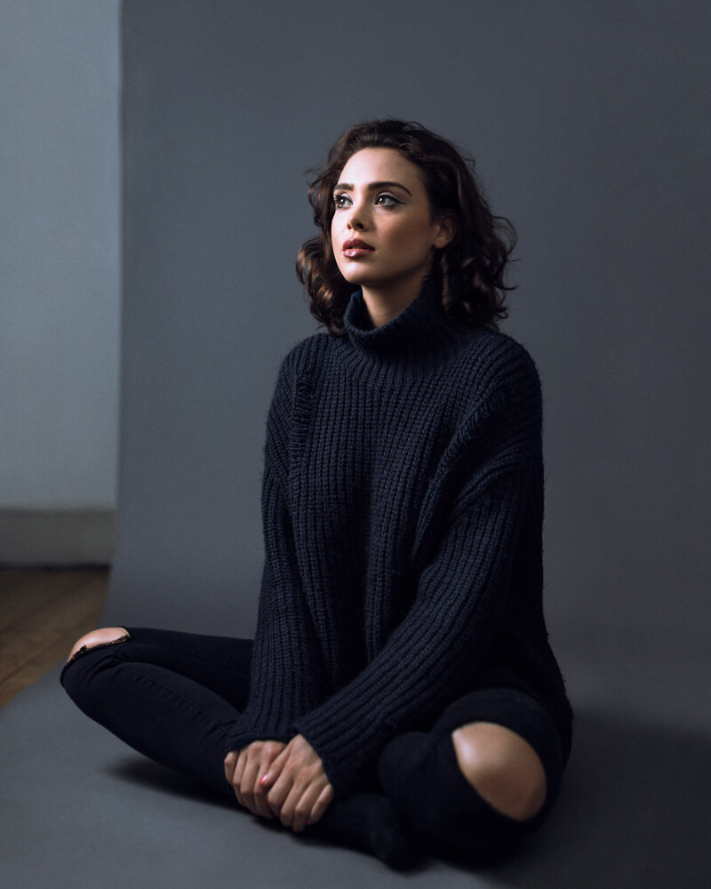
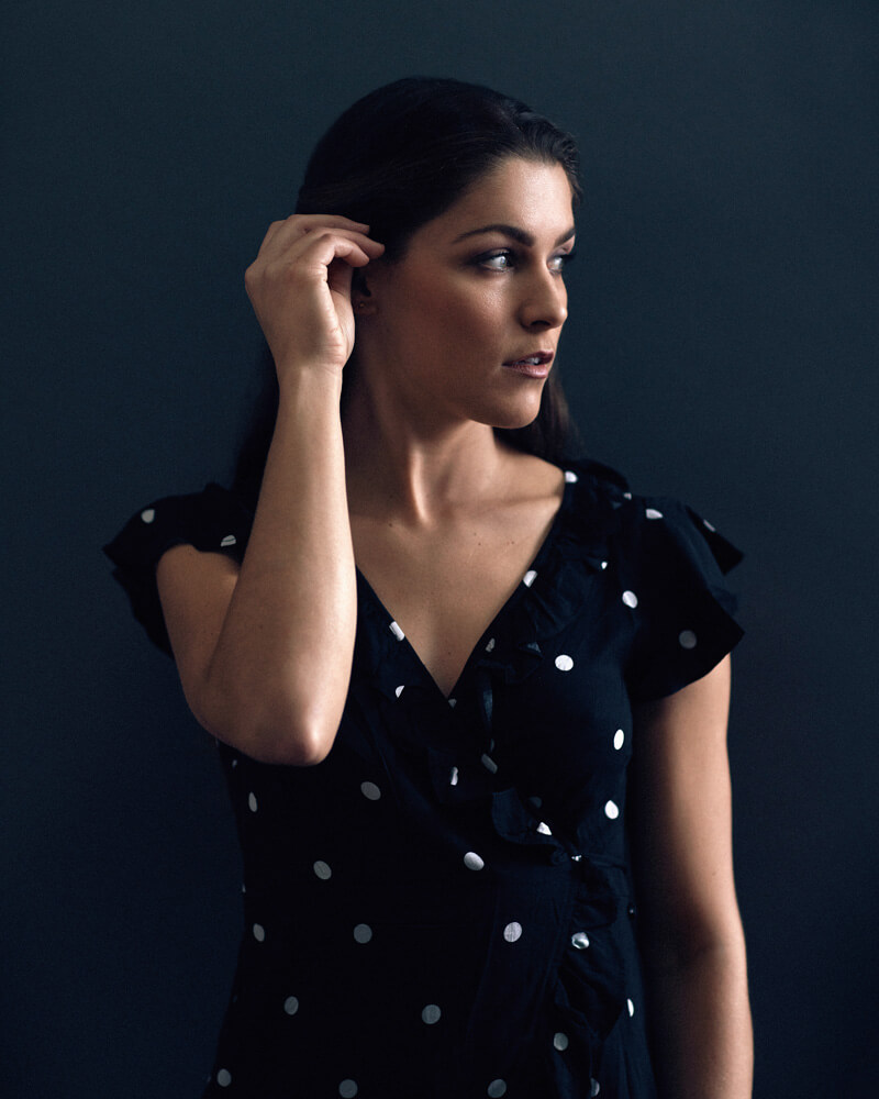
Your portfolio has quite a bit of black and white in it; do you have a preference for black and white over color imagery? How do you decide the direction you will take between the two?

I love black and white, I often find it draws more attention to the subject, and I find the viewer is able to create a stronger connection with the subject. There aren’t as many distractions coming from varying colors in the background (when I’m on location) etc.

Sometimes though, the colors are irresistibly beautiful, and work much better than a black & white image.

I shoot on location quite regularly, so I often don’t have control over what colors appear in the background, when there are a lot of distracting colors, converting to B&W is often my first idea to help the image.

Another occasion in which I often go towards B&W would be when I’m shooting in high-contrast lighting conditions, I love a contrasty b&w.


You have photographed everything from aspiring actors to celebrities and social movers – do you approach shooting with a star differently than you do shooting with other people?

In general, I will approach similarly to how I approach anyone else, I’ll introduce myself and if time allows, talk for a while to make them feel comfortable. To get the connection with a famous person, I think the fame is often a barrier that can get in the way of connecting with another person, I try to avoid this by treating them like a human, I still acknowledge their talent of course, but I try to avoid seeming starstruck. I see them as someone who’s very good at their job, and treat them with the respect that goes along with that.

The other way a shoot with a celebrity often differs, would the amount time I have with them is a lot more limited, so I’d have done lighting tests beforehand, I’d have also made a thorough plan with the client, to make sure we get exactly what is needed from the shoot.

Lastly, I always make sure to also communicate with the talents management to make sure my ideas for the shoot would be okay with them too.


You have shot with Lara Jade on a few different occasions for editorial work. How does it feel having another photographer, especially someone like Lara, in front of your lens knowing that they understand everything you are doing every step along the way?

Lara and I have been good friends for almost 10 years now, and I’ve been taking her portraits for almost as long. To begin with, I felt a little daunted by the fact that she would know exactly what was happening behind the camera, and would know if I had made a mistake.

As we did more shoots, I found her being a photographer was actually a good thing, as we can collaborate during the process and I know she’ll understand why I choose a certain location because the light works best there etc.

Our shoots are always super chilled, and fun as we know how the other works, and how to get the best results possible!


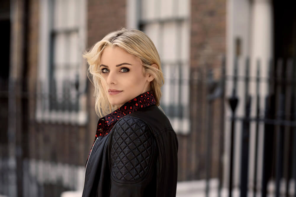
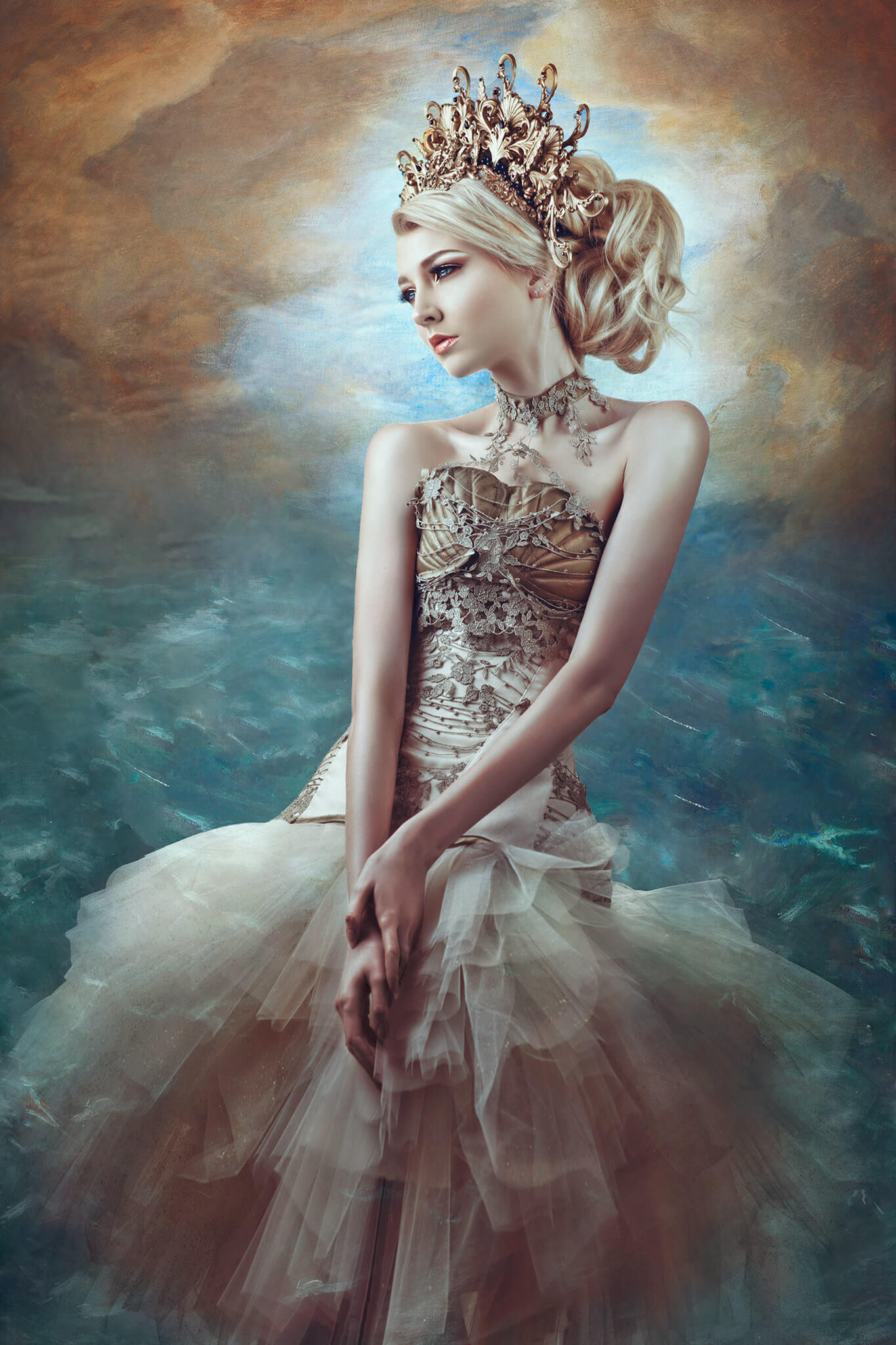
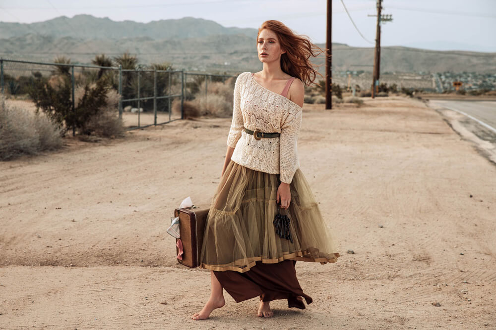
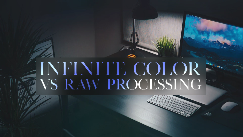
How do you approach your color grading process?

I’ve just recently started using Capture One to process raw files (very late to that party I know!) So I begin there, generally starting by getting the white balance looking accurate, then making subtle adjustments in the advanced color editor – often making most colors a little muted, but leaving the key color in the image quite strong.

When working with color, I like to keep the color pallette quite muted, with one, or two brighter colors to make the subject pop, and draw attention to the subject. I am currently experimenting more with what I can do with color.

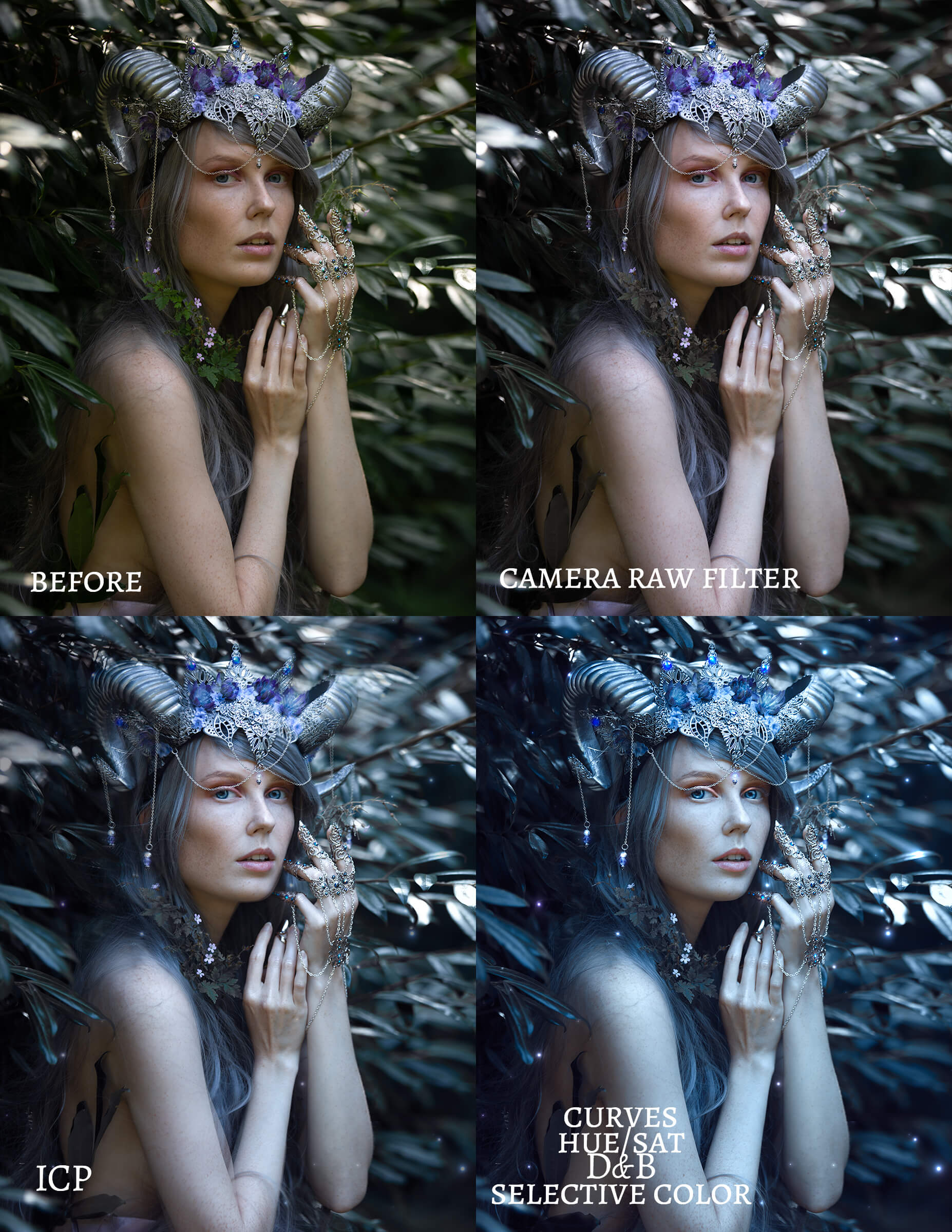
From there I take the image to Photoshop, and as the final part of the process, I use ICP, and Alienskin Exposure to add a little grain and contrast.


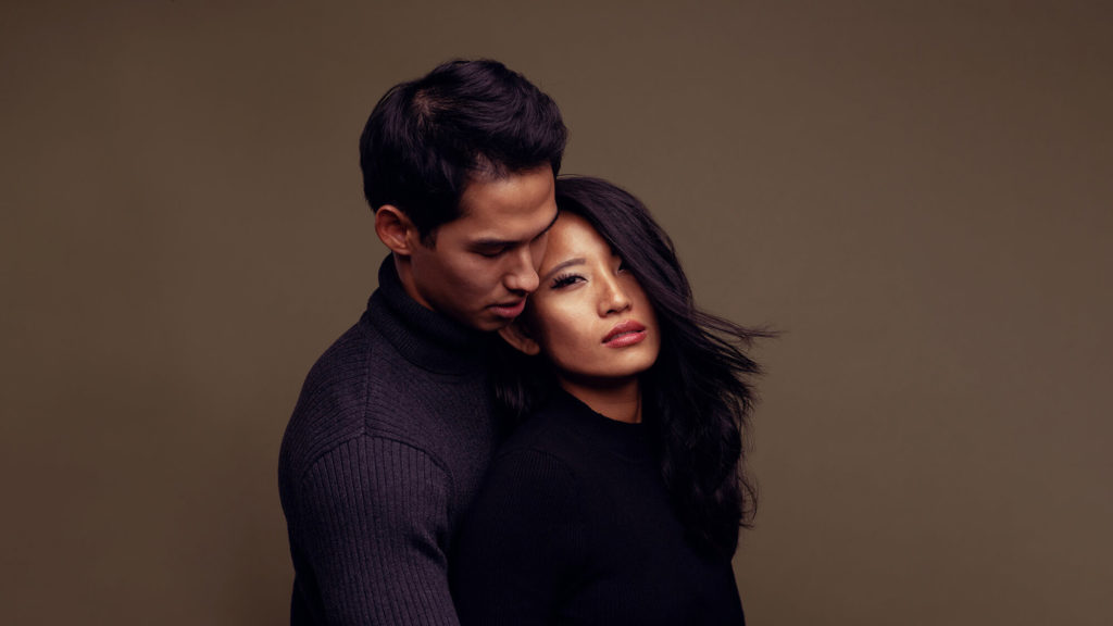
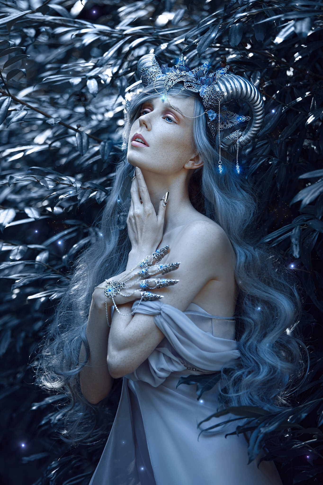
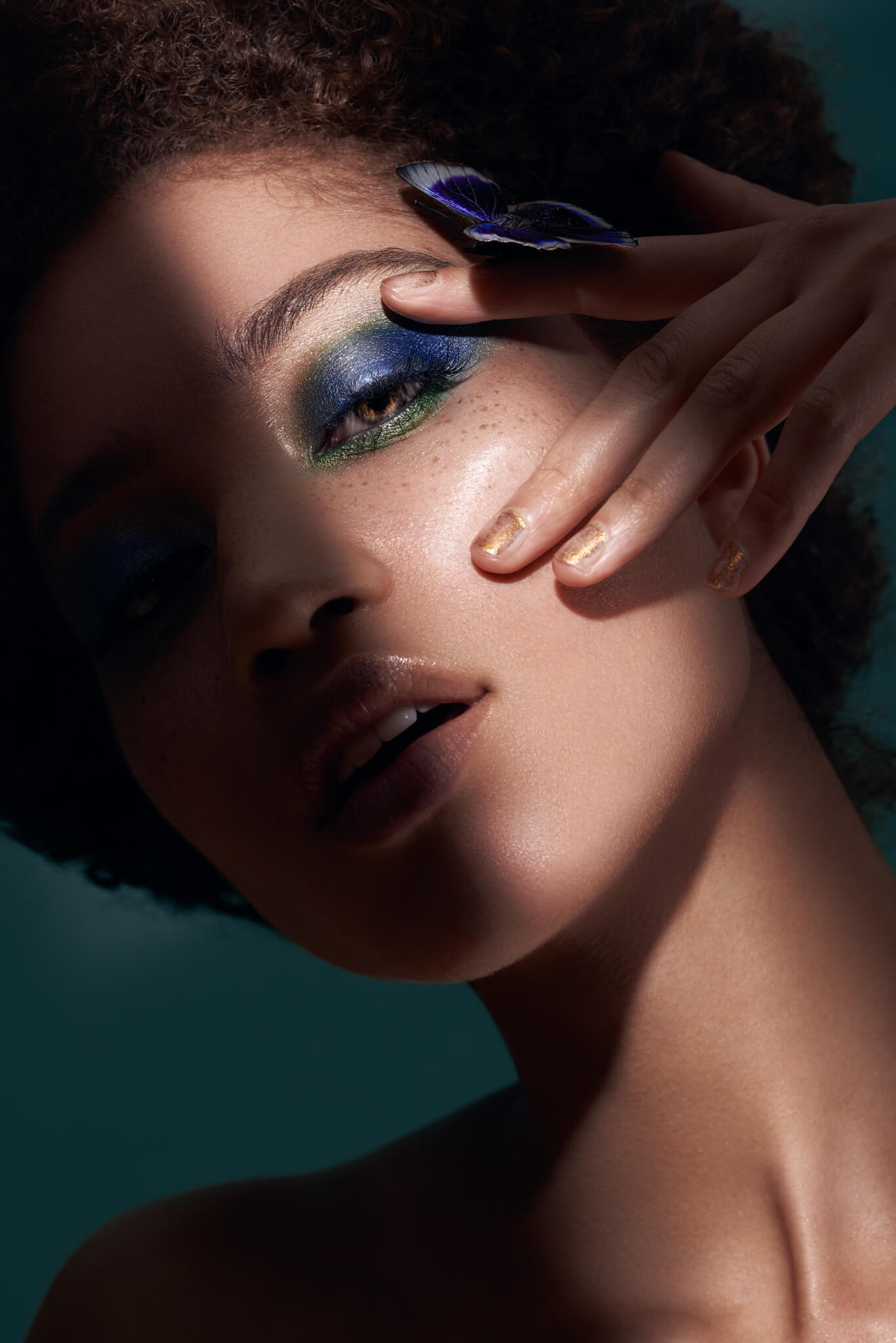
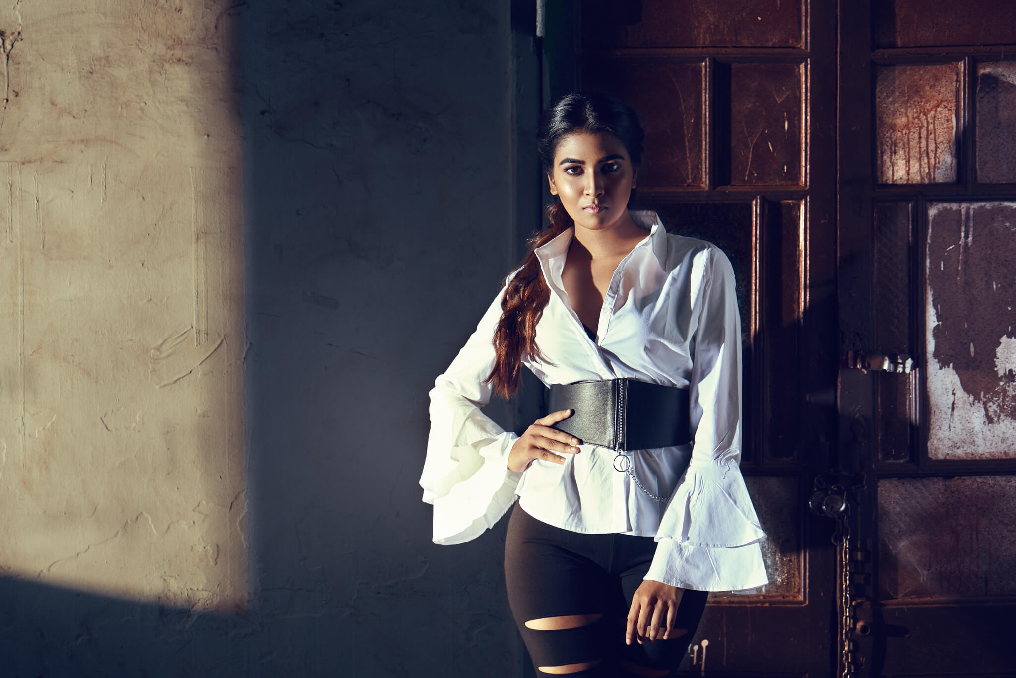
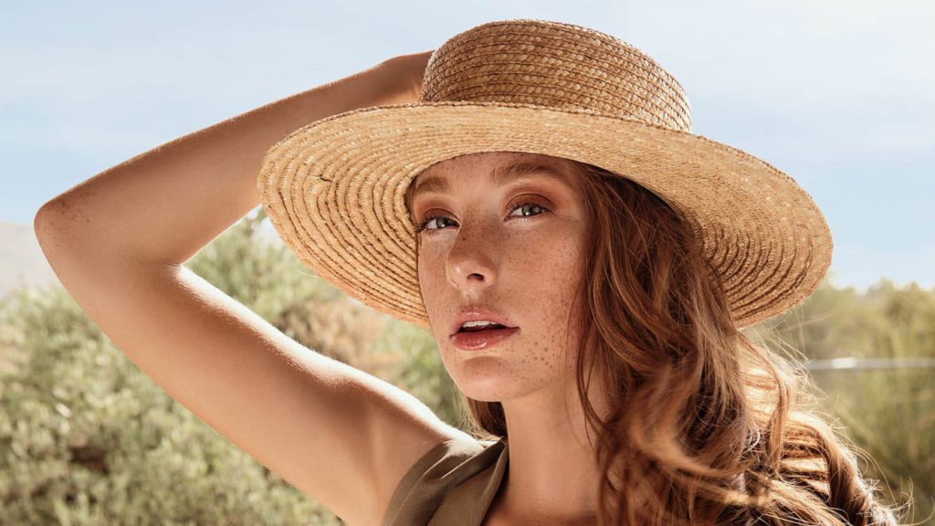
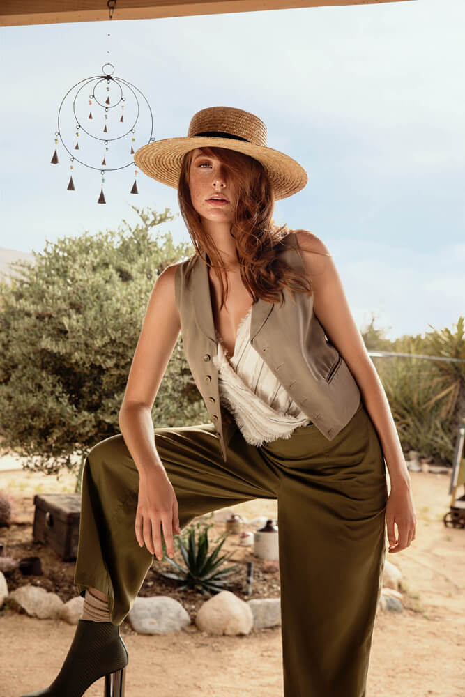
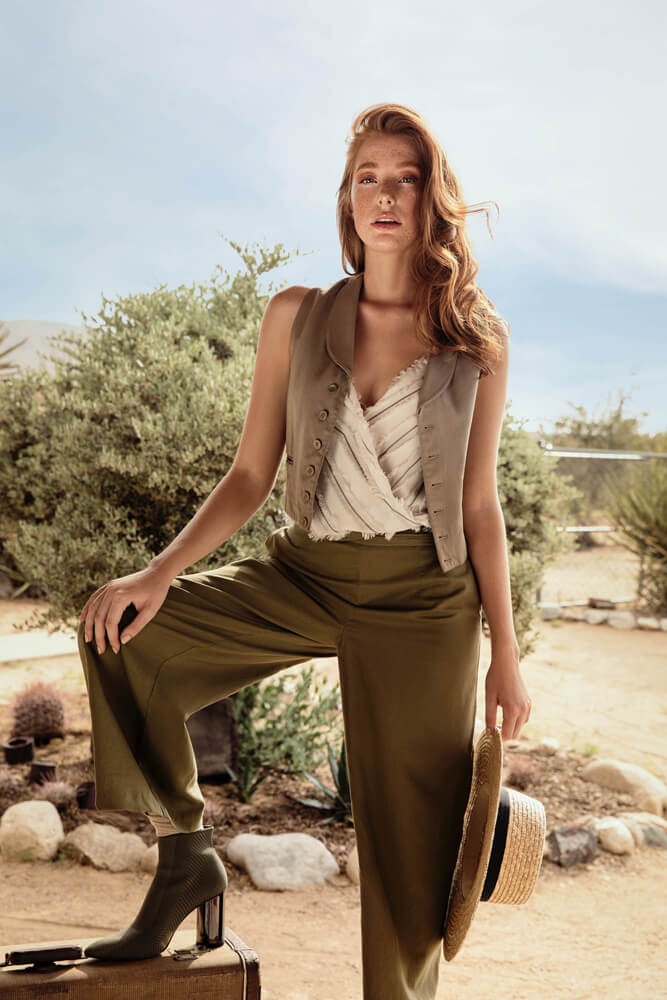
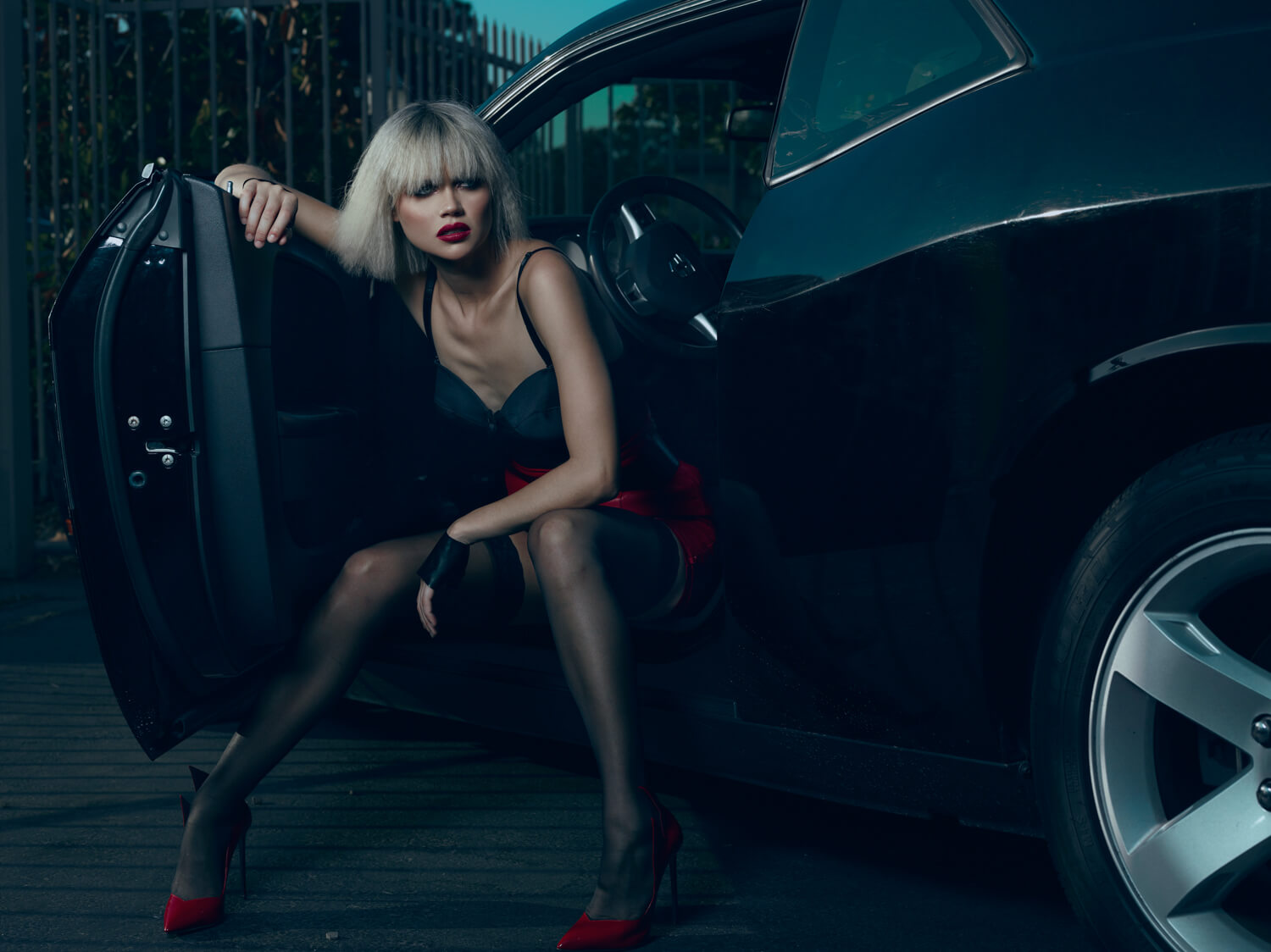
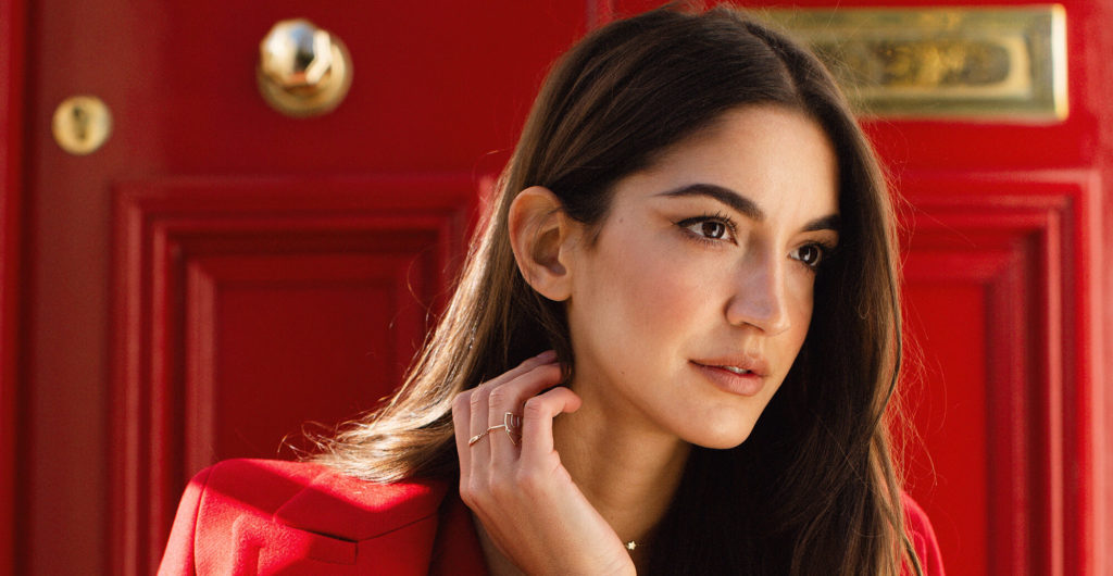
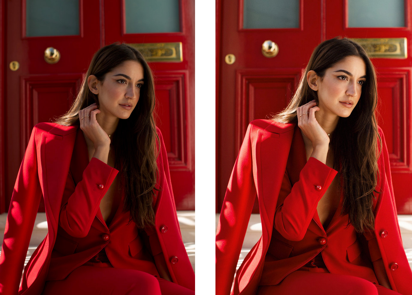
A before/after example of Oscar using Infinite Color Panel.

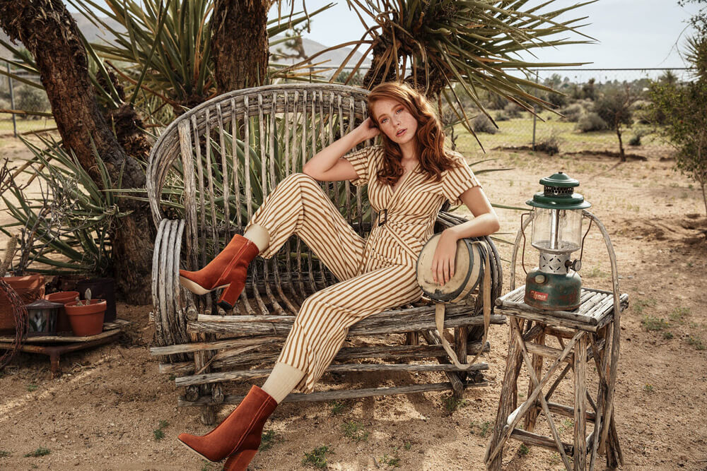
How do you incorporate Infinite Color Panel into your workflow and how do you think ICP benefits those less experienced in color work?

I have always kept my colors quite true to life in my photography, but I have wanted to break away from that a bit recently, so Infinite Color Panel has been great at encouraging me to try out new ways of using color.

Before I started using it, I tended to stick to the same toning styles, mostly out of comfort, and ease. Now I can quickly flick through lots of different options, when I find one I like, I tend to rename the folder, hide it, and start stockpiling other options I might prefer, once I have a few I’m happy with, I’ll go back through my options and choose one, or mix them up a bit.

If I’m working on a group of images, I’d also drag the Infinite Color folder I chose over to the other images to keep the consistency.

_

Have you tried the panel yet? We’d love to see your creations! Get in touch on Instagram @infinitecolorpanel or the Facebook Infinite Color Panel group and show us your work.

If you haven’t tried the panel yet, get started here:  https://infinite-tools.com/infinite-color-plugin/


Creative Conversations with Fine Art Still Photographer Melanie Kern-Favilla

Written by Casey Cosley and Pratik Naik

Melanie Kern-Favilla is the type of photographer you never forget. The way she captures the world around her makes you want to stay for a while and look longer. The colors she dresses them up with compliments the scene perfectly. Melanie is a member of our Infinite Color family and we love the way she captures her subjects!

Be sure to follow her on Instagram, her website, and Facebook.

Your photography is so lovely and entrancing! We adore your uniquely brilliant eye for color, composition, and presentation. How do you go about selecting your subject matter, scouting locations, etc.?

For my still-life images, including my floral photography, I tend to choose subjects that lend themselves to dark, moodier lighting.  For my floral work in particular, I tend to choose blooms which have broad, flowing petals and lots of texture. I love when the subject is gently touched by the light, with gentle fall-off leading into shadow.  I also tend to choose my subjects that have a more sensual feel to them, a la Georgia O’Keeffe.

For my landscape images, most of them are severe weather images.   I travel with a storm-chasing company called ‘Silver Lining Tours,’ and they put me right where the action is, and they do so in a safe manner. I think of it like going to a photography workshop, where the landscape always changes and I’m constantly awarded with great subject matter.

In terms of still-life work, it seems as though you are drawn to many things but especially flowers. Please, if you would be so kind, elaborate on the connection between you as an artist and flowers as an individual and collective subject?

I am simply fascinated by nature.  I love that there are so many different species of flowering plants, all with unique shapes, colors and sizes.  As I continue to develop my eye as an artist, I notice the shapes and lines of many flowers can be so striking, in coordination with bold, bright colors (or completely lacking in color).  I love the challenge of taking something as ubiquitous as a flower and elevate its appearance using light and shadow.

Your art has a lovely surreal quality while still retaining familiarity. In terms of color, do you strive to enhance what is already present, or opt to reimagine  and present your subjects in a more abstract sense?

As a photographer, I tend to grow weary of subject matter easily.  That boredom tends to push me to experiment with color, in order to get different results on a repetitive subject.   I am an artistic photographer, as opposed to a documentarian/journalistic photographer, so I have no fear of changing the color in an image to get the final result that I desire.

Regarding your workflow, how do you integrate and utilize the Infinite Color Panel? Has the panel had an impact on your aesthetic, process, or efficiency?

ICP is always my last step in editing my images, just before final output.  I have such a blast rolling through all of the choices. Many times I have trouble choosing just one!   I usually reduce the opacity of the layer by quite a bit, as I tend to love the boldness of the more intense, heavy-handed colors at the beginning and then realizing that it’s just too much, only ten minutes later!  ICP saves me a lot of time, allowing me to avoid the creation of layer after color-editing layer.

What do you enjoy most about using the Panel?

The ‘Shuffle’ button rules!  I bounce back and forth between all of the shuffle buttons, trying tons of different combinations and adjusting the individual layers.  I tend to gravitate toward the ‘medium’ and ‘intense’ buttons, but I find that I end up landing on the low-opacity end of ‘medium’, even though I yearn for ‘intense!’

Before

After

Do you have any advice for those who may went to explore or delve deeper into still-life and landscape photography? Any thoughts or words of wisdom regarding developing one’s own visual voice and style?

Whether someone enjoys landscapes or still-life photographs, there is really only one sure-fire way to get better as a photographer:  practice, practice, practice. If you find that your images are lacking in some way, then shoot more of them. A lot more of them. The more you shoot, the more you figure out little things that can be improved.  

Another way to improve your photography is to study photographers whom you admire.  Go to the top of the ‘Popular’ page on 500px and see the best of the best. Then try and figure out what they are doing to make those photos so great.  Are they shooting at high noon in July? Or are they shooting with the most amazing golden-hour light? Are they shooting from eye level or are they shooting from a different perspective?    Are they shooting with harsh, direct light, or are they diffusing that light beautifully? When you start to analyze other artists’ work, you start to see things that they are doing right and that you might be doing wrong.  

Once you find out what those photographers are doing to make their images sing, try to replicate it yourself.  And don’t give up if you fail the first 50 times. The more you shoot, the more you will learn what is working and what needs improvement.  I still have so much to learn and I will continue to push myself to get better as an artist and as a photographer.

_

Have you tried the panel yet? We’d love to see your creations! Get in touch on Instagram @infinitecolorpanel or the Facebook Infinite Color Panel group and show us your work.

If you haven’t tried the panel yet, get started here:  https://infinite-tools.com/infinite-color-plugin/

Creative Conversations with The Phenomenal Tina Leu

Written by Casey Cosley and Pratik Naik

We’ve watched the work of Tina Leu for a while now. Her portrait work has been really captivating. I recently found her work on the Sue Bryce group and got to recently meet her in person at the Portrait Masters conference. There is something magical about her work and the essence of it. What I love most about her work is that she photographs a wide range of genres and still manages to maintain her style. We wanted to sit down and learn more about her work and her thoughts on color!

To start, your art is beautiful! We were struck by the diversity of your work and extremely impressed by your unique aesthetic which seems to harmoniously weave throughout all of the genres that you photograph. Is there a specific niche that you would consider a personal favorite, or one that you feel particularly drawn toward?

First, I want to thank you for having me for this interview and your observations of my work! Honestly, I’m still finding my voice through my passion. There are so many creative categories out there that it’s just as challenging as it is fun to focus on just one. However, recently, my journey has taken me to a place where I’m really enjoying portraiture and fitness lifestyle imagery. Although the styles are completely different, the approach is the same with capturing the person’s strength, both externally and internally. The reactions of those I photograph are equally similar as they’ve never seen images of themselves captured that way.  It excites me knowing that I’m creating something that gives them more confidence.

One thing we love about your work is how you masterfully use color to create, define, and potentiate mood. How do you go about deciding upon creative direction, in the post-processing phase of your workflow?

It’s been a learning and discovery process to determine what moods I’m most attracted to.  During the planning of a shoot, I’m more focused on location/setting, styling, and the needs of the client.  The post-processing of color happens when I’ve narrowed down the images and play around with both cool and warm tones. Much of my work is influenced by the emotions that lie behind cool and warm gradients. Throughout the pre- and post-editing process, I search for the connection that feels best for the overall piece and the client’s needs. Once a color palette gives me that emotional response, I know what direction to take to create the best image.

In the beginning, a lot of my work leaned on the cooler side because I love the bright, modern, concrete, and urban aesthetic.  As I’ve learned more about portraiture and the human side of photography, warmer tones have entered into my workflow based on how I interpret it.  Come to think of it, the music I listen to while editing drives a lot of my post-processing decisions. Contemporary neo-classical/electronic music is my ultimate editing soundtrack.  As I’m moving into the New Year, I’m completely inspired to create moods and personal work that evokes how I internally feel when listening to these piano-centric sounds. I suppose my workflow has just changed in this moment! Like I said, it’s been a learning and discovery process, which will never end.

As a photographer with a formal education in the craft, what are your thoughts regarding the traditional, University route versus going it alone and embarking on a self-taught journey?

My formal education as a Photography major consisted more of alternative processes and the darkroom.  The projects centered all around creating artistic imagery, and the supplemental courses for a BA in the Arts included drawing, sculpture, and art history.  I didn’t learn a lot about graphic design/Photoshop (it was only version “CS” at the time!) and studio lighting was just one course out of all my classes. All that being said, the formal education gave me a greater appreciation and understanding of all art forms and their history.  Does it play a role in how I create? Unfortunately not as much as I’d like to admit. I worked in a corporate tech industry throughout school and after graduation, I continued to work full-time for the next ten years with just fun shoots with friends on rare occasion. That prolonged time away from the creative field caused me to forget some fundamentals of my craft.

Now that I’ve transitioned into a full-fledged Photographer and entrepreneur, I wish all that schooling taught me the business side of photography.  There is an abundance of educational and tutorial content on the web that go over techniques and processes – way more than you’ll ever receive from a college degree and for a lot less money.  What I do appreciate from my education are the professors/mentorship and the assignments and projects that helped stretch our minds and creativity. The critiques of the professors and your peers outside of the digital social media realm allowed you to give and hear constructive criticism.  Something that is more lost than found in this current social media era, along with the inevitable feelings of comparison. Going on a self-taught journey is completely doable, respectable, and encouraged. Surround yourself with creatives and a network that embodies community over competition.  You can undoubtedly make it happen in as less than two years with relentless drive and hunger to create. I’ve seen it happen, because, well, I’m living and loving it!


You’re incredible at engaging people in the social realm through Instagram Stories! Is that something you feel is an innate strength, or an aspect of yourself that you’ve developed and polished? Along those lines, do you have recommendations for those that may struggle to maintain an active social presence?

Instagram Stories is the best way for me to connect with my audience in an organic way.  My feed is curated with my work and rarely has a photo of me in it (which will change come 2019).  Stories allows me to share spontaneously about what I’m up to and behind-the-scenes of my shoots. Not only that, it’s something that I can do multiple times a day without having to worry about what my feed is going to look like. Folks are able to see me, hear me, and get to know me.  I’ve gotten several requests from local photographers asking to meet up and share my knowledge, based on the snippets I share from my own journey. The business aspect is not as readily accessible as the creative side, especially finding other photographers who are willing to share that information.  It was really tough finding my way and footing when I started my business. I contacted a lot of photographers in my area who operated their own studio to ask to meet, be mentored, and assist. Let’s just say, the opportunities were slim. At the end of the day, I understand that it’s a business, but I feel that there’s enough space for work and creativity for everyone to show their best ideas. I now make a point to share my lessons, processes, and thoughts openly on IG Stories to help and inspire at least one person.

As an avid social media participant, I feel it’s both an innate strength and a developed skill because I’ve always challenged myself to try the newest tech trend or way to reach an audience. It started with Snapchat, but then having to manage multiple social platforms became cumbersome until IG released the Stories feature.  That feature allowed me to compartmentalize all of the various features from other social media platforms in to one medium. I immediately practiced posting frequently at its early stages and I’d be able to see everyone’s Stories within 10 minutes because folks weren’t quite sold on its existence in the first place. It was like that for several months compared to now… I don’t even know how long it would take for me to actually watch every single Story of those I follow!

For those looking to maintain an active social media presence, take it slowly and be patient with yourself and the process. If you don’t ever post, start with once or twice a week until you’re up to at least 5 times a week.  Share what’s comfortable and easy for you to talk about. When you’re on a shoot, get an assistant or makeup artist to take some BTS shots and save boomerangs/videos of you working that you can post later. If you don’t have someone else, do it yourself. Everyone loves anything to do with behind-the-scenes, whether you’re editing, setting up lighting, meeting a client, going through your planning process, location scouting, what your client experience is like, etc. The important thing is to show up consistently for viewers to see and interact with you so your posts continue to show up on their screens. Set a calendar reminder or use social planning apps if you have to. Have fun with it and don’t overthink it.

Clearly, and for very compelling reasons, you are a champion for printing rather than settling for digital display. Do you approach color grading differently, when editing an image for print versus digital usage? Why is printing so important to you?

I do not approach color grading differently for print because there hasn’t been an issue of discrepancy between what’s printed and what’s on screen, besides ensuring that the shadows are lifted more for print.  It’s significant to me because printing almost gives me the feeling of being back in the darkroom. It provides me with a sense of appreciation of all the work that went into creating that image. There’s a process and end result that can be held and observed one by one, different from digital hard drives of images stored and forgotten.

Originally, I grew up in Germany and am adopted.  Thankfully I still have contact with my birth family, and what I cherish most are the physical prints and albums filled with images from my childhood.  Call me old school, but seeing the corners of the images fade and fray over time makes them all the more valuable. Being able to see my mother and grandmother at my age, my brother who I just recently reconnected with, all those images are priceless.  There’s only one image of each – no copies. It makes you cherish them so much more. Print is permanent and digital is fleeting in the sense of photography. We now easily take thousands of images on our cameras within days and hardly even go back to look at them.  This isn’t just about portraits, travel photography applies as well! These epic trips you took and the adventures and scenes you captured along the way, should be celebrated and printed as well – not just stuck on a Facebook album.

As a user of the Infinite Color Panel, we’re curious to know how the Panel has influenced your artistic relationship with, and workflow related to, color?  

2 words: endless opportunities.  Color theory is still something I’m learning, and ICP has made the process so much easier and fun.  Every single layer can be adjusted to my liking and I can stack additional ICP layers on top of one another to customize it even more.  My workflow has both sped up and slowed down! It’s intensified because I can go through a variety of looks more quickly than before. Conversely, it’s slowed down BECAUSE I can go through so many looks quickly, I end up creating endlessly and going back and forth to compare (if time allows).  It’s given me a more sophisticated color palette that I otherwise wouldn’t have known how to develop on my own.

What is your favorite aspect or facet of the Infinite Color Panel? Do you have any advice for individuals that may be new to the Panel, as far as getting started or exploring features?  

Being able to turn on/off certain adjustment layers and the fact that it creates a neat group of adjustments in the History tab, without clogging it up with individual steps.  It allows me to quickly go back a few creations to compare. Most of all, I love that it’s so versatile. I’ve tried it on my portraits, beauty work, fitness looks, and my travel landscapes – all have resulted beautifully! Other color grading tools either favor landscapes or people, but ICP performs flawlessly on all and results are professional-grade.

For those new to the panel, big CONGRATS and welcome! You’ve made a fine choice. Other than checking out how each intensity level affects your image, play around with opacity and turning on/off individual adjustment layers. You may be surprised how just turning 1 off, can really make your image.

Be sure to follow Tina’s work on Instagram and her Website!

Have you tried the panel yet? We’d love to see your creations! Get in touch on Instagram @infinitecolorpanel or the Facebook Infinite Color Panel group and show us your work.

If you haven’t tried the panel yet, get started here:  https://infinite-tools.com/infinite-color-plugin/

Color Conversations with Grace Almera

written by Casey Cosley

Grace Almera has a knack with colors that will bring you to another world. Her fantasy inspired art holds a promise of the legends and fairy tales we’ve all grown up with.

Her exquisite work peaked our interest immediately and she gracefully accepted our invitation to give us some insight into her creative brain.


Looking at your work brings me back to the days when my head was firmly planted between the page of any fantasy book I could get my hands on. It has a simple elegance that carries with it a breadth of story and power. How did you come upon such a fantastical style?

Photography is a sort of therapy for me. The reason why I started it was because my aunt, who was like a second mom and my best friend passed away. I needed an outlet. Something very different from my studies and previous hobbies.

Back when we were kids, there would often be power outages in the Philippines, especially during storms. My grandmother would gather us in the living room or in her bedroom, and light some candles. We would then sit cosily on the bed or sofa and listen to her stories about mythical creatures living in the forests or scary stories. The latter was not my favourite part back then haha.

So, I think the environment that I grew up in has really influenced and shaped my personal style. I wanted to go back to that cosy place, daydream and feel comforted at the same time, which resulted in the images that I have created so far.

What do your mood boards look like when you’re concepting an image?

To be honest, my mood boards are quite messy. I would make one and send it to my team, but that mood board might change and I would scrap that whole idea if I see something that would work out better on the day of the actual shoot. I would however keep the core story, and update my team.

However, if it’s a client session, I stick to what the client and I agreed on.

Outside of creating art, what type of things do you do to keep yourself inspired and motivated?

I like to spend quality time with friends and loved ones.  Find locations for future photoshoots. I also love watching fantasy and sci-fi movies, where I often get my inspiration. This might sound weird, but when I feel that I had a long and rough day, I like to go to my favourite coffee shop, sit close to where the windows are and look at people passing by while drinking a cup of coffee. I would then try to imagine what kind of person they are and what characters in a fantasy movie or book they would be.

I also like going to exhibitions (we do not have that many here in Denmark though) and look at the works of talented creatives. Moreover, I live near two castles; one of them is close to the sea. When the weather is warmer, I like to sit by the harbour and just enjoy the view. I think it is important to have days where you do not really do anything and just reset and refuel.

How has your style evolved over time?

The first couple of years from when I received my first camera, I used it to take photos of mostly flowers, my parent’s cat and random things. As I mentioned earlier, I used photography as a sort of therapy. I would take my camera with me whenever I go out for short and long walks. I would then use the images that I took as backgrounds for quotes that I like from films, poetry and lyrics. I called my page in Facebook, “Photography Smashed with Poetry”, which I changed to my name back in 2016, when I decided that I wanted to pursue it full time after I took my master’s degree in marketing.

I am quite fortunate that I knew from the start that fine art and fantasy themed images are the genres that I liked. I really enjoyed the works of Tim Walker, Zemotion, Brooke Shaden and Emily Soto. I was following them on social media, reading their blogs and watching tutorials on YouTube.

From there it was more or less trial and error as well as a lot of experimenting to find my personal style. The thing that I love about photography is the fact that you can always learn or try something new.

In your blog, you mention that you are a part of the Free Spirit team. Can you tell us a little about that and how you got started with them?

I met the founder of the Free Spirit crew and his lovely wife (designer Fraise au Loup), when they invited us to Paris a couple of years ago for a project featuring Fraise au Loup’s new creations. After the trip, they asked if I wanted to join the organisation, which I gladly said yes to.

The Free Spirit is a group of passionate individuals working together to create several projects and campaigns to raise money for an orphanage in Africa. We combine art and philanthropy. Last year, we started a campaign called “The Essence of Life”, which is a project dedicated to create awareness regarding climate change and the human impact on the environment.


At what point in your creation process do you come up with the colors you want to use?

From the actual planning to post-processing. I usually try to choose colours that I know will complement each other when I choose the outfits and makeup look for the model. Sometimes, I get lucky with the location and I only need to tweak a bit of the colours in Photoshop. Other times, I need to composite to create the background that I want, or add elements e.g. fabrics, fireflies etc. Photoshop is such an amazing tool to bring your images and imagination to life.

What would you say to people who are curious about ICP and want to know if it’s for them?

Purchase it! NOW! You won’t regret it. It’s very addictive, but don’t purchase it in the middle of the night as I did. Especially if you have an important meeting or work the day after, because you’ll end up clicking that “create” button over and over again. ICP will give you unique looks to build the mood of your images.  

How hard is it to get to the final result for your colors on your images using ICP? Has using ICP made the creation of your work easier?

I sometimes have days when I’m not really sure how I want to edit a certain image. On such days, I would play around with different adjustments in Photoshop, which makes the editing process much longer than usual. Using ICP not only saves me time, it also creates so many different looks. It gives the base of the overall mood that would usually take me hours to figure out.

 ICP is also buildable, so you can keep on stacking the colours, tweak them and add your own adjustments to get the final look that you want in the end.

Actually, you can end up with so many looks; you’ll have a hard time choosing, which is such a luxury. Furthermore,  ICP is very versatile and you can use it whether you are toning for beauty, fine art, product photography and so on.

If you want your jaw to hit the floor you’ll chip a tooth, check out more from Grace Almera on her website and keep up to date with more of her incredible imagination on instagram, YouTube, and Facebook.

Have you tried the panel yet? We’d love to see your creations! Get in touch on Instagram @infinitecolorpanel or the Facebook Infinite Color Panel group and show us your work.

If you haven’t tried the panel yet, get started here:  https://infinite-tools.com/infinite-color-plugin/


If you’re still reading (I know you are) check out this amazing step by step visual of Grace building her color with ICP!

Color Conversations with Rutvik Katuri

Written by Casey Cosley

Being a self-taught photographer is a tough row to hoe, and Rutvik Katuri being of that ilk has brought the same perseverance to the table and mixed it his special brand of craft. Each of his images has a thoughtfulness of design playing throughout from conception, to color, and tone.

Rutvik’s ability to balance those elements and create depth is a skill we strive to achieve.

Join me for an internet round of applause (is that just a bunch of clap emojis? 👏👏👏) as he shared that with us what drives him and how he considers his artistic process.


Your work has such a strong presence of story while maintaining a sense of self that maintains a style unique to yourself. How would you describe that style to someone who has yet to see your imagery?

Fashion and beauty are essentially the two genres I am pursuing and am fascinated with. My sense of aesthetic is currently evolving in beauty but I like experimenting with the play of colors, while adding a dramatic element to it. Drama with a great deal of vibrance and edgy, And bold is my current fashion aesthetic. I consciously aim to have a consistent aesthetic in both these areas of my craft.

What part of your process feels the most personal to you?

The art of crafting and shaping light is something I love. This process excites me about this field and it conveys my perspectives and the essence of my work and is most personal to me.

Tell me a little about your concepting process.  

I draw my inspiration from some of the top fashion & beauty photographers like Lindsey Adler, Tina Eisen. Movies and music videos also influence my thought process and ideas. As an example when I’m inspired by a certain light or possibly an element from these shoots or music videos it results in an idea for which I discuss a collaboration with my stylist and MUA, and all the elements become clear to me and then I take it forward. From there everything fits like a jigsaw puzzle and it also evolves into narrowing down on the model, the kind of expressions and posture which ultimately is my concepting process.

Is there a facet of your work you’re proud of?

Before I pursued photography, I was fascinated with photoshop, also proved my love for graphic designing in my early years. And when I took up photography my love for graphic designing transformed into my love for retouching. I am a self-learner, so I spent time watching tutorials on YouTube and kept exploring the idea, I was having to do lot of trial and error. That is when I finally got a hang of retouching skin & hair. But for me the most important thing about retouching that defines my work is the color grading process and tweaking the light in post to get it to where I want. That way the viewer perceives the image exactly how I want them to view it while my idea behind it is transferred to them. By tweaking the light and color I can control how the viewer views the images. It definitely took a lot of effort and time to understand but it also keeps me going.

What part of your post processing workflow has taken you the longest to master?  

I believe that one never stops learning. The process of Retouching hair and skin is not for the faint-hearted. It’s something that requires patience and a lot of love. They are both daunting to me till date but keep me on my toes while making sure I’m still evolving.

Do you have a routine that helps you get into the editing groove?

Having the attention span of a chimpanzee which is about 20 seconds in other aspects of my routine, my love for my work has me glued to my computer for more than 8 hours a day retouching images. Also, I am very particular about the perfect temperature in my room. The comfort of my seat has to be just comfortable enough to work but not too comfortable that I doze right off. And most importantly, my playlist. Each beat in a track adds to my editing groove.

In what way does using ICP help with the creation of your work, and that workflow?

Before starting the post-production for any image, I generally have a color palette in mind and I complete the image on my own, no problem! There are many situations where I don’t know what I want or complete my initial color grading process and realize it’s not working. This is where ICP steps in; it really helps me get an idea of what I want or at least get me close to it so that I can tweak and turn it into absolute perfection. I absolutely love the shuffle tool, it is my go-to when I feel like trying something entirely new and different or get to a good starting point.  

What would you say to people who are curious about ICP and want to know if it’s for them?

Well for most artists today the clarity about their end product or how to get there can get unclear or hazy, which can lead to them not satisfied with the result. This tool is definitely for them, and like I mentioned the shuffle tool is simple yet the perfect tool for color grading.


How hard was it to get to the final result for your colors on this set?

Retouching or color grading for me isn’t about finding it hard or easy. I look at how much time it consumes and how much of tweaking is necessary. And for this particular set because I already had a color palette in mind, once I got my base/first image, it took me no more than a minute to apply that color group into the rest of the images to match. For an image or two had to tweak it a bit more to get it to where I wanted. And the base/first image took around 2 minutes to get to where I want with ICP.

Do you have a vision of the colors you want to use for future work?

Since I make the conscious effort to keep my aesthetic evolving, there is a lot to explore for me, but if you see any of my work, you will see a majority of black and cool tones. On very rare occasions there is a mix of cool and warm tones. My current work is now starting to branch into broader color palettes that are current in the commercial market.

Check out and stay up to date with Rutvik Katuri’s work by following his instagram, facebook, or purising his website!


Have you tried the panel yet? We’d love to see your creations! Get in touch on Instagram @infinitecolorpanel or the Facebook Infinite Color Panel group and show us your work.

If you haven’t tried the panel yet, get started here:  https://infinite-tools.com/infinite-color-plugin/


Anja Ekstrøm’s Desert Inspired Fashion Shoot Flourishes

Anja Ekstrom is a photographer that I am also proud to call a friend. Accordingly, she posted this recent shoot in our Facebook group that I was in love with and coincidentally, she used our Infinite Color Panel as a part of her workflow! I had to feature the images and ask her what went into them.

Below, she talks about how she came up with the shoot from start to finish that is just fascinating to read about!

You can click on each image to see it larger.


Anja writes:

Last year when visiting LA I shot in a dried out lake and an idea started to brew.

I wanted colours and desert to mix and I already knew that the model had to be a readhead with freckles. The LA blue sky had to play a big part as well. The coppery hair against the blue sky came to mind.

The Location:
I was searching for locations online and stumbled across the place were trailers and old diner signs come to “die” in Salton Sea, but were advised against it by several people due to safety issues.

And then I found Joshua Tree…

I knew this was it! It had the desert-feel I needed and still, gorgeous nature.

I started toying with the idea to rent an RV but the stylist said, “I think its cheaper to find a house on AirBnB” and I went, “OF COURSE!”

I found a house with the perfect backyard! It contained everything I wanted, so we didn’t have to travel between look/styles. We literally just opened the door and behold, the house contained old vintage suitcases and so much more we could use as accessories. After that, the storyline took a turn and magic was made!

In my mind, it was “just” going to be a fashion shoot.

That changed with finding these suitcases, old keys, and seeing James’ wardrobe for the model, I started to feel an Karen Blixen Vibe in the shoot.

Imagine this young girl arriving without a clue, to this African ranch on the savanna, and following her journey to becoming this STRONG resourceful woman who OWNS the ranch and runs it. It’s a story from caterpillar to butterfly.

I really got this vibe as we were shooting and I LOVE the results!

The Lighting:
It is really as simple as can be: sunlight and a silver bounce.

In hindsight, the bounce should have been placed from above instead of from beneath but it’s too late now. I love how it aggressively catches the highlight on the skin.

The Team:
Cianne Denize (muah – @Ciannedenize) and I go back a while and have worked on more projects that I can count in Denmark, and since we both were in L.A. (she is SO damn talented), it was never a question of “if” she was gonna be in this project – she didn’t have a choice.

James Harris JR. (stylist – @jhjstyles) and I talked a lot through IG last time, but never got to shoot back then, so this time we had to… and what a collaboration! He is a genius stylist.

Madeline Ford (model – @madelineaford). I scouted her on IG and I am so glad that she and her agency said yes, as she fit my vision to a T! Her look and vibe was exactly the one I wanted for this shoot.

My assistant Celia Schow (@celiaschow), is my America-wifey she is a dear dear friend who was key to get this project rolling as she was the glue to keep all the loose ends together.

Stefaniya Nazarenko (retouch – @stef_nazarenko)
Stef and I also go back, and I am so thankful that she gets me, my vision, and my “OCD” perfection as she has my same sensibilities with retouching. I knew I had to ask Stef to help me, as this series alone was 32 frames! And luckily she saw the beauty and potential in the series and was on board.

My post production thoughts:
Even though I brought a retoucher on board, she still followed my instructions and vision for every frame, including putting her own “sprinkle” on top.

What was key for me, was to enhance the glow, the freckles, and at the same time, really make the most of the nature, colours, and keeping it real. We kept the toning a warm tone to get that desert feel.

I think that all pieces fit perfectly and I simply think this is one of my favorite series of my entire career.

_

Be sure to follow Anja’s work on Instagram and her Website!

Have you tried the panel yet? We’d love to see your creations! Get in touch on Instagram @infinitecolorpanel or the Facebook Infinite Color Panel group and show us your work.

If you haven’t tried the panel yet, get started here:  https://infinite-tools.com/infinite-color-plugin/

Color Conversations with Shavonne Wong

Written by Casey Cosley

Take a quick look and it’s easy to see the skill and consistency Shavonne Wong applies to her imagery. Her work with Fashion and Beauty carry with it unique elements of storytelling alongside color grading that feels harmonious to the viewer (hey that’s us!).

We asked her give us a “behind the concept and creation” of her work as a returning photographer on Asia’s Next Top Model.

What is the backstory of these photos? (As in the concept of the photos, and what the dogs had to do with them)

I was recently given the opportunity to be a guest photographer for the 2nd year in a row on Asia’s Next Top Model. Needless to say, I absolutely loved it! It’s always an enjoyable challenge knowing my work was going to be on international television and I was honoured to be asked back for the show. As if I needed more reasons to be thrilled, it’s a nice treat to be able to work up close with the host Cindy Bishop!


What was your experience like shooting on top model?

For this season my shoot for the cycle was to be done in conjunction with Subaru who sponsored the particular episode. This meant I didn’t just have to keep ANTM happy but that there was actually an additional client to make sure my photos were good enough for! For the concept of the shoot the idea was to showcase the car Subaru XV, as a “girl’s perfect companion that’s always there as they go on their next adventure”. To spice things the producers thought it would be fun to add another perfect companion for the adventure and that would of course be man’s best friend, dogs. For the shoot itself the images were to show the sophisticated modern woman who is always on the move with her car and furry friend.

What were some of the challenges you didn’t expect being on set that no one knew about from just watching the show? For direction of the retouching and color grading, did you have to seek approval from anyone on staff, or did you just do as you wanted?

The dogs added a cute factor to the images but the dogs brought along with them their own set of challenges. It was imperative that the final images had both the model and dog looking good and straight at the camera and that wasn’t always easy. It took a lot of quick camera snapping and loads of attention from the girls towards their furry friends to get the shots to work. Well done ladies!

As my episode was only the third episode of the season, there were still 10 contestants in the running and that meant a long day of shooting 10 different girls for the photoshoot. Lighting was another thing I had to consider as I needed to make sure there was consistency between images. Turnover time for the images was also very short as AsNTM needed the images for the judging panel so that meant overnight editing. I’m just grateful that the production team, who are absolute professionals, trusted me enough to give me free reign on how I wanted to edit and color grade the images!

How fast did you come up with the color grade using the panel?

Seeing that the concept was along the lines of a road trip I wanted to give a rather warm and sunny feel to the images. Using ICP I ran the panel a couple of times and was able to pick out the look I wanted fairly quickly. I usually know what I want but the panel also provided some options that I did not consider and helped me create an even better end result.

With color grading, do you usually have a preference when it comes to direction of color grading?

Options aren’t a bad thing! I also layered a few of them and tweaked some of the layers to get the final look. Definitely a very efficient way to color grade!

For people new to color grading, what are some tips you have for them to better help train their vision?

Color grading isn’t really an exact science but rather incredibly subjective. I personally feel that the best way to improve is to keep observing professional work and get your eye used to seeing how images that are skillfully colour graded look.


More of Shavonne’s work can be found on her website www.zhiffyphotography.com. Join us in following her instagram @zhiffyphotography and by giving her a like on facebook!

Have you tried the panel yet? We’d love to see your creations! Get in touch on Instagram @infinitecolorpanel or the Facebook Infinite Color Panel group and show us your work.

If you haven’t tried the panel yet, get started here:  https://infinite-tools.com/infinite-color-plugin/

Color Conversations with Fashion Photographer Dae Howerton

Written by Casey Cosley

Dae Howerton has worked his way with fashion and beauty photography like it’s going out of style.

The balance of striking color and clean composition, is further bolstered by his cinematic approach to imagery. From influence to vision, Dae gave us (and now you!) access to a deeper into his process and to detail how his work comes together.

Here is some imagery that Dae worked his magic and witchcraft on using Infinite Color Panel.

Tell us a little about your mindset going into how you decided to light the shots.

I’m a huge storyboarder. I knew for this shoot I wanted it to look cinematic.  

I watched a lot of women action movies: Atomic Blonde, Kill bill, Femme Fatale.

I knew I wanted everything to tell a story from the slit of light, to the spotlight in the corner.

I wanted everything to feel true to the story and the character.

Was there a storyboard/moodboard before the shoot?

Yes!!! With many many screenshots of movies. I can be a bit obsessive.

I always want for my team to be on the same page so I create a couple of mood boards.

How did the shoot come about, and how did you put it together (including location/model/team)?

I am a transplant from New York and moving to California, it is a completely different aesthetic.  In New York, you can walk down any street and it tells a story, however, living in Los Angeles, it’s not quite that way, so I had to make my neighborhood “magical”.  So working around my housing complex, I had to use creative angles and cropping situations so you would not see the “Desperate Housewives” homes in the background.

When it came to my crew, I have a roster of talent that I rotate through and once I gave everyone the mood board, they instantly knew my vision. It is a dream when you have a team you can show let’s say three images, and they totally get me. I felt like I was playing Pictionary and they got me, they really got me. Jessica Morrow from LA Models was cast perfectly (in look, in energy, in talent) and when I sent her the mood board, she instantly said “wow, this is so Atomic Blond”. She got it.  So when your entire team is in complete sync, all it does is elevate the project.

With your concepts, do you come up with them or work together with the team to do so?

I’m a dreamer and I fantasize a lot about photo shoots and I am inspired by everything around me.  I am inspired by paintings, television shows, and movies. Lots of times I would see a movie and I think to myself:  “how can I tell THIS story with my own twist?” and once a concept comes to mind I begin to obsess about it. I will go online and start looking at movies and from there it goes to hair, then makeup, then styling and before you know it, the story comes to life in front of me. I drive my friends crazy because then I would constantly talk about it and I would bounce ideas off of them and I will do this until I finally shoot it. Once it’s done, I am on to the next thing to obsess about.

What magazine were they in and how did you decide on it?

This spread is in Vulkan magazine. I decided to submit them to Vulkan because I really love their fashion stories. I follow them on social media and even buy the print magazine. When I submitted the images and they accepted instantly it was incredibly happy.

As it comes to the color grading, why did you choose to use ICP as a part of your process (thank you by the way!)

I knew for this shoot I wanted something refreshing for these images. I knew my lighting would be dynamic and I need the grading to be just as dynamic as the lighting. For me, ICP always sprinkles that final touch whether it’s drama or pop of color. It completely transformed the story from nice images to dynamic. It’s now apart of all of my fashion stories. It’s my GO TO.

For people who aren’t sure if it’s right for them, what would you say to recommend it to them?

I shoot beauty, fashion, and commercial work. I always get complimented  on my color grading or skin tones. It has been my secret not secret for about a year. I always recommend ICP to anyone that wants their images to stand out, to anyone who wants their images to jump off the pages of their portfolio, to anyone who wants that unattainable “PROFESSIONAL LOOK” that we see in magazines and in commercial photography.

Did you have a color vision in mind before you began working on these images?

I did have a color vision in mind. I wanted green tones with reds to pop out. When the ICP gave me the blue tint with the reds I said … THAT’S IT!!! It was perfect.

How hard was it to get to the final result for your colors on this set?

LITERALLY 2 clicks. I changed the opacity of a couple of layers. But for the most part, it was SPOT ON.

Check out and stay up to date with Dae Howerton’s work by following his instagram or website!

Have you tried the panel yet? We’d love to see your creations! Get in touch on Instagram @infinitecolorpanel or the Facebook Infinite Color Panel group and show us your work.

If you haven’t tried the panel yet, get started here:  https://infinite-tools.com/infinite-color-plugin/


And if you’re still here, here is a little bonus BTS video of Dae’s shoot for Vulkan Magazine.

Credits:

Photographer: Dae Howerton @DaeHowerton | www.DaeHowerton
Models: Jessica Morrow @jjmorrow
Male Model: Jacob Sones @Jakesones55
Stylist: Monica Cargile | www.MonicaCargile.com
Makeup Artist: Hendra Nasril @makeupbyhendra | www.MakeupbyHendra.com
Hair Stylist: Shelli Mosley @shellimosley | www.Shellimosley.com

LOOK WINDOW HARD-LIGHT
Top & Pant – Symphony
Shoes – Marco Proietti Design

SYMPHONY
https://www.symphonyfashion.com/ @Symphonyfashion

MARCO PROIETTI DESIGN
http://www.marcoproiettidesign.com/en/ @marcoproietti_official

LOOK 2 HALLWAY CATSUIT
Bodysuit – Trend Haus
Bra – RAAD KERR
Shoes – Marco Proietti Design
Gloves – Vintage

TREND HAUS
https://www.facebook.com/trendhauslosangeles/ @thetrendhaus

RAAD KERR

MARCO PROIETTI DESIGN
http://www.marcoproiettidesign.com/en/
@marcoproietti_official

LOOK 3 RED DRESS
Dress – Michelle Hébert

MICHELLE HÉBERT
http://www.michellehebert.com/

LOOK 4 BALCONY
Jacket – Beyond Proper
Skirt – Syren
Belt – Vintage
Shoes – Marco Proietti Design

BEYOND PROPER
www.bostonproper.com
@Beyondproper

SYREN
http://www.syren.com
@syrenlatex

VINTAGE

MARCO PROIETTI DESIGN
http://www.marcoproiettidesign.com/en/
@marcoproietti_official

LOOK 5 CAR FIGHT SCENE
Bodysuit – Trend Haus
Skirt – Vintage
Belt – RAAD KERR
Thigh Highs – La Perla
Shoes – Marco Proietti Design
Gloves – Syren

TREND HAUS
https://www.facebook.com/trendhauslosangeles/
@thetrendhaus

VINTAGE

LAPERLA
www.laperla.com @laperlalingerie

RAAD KERR

MARCO PROIETTI DESIGN
http://www.marcoproiettidesign.com/en/ @marcoproietti_official

SYREN
http://www.syren.com @syrenlatex

LOOK 6 | THE CAPTURE
Coat – Nu
Pants – RAAD KERR
Panties – Oh La La
Shoes – Marco Proietti Design

NU
ww.shopsnu.com www.instagram.com/shopsnu

RAAD KERR

OH LA LA
ohlalacheri.com @ohlalacheriparis

MARCO PROIETTI DESIGN
http://www.marcoproiettidesign.com/en/ @marcoproietti_official


Comparing Color Grading With Infinite Color Vs Raw Processing

Photo by Nikita Kachanovsky

As a retoucher or photographer, it’s safe to say color is vastly important and we can all start there as our commonality.

Likewise, it’s important that we discuss just how Infinite Color Panel compares to color grading in the raw processing stage. Along the way, we’ll discover just how complimentary both are together, and how they also differ on their own.

Being that I truly value and am inspired by our amazing community, I wanted to give them an opportunity to answer as well. This will give a great perspective into what everyone thinks as to paint a picture that is more open than writing the article through my own words.

My own personal preference is using Capture One as my raw processor. The reason is because they have profiles developed for each specific camera on the market that is compatible with the program. The results produce a solid rendition of the raw file out of the box. But no matter what you use, this will all be relatable.


A non-destructive workflow allows for the pairing of beautifully processed files with detailed color grading for a superior result.

In actuality, my first reason insists on the inclusion of both in the process for the best overall look. Since the processor is there to set a great “base look”, ICP can be used to push colors in a way that can be modified. Since adjustment layers have the ability to be changed at any time, having them in layers at the end of your retouching workflow is the most non-destructive process. So you won’t have any regret tomorrow or 5 years from now in case your color vision has changed or becomes refined over time.

The difference is that you (or your customer) can change their mind. Doing the grading in Photoshop is non destructive, while RAW is destructive. RAW is closer to the source, so if you do really crazy grading with super strong saturated colors, then I would favour doing it in RAW destructively. For all other images, and especially if you work in 16-bit, there is no difference in quality between the two and as such I prefer doing my grading non-destructively.

Additionally, I have seen some people who apply grading in RAW using camera profiles. This is very bad since it removes the original color translation that every camera needs for the images to look good. This color translation is the whole purpose of a good raw-converter, and it is the main reason that Capture One is favoured among professionals. Simply because the camera profiles they have created are just that good. Meaning, since you can only use ONE profile, then if you apply grading this way you are throwing away the original mapping.- Conny Wallstrom

To me a great advantage that ICP has over toning in the raw editors is that it makes use of non-destructive adjustment layers to create the toning. The use of adjustment layers also allows for complete control and customization of each individual adjustment made by ICP, no matter what point of the process of finishing the photo you’re at. – Dan Ostergren


Manual Processing vs Intelligent Automation – Quality and Speed

The biggest advantage of the Infinite Color Panel over CO/LR is that it’s an intelligent automated process. In CO/LR you are manually adjusting each slider and sometimes are not sure what the results will be. ICP creates a harmonious color grading that would be difficult to achieve manually. It’s also so quick to run through many (infinite?) different color schemes that would take up an enormous amount of time manually. – Jay Coy

The layers in the panel are specifically designed to work together to be universally favorable. It was designed by studying the layers within the images that were submitted to high end editorials. I would dissect the adjustment layers and figure out the parameters that each adjustment layer should have. We tweaked them for months before coming to the right formula.

Typically speed is a huge factor with processing you have to also consider. If you have the time and knowledge to manually create intricate looks yourself, that is wonderful. The panel provides you to be the most efficient with your time in crafting multiple looks instantly. Better yet, after you develop something you like, you can then save it so you get something that is yours, time and time again.


Inspiring Creativity For Any Level  – Suggestions In Color

I would say it allows people with little to no experience in color grading jump right in and take their creativity to the next level. I also feel like the tool encourages you to play when maybe you wouldn’t because you weren’t even sure where to begin. It makes creating more fun and less time consuming by popping in these powerful layers for you as if to say, here’s a pallet of amazing color, go forth and create! – Sarah Rocca Vento

Aside from the intelligent coding (thanks to coding master Conny Walstrom), it provides a sense of direction when you may not know where to push the colors in the raw processor. If you already have an idea of where to go, then at least the panel can also provide you with alternative ideas on where else it could go. Why limit yourself to just one direction? I’ve been surprised multiple times by the panel in training myself in seeing how else the colors could be pushed.

The biggest benefit for me, as someone who has no particular direction is the fortunate opportunity of being presented with a host of color combinations and being able to pick any one I want, or keep all of them. It gives me a palette of colors where I can tweak anything I want manually and build on them. I can also add in additional adjustment layers to complete the process.

Usually I have an idea where I want to go with the colour but sometimes I’ll have an image where I don’t have a clue. A few rounds of ICP and I’ll quickly realise whether I want it warm or cool, bring up certain colours in shadows or highlights and get pretty close to where I want to be. Then I can make further fine tuning adjustments. I think it would be impossible to play with different colour ideas manually in ACR or LR without knowing in advance what you want. ICP takes you to new colour-lands – Alex Baker


Advanced Masking Capabilities
You can mask the layers individually, or as a group using your channels, or even calculations. This makes a smart system even smarter. – Ben Heath

This is an important distinction. What I love about Capture One is the ability to use layers and masks. I use them all the time! Knowing that I have this capacity in Photoshop gives me a familiar workflow in the color grading process. It also takes it to another level combining channel masks and even calculations if that’s your jam.

Learning through osmosis
As a side bonus (a really great bonus), studying the color possibilities Infinite Color provides in each image will also serve as a tool to learn what you like and don’t like! I can tell you that just in the short few months of using the panel, I’ve surprised myself after seeing what direction my images have gone in. If you find that you naturally have a preference in certain directions, the panel will really give you ideas that you might not have thought of on your own.

JOIN THE COMMUNITY!

Have you tried Infinite Color yet? We’d love to see your creations! Get in touch on Instagram @infinitecolorpanel or the Facebook Infinite Color Panel group and show us your work.

If you haven’t tried the panel yet, get started here:  https://infinite-tools.com/infinite-color-plugin/


Michael Moon Shows Us What It Takes To Photograph The NFL

We welcome one of our friends and community members, Michael Moon, to write about his experience photographing the NFL. Based in Houston, I love his work and have always been curious into what goes into it. It’s also great seeing how color grading plays a role in it.

Thank you Michael for this amazing post. be sure to see more of Michael’s work on his website and Instagram.

When you come from a portrait background, shooting sports isn’t as difficult as it may seem from a technical standpoint. You already know composition, story telling, and essential camera basics. Where the difficulty comes in is the pace of the game, being able to predict where the action is going, and maneuvering around other photographers, tv crews, and the packed sidelines. College football moves a lot faster than the NFL, so you don’t have time to look at the camera to make sure you’re getting great shots. Plays happen as fast as they end, so if you’re not focused on the action, you will miss the shot.


The first time you walk out of the tunnel and onto the field, it’s a rush of excitement and awe. The production level in college football is incredible, but there’s nothing quite like the NFL. There’s a level of theatrics that is undeniable and keeps you coming back for more. As photographers, we’re always chasing amazing images and when a 3rd down sack, interception, or a game winning touchdown happens right in front of your camera and you capture that moment, you feel like a kid on Christmas morning.


During warmups, you get a chance to catch the players in that “unplugged” stage. They’re goofing off with each other, with the crowd, and if you’re lucky they’ll even give you a quick pose. For me, the best part of the job is being on the field and part of that production as a whole. It’s pretty cool when people send you screenshots of you on tv capturing the action too.

Let’s talk gear for a moment. I have a Pelican 1560 hardshell case with wheels that carries my Canon 1D X Mark II’s, 400mm f/2.8, 70-200mm f/2.8, 24-70mm f/2.8, Profoto A1, and all the other little things I carry with me. In order to compete at a high level in sports photography, it’s essential to have a fast camera body and fast glass. The 400mm is a huge lens, which stays mounted to a Manfrotto monopod during game time and the 70-200mm is on a black rapid strap for quick access as the action gets closer. My 24-70mm doesn’t see any action during the games, so I generally leave it in my case. After the game is over and we all pile onto the field to capture the players talking, swapping jerseys, or prayer; I’ll use either the 70-200mm or my iPhone X for the wide shots.


After the game is over, it’s back to the media room where I have my laptop setup and I’ll dump my memory cards while I’m packing everything up. Since I only shoot JPG for the games, I import everything into Lightroom. Generally, you’ll see sports photographers using Photo Mechanic but we all do things differently. The reason I use Lightroom is simple; I already own it and I have presets made that I can apply during import that cut my editing times down. The faster you can get your images out, the better off you’ll be because there are 20+ other photographers there trying to put out the same content. Like I said before, it’s very competitive but it’s also a very friendly environment.

ost processing sports images is relatively easy compared to portraits since you don’t have to worry about tedious skin and hair cleanup. My Lightroom preset for sports consists of exposure, contrast, highlights, shadows, and sharpening. I’ll go through the images, mark my selections, crop them and export them. Once that’s finished, I open Photoshop where my only stage of editing left is color grading. That’s where the Infinite Color Panel comes in. With a single click, you get something cool and professional. To take it a step further, I rename the group folder and hit Create again to stack color grades. One of my favorite things about this panel is how fast and easy it is to use. It’s like wandering through the Moors and stumbling across Willy Wonka’s factory. Once you’re inside, the Oompa Loompas do all the work to make something magical happen. You can touch all the things without fearing of turning into a giant blueberry. Another powerful tool is being able to save those color grades out to a LUT which I can then batch out via an action, which I highly recommend if you’re working on a large series of images. Remember, the faster you get your images out, the better.

JOIN THE COMMUNITY!

Have you tried Infinite Color yet? We’d love to see your creations! Get in touch on Instagram @infinitecolorpanel or the Facebook Infinite Color Panel group and show us your work.

If you haven’t tried the panel yet, get started here:  https://infinite-tools.com/infinite-color-plugin/