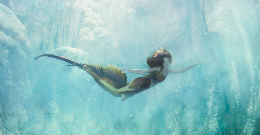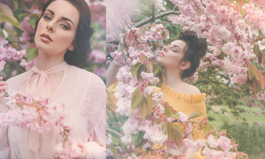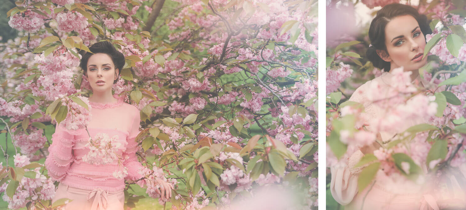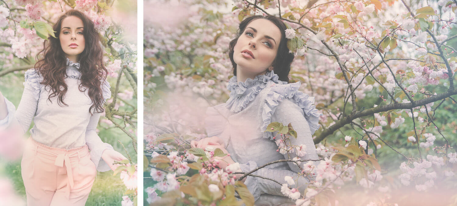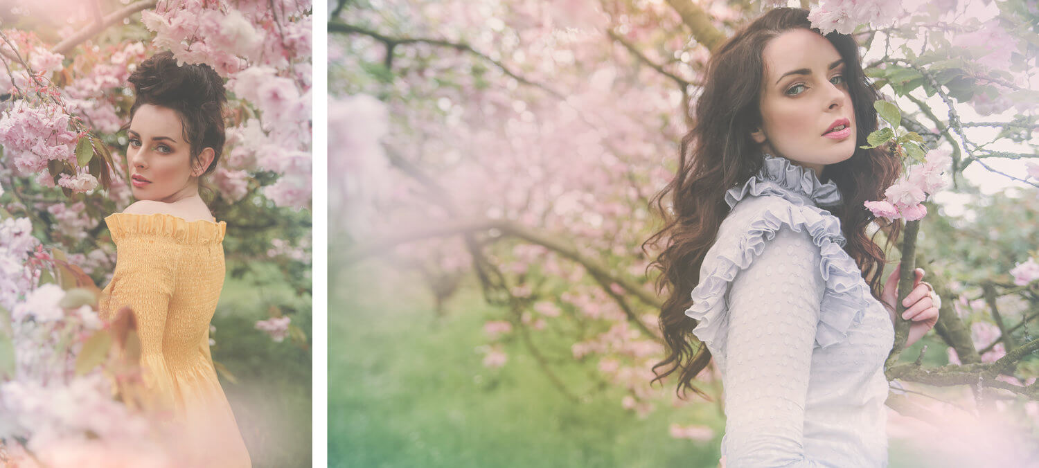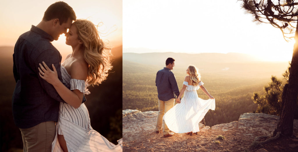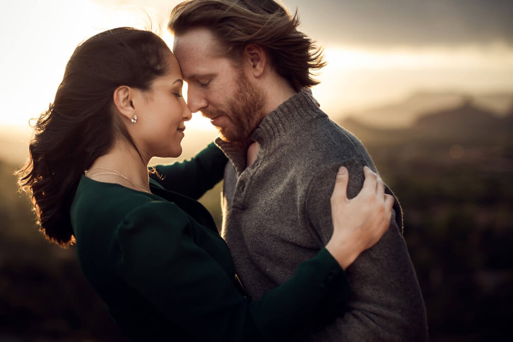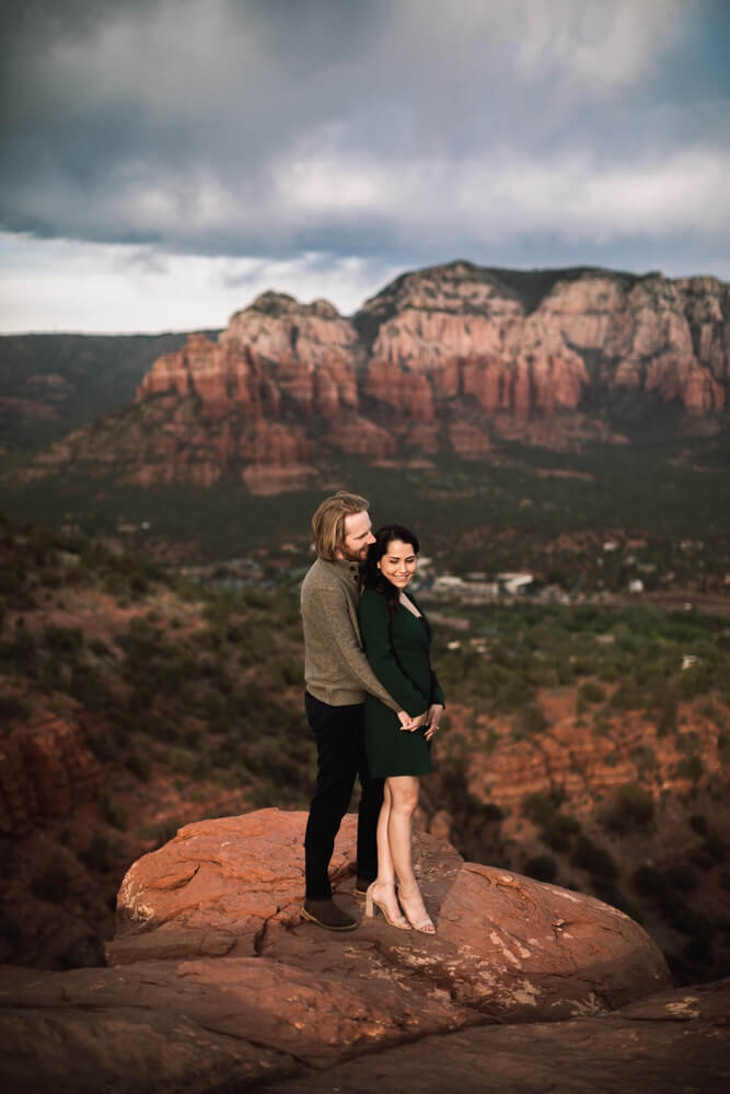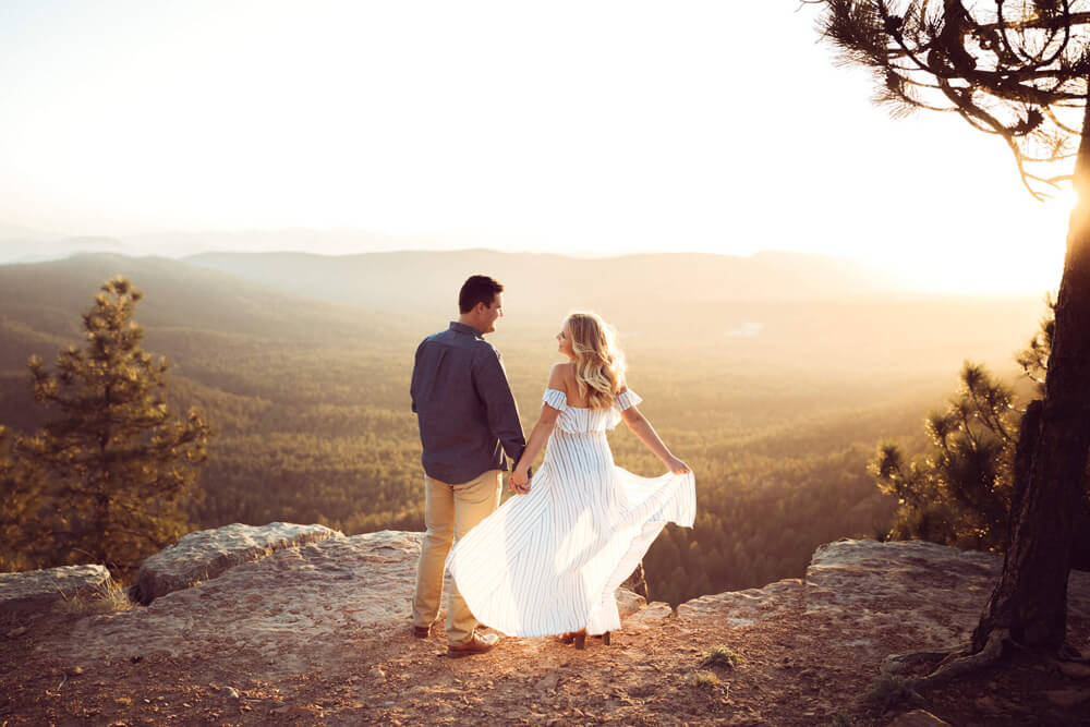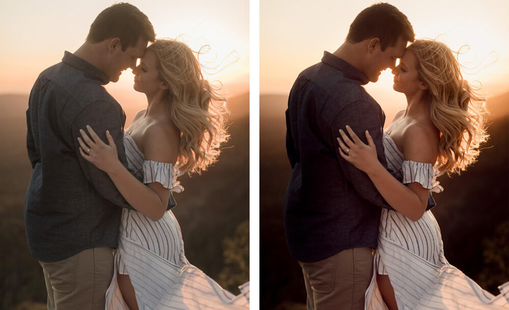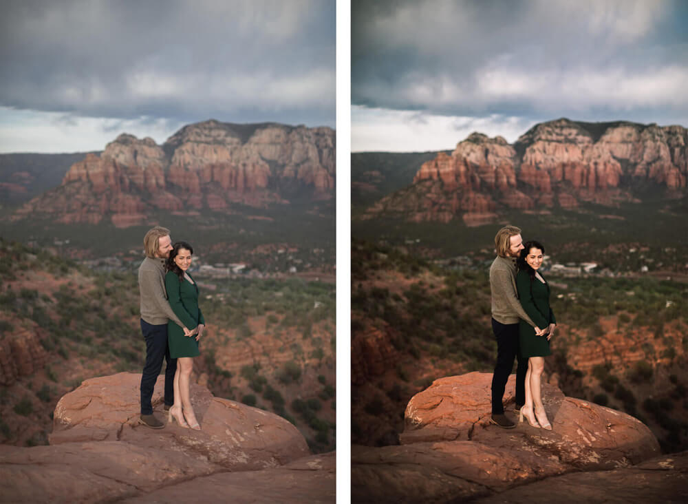

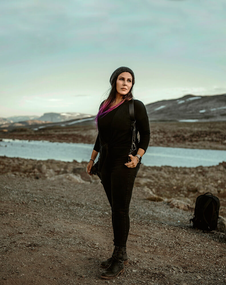
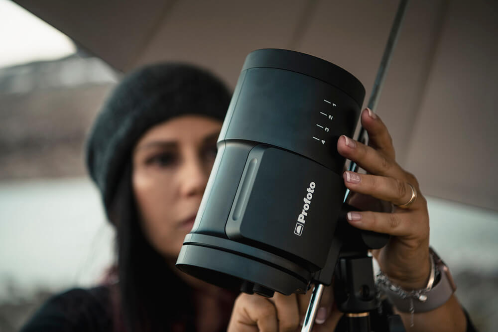
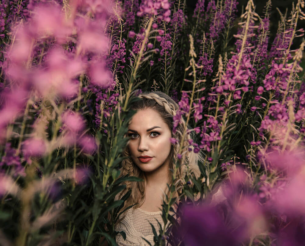
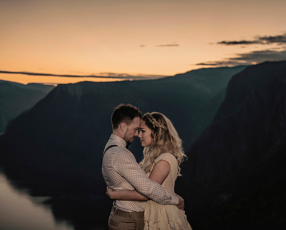
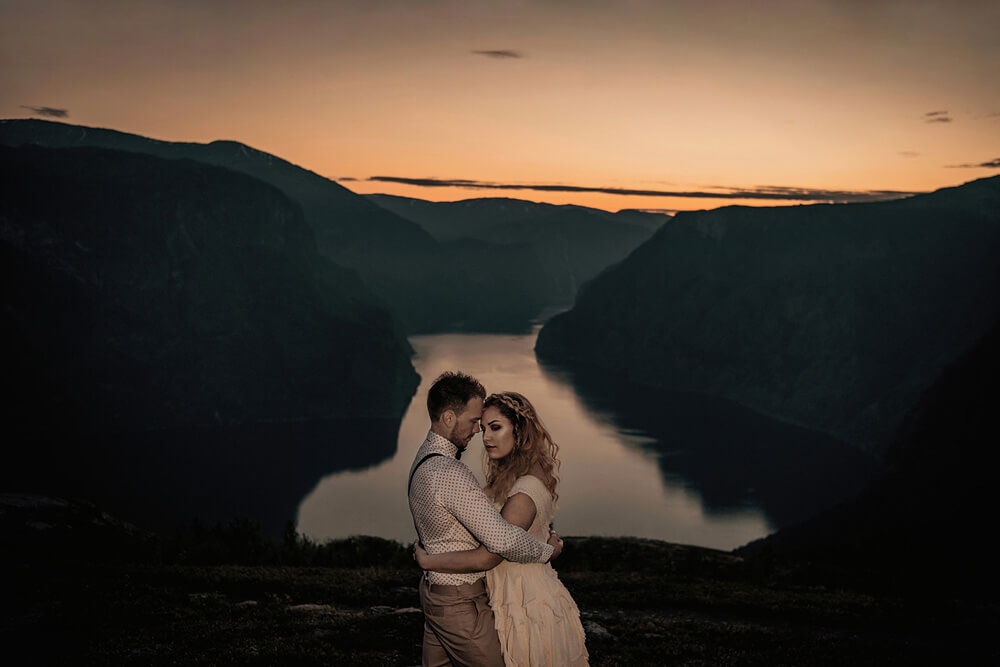
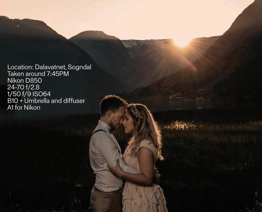
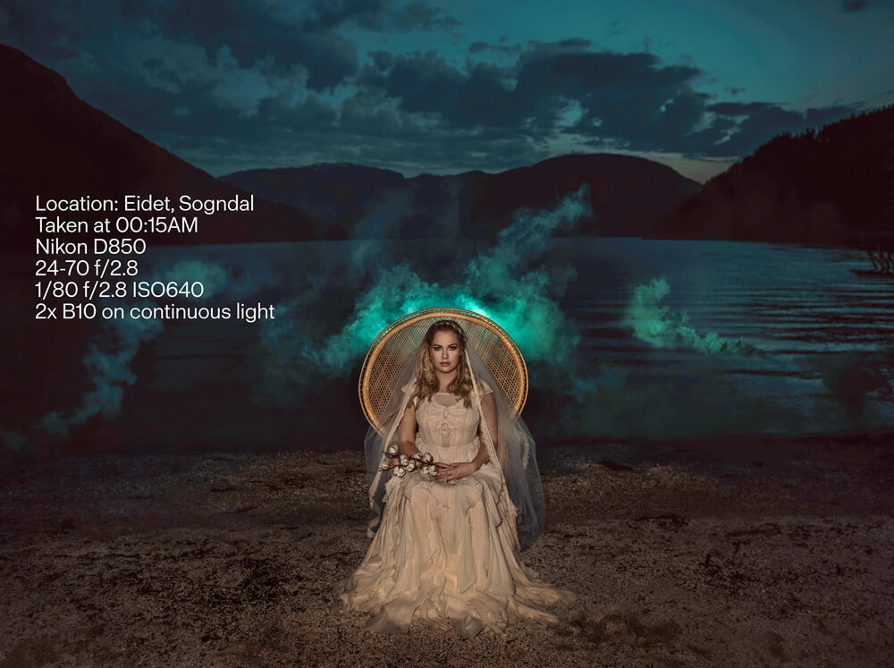
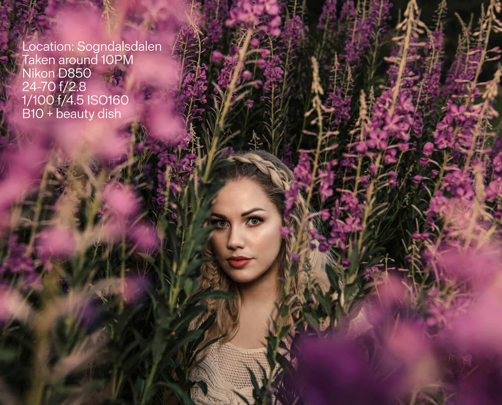
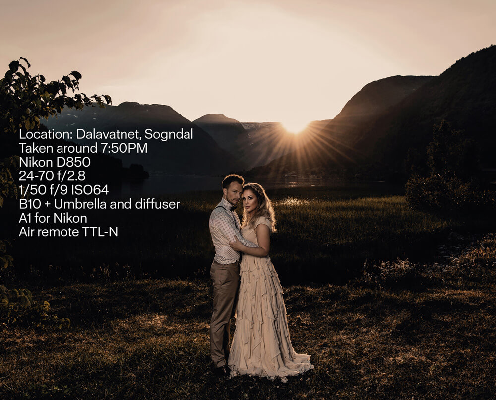
Just recently, Profoto announced the compact and powerful Profoto B10. A simple an elegant wireless flash with remarkable power. I first came way of this from seeing Frøydis’s recent feature, where she took the B10 in the mountains of beautiful Norway. The images and video were just stunning!

Video
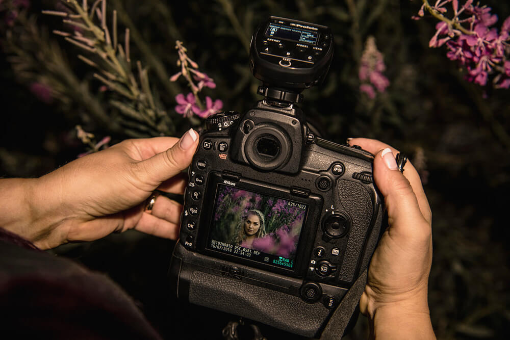
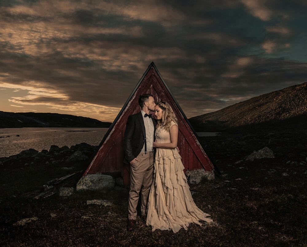
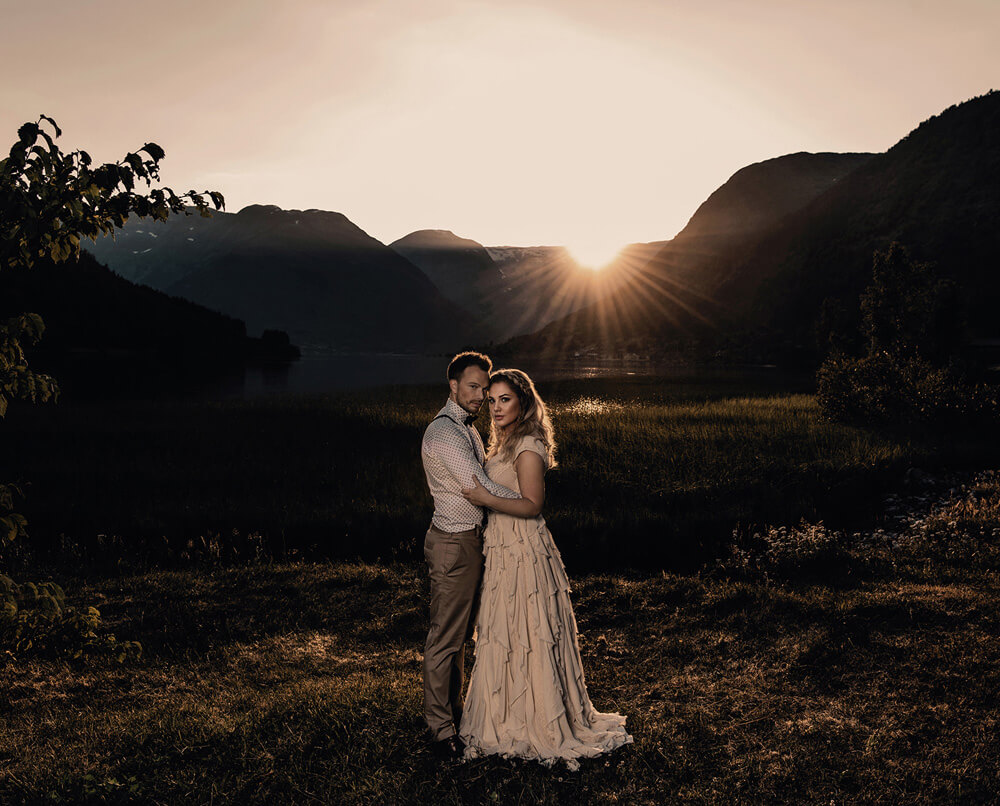
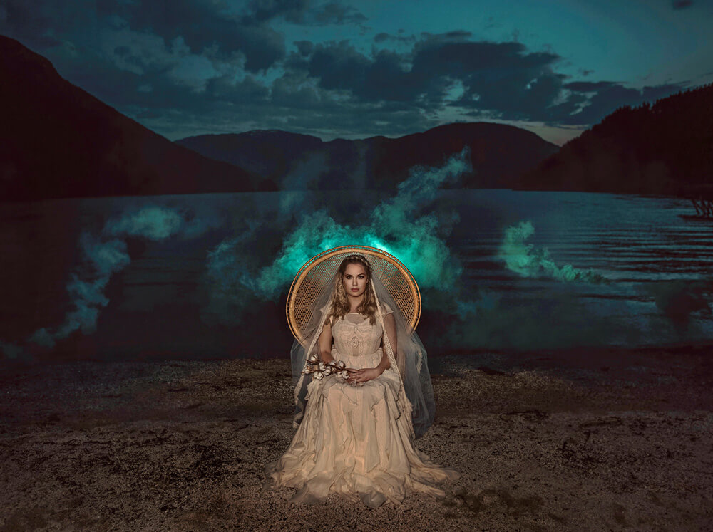
Images
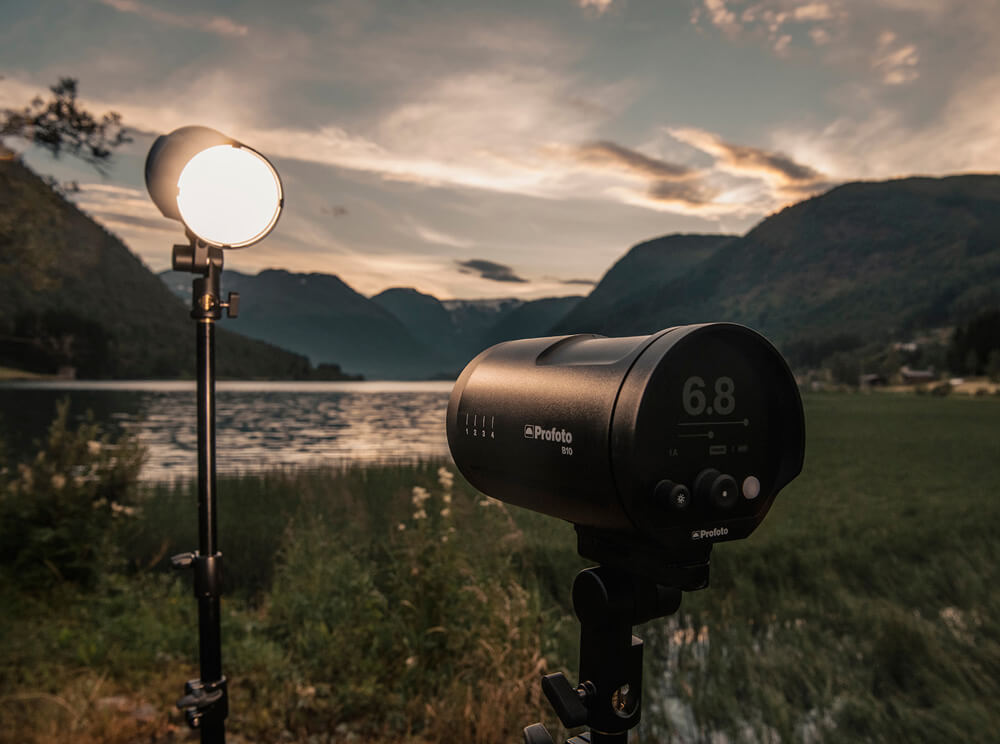
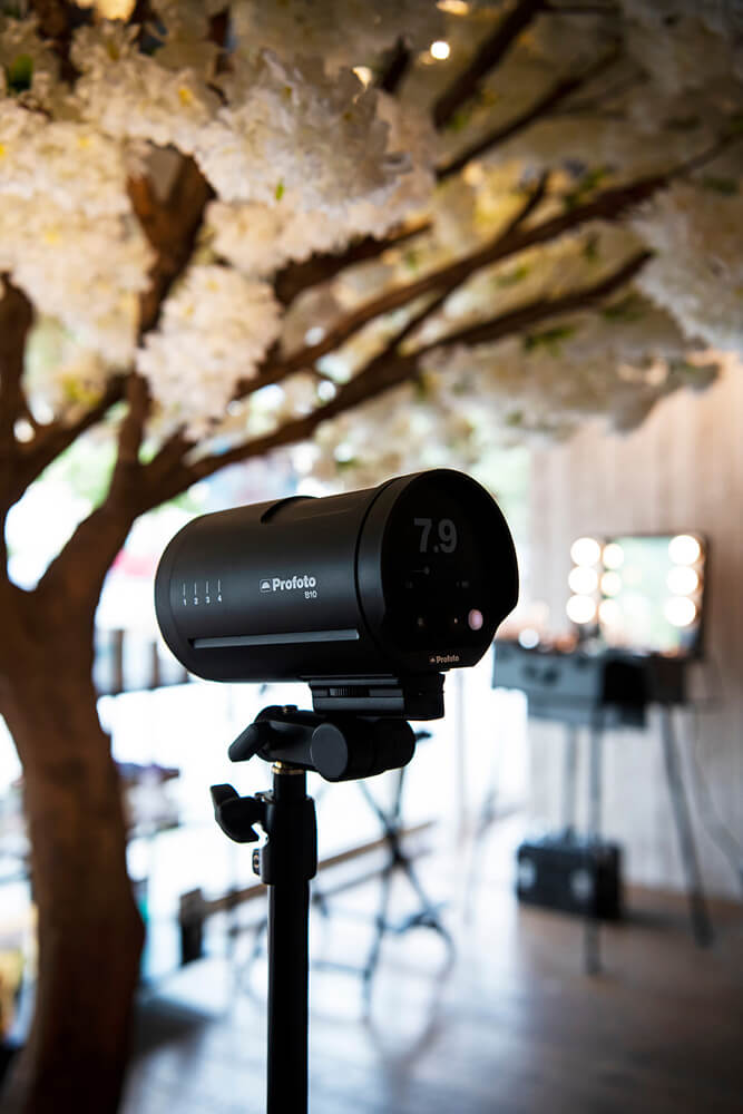
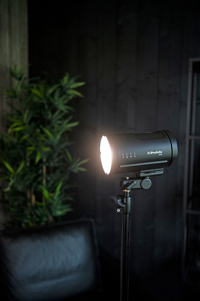
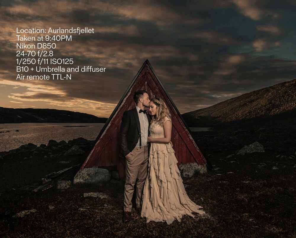
Lighting Details
If you’re curious on how they were shot, here are the settings that went into it!
Follow
Be sure to follow Frøydis on all her amazing channels!
Website: http://www.froydisgeithus.com/
Instagram: https://www.instagram.com/froydisgeithusphotography/
Credits
Below, you’ll find the entire set of credits for the film.
Håvard Nesbø filmed, shot and made this movie.
Iselin Solbakken and Steffen Lægreid; the beautiful couple in this film. Iselin was also the MUA.
Elise Lillestøl, the wonderful hairstylist and assistant.
Angeliki Kontakioti sent the amazing wedding dress from Atelier Zolotas, all the way from Athens!
Nikon, sent everything for the movie, except for a few drone shots.
Rebecca Ahremark and Svein Bringsdal. Frøydis writes: YOU TWO ARE ABSOLUTELY AMAZING!!! Thank you so much for choosing me, and for helping me so much along the way.
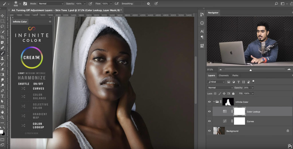
Join the Community!
Have you tried the panel yet? We’d love to see your creations! Get in touch on Instagram @infinitecolorpanel or the Facebook Infinite Color Panel group and show us your work.
If you haven’t tried the panel yet, get started here: https://infinite-tools.com/infinite-color-plugin/