
Written by Casey Cosley
Dae Howerton has worked his way with fashion and beauty photography like it’s going out of style.
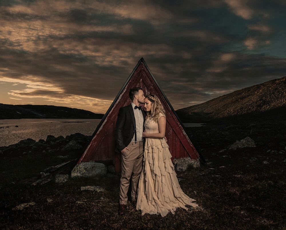
The balance of striking color and clean composition, is further bolstered by his cinematic approach to imagery. From influence to vision, Dae gave us (and now you!) access to a deeper into his process and to detail how his work comes together.
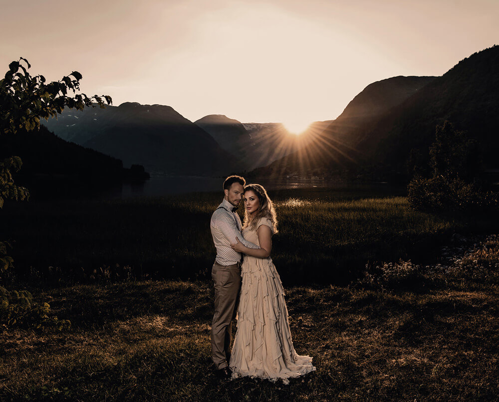
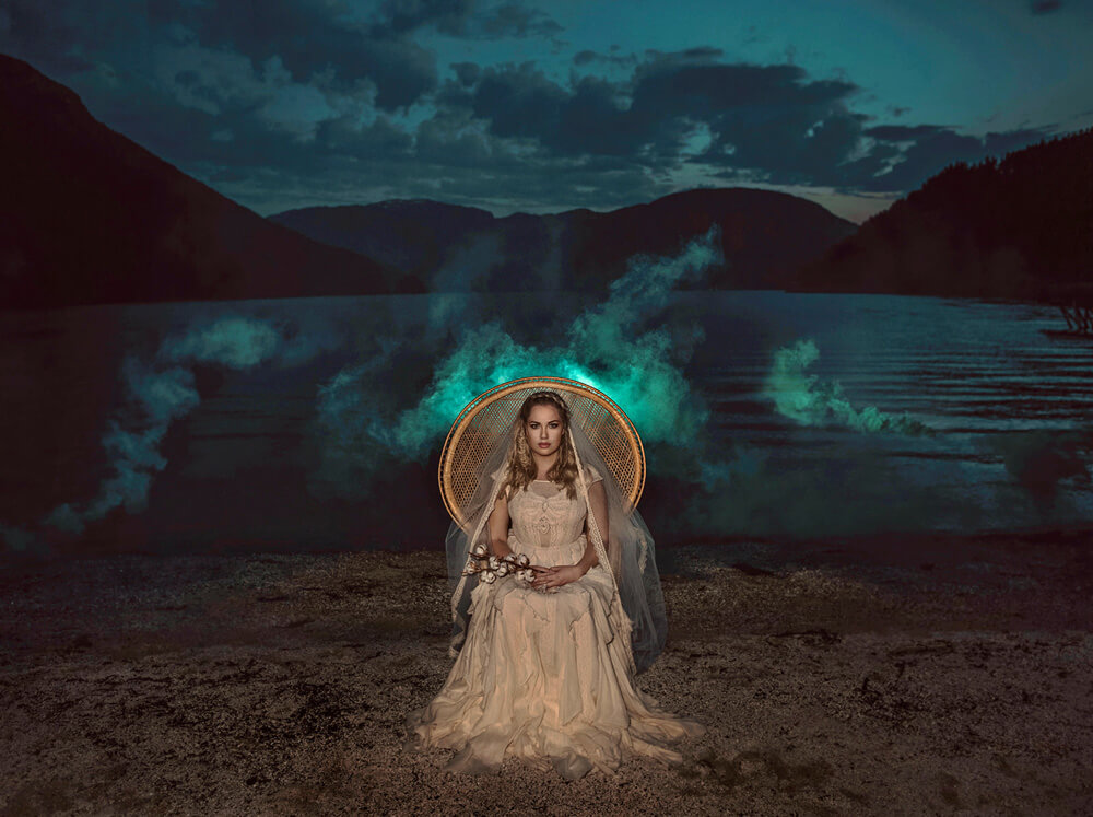
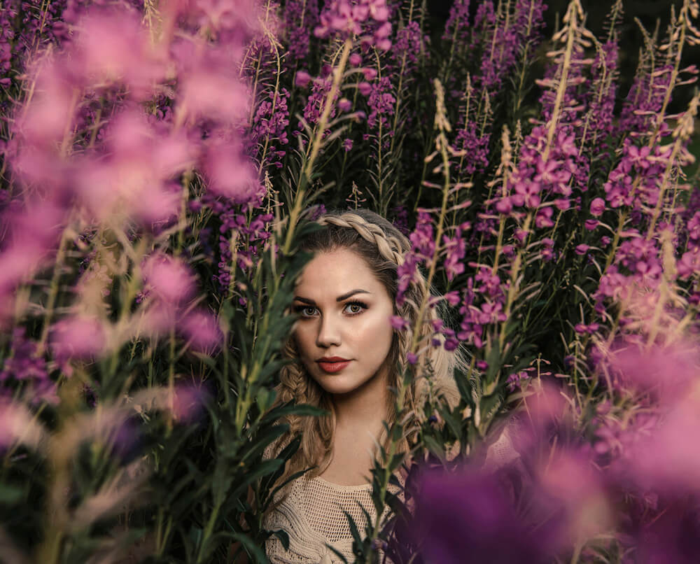
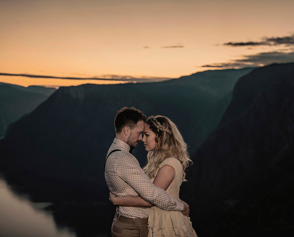
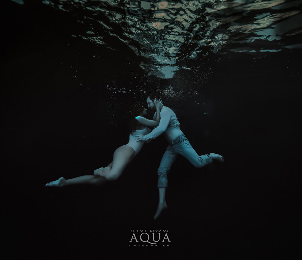
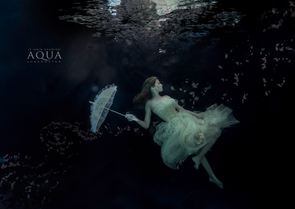
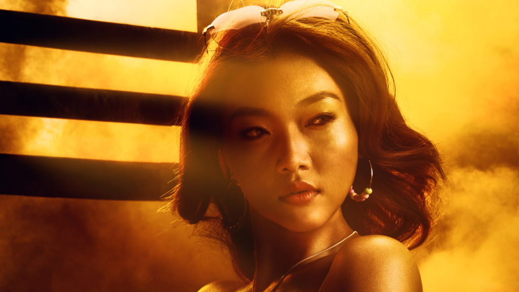
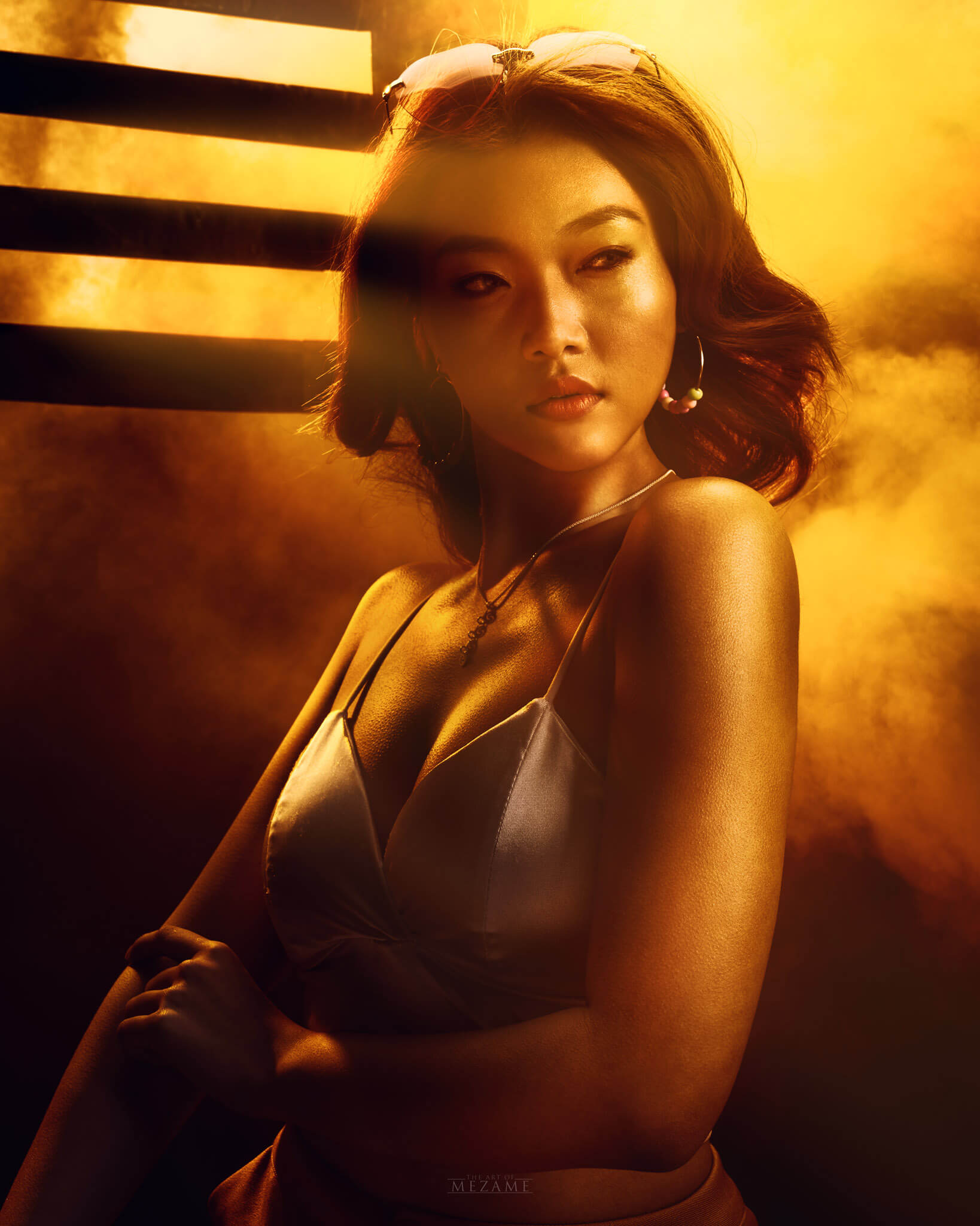
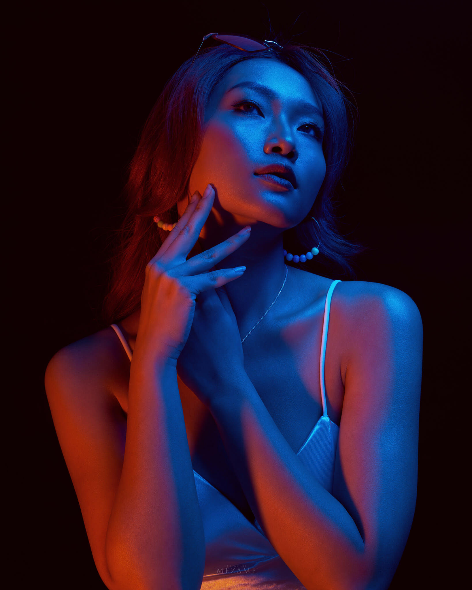
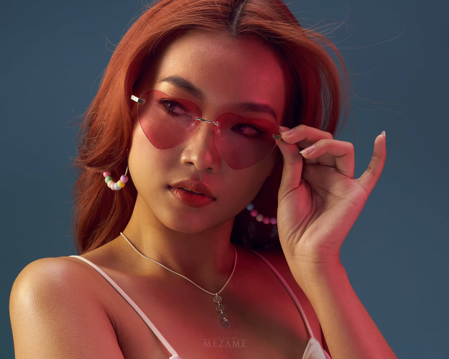
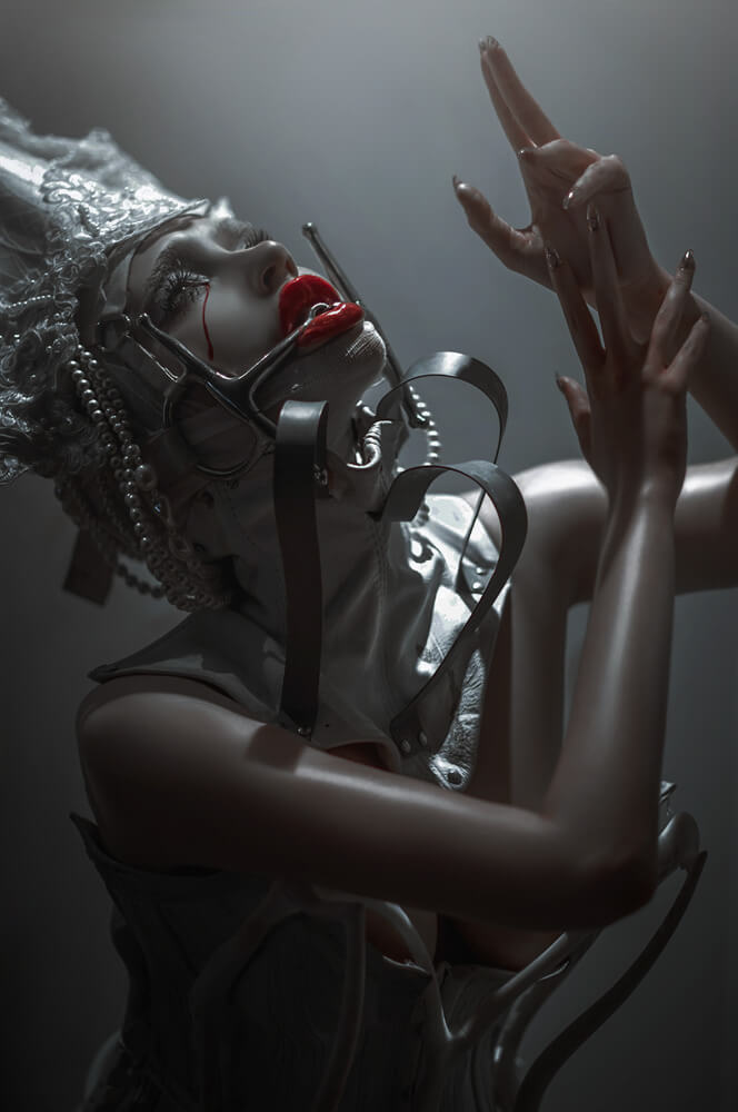
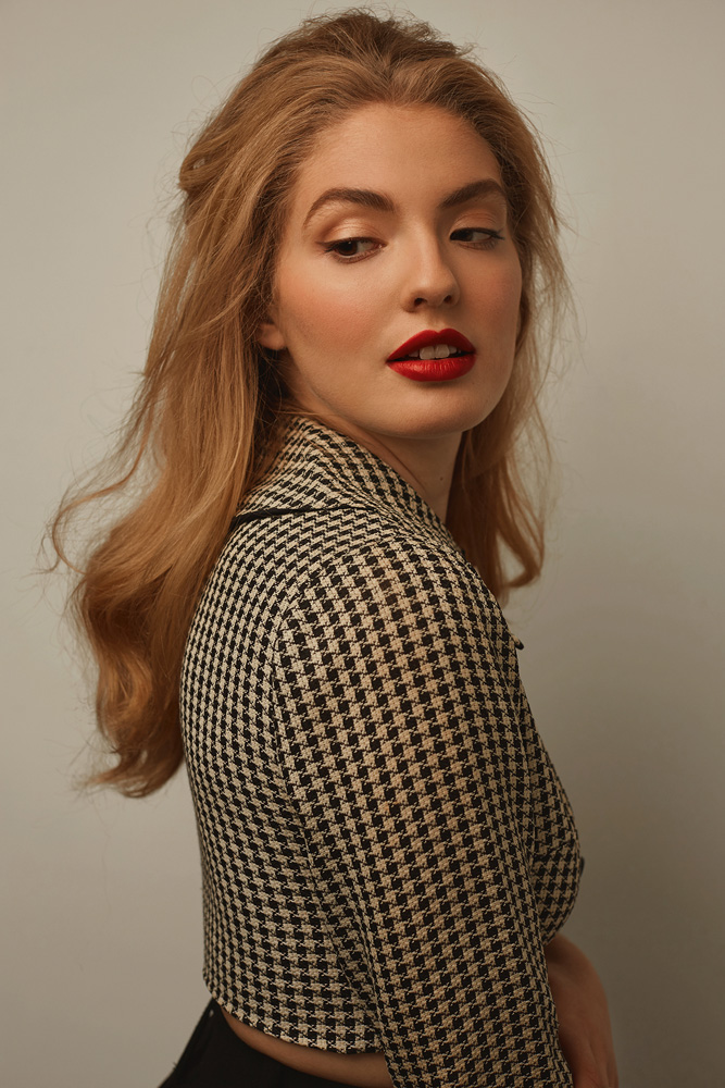
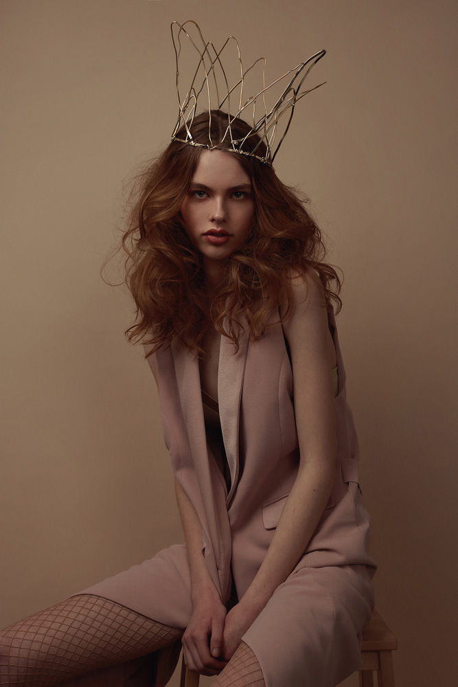
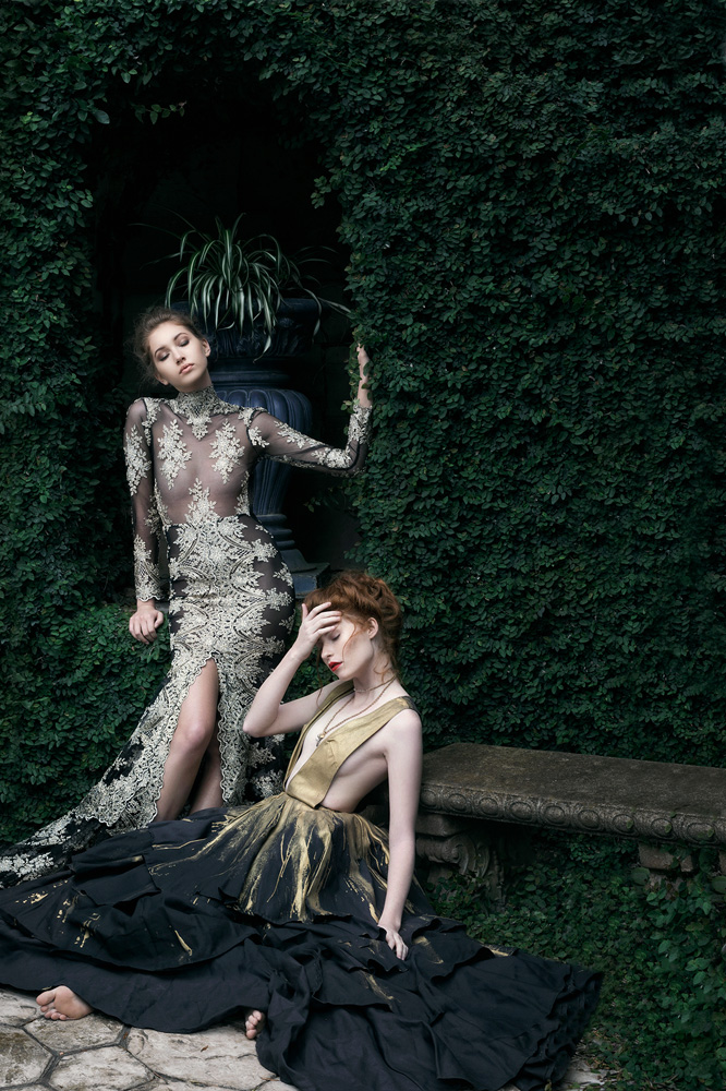
Here is some imagery that Dae worked his magic and witchcraft on using Infinite Color Panel.
Tell us a little about your mindset going into how you decided to light the shots.
I’m a huge storyboarder. I knew for this shoot I wanted it to look cinematic.
I watched a lot of women action movies: Atomic Blonde, Kill bill, Femme Fatale.
I knew I wanted everything to tell a story from the slit of light, to the spotlight in the corner.
I wanted everything to feel true to the story and the character.
Was there a storyboard/moodboard before the shoot?
Yes!!! With many many screenshots of movies. I can be a bit obsessive.
I always want for my team to be on the same page so I create a couple of mood boards.
How did the shoot come about, and how did you put it together (including location/model/team)?
I am a transplant from New York and moving to California, it is a completely different aesthetic. In New York, you can walk down any street and it tells a story, however, living in Los Angeles, it’s not quite that way, so I had to make my neighborhood “magical”. So working around my housing complex, I had to use creative angles and cropping situations so you would not see the “Desperate Housewives” homes in the background.
When it came to my crew, I have a roster of talent that I rotate through and once I gave everyone the mood board, they instantly knew my vision. It is a dream when you have a team you can show let’s say three images, and they totally get me. I felt like I was playing Pictionary and they got me, they really got me. Jessica Morrow from LA Models was cast perfectly (in look, in energy, in talent) and when I sent her the mood board, she instantly said “wow, this is so Atomic Blond”. She got it. So when your entire team is in complete sync, all it does is elevate the project.
With your concepts, do you come up with them or work together with the team to do so?
I’m a dreamer and I fantasize a lot about photo shoots and I am inspired by everything around me. I am inspired by paintings, television shows, and movies. Lots of times I would see a movie and I think to myself: “how can I tell THIS story with my own twist?” and once a concept comes to mind I begin to obsess about it. I will go online and start looking at movies and from there it goes to hair, then makeup, then styling and before you know it, the story comes to life in front of me. I drive my friends crazy because then I would constantly talk about it and I would bounce ideas off of them and I will do this until I finally shoot it. Once it’s done, I am on to the next thing to obsess about.
What magazine were they in and how did you decide on it?
This spread is in Vulkan magazine. I decided to submit them to Vulkan because I really love their fashion stories. I follow them on social media and even buy the print magazine. When I submitted the images and they accepted instantly it was incredibly happy.
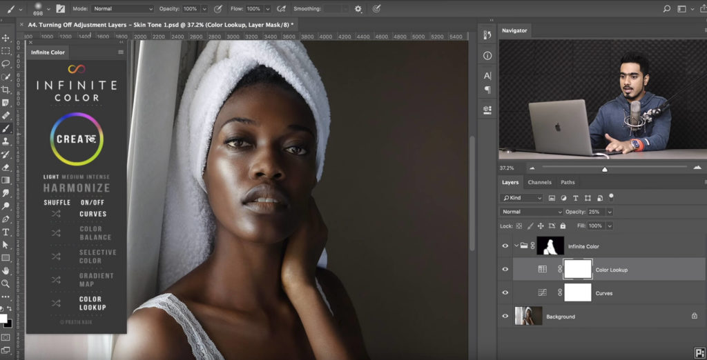
As it comes to the color grading, why did you choose to use ICP as a part of your process (thank you by the way!)
I knew for this shoot I wanted something refreshing for these images. I knew my lighting would be dynamic and I need the grading to be just as dynamic as the lighting. For me, ICP always sprinkles that final touch whether it’s drama or pop of color. It completely transformed the story from nice images to dynamic. It’s now apart of all of my fashion stories. It’s my GO TO.
For people who aren’t sure if it’s right for them, what would you say to recommend it to them?
I shoot beauty, fashion, and commercial work. I always get complimented on my color grading or skin tones. It has been my secret not secret for about a year. I always recommend ICP to anyone that wants their images to stand out, to anyone who wants their images to jump off the pages of their portfolio, to anyone who wants that unattainable “PROFESSIONAL LOOK” that we see in magazines and in commercial photography.
Did you have a color vision in mind before you began working on these images?
I did have a color vision in mind. I wanted green tones with reds to pop out. When the ICP gave me the blue tint with the reds I said … THAT’S IT!!! It was perfect.
How hard was it to get to the final result for your colors on this set?
LITERALLY 2 clicks. I changed the opacity of a couple of layers. But for the most part, it was SPOT ON.
Check out and stay up to date with Dae Howerton’s work by following his instagram or website!
Have you tried the panel yet? We’d love to see your creations! Get in touch on Instagram @infinitecolorpanel or the Facebook Infinite Color Panel group and show us your work.
If you haven’t tried the panel yet, get started here: https://infinite-tools.com/infinite-color-plugin/
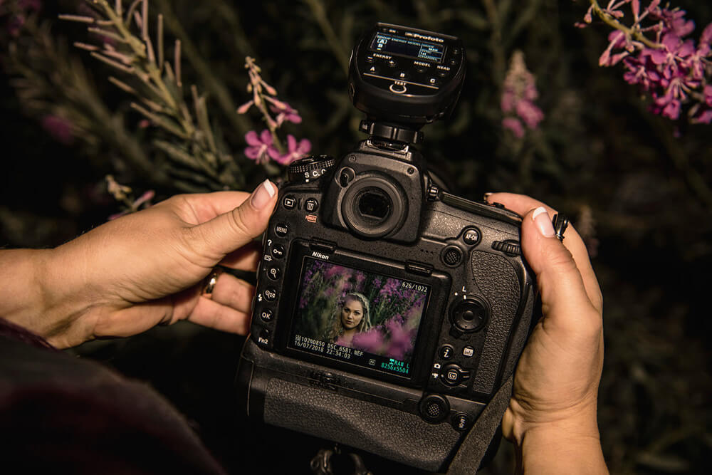
And if you’re still here, here is a little bonus BTS video of Dae’s shoot for Vulkan Magazine.
Credits:
Photographer: Dae Howerton @DaeHowerton | www.DaeHowerton
Models: Jessica Morrow @jjmorrow
Male Model: Jacob Sones @Jakesones55
Stylist: Monica Cargile | www.MonicaCargile.com
Makeup Artist: Hendra Nasril @makeupbyhendra | www.MakeupbyHendra.com
Hair Stylist: Shelli Mosley @shellimosley | www.Shellimosley.com
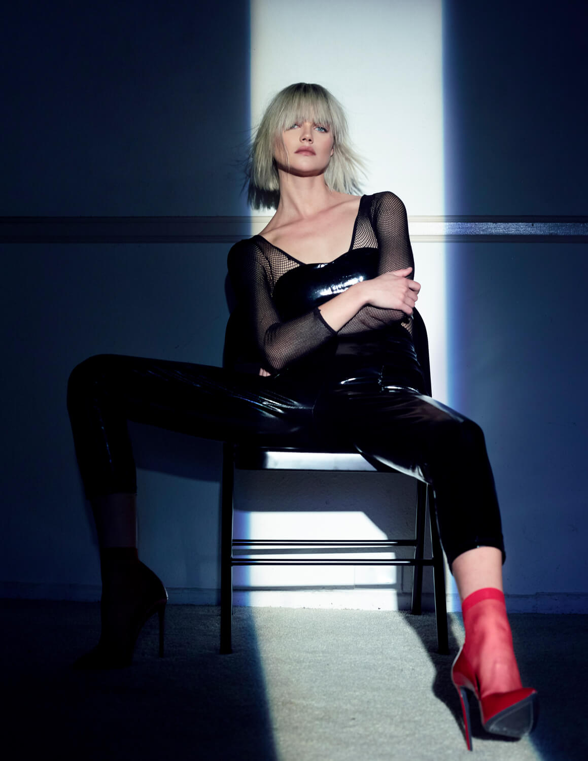
LOOK WINDOW HARD-LIGHT
Top & Pant – Symphony
Shoes – Marco Proietti Design
SYMPHONY
https://www.symphonyfashion.com/ @Symphonyfashion
MARCO PROIETTI DESIGN
http://www.marcoproiettidesign.com/en/ @marcoproietti_official
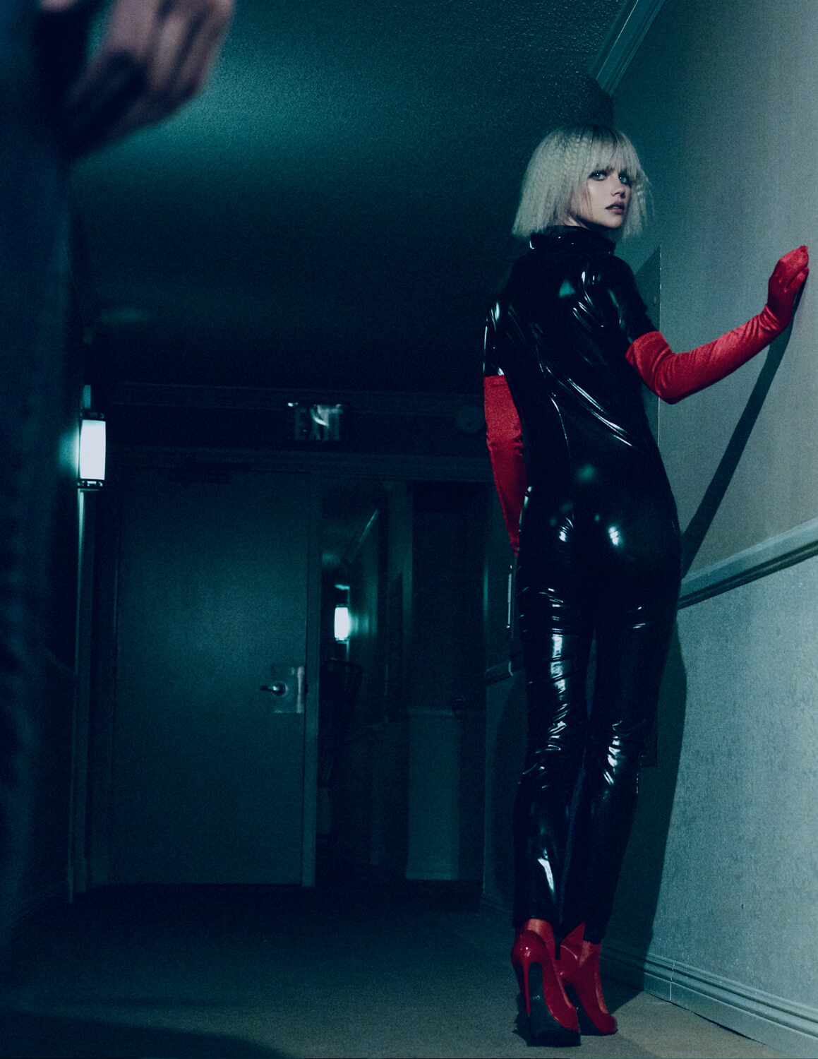
LOOK 2 HALLWAY CATSUIT
Bodysuit – Trend Haus
Bra – RAAD KERR
Shoes – Marco Proietti Design
Gloves – Vintage
TREND HAUS
https://www.facebook.com/trendhauslosangeles/ @thetrendhaus
RAAD KERR
MARCO PROIETTI DESIGN
http://www.marcoproiettidesign.com/en/
@marcoproietti_official
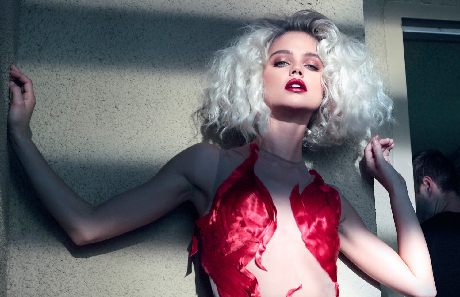
LOOK 3 RED DRESS
Dress – Michelle Hébert
MICHELLE HÉBERT
http://www.michellehebert.com/
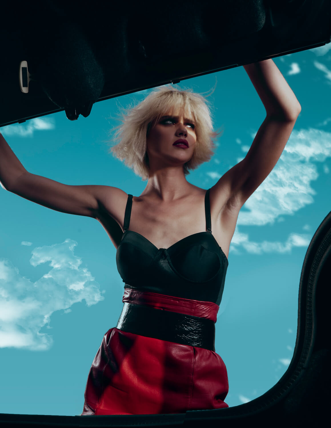
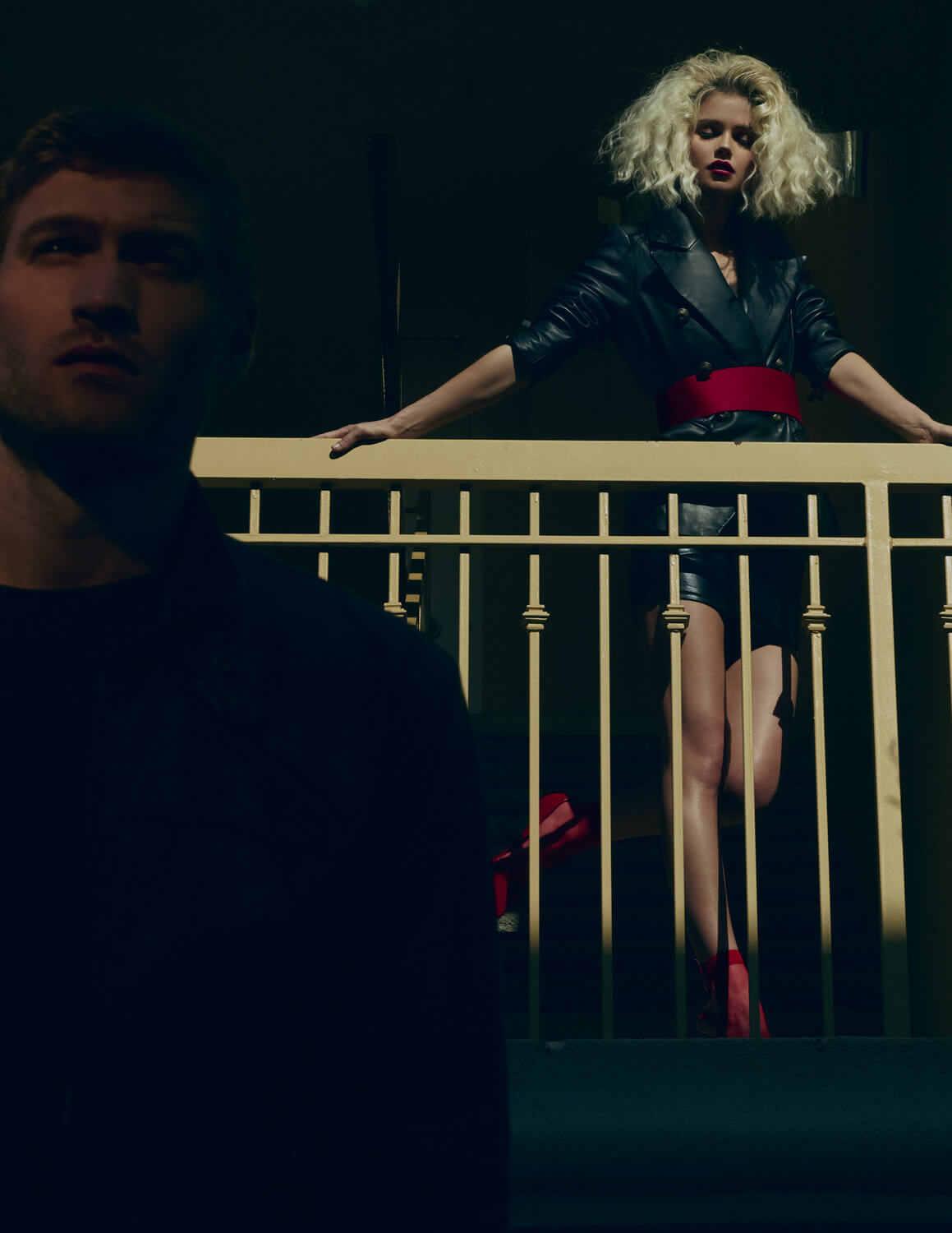
LOOK 4 BALCONY
Jacket – Beyond Proper
Skirt – Syren
Belt – Vintage
Shoes – Marco Proietti Design
BEYOND PROPER
www.bostonproper.com
@Beyondproper
SYREN
http://www.syren.com
@syrenlatex
VINTAGE
MARCO PROIETTI DESIGN
http://www.marcoproiettidesign.com/en/
@marcoproietti_official
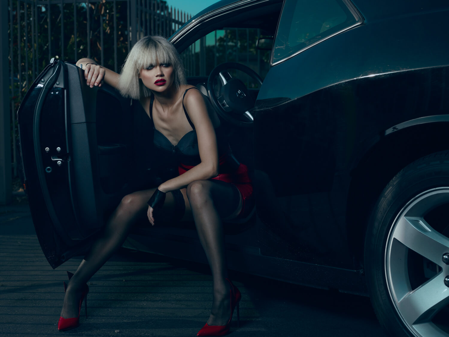
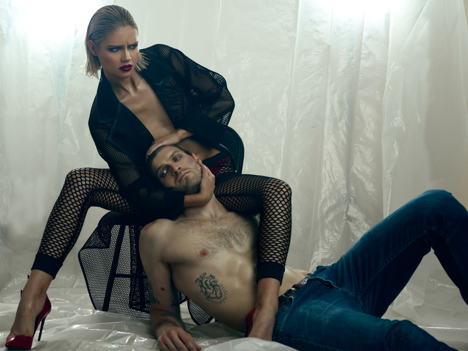
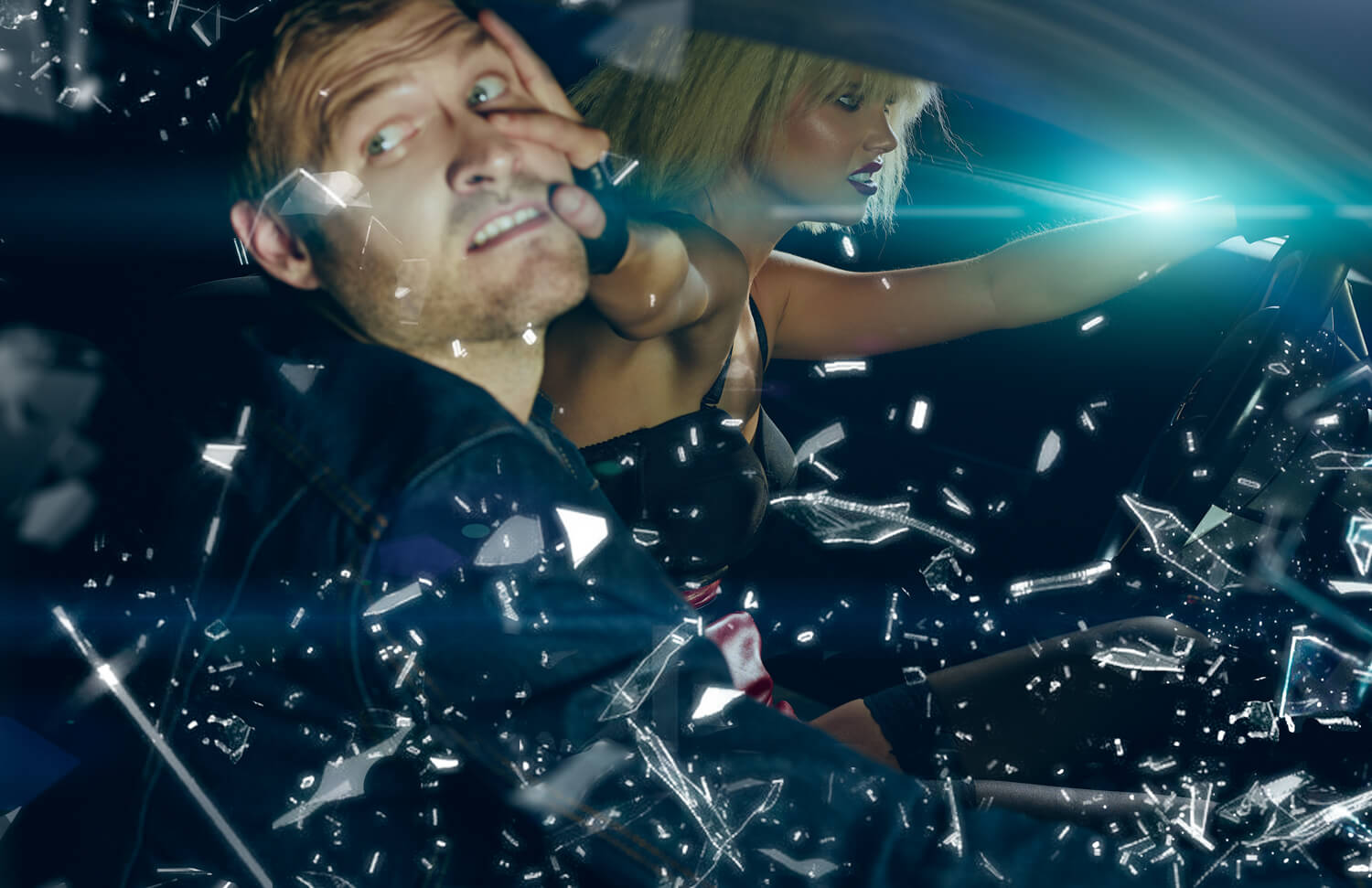
LOOK 5 CAR FIGHT SCENE
Bodysuit – Trend Haus
Skirt – Vintage
Belt – RAAD KERR
Thigh Highs – La Perla
Shoes – Marco Proietti Design
Gloves – Syren
TREND HAUS
https://www.facebook.com/trendhauslosangeles/
@thetrendhaus
VINTAGE
LAPERLA
www.laperla.com @laperlalingerie
RAAD KERR
MARCO PROIETTI DESIGN
http://www.marcoproiettidesign.com/en/ @marcoproietti_official
SYREN
http://www.syren.com @syrenlatex
LOOK 6 | THE CAPTURE
Coat – Nu
Pants – RAAD KERR
Panties – Oh La La
Shoes – Marco Proietti Design
NU
ww.shopsnu.com www.instagram.com/shopsnu
RAAD KERR
OH LA LA
ohlalacheri.com @ohlalacheriparis
MARCO PROIETTI DESIGN
http://www.marcoproiettidesign.com/en/ @marcoproietti_official