Category Archives: Uncategorized

Color Conversations with Akwesi Baah

Written by Tina EisenAkwesi Baah is a commercial, food, beverage and product photographer based in Ghana.

His attention to detail and understanding of harmonising colors has recently caught our eye and we had the pleasure to (virtually) sit down for an interview with him this week!

These images posted below were all treated with a little love from our Infinite Color panel!

1. Akwesi, what are your primary sources of inspiration?

I draw inspiration from a vast variety of sources like my environment, mentors, Instagram, Pinterest, the list is endless. I pay attention when I go out and see print ads and campaigns, I draw some inspiration from there as well, but mostly my background in film and advertising plays a very significant role in giving me inspiration for my work.

2. Many creatives don’t believe they have their own style even though others might see it, do you believe you have a particular style and how would you define it?

Lol… I think I belong to the crop of creatives who don’t believe they have a particular style, although, come to think of it, I seem to be drawn mostly to a lot of drama. I find myself trying to create drama within my work and in so doing, detaching myself from “catalog” imagery.


3. What role does color grading play in the execution of your vision? Do you think it’s a necessary part of the process?

Because I’m drawn to a lot of dramatic imagery, color obviously plays a very crucial role in creating that drama I may be seeking to achieve. I can create either a very happy, bright theme or a moody and dark theme simply by lighting right and grading to the specific theme I’m going for.

4. Does the direction you go with color grading change based on certain factors? How do you know where to go with it?

The direction I go with color grading may change or may not change based on what I may be working on, sometimes clients can influence the kind of color grade for the final look. Otherwise, based on my mood during a particular edit, I may choose a different color grading path.


5. I’ve seen your work with Infinite Color and we’re so happy you’ve decided to use us to help with your color vision! How would you say the tool helps you in what you’re looking to accomplish?

I used to fret about how fast and effective I can be during my color grading sessions. Grading alone sometimes takes hours or even days to finish just one image. Sometimes it demands taking a break, and stepping out simply just to refresh your view and clear from your mind the colors your eyes have become used to. There have been times I recorded and saved my colors to use them later but unfortunately, they seem to always change. I heard about Infinite Color Panel and started reading and watching the tutorials on YouTube. Then quite sincerely, after trying it hands on, I realised I could save a whole lot of time during the coloring process. The various color profiles come in handy, as alternating between or tweaking colors and even combining different color profiles makes the panel more intuitive, easy and convenient to use.


6. Would Infinite Color be something you’d recommend for other creatives as well? What are some of your favorite features and what will they find when using it too?

Most certainly! I recommend and endorse Infinite Color. I love the ergonomics and design of the whole panel and how easy it is to use, and most of all, how simply you can build or combine different color tones to create your desired look/mood. This is what I choose to call “Color Grading Made Easy!”

Tried! Tested! and Boom! Love it!

More of Benedcit’s work can be seen on his Instagram!

Have you tried the panel yet? We’d love to see your creations! Get in touch on Instagram @infinitecolorpanel or the Facebook Infinite Color Panel group and show us your work.

If you haven’t tried the panel yet, get started here:  https://infinite-tools.com/infinite-color-plugin/


Infinite Color is Featured in Photoshop User Magazine

I’m so happy to say that we’ve been featured in Photoshop User magazine this month!

Writer and Photoshop expert Gilmar Smith kindly took a test drive of our Infinite Color Panel and put her thoughts down to paper. I was pleasantly surprised with what she found! Gilmar is someone who I personally respect in the industry and I am glad she found it easy to use, and quite addicting! I was curious to see what she would find without much context and it is fascating to read.

Be sure to check it out below! And as always, if you’re interested in checking out the panel, visit our homepage at www.infinitecolorpanel.com along with the education part of our website to learn more on the many ways to use it!

If you haven’t tried the panel yet, get started here:  https://infinite-tools.com/infinite-color-plugin/

Color Conversations with Umbar Shakir

written by Tina EisenI met Umbar nearly 10 years ago and her talent and beautiful, kind nature made me never want to take my eyes of her ever evolving work during the years to follow.

Umbar Shakir is a beauty and fashion photographer based in London, UK. She’s no stranger to collaborating with the creative talent the city has to offer, from agency models to make up artists and designers.

While during the earlier days of her career Umbar was more of a studio photographer, she is now drawn to shooting outdoors and on location a lot more.

Umbar pins her distinct happy, colorful style partly on her Pakistani heritage and partly on her love for all things nature and flowers.

“Growing up in London, against an urban backdrop, and a riot of colour at home, I was either going to rebel against color or embrace it – and embrace I did!”

When we asked Umbar about the inspiration to her images she told us passionately about the difference between ‘pics’ and ‘images’.

Imagery is a piece of art, created through the medium of photography and serves a much more deliberate purpose than a picture, which is but a capture. For Umbar her conscious color choice plays a big role in making that transformation from a pic to an image.

“Pics can be nice, but an image will move me, impact me, be thought provoking and aspirational!”

With colors being linked so closely to the viewers mood, toning is a powerful tool for Umbar to get across an emotion and evoke a response.

Before her shoots, Umbar typically comes up with a concept and moodboard. In this early stage of her shoot planning process she already has an idea of how she will later color grade her finished images – whether it’s a warm or cool tone; saturated or neutral colors. Rarely will she just go with the flow during her post production.

For the “Blossom Reveries” series Umbar’s color vision ahead of the shoot evolved around soft, candy pastels and slightly porcelain, cool tones.

For this specific set, which was created in the late spring of this year, Umbar and her team patiently waited for the first sun rays to grace the UK and for all the beautiful blossoms and flowers that came with it!

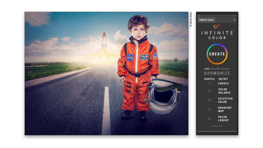
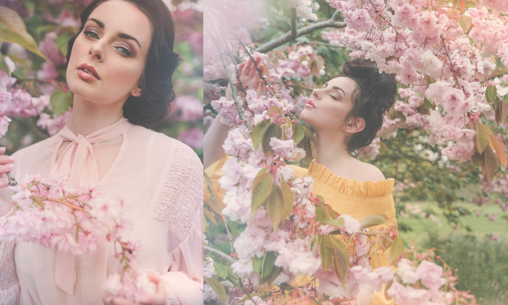
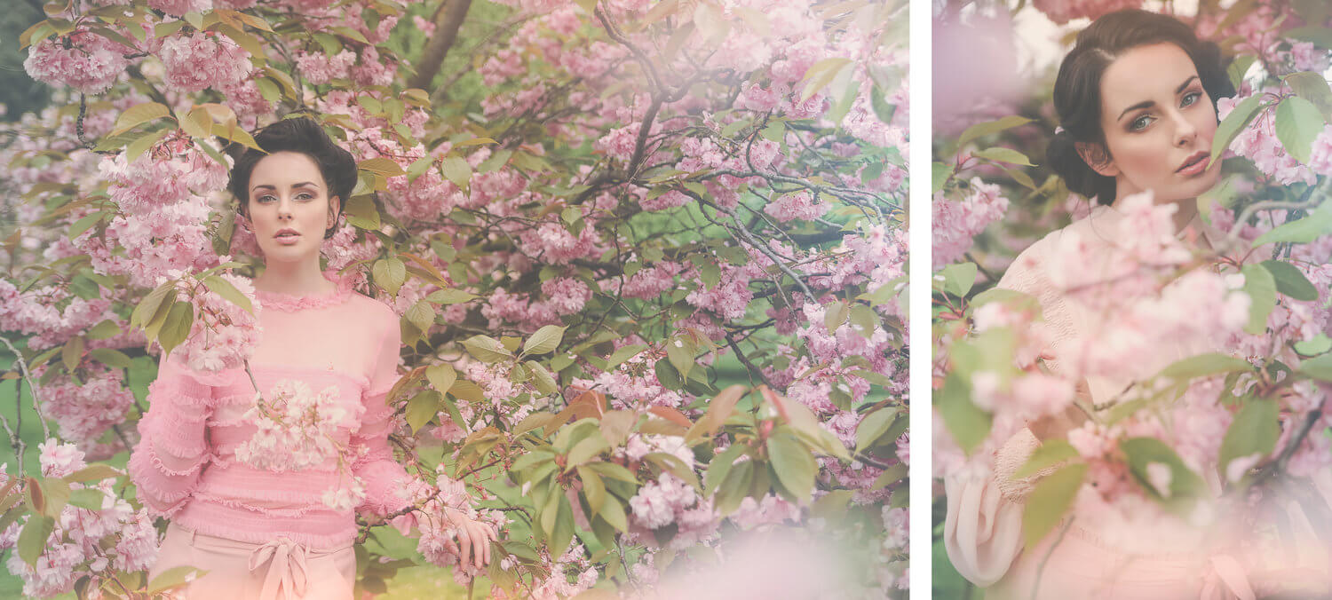
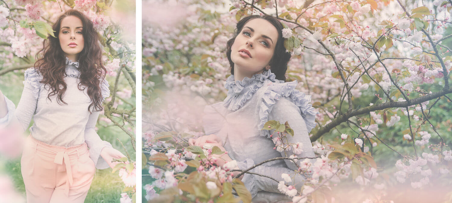
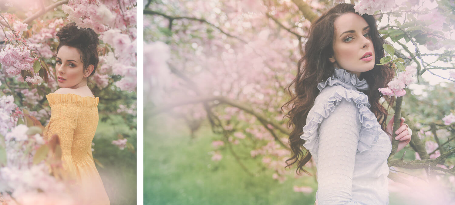
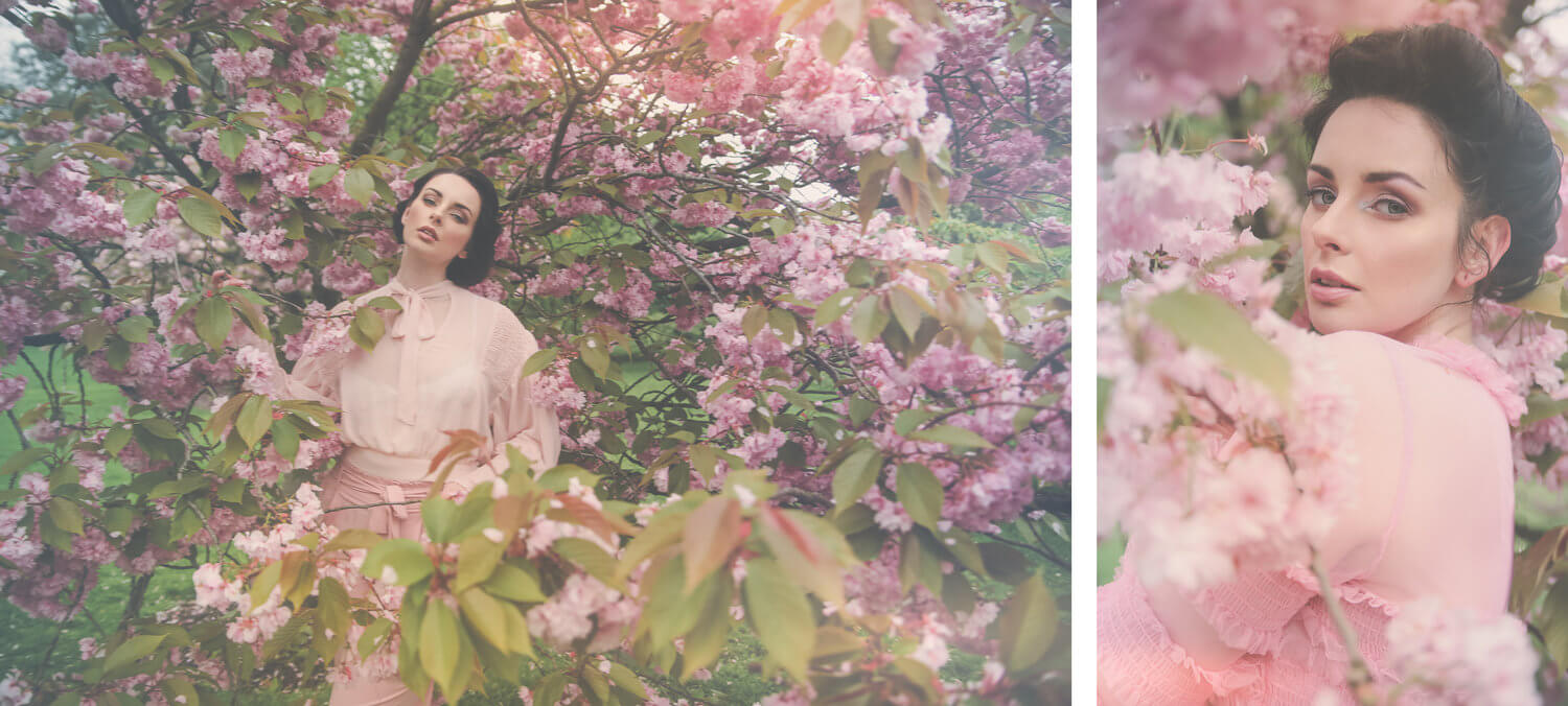
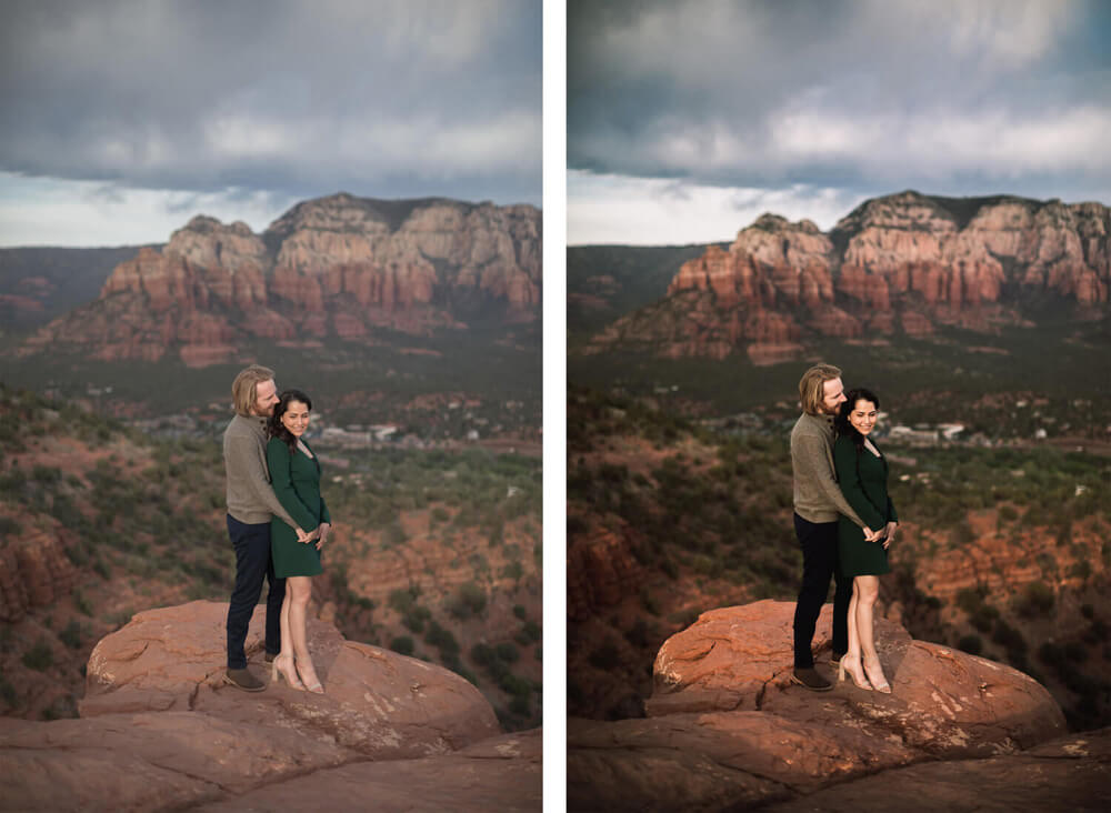
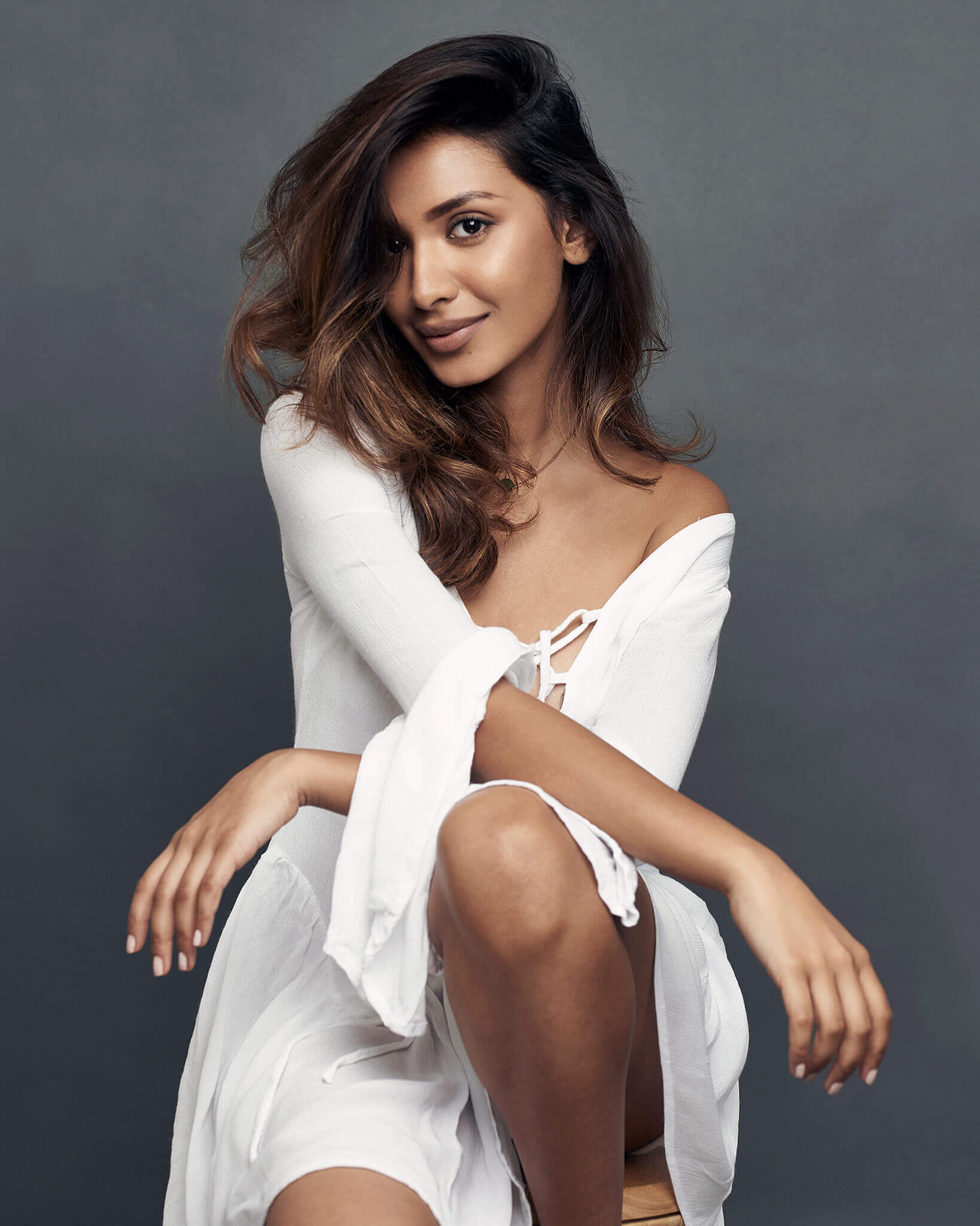
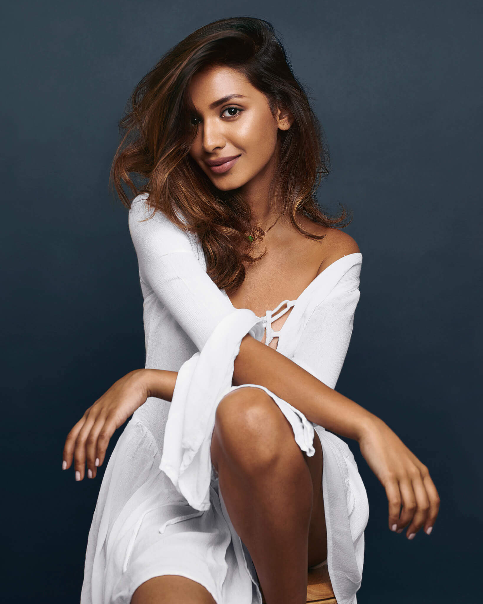
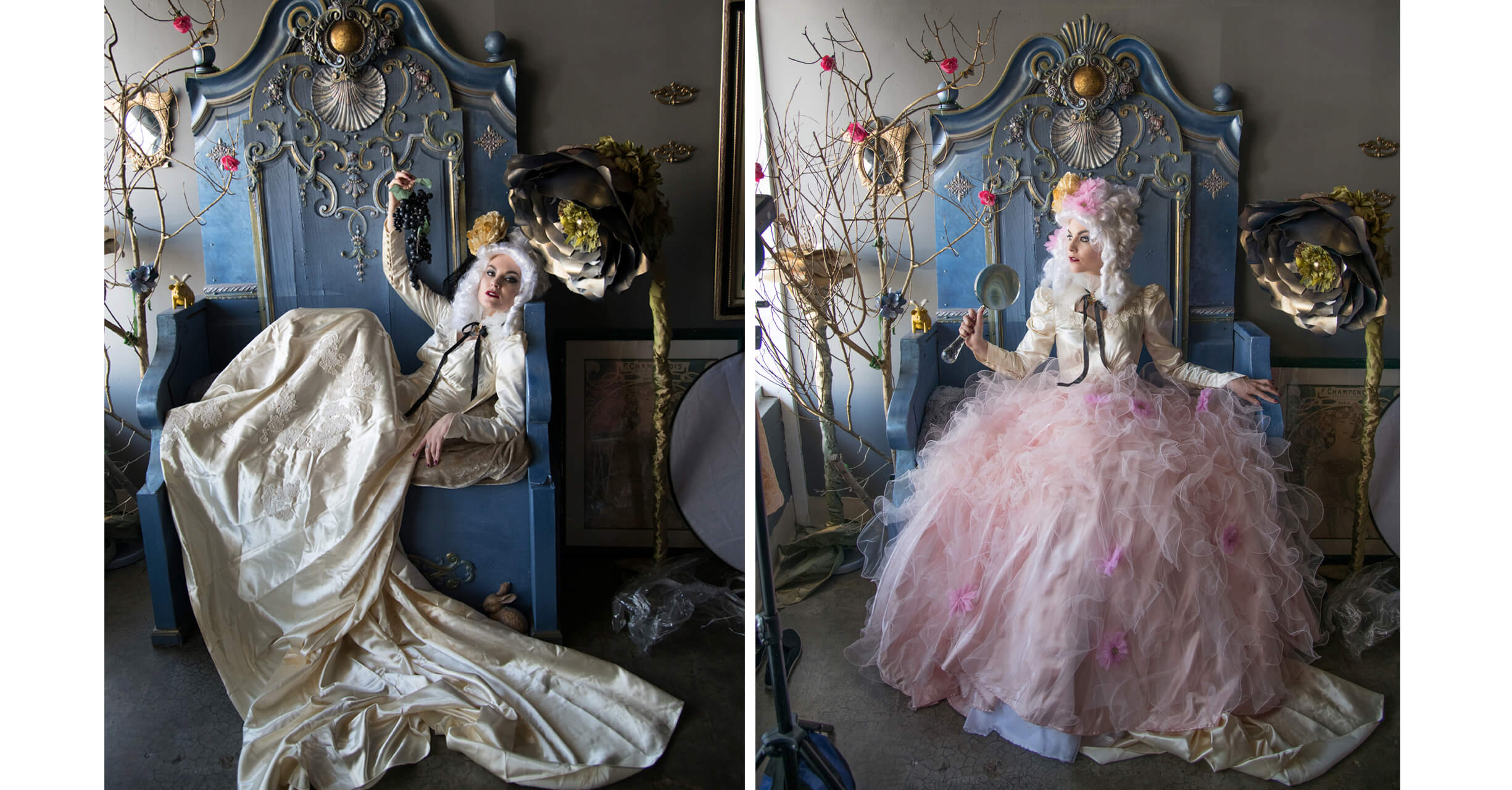
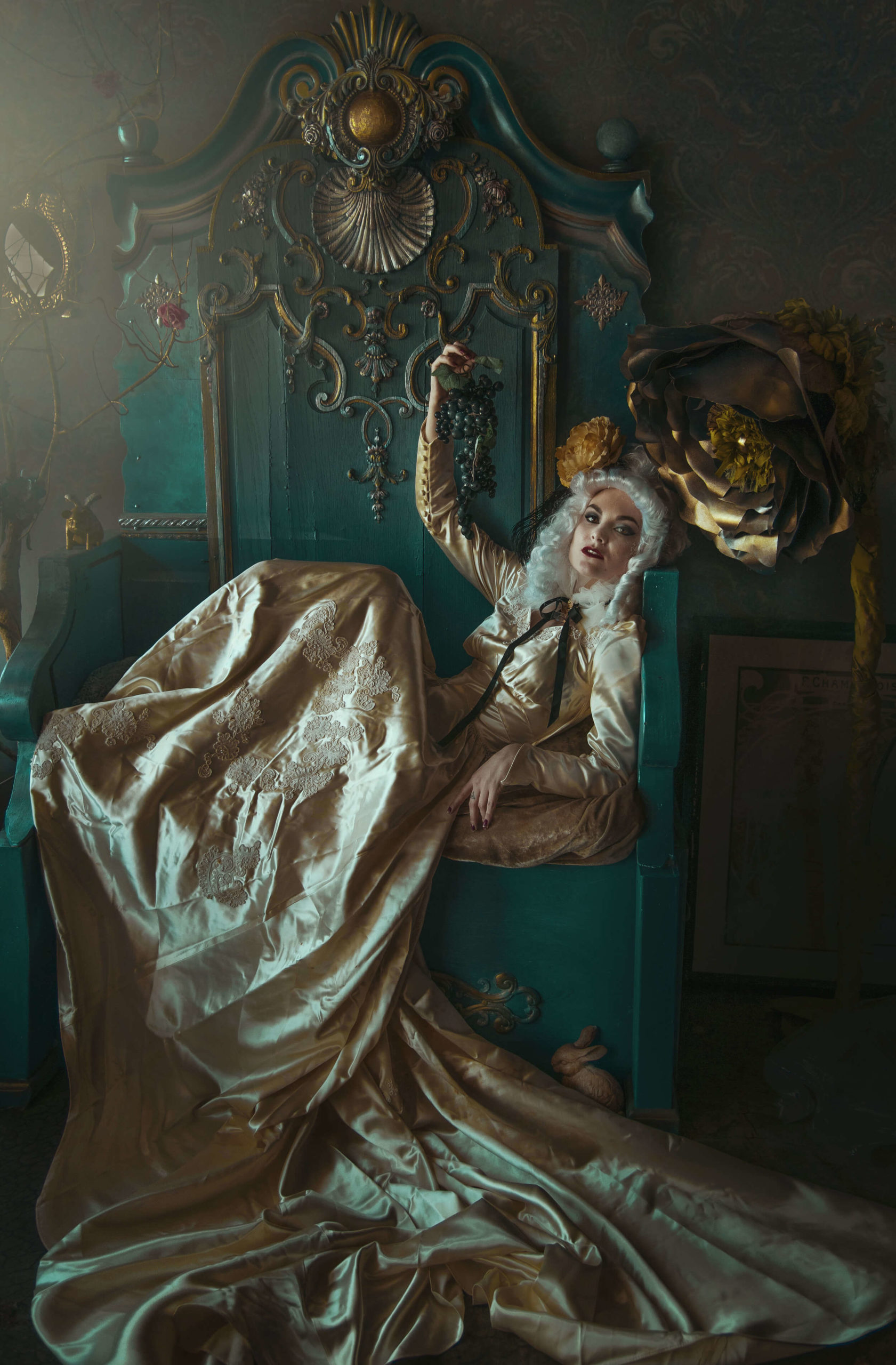
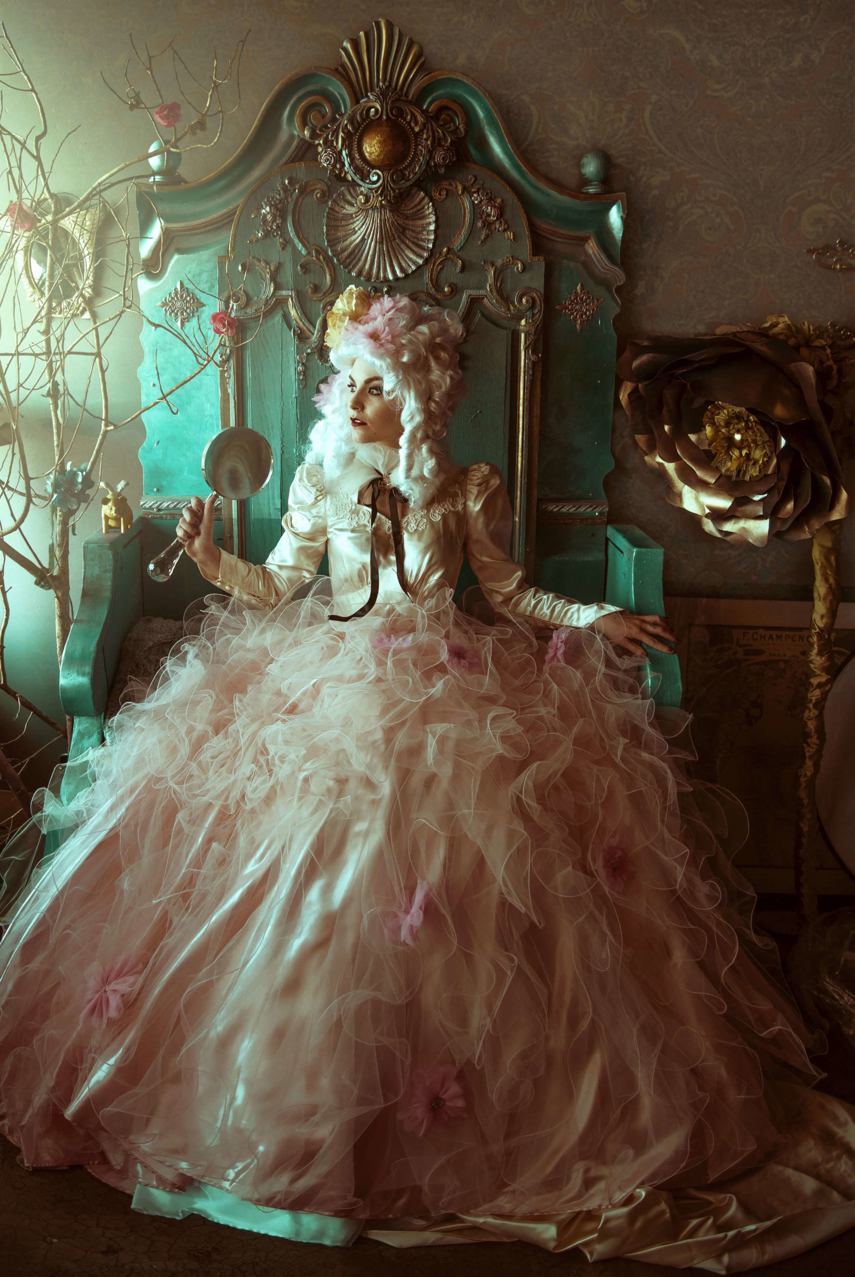
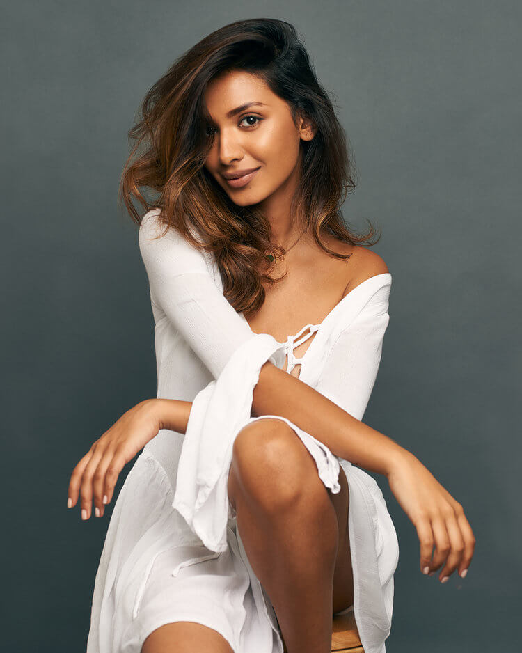
Due to a last minute cancelation on the same day for both Umbar and her model, they spontaneously threw together a mood board, portraying floaty, soft, romantic vibes inspired by current pastel coloured fashion, feminine ruffles and sakura blossoms. Make Up Artist in tow they went on a venture to Kew Gardens in London.

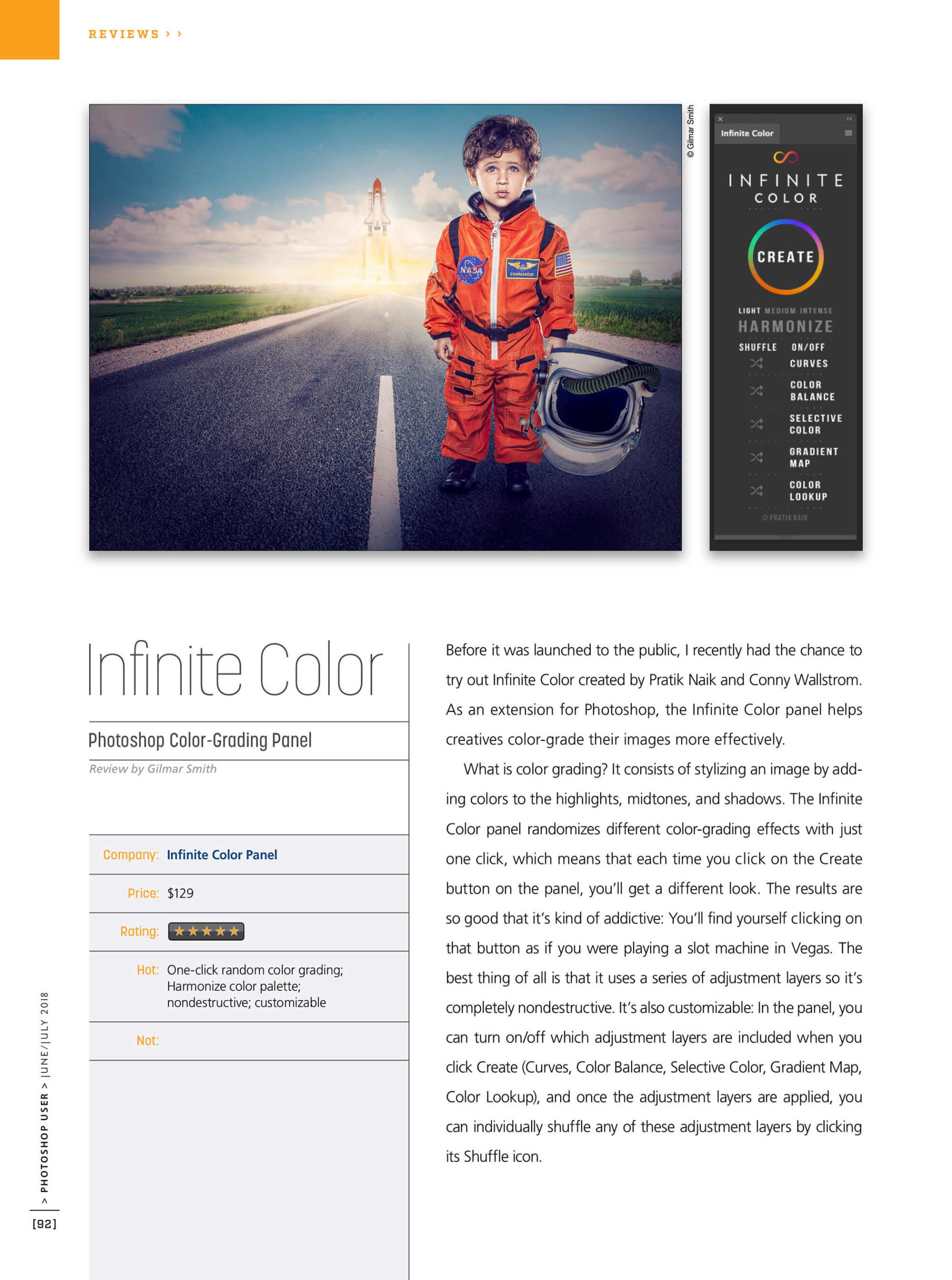
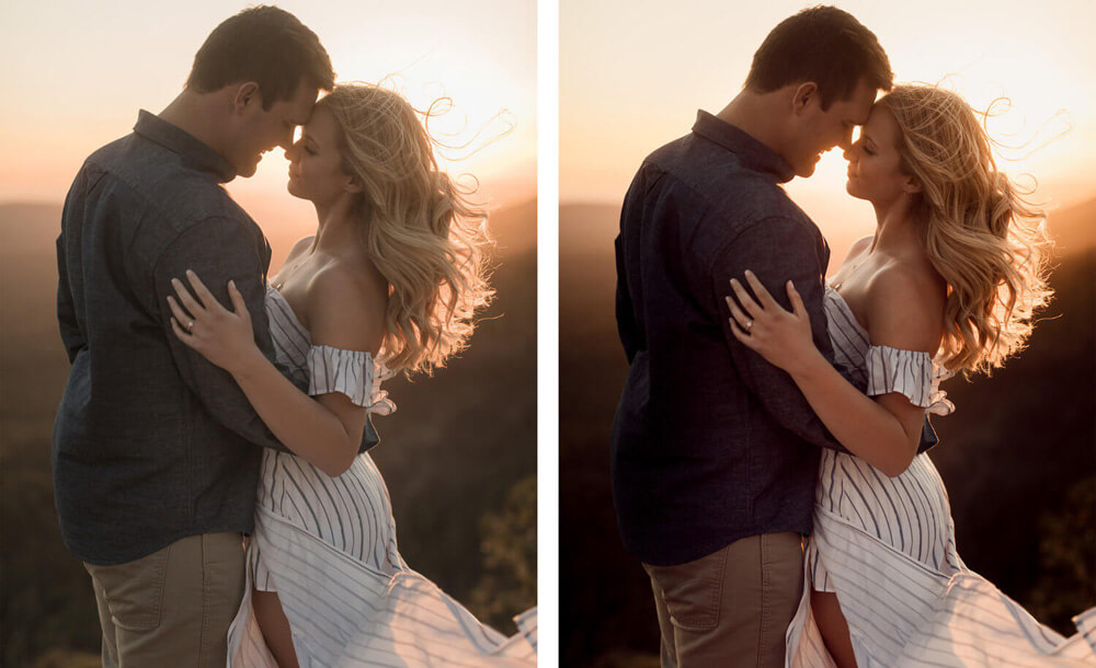
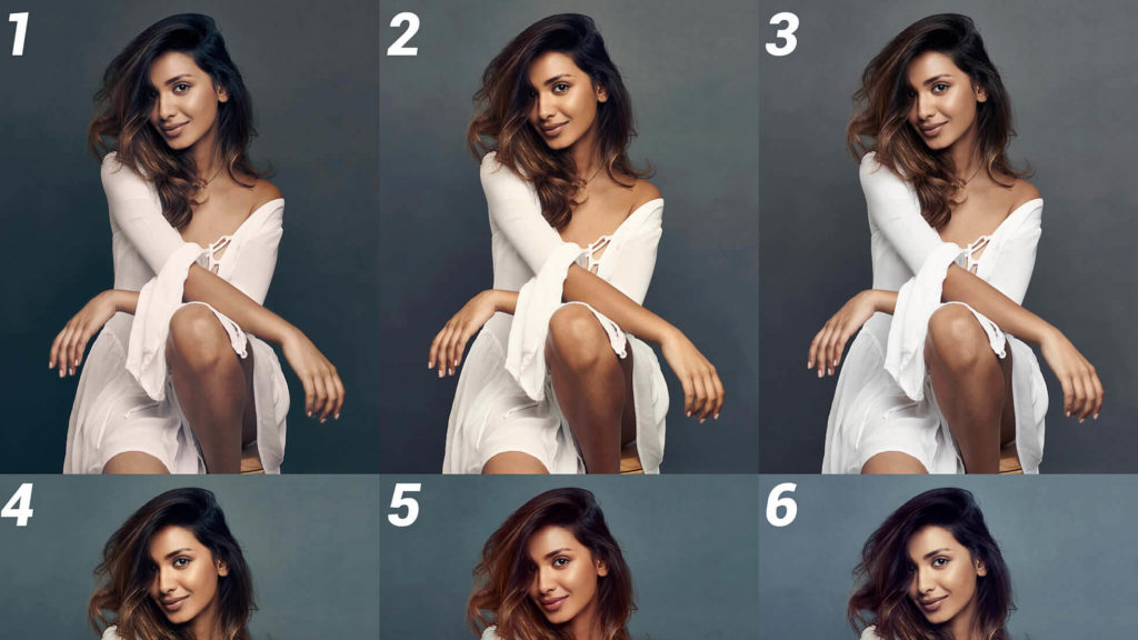
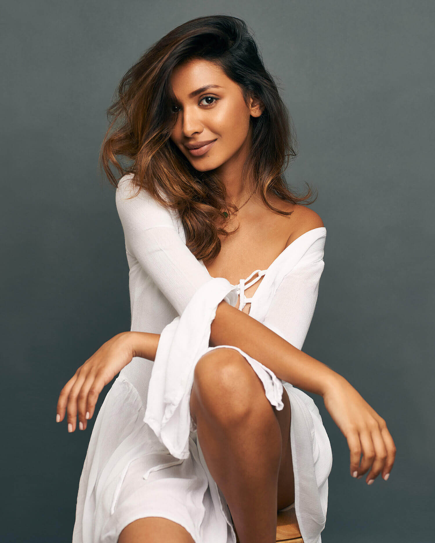
The images of the “Blossom Reveries” series was one of the first sets Umbar tried the Infinite Color Panel on.

Using the panel and hitting the create button opened up a world of options, some even differed from her original vision. Seeing the different suggestions really prompted Umbar to consider her color schemes for the shoot in more depth. The aesthetic, mood and style she wanted to portray to the viewer played a big role in her decision.

Being able to see the alternatives actually helped Umbar confirm her colour vision in this case – The palette suited the overall emotional tone of the shoot, which she wanted to be soft, romantic, and slightly retro.

“I believe we all see colour in different ways, some see the world in cool tones, some see it saturated, some see it in muted neutrals etc.  I can’t totally prove my theory, but I think how I see the world totally shows in my work…  Stay your own colour happy!”

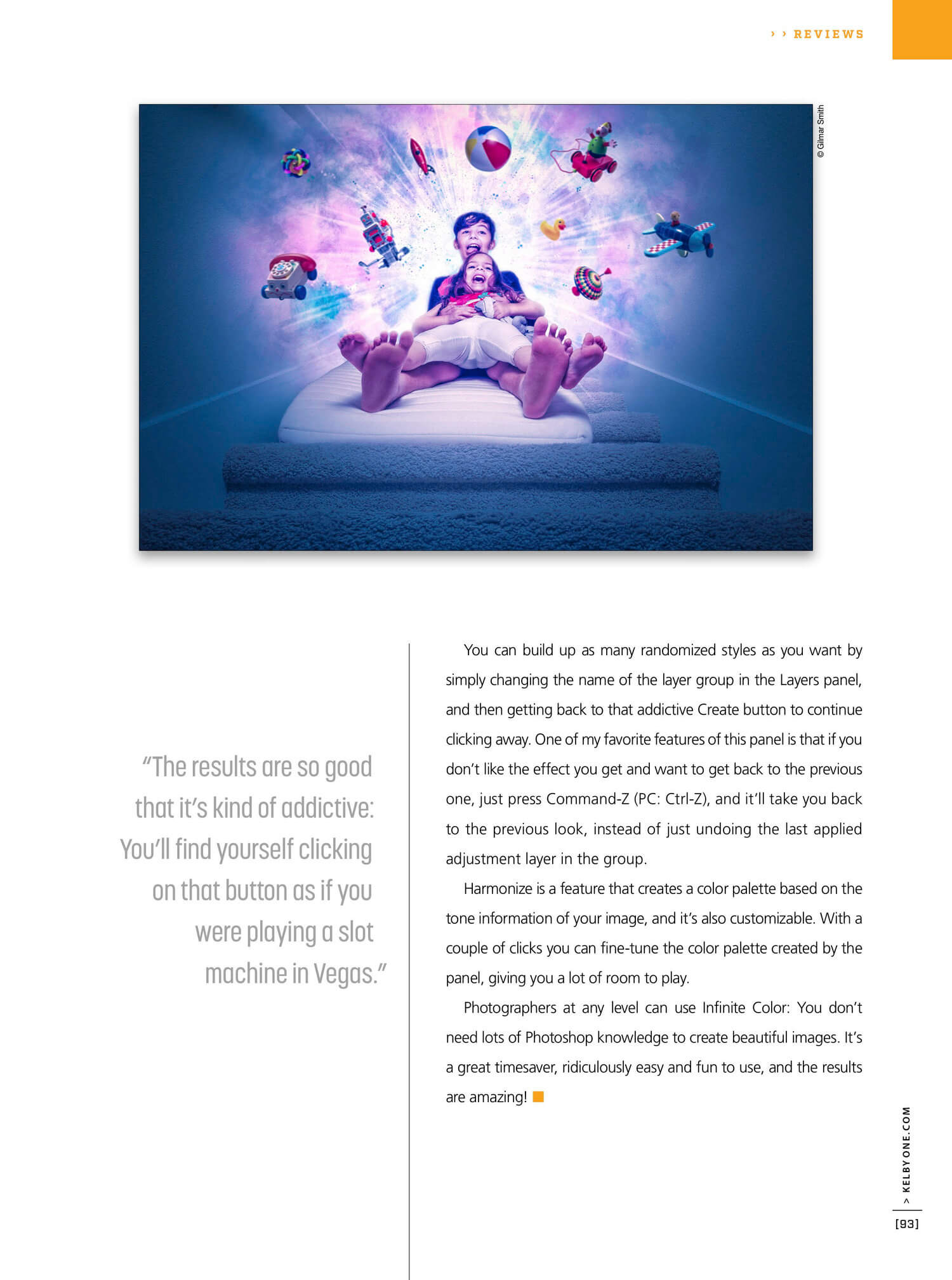
She set out to impact the viewer,… mission accomplished! A striking set of images, making us not only re-live the buzz and joy that was in the air when sunshine and spring finally hit the UK after a winter that went on forever, but also makes me (quite literally!) smell the scent of those blossoms as I browse through this set!


Infinite Color Panel Tutorials BY Umbar

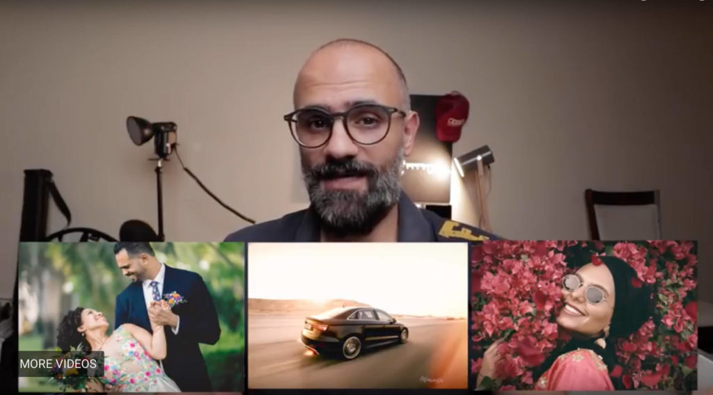
If you’d like to see a behind the scenes of Umbar’s shoot or a video of her workflow, including the Infinite Color Panel, here’s some links for you:


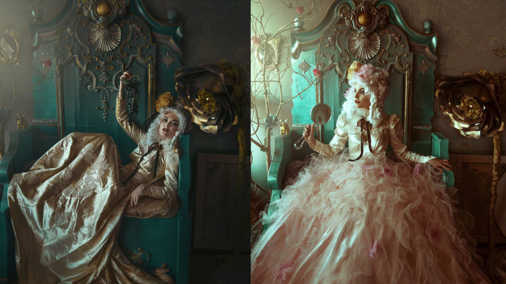
Umbar on set, a bts look at a fashion shoot


More of Umbar’s work can be seen on her WebsiteInstagram and Facebook.

Have you tried the panel yet? We’d love to see your creations! Get in touch on Instagram @infinitecolorpanel or the Facebook Infinite Color Panel group and show us your work.

If you haven’t tried the panel yet, get started here:  https://infinite-tools.com/infinite-color-plugin/


Creative conversations: with Scott English Milam

Scott English Milam is an Arizona native who has a great eye for capturing beautiful and authentic moments with couples.

With over 10 years of experience, he has learned to cultivate an environment that makes it easy for couples to express their love in front of the camera. Scott’s work is everywhere and we just had to sit down with him and ask a few questions about work ethic and practises.

…what a bonus that he is also a fan of Infinite Color!

Scott’s work with couples and weddings really serves as an inspiration for those in and out of the field. The viewer can truly see the love he captures in his subjects and we believe that to be one of the keys to Scott’s success.

We asked Scott what his primary sources of inspiration are and he told us how he always seeks to create authentic and meaningful images.

A lot of his inspiration comes from his own marriage and the marriages around him. Those relationships have helped him understand what kind of interactions mean the most to people who are in love. Scott works hard to set up those meaningful moments, in order to tell stories that have a bigger impact than just a pretty picture.

Over the years we have realised that many creatives don’t believe they have their own style even though others can clearly see it, so we were intrigued to see if Scott believes he has a particular style and how would he define it.

Scott told us:

“I would define my style as warm and peaceful. Because I live in Arizona, we have a lot of warm tones to start with, so it was always easy to harness that style. As I’ve progressed as a photographer I’ve continued to emphasize those tones to create more of a feeling with my images, instead of just an aesthetic style. And hopefully, that feeling is peacefulness because I am convinced that within the sweetest, most intimate moments with our significant others, we will find peace.”

Which leads us to the question what role color grading plays in the execution of Scott’s visions and whether he believes it to be a necessary part of the process.

Scott considers grading crucially important in conveying those feelings and maintaining his style. He has worked hard over the last few years to hone in on that style through editing and feels like he’s gotten to a really great place.

We were keen to find out if the direction Scott takes with color grading changes based on certain factors and how he knows where to go with it?

“It all has to do with the general color palette of the image, and the emotion that I am trying to convey. So if there are a lot of softer, muted tones already present in the image, I just focus on accenting those colors without overpowering anything. But, with images that are vibrant and contain bright colors, I focus on balancing those colors without desaturating anything too much because I think life should be full of color, so why rob photographs of the color they deserve! Ha!”

After seeing Scott work with Infinite Color and we’re delighted he’s chosen to use the panel to help with his color vision.

Scott tells us how the tool helps him accomplish his unique results in two ways.

Some of the time he starts out by dialling in most of his colors in Lightroom and then bringing over select images to Photoshop to tweak the tones with the Infinite Color panel. He likes the subtlety and easy tweaking the panel offers, which helps Scott not to stray too far away from his previous RAW adjustments.

However, as an alternative to the first method, Scott also likes starting from scratch with Infinite Color. He starts off by using Lightroom for image normalizing, then exports his images over to Infinite Color to see what options the panel comes up with. This is a great way to find new color toning styles and it helps Scott discover more about how to edit tones in Photoshop, which is a nice bonus!


Infinite Color Panel in Action

Lastly we asked Scott if Infinite Color would be something he’d recommend for other creatives, too, and what some of his favorite features were.

“Duh! It’s a no brainer! They really dialed it in, so that the toning is pleasant, yet still stylized, which most plugins seem to have a hard time finding that balance. It’s so easy to use, and the ability to adjust the layers after the fact, it’s so great for fine tuning!”


Thank you very much for giving us an insight into you world of photography and colour toning, Scott!

More of Scott’s work can be seen on his website and Instagram.

Have you tried the panel yet? We’d love to see your creations! Get in touch on Instagram @infinitecolorpanel or the Facebook Infinite Color Panel group and show us your work.

Infinite Color War – Vote For Your Favorite Submission

THE WINNER IS…

Our contest had an amazing turnout, with over 630 votes!

With 31% of the votes, the winner was number 10, Darryl Pascoe! Congratulations Darryl, your work is beautiful!

I kept the poll live so you can click on “see results” to see how everyone else did. As you can see, it was a pretty close competition with second place!

Below is the original post, where I’ve labelled the names of everyone who made the top 12. Also, in a future post I’ll be sharing  bunch of other submissions so you can see a full gamut of images!

We’ve been thrilled on the response of Infinite Color and the community that has already developed in a month that we decided to have our first contest! In case you missed it, check it out here.

The image for the contest was provided to us by London based photographer Indy Sagoo!
(Model Naina Mall)

ORIGINAL IMAGE

How We Decided

Indy and I both picked a few of our favorites. We went by the ones we felt had enough variation and were still visually pleasing. On Indy’s side, he decided which ones stood out to him based on his taste. Once the contest is done, Indy will state the reasons why he picked the ones he did as well.

Anonymous Voting

To keep it fair, we have left the names out. Once the contest is finished, we’ll share the names of who did what, along with presenting a gallery of all the other entries too!

Rules, Deadline, and Prizes

The rules are simple. Look at the images presented below (click on them to see them in full screen). Pick your favorite one, and vote for the number you liked the best!

Voting effectively ends on June 8th, 10 p.m. Eastern Time Zone! The winner gets to keep the panel for free (a full reimbursement), plus $200 in cash, and a spotlight feature and interview about them on our website.


Which image was your favorite?


Image 1 – Jennifer Carter
Image 2 – Ruli Koto

Image 3 – Preet Uday

Image 4 – Muffadal Abbas

Image 5 – Marco Verna

Image 6 – Laura Sheridan
Image 7 – Kassie Jackson
Image 8 – Carolina Zapata – Second Place
Image 9 – Jerry Fredriksson
Image 10 – Darryl Pascoe – Winner
Image 11 – Kaela Speicher
Image 12 – Alex Baker

If you haven’t tried the panel yet, get started here:  https://infinite-tools.com/infinite-color-plugin/


Infinite Color Reviews Now On Youtube

Written by Tina Eisen

The Infinite Color Panel launched only a couple of weeks ago and thus far the feedback has been incredible!

It has been exciting to hear and read about people’s experiences with the panel and we have seen some wonderful, kind reviews on blogs and pages such as PetaPixel, FStoppers and SLRLounge.

Recently people have started giving video reviews on their YouTube channels and we simply love them! Anyone wanting to see the panel used in real life can now do so via channels such as Umbar ShakirMoe Zainal, and others.

Moe Zainal

Umbar Shakir

Antti Karppinen

Check out our Press Section for more!

Do you have a YouTube channel yourself? Are you interested in reviewing the Infinite Color Panel on there? Just drop us a line on [email protected] and let’s talk!

If you haven’t tried the panel yet, get started here:  https://infinite-tools.com/infinite-color-plugin/


Color Conversations with Christyl O’Flaherty

Written by Tina Eisen

California based Christyl O’Flaherty, self taught and following the footsteps of her photographer grandfather, inspires us in many ways. Her passion to create magical, enchanting moments and her incredible eye for the beauty in others and her surroundings shines through her mesmerising, fairytale like work.

Christyl’s latest work tells a story of a carefree, fun loving dame on her throne enjoying the luxuries she’s surrounded with… meet “Lady Binx”!

The idea started with a beautiful wedding gown Christyl found on a social site that belonged to one Margaret Howe McCaffery. Margaret wore her dress while strutting down the aisle in 1942 Beverly Hills, California.

Margaret Howe McCaffery’s wedding in 1942, Beverly Hills, California.

Once purchased at J. Williams, a department store no longer in existence, the wedding gown had served its purpose and got handed down years later from one generation to another. By the time Christyl had laid her eyes on it online, it belonged to Margaret’s grand daughter Cathy, now 82 years of age who kept the treasure hidden in her closet. Knowing that it would bring much more joy to Christyl, her team and countless viewers in the future, Cathy kindly donated the dress.

Upon shedding a few tears, Cathy wrote to Christyl:

“I have to admit, my heart pretty much ached after I left that dress with you. But then, I thought about how it would only sit in my closet, deteriorating, when it could be bringing joy through your wonderful inspirations! I sooo look forward to seeing your creations! Don’t forget me. Love to you, my new friend!! Cathy.”

The photoshoot was put together rather quick and soon after. Shot in Christyl’s studio Muse Factory, a throne (painted by Chelsea Starling) was erected in the lobby near a window, with by-passers stepping over the scene.

1942 Wedding Gown & Quinceanera Dress ready for the shoot.

Christyl and her model Jessica Pierce had a fun, spontaneous shoot playing with different garments and props, such as a flying pig statue, a stone rabbit, an old quinceanera dress, a giant magnifying glass and some wonderful costume jewellery. Pretending to be wine-drunk ladies at an old French chateaux, the pair captured scenes of lavish medieval nobility and carefree abundance.

Grandma’s Jewellery & The Flying Pig 

The images were lit by daylight coming through a nearby window and one single speed light for fill.

After the shoot Christyl decided that the colour grading of her images should portray a certain degree of comfortable warmth, while still preserving the fun of the day. She wanted her viewers to be able the “feel” the scene, to smell the lavender and caramel and become part of the story.

Unedited, out of camera images.

Playing with the Infinite Color Panel Christyl found a pleasing combination of colours within moments. She ran the panel in “Light” mode and masked out a few areas until the desired end result was achieved.

Christyl tells us proudly how the colours applied to her final work brought this story to life and tied together a fairytale that started one magical wedding day in 1942.

We’re in love with the results!

Have you tried the panel yet? We’d love to see your creations! Get in touch on Instagram @infinitecolorpanel or the Facebook Infinite Color Panel group and show us your work.

If you haven’t tried the panel yet, get started here:  https://infinite-tools.com/infinite-color-plugin/


Infinite Color War: Our First Color Grading Contest!

It’s time for our first color grading contest! Are you ready to suit up and battle? Let’s see how your taste in color compares with others in our first fun contest!

With the launch of Infinite Color Panel, it’s been incredibly inspirational seeing people’s work and their taste in color finally come through with the help of it to guide them there. So it got us thinking, what would happen if everyone worked on the same image? What color choices would people make? What direction would they go and how would they color grade this image? What look would people collectively like the most? All the questions!

Hence the contest was born.

THE IMAGE FOR THE CONTEST TO COLOR GRADE


This image was provided by London based photographer Indy Sagoo!
(Model Naina Mall)

To download the PSD image to work on, go here:

Open the PSD image in Photoshop upon downloading to start working.

1. Rules

A. Color grade this using the Infinite Color Panel as a part of your color grading.
B. You can certainly use as many of your own layers and tweaks as you’d like as long as the panel is a part of the process.
C. Ensure you save your layers, we’ll ask the winners for screen shots and ensure they own the panel.
D. One entry per person!
E. You can dodge and burn to modify light if you wish too as a part of the process, since it impacts the overall “feel” of the image.
F. You may use masking and stack colors to your heart’s content!

2. Deadline:

As of reading this post, the contest has now ended and we’re in judging mode! We’ll be making a blog post this week with some of our favorites, so you can judge for your favorite anonymously!

After the winner is given and announced, we’ll be posting a wide selection of photos that were submitted along with who did them.

Stay tuned!

3. Submit: 

A. Upload a JPG here:

– Do not change the resolution or color space of the image
– Rename the file to your name so we know it’s you!
– Please read the rules before submitting. One entry per person.

B. Optional: Upload an image to Instagram and tag #infinitecolorcontest and tag us at @infinitecolorpanel so we can follow along on IG to see what the community thinks of what you make!

4. Voting and Winners: 

Once the contest ends, we’ll make a blog post with our top favorites without listing the names, and ask the audience to vote for their favorites!

After which, we’ll announce who won the contest with a feature, and also announce who our top favorites were by naming them.

5. Do we win anything aside from having fun? 

A. We’ll be refunding the main winner so you’ll get to keep the panel for free!
B. The main winner gets a spotlight feature and interview about them and their work.
C. He or she also gets $200 in cash (USD)!

6. How can I learn how to use the panel like a pro? 

If you’re new to using the panel, be sure and visit the Education tab on the top of the site to see more videos on some great ways of using it!